Why St. Columba's looks the way it does
A site for a mid-sized Episcopal parish whose music is the thing strangers have heard about. It treats Evensong as the front door, publishes the music list the way the choir actually uses it, and explains Anglican worship plainly to people who have never been inside.
- Built for
- Concert-goers and students who come for the singing, families looking at the free choristers' program, and long-time parishioners who want Sunday's leaflet before they leave home.
- Navigation
- Split screen. Identity and navigation stay fixed on the left half while content scrolls on the right, like a printed programme.
- Pages
- Home, Sundays, Evensong, Sing with us, The parish, Give
- Hero
- A tall typographic poster: the headline stacks down the left in mixed weights, italics and outlines, with a rotated side label and a photo panel. Variants: a = side label, stacked headline, then a tall photo on the right; b = photo panel on the left and the lines stepping in from the right, label on the far edge; c = the lines are pasted like strips over the edge of a large photo; A single verse or sentence set enormous as the opening statement, with its reference, a short supporting line and one action. Variants: a = the quote fills the width with a hanging quotation mark; b = the quote beside a tall photograph; c = the reference becomes the architecture, with the book name and a giant outlined chapter and verse in the left column
Typography
Bodoni Moda sets every heading. It descends from the types Giambattista Bodoni cut in Parma, and it is the letter of engraved anthem title pages, so it carries the choral tradition without a single clip-art clef. Libre Franklin does the practical work underneath, and Spectral SC gives the labels true small capitals, the way rubrics are set in the printed leaflet.
Color
The blue is Sarum blue, the Advent color of the medieval Salisbury rite that many Anglican parishes still use in December. The claret comes from the choristers' cassocks. The gray-blue paper color is Lake Champlain in November, three blocks downhill. In dark mode the blue lifts to a pale periwinkle and the claret to a rose, so both read as candlelight rather than neon.
Layout and navigation
The split-panel navigation keeps the parish name, the pages and the service times fixed on the left while the content scrolls on the right, like a printed order of service you hold open in one hand. On a phone it folds into a single menu with the Evensong button always visible.
The hero
The home page opens on a typographic poster for the Evensong season because that is what newcomers search for and what the parish does best. The lines stack like a concert bill, with the time and season printed up the side so nobody has to scroll to learn when to come.
Calls to action
Every button names the service or the task: Hear Evensong at five, Come on Sunday at ten, Book a chorister's audition, Give to the music. Anglican worship has a lot of unfamiliar words, so the buttons never add more of them.
Photography
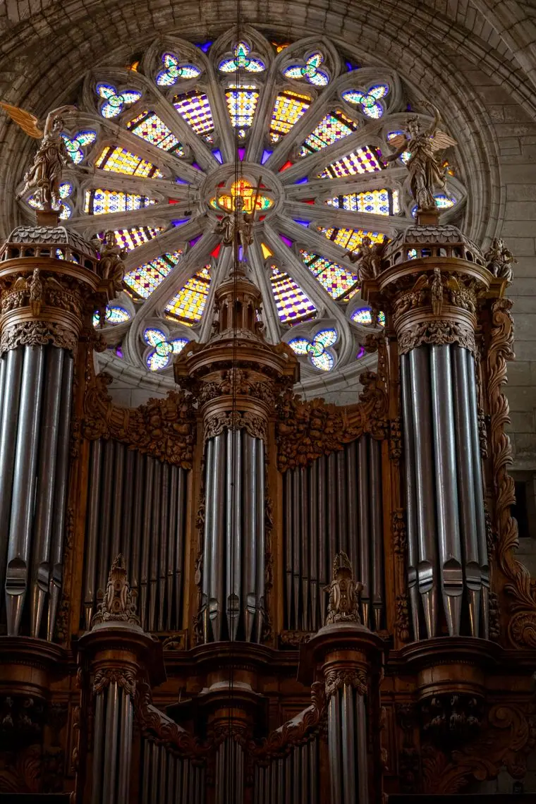
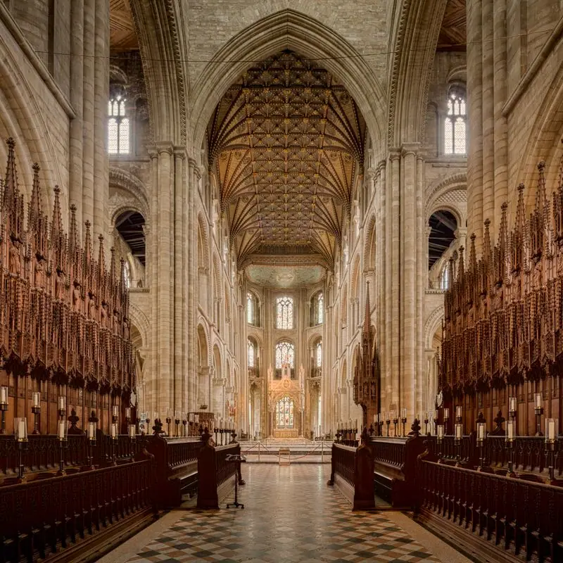
Stone, candlelight, music on the stand and children at the piano, with people photographed while they rehearse or sing rather than posing. We dropped every wide cathedral nave we were offered: Evensong at St. Columba's draws sixty to a hundred people, and the pictures should never promise a cathedral. The history timeline carries no photographs at all, because we had none that were honest about 1868 or 1923.
Accessibility
Body text is 17px with generous leading, every color pair passes WCAG AA in both themes, and the bracket buttons are real text links with a visible focus outline. The Sundays page says plainly where the level entrance, hearing loop and large-print leaflets are, before anyone has to ask.
Type system
- DisplayBodoni ModaBodoni is the face of engraved music title pages and old hymnal frontispieces; its hairlines and heavy stems feel like stone and ink.
- TextLibre FranklinA plain American gothic that stays out of Bodoni's way and holds up in long practical paragraphs about parking and auditions.
- AccentSpectral SCTrue small capitals for labels, the way rubrics are set in a printed order of service.
Colour and contrast
Every text pairing is checked against WCAG 2.2 in both themes.
Light theme
| Pairing | Sample | Ratio | WCAG |
|---|
| Body text on page | Aa | 15.14:1 | AAA |
| Body text on cards | Aa | 16.73:1 | AAA |
| Secondary text | Aa | 5.66:1 | AA |
| Links | Aa | 9.94:1 | AAA |
| Button text | Aa | 11.38:1 | AAA |
| Accent label text | Aa | 7.69:1 | AAA |
| Text on dark bands | Aa | 15.14:1 | AAA |
| Muted text on dark bands | Aa | 7.96:1 | AAA |
| Text on brand bands | Aa | 11.38:1 | AAA |
| Muted text on brand bands | Aa | 7.15:1 | AAA |
Dark theme
| Pairing | Sample | Ratio | WCAG |
|---|
| Body text on page | Aa | 15.5:1 | AAA |
| Body text on cards | Aa | 14.09:1 | AAA |
| Secondary text | Aa | 6.81:1 | AA |
| Links | Aa | 9.4:1 | AAA |
| Button text | Aa | 9.52:1 | AAA |
| Accent label text | Aa | 7.66:1 | AAA |
| Text on dark bands | Aa | 16.32:1 | AAA |
| Muted text on dark bands | Aa | 8.17:1 | AAA |
| Text on brand bands | Aa | 9.52:1 | AAA |
| Muted text on brand bands | Aa | 5.71:1 | AA |
 Sundays at fiveChoral Evensong