Why Vida Nueva looks the way it does
Vida Nueva is a bilingual Pentecostal church where grandparents worship in Spanish and their grandchildren often pray in English. The site greets both at once, leads with testimonies instead of a mission statement, and puts prayer, not giving, in the header.
- Built for
- Spanish-speaking families in east Pasadena and Deer Park, their bilingual teenagers and adult children, and neighbors looking for a church after a hard season.
- Navigation
- Two-tier header. A thin utility strip carries times, phone and language; the main bar below holds pages and the action.
- Pages
- Home, Services, Kids & youth, Prayer, About us, Give
- Hero
- a mirrored bilingual opener: the same welcome written in two languages, each with its own service times, shown together on purpose so both congregations are greeted first. Variants: a = two columns that face each other across a centre rule, with a wide photo beneath; b = one headline set large with its translation directly beneath like an interlinear text, a shared timetable and a portrait photo; c = a full-height photo beside a printed-programme column where each language has a hanging label
Typography
Gabarito in ExtraBold has the round, confident shapes of the hand-painted lettering on church vans and taquería windows along Red Bluff, without tipping into novelty. Onest sets the body at 18px: it is open and warm, its accents sit high and clear, and it stays readable on a phone with the brightness down in a dark sanctuary. Both faces carry ñ, ¿ and ¡ cleanly at every size.
Color
The red is the color of Pentecost, the tongues of fire in Acts 2 and the altar cloth that goes up every May. The blue is the awning over the side door, the landmark everybody mentions when they tell a cousin how to find the church. Neutrals lean warm rose so the pages feel like the fellowship hall, and the dark theme sits on a deep wine instead of black.
Layout and navigation
A two-tier header keeps both service times, the address and the language switch on every page, because those are the three things people text each other. The bar below holds six pages and one action. The home page then runs in the order a newcomer asks: which service is in my language, is anyone like me here, what does it look like, and where is it.
The hero
The opening screen says the same welcome twice, side by side, each with its own congregation's service time. The Spanish is written as Spanish, in the voice Pastor Rubén uses from the pulpit, so it doesn't read like a translation of the English. A grandmother and her grandson can look at the same phone and both find their hour.
Calls to action
The header button is 'Ask for prayer' because that is the first thing most people who find a Pentecostal church online are looking for, often late at night. 'Come this Sunday' and 'Register your kids' follow, and giving sits on its own page instead of in the header.
Photography
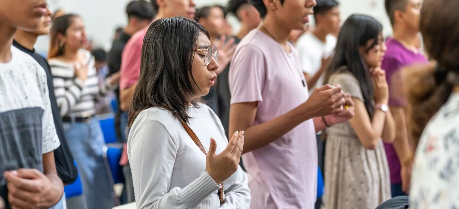
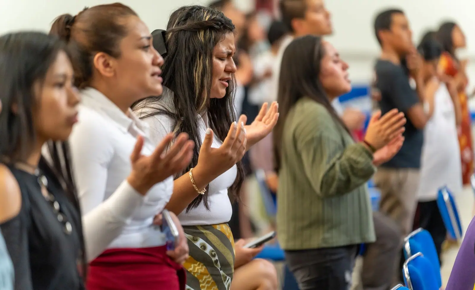
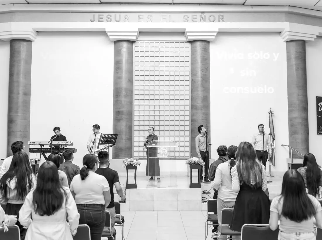
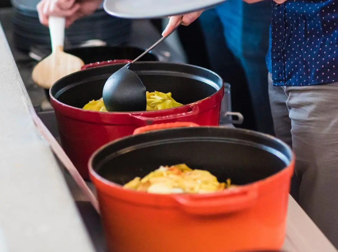
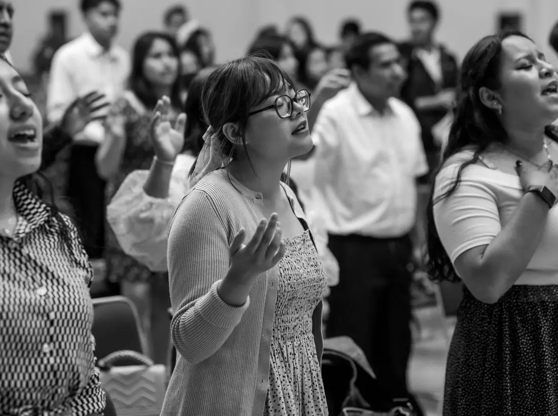
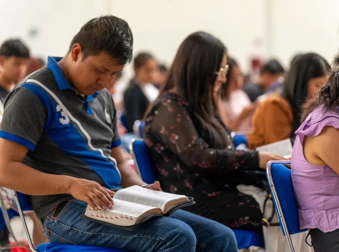
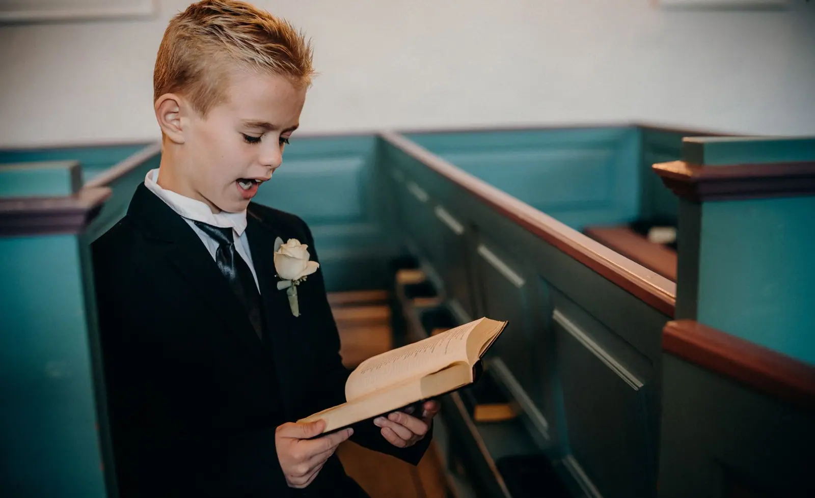
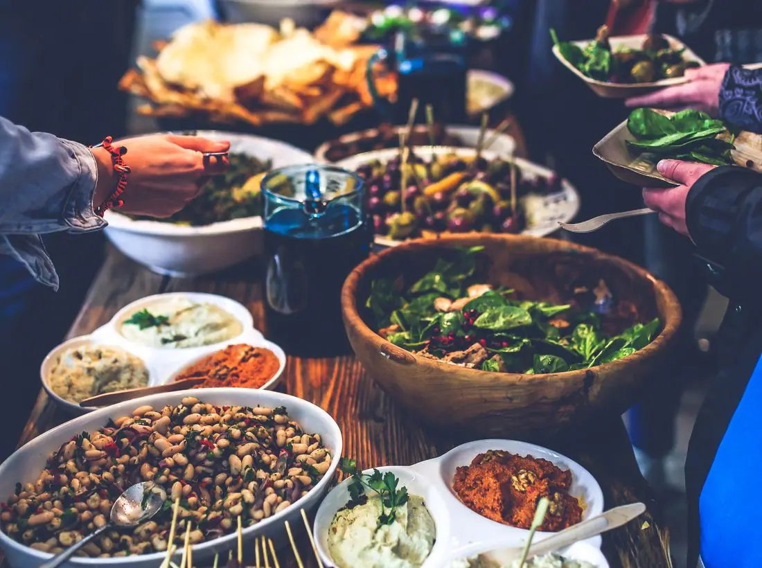
Photos come from Spanish-speaking congregations at worship, at the altar on revival nights and around the food table: raised hands, open Bibles, tamales in foil pans. Crowd shots stay at rooms of a hundred or so, which matches a real Sunday here. The testimony wall has no photos at all on purpose, so the words carry it.
Accessibility
Every heading and button switches language together, and the page's lang attribute changes with it so screen readers pronounce Spanish correctly. Body text is 18px with contrast above 7:1, and the prayer form never requires a name or an email.
Type system
- DisplayGabaritoA round, sturdy geometric sans that reads like hand-painted church van lettering and sets Spanish accents cleanly.
- TextOnestA warm, open grotesque with generous accents and a tall ñ, very easy to read on a phone with the brightness turned down during the service.
Colour and contrast
Every text pairing is checked against WCAG 2.2 in both themes.
Light theme
| Pairing | Sample | Ratio | WCAG |
|---|
| Body text on page | Aa | 15.63:1 | AAA |
| Body text on cards | Aa | 17.45:1 | AAA |
| Secondary text | Aa | 5.79:1 | AA |
| Links | Aa | 6.44:1 | AA |
| Button text | Aa | 7.19:1 | AAA |
| Accent label text | Aa | 6.92:1 | AA |
| Text on dark bands | Aa | 15.63:1 | AAA |
| Muted text on dark bands | Aa | 8.1:1 | AAA |
| Text on brand bands | Aa | 7.19:1 | AAA |
| Muted text on brand bands | Aa | 4.63:1 | AA |
Dark theme
| Pairing | Sample | Ratio | WCAG |
|---|
| Body text on page | Aa | 15.96:1 | AAA |
| Body text on cards | Aa | 14.66:1 | AAA |
| Secondary text | Aa | 6.96:1 | AA |
| Links | Aa | 8.45:1 | AAA |
| Button text | Aa | 8.51:1 | AAA |
| Accent label text | Aa | 9.51:1 | AAA |
| Text on dark bands | Aa | 16.77:1 | AAA |
| Muted text on dark bands | Aa | 8.34:1 | AAA |
| Text on brand bands | Aa | 8.51:1 | AAA |
| Muted text on brand bands | Aa | 5.36:1 | AA |