Why Verse & Rhythm looks the way it does
Verse & Rhythm is built like a sleeve for a mixtape: loud type, a running reel of photos, and the facts a teenager or a parent needs set in a timestamp face. It had to feel like it was made by people who make things, because that is the whole pitch to a fourteen-year-old.
- Built for
- Atlanta teens aged 13 to 19 who rap, dance, write or make beats; the parents and grandparents who need to trust the building; and churches and schools who book the crew for workshops.
- Navigation
- Corner controls. Name in one corner, menu in the opposite corner, primary action in a third. The page itself has no header bar.
- Pages
- Home, The Lab, First Fridays, Listen, Book us, Crew
- Hero
- a two-tone split: one half is a solid block of the brand colour carrying a giant date, time or short word (such as SUN 10:30), and the other half holds the headline, a short lead, the main action and a photo. Variants: a = block on the left at full height with the giant type stacked, content and photo on the right; b = the block runs across the top with the giant type on one line, and headline, lead and photo sit in columns beneath; c = a narrow block on the left, the text in the middle and a photo bleeding off the right edge; a short action form as the hero: the one thing most visitors came to do (request a ride, ask for help, register a child) can be done before they scroll, with reassurance beside it. Variants: a = headline, reassurance and a photo on the left with the form as a raised card on the right; b = a tall photo carrying the headline, with the form and reassurance on a plain panel beside it; c = headline beside a photo, then the form laid out as one horizontal booking bar; a headline over a slow, continuous strip of captioned photographs that visitors can also drag or scroll; it pauses on hover and focus, has a pause button, and stays still for people who prefer reduced motion. Variants: a = headline and lead side by side above a strip of mixed portrait and landscape photos; b = a giant headline beneath a strip whose photos step up and down; c = two strips moving in opposite directions with the headline between them
Typography
Rubik Mono One is wide, monospaced and unapologetic, closer to a road-case stencil or a sampler's LCD than to anything you would see on a church sign. Because every letter takes the same width, headlines fall into a beat of their own. Space Grotesk does the reading, and DM Mono carries times and track lengths the way a DAW timeline does.
Color
The violet comes from the Lab's back wall, painted by the teens the summer they moved into the tire shop in 2022, and the orange is a ripe Georgia peach. The neutral is a cool concrete with a faint violet cast so the photos, which are full of neon and street light, sit on something that belongs to them. The dark theme is a studio at midnight with the violet lifted to lavender, rather than an inverted light page.
Layout and navigation
The corner controls leave the first screen entirely to the photos: the name sits top left, the menu opposite, and the Join the Lab button holds a third corner on every page. Teens arrive from an Instagram bio link on a phone, so there is no header bar to scroll past before they see people their own age.
The hero
Two strips of photographs run in opposite directions with the promise between them, so the first thing anyone sees is a real week: beat lab, crew practice, the ten minutes of scripture that opens every session. Each frame carries its day and time, which answers the parent's first question before they ask it. The reel pauses on hover and stands still for anyone who prefers reduced motion.
Calls to action
Join the Lab is the single action that matters, so it owns the corner. The other buttons say exactly what happens next: Get on the First Friday list, Book a workshop, Fund a studio seat. Giving appears once, on the Crew page, priced in suppers and laptops so a donor can see what $45 actually buys.
Photography
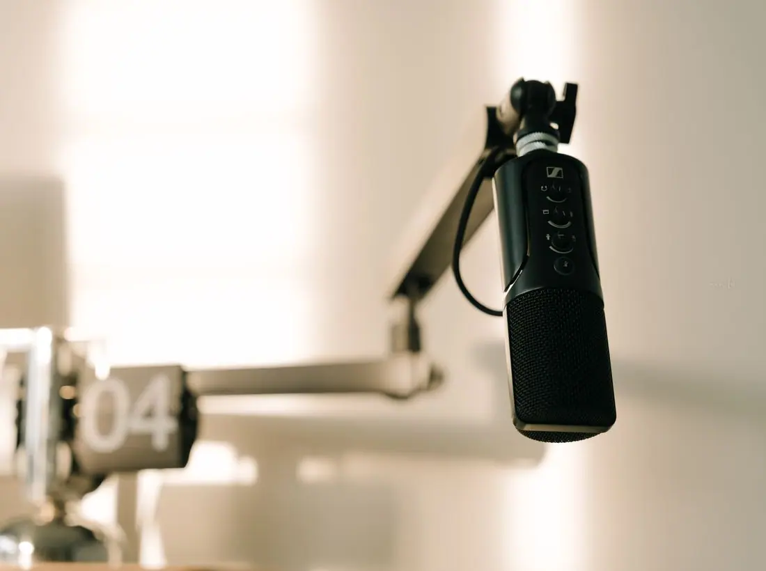
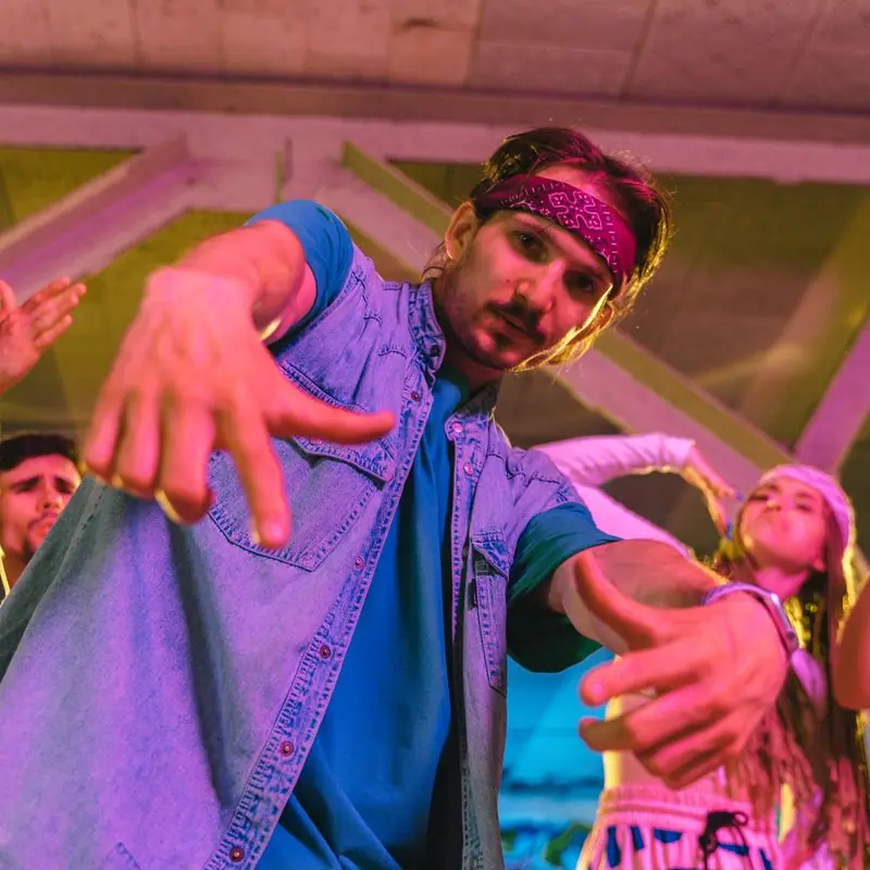
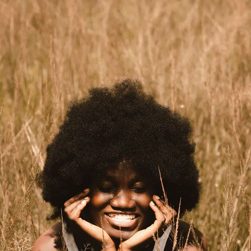
Teens dancing, painting, writing and standing at the mic, mostly in street light and studio light rather than stage spectacle. Portraits of mentors are plain and close, because a parent deciding about a Tuesday afternoon wants to see the face of the adult in the room.
Accessibility
Rubik Mono One is only ever used for headings and big numbers; everything you read in paragraphs is Space Grotesk at 17 pixels with generous line spacing. Both moving strips can be paused and are still for reduced-motion users. Every text pairing passes WCAG AA in both themes, and the schedule table marks today's column in text as well as color.
Type system
- DisplayRubik Mono OneA monospaced, ultra-wide geometric that reads like stencilled lettering on a road case; every letter takes the same space, like beats in a bar.
- TextSpace GroteskA grotesque with quirky, slightly mechanical details that keeps up with Rubik Mono One without shouting back at it.
- AccentDM MonoSession times, track lengths and room names, set like the timestamps on a DAW timeline.
Colour and contrast
Every text pairing is checked against WCAG 2.2 in both themes.
Light theme
| Pairing | Sample | Ratio | WCAG |
|---|
| Body text on page | Aa | 15.14:1 | AAA |
| Body text on cards | Aa | 17.19:1 | AAA |
| Secondary text | Aa | 5.76:1 | AA |
| Links | Aa | 7.94:1 | AAA |
| Button text | Aa | 9.38:1 | AAA |
| Accent label text | Aa | 6.79:1 | AA |
| Text on dark bands | Aa | 15.14:1 | AAA |
| Muted text on dark bands | Aa | 7.89:1 | AAA |
| Text on brand bands | Aa | 9.38:1 | AAA |
| Muted text on brand bands | Aa | 5.97:1 | AA |
Dark theme
| Pairing | Sample | Ratio | WCAG |
|---|
| Body text on page | Aa | 16.58:1 | AAA |
| Body text on cards | Aa | 15.16:1 | AAA |
| Secondary text | Aa | 7.2:1 | AAA |
| Links | Aa | 8.17:1 | AAA |
| Button text | Aa | 8.14:1 | AAA |
| Accent label text | Aa | 9.02:1 | AAA |
| Text on dark bands | Aa | 17.32:1 | AAA |
| Muted text on dark bands | Aa | 8.56:1 | AAA |
| Text on brand bands | Aa | 8.14:1 | AAA |
| Muted text on brand bands | Aa | 5.1:1 | AA |
 Mixtapes, Vol. 1–3West End Psalms
 Amaya J.Writing Room, age 17, from New Every Morning