Why New Roots Refugee Services looks the way it does
A resettlement agency site that has two very different visitors: a family who landed at Boise Airport last week, and a neighbor who wants to help. The newcomer comes first. The site opens on a bilingual search for what they need today, and everything for volunteers and donors sits one tap away in the dock.
- Built for
- Newly arrived refugee families (most from Congo, Burundi, Afghanistan and Ukraine), their sponsors, and Boise volunteers, employers and donors.
- Navigation
- Floating dock. Navigation floats in a dock at the bottom of the screen, where thumbs and eyes already are.
- Pages
- Home, Just arrived, English, Work, Help out, Talk to us
- Hero
- a short action form as the hero: the one thing most visitors came to do (request a ride, ask for help, register a child) can be done before they scroll, with reassurance beside it. Variants: a = headline, reassurance and a photo on the left with the form as a raised card on the right; b = a tall photo carrying the headline, with the form and reassurance on a plain panel beside it; c = headline beside a photo, then the form laid out as one horizontal booking bar; A 'What do you need today?' search that filters real services as you type, for organisations whose visitors arrive with an urgent need
Typography
Albert Sans for headings: round, open and calm, and nothing like the type on the UNHCR forms many of these families have been filling in for years. Body text is Atkinson Hyperlegible at 18px, drawn by the Braille Institute so that I, l and 1 never look alike. For someone reading English as a third language, that is a real kindness.
Color
Plum and apricot come from the Boise foothills at dusk, the view from the apartment complexes on the Bench where most New Roots families live. The apricot also matches the wax-print fabric many Congolese families wear on Sundays. Plum carries buttons and links; apricot is kept for highlights so it never has to carry text on its own.
Layout and navigation
A floating dock at the bottom of the screen, with an icon on every item. Most of our families use the site on a phone, sometimes before they can read much English, and a row of pictures where the thumb already rests is easier than a menu hidden behind three lines. The French switch is at the top of every page.
The hero
A search box that asks, in English and French, what you need help with today. It understands both languages, so 'école' and 'school' find the same answer. Every result says when and where in one line, because the second question after 'can you help' is always 'when'.
Calls to action
For newcomers the main action is 'Book a caseworker', a real appointment with a person who speaks your language. For neighbors it is concrete: 'Set up an apartment', 'Fund a welcome kit', 'Save a seat in class'. We avoided words like 'support' and 'make a difference' because they don't tell anyone what happens next.
Photography
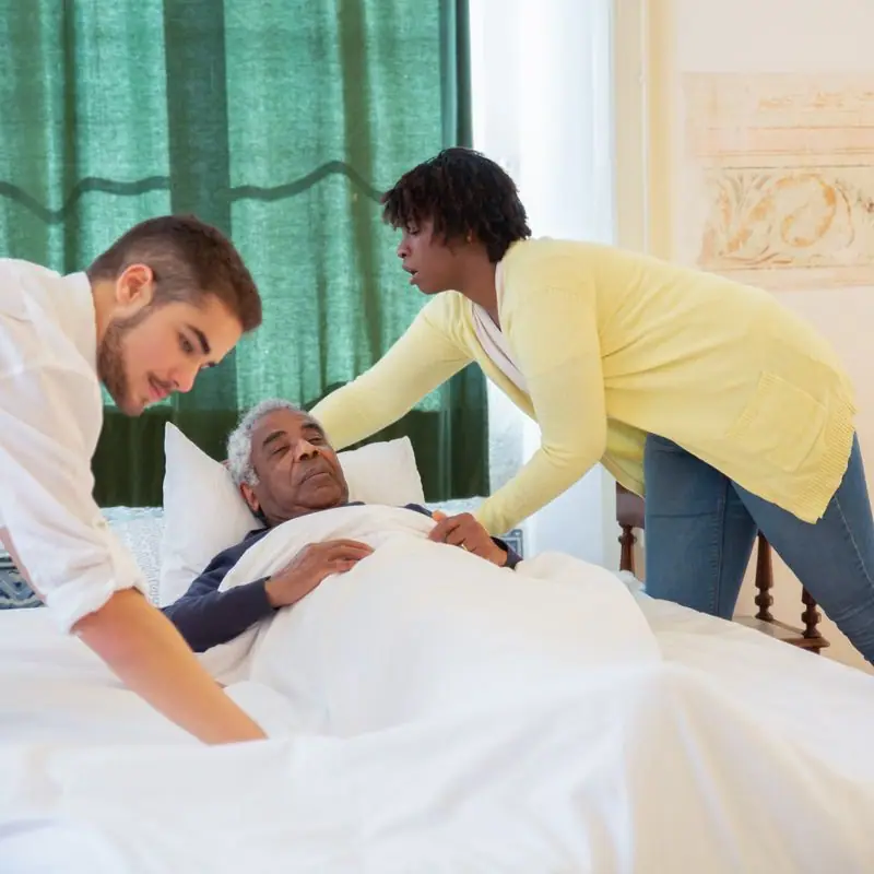
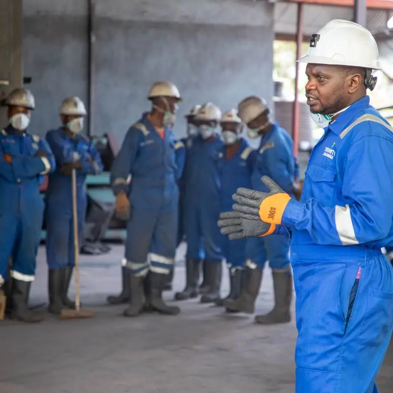
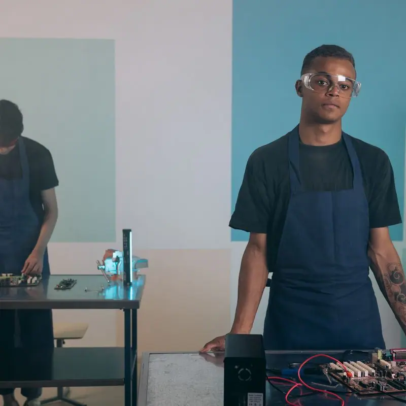
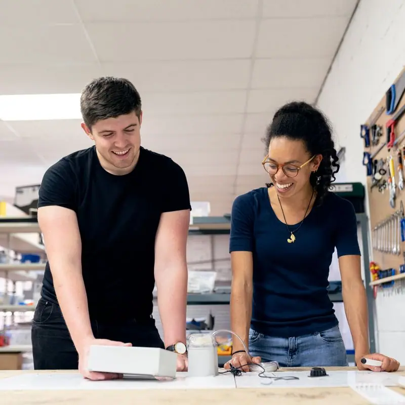
Families, classrooms and soccer fields in daylight, with people looking at the camera as equals. No camps, no tents, no crying children: the families we serve have seen enough of those pictures of themselves. Every photograph shows people a year or more after landing, at work, at school, on the field.
Accessibility
Every line of the site is available in French, the shared language of most of our Central African families, and the language table shows where interpreters are available for everyone else. Body text is above 10:1 contrast in light mode, tap targets are at least 44px, and the search works with a keyboard and a screen reader.
Type system
- DisplayAlbert SansAlbert Sans is a Scandinavian grotesk with open, round letters. It reads as friendly and modern in English and French alike, and its bold weight stays clear on the cracked phone screens many newly arrived families are using.
- TextAtkinson HyperlegibleDesigned by the Braille Institute so that easily confused letters (I, l, 1, O, 0) look different. That matters for low-vision readers and just as much for people reading English as their third or fourth language.
Colour and contrast
Every text pairing is checked against WCAG 2.2 in both themes.
Light theme
| Pairing | Sample | Ratio | WCAG |
|---|
| Body text on page | Aa | 14.89:1 | AAA |
| Body text on cards | Aa | 16.83:1 | AAA |
| Secondary text | Aa | 5.85:1 | AA |
| Links | Aa | 8.48:1 | AAA |
| Button text | Aa | 9.58:1 | AAA |
| Accent label text | Aa | 8.1:1 | AAA |
| Text on dark bands | Aa | 14.89:1 | AAA |
| Muted text on dark bands | Aa | 7.91:1 | AAA |
| Text on brand bands | Aa | 9.58:1 | AAA |
| Muted text on brand bands | Aa | 6.13:1 | AA |
Dark theme
| Pairing | Sample | Ratio | WCAG |
|---|
| Body text on page | Aa | 15.76:1 | AAA |
| Body text on cards | Aa | 14.34:1 | AAA |
| Secondary text | Aa | 6.93:1 | AA |
| Links | Aa | 9.31:1 | AAA |
| Button text | Aa | 9.44:1 | AAA |
| Accent label text | Aa | 9.56:1 | AAA |
| Text on dark bands | Aa | 16.55:1 | AAA |
| Muted text on dark bands | Aa | 8.29:1 | AAA |
| Text on brand bands | Aa | 9.44:1 | AAA |
| Muted text on brand bands | Aa | 5.67:1 | AA |