Why Igreja Semente looks the way it does
A bilingual site for a Brazilian evangelical church whose real work happens between Sundays: helping families who arrived last month get warm, learn English and find a living room to belong in. Portuguese leads everywhere a member would look; English is never an afterthought.
- Built for
- Brazilian immigrants in MetroWest Boston, many recently arrived from Minas Gerais, plus their English-speaking kids and spouses.
- Navigation
- Floating dock. Navigation floats in a dock at the bottom of the screen, where thumbs and eyes already are.
- Pages
- Home, Services, Just arrived, Groups, English, Give
- Hero
- a short action form as the hero: the one thing most visitors came to do (request a ride, ask for help, register a child) can be done before they scroll, with reassurance beside it. Variants: a = headline, reassurance and a photo on the left with the form as a raised card on the right; b = a tall photo carrying the headline, with the form and reassurance on a plain panel beside it; c = headline beside a photo, then the form laid out as one horizontal booking bar; a headline over a slow, continuous strip of captioned photographs that visitors can also drag or scroll; it pauses on hover and focus, has a pause button, and stays still for people who prefer reduced motion. Variants: a = headline and lead side by side above a strip of mixed portrait and landscape photos; b = a giant headline beneath a strip whose photos step up and down; c = two strips moving in opposite directions with the headline between them
Typography
Epilogue at 800 carries the headlines. It has a slightly cut, storefront quality that suits a church in a former furniture showroom, and its accents (ã, ç, é) sit cleanly without crowding the line. DM Sans handles reading text because it stays crisp on the low-cost Android phones most new arrivals use.
Color
The palette comes from an açaí bowl: a deep purple brand color and a maracujá yellow accent. It says Brazil without reaching for the green and yellow of the flag, which every Brazilian business in Framingham already uses. Neutrals carry a faint violet bias so the page never feels gray.
Layout and navigation
Navigation lives in a floating dock at the bottom of the screen because this audience is almost entirely on phones, often one-handed on a bus. Six icons, labels in whichever language is chosen, and the nav action is the one thing a newcomer needs most: 'Acabei de chegar'.
The hero
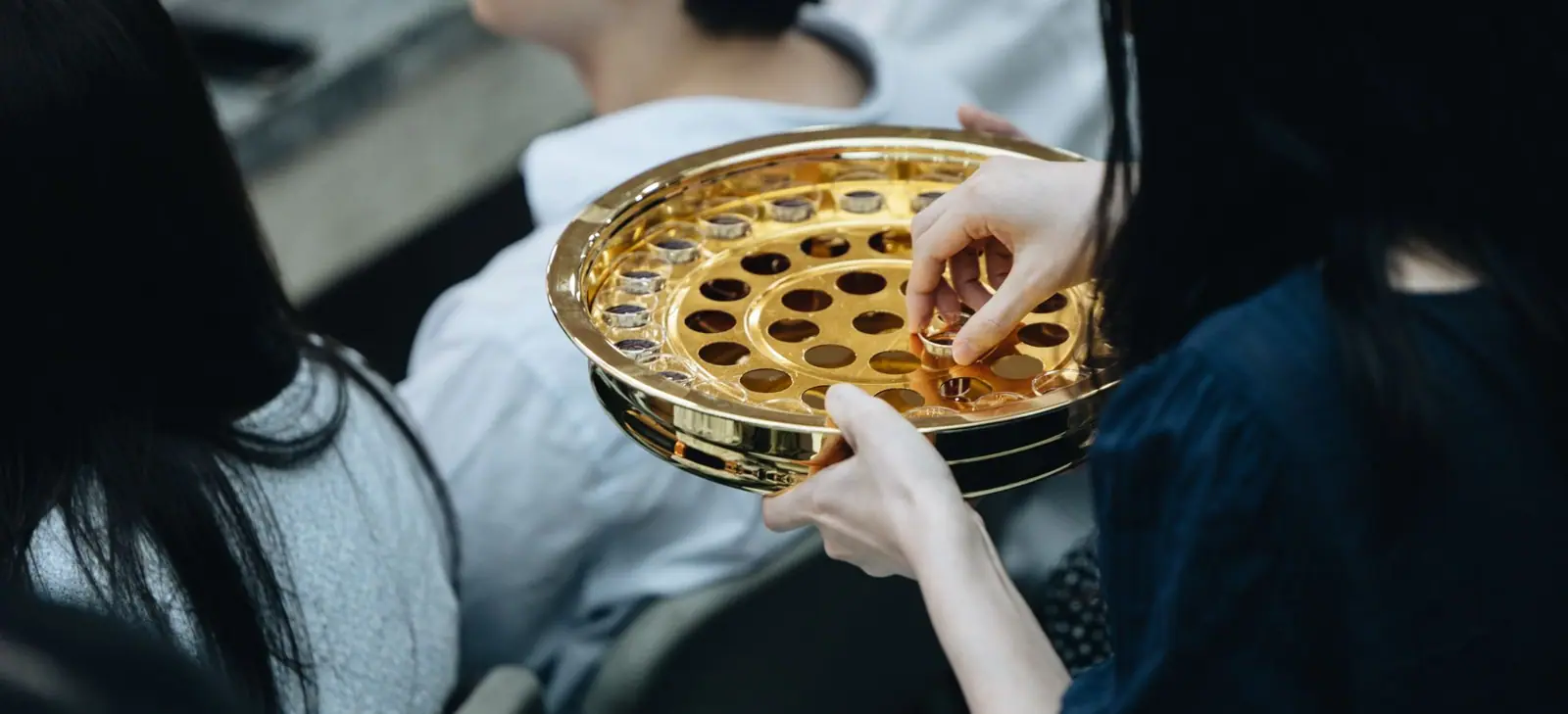
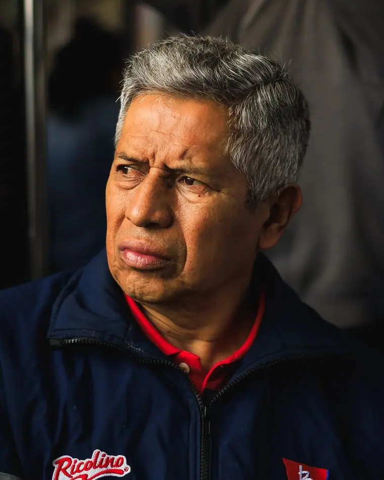
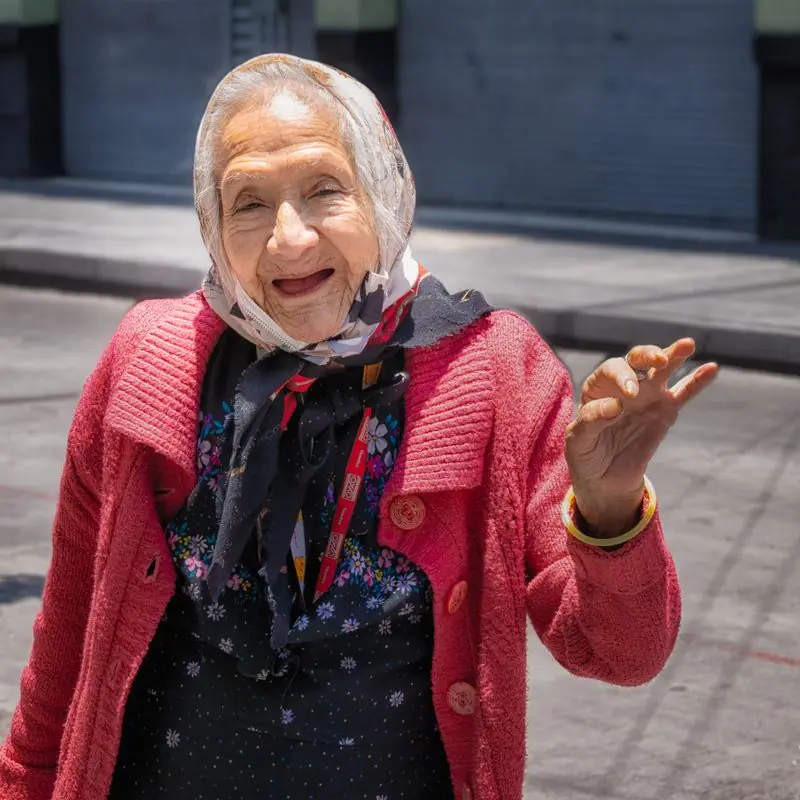
The opening is a slow strip of photographs captioned with times: lunch, futebol, the coat closet, a home group. For people deciding whether a church is for them, seeing a normal week is more persuasive than any headline, and the strip pauses on touch and stays still for anyone who prefers reduced motion.
Calls to action
Each action names a real next step: 'I just arrived', 'Find a home group', 'Save a seat in English class', 'Give your tithe'. 'Dízimo' is the word these members use; 'donate' would sound like a charity appeal.
Photography
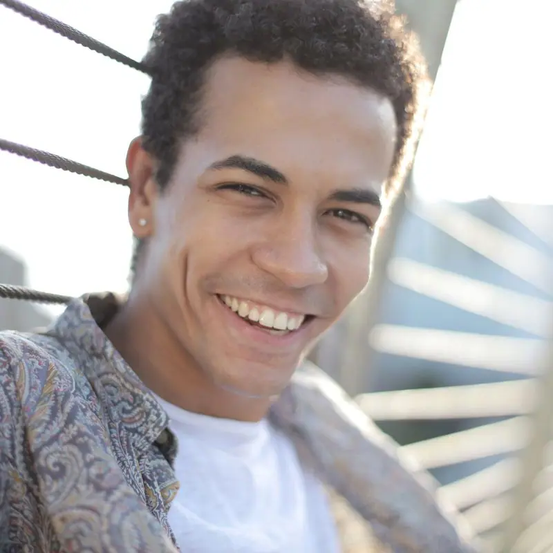
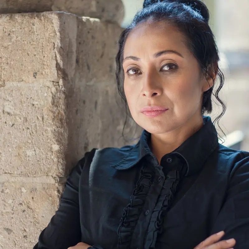
Real weekly scenes over stage shots: winter coats, food on the table, kids on the steps, futebol on a dry field. Faces are mixed, as Brazilian congregations are. Captions name places a member would recognise, like Bowditch Field and the basement hall.
Accessibility
Every string has a natural Portuguese version, and the language toggle remembers the choice. The FAQ says plainly that nobody will ask about immigration status, because fear is the biggest barrier for this audience. Contrast passes AA in both themes and the dock buttons are 48 pixels tall.
Type system
- DisplayEpilogueA grotesque with a slightly hand-cut edge, heavy enough for a storefront sign on Waverly Street and clean with Portuguese accents.
- TextDM SansLow-contrast and open, it reads well on the cheap Android phones most of our newcomers arrive with.
Colour and contrast
Every text pairing is checked against WCAG 2.2 in both themes.
Light theme
| Pairing | Sample | Ratio | WCAG |
|---|
| Body text on page | Aa | 15.69:1 | AAA |
| Body text on cards | Aa | 17.57:1 | AAA |
| Secondary text | Aa | 5.77:1 | AA |
| Links | Aa | 9.92:1 | AAA |
| Button text | Aa | 11.12:1 | AAA |
| Accent label text | Aa | 6.41:1 | AA |
| Text on dark bands | Aa | 15.69:1 | AAA |
| Muted text on dark bands | Aa | 8.17:1 | AAA |
| Text on brand bands | Aa | 11.12:1 | AAA |
| Muted text on brand bands | Aa | 6.96:1 | AA |
Dark theme
| Pairing | Sample | Ratio | WCAG |
|---|
| Body text on page | Aa | 15.91:1 | AAA |
| Body text on cards | Aa | 14.49:1 | AAA |
| Secondary text | Aa | 6.95:1 | AA |
| Links | Aa | 9.04:1 | AAA |
| Button text | Aa | 9.11:1 | AAA |
| Accent label text | Aa | 11.07:1 | AAA |
| Text on dark bands | Aa | 16.74:1 | AAA |
| Muted text on dark bands | Aa | 8.33:1 | AAA |
| Text on brand bands | Aa | 9.11:1 | AAA |
| Muted text on brand bands | Aa | 5.55:1 | AA |