Why Ân Điển looks the way it does
A site for a Vietnamese Baptist church in Little Saigon where grandparents worship in Vietnamese at nine, their grandchildren in English at eleven, and everyone eats together at half past twelve. It puts the language choice up front, makes room for the citizenship class that brings in neighbors who have never been to church, and treats baptism as the Baptist distinctive it is.
- Built for
- Vietnamese-speaking elders and recent arrivals, second- and third-generation Vietnamese Americans, spouses who don't speak Vietnamese, and neighbors preparing for the citizenship test.
- Navigation
- Two-tier header. A thin utility strip carries times, phone and language; the main bar below holds pages and the action.
- Pages
- Home, Sundays, Every generation, Citizenship class, Baptism, Our story
- Hero
- a short action form as the hero: the one thing most visitors came to do (request a ride, ask for help, register a child) can be done before they scroll, with reassurance beside it. Variants: a = headline, reassurance and a photo on the left with the form as a raised card on the right; b = a tall photo carrying the headline, with the form and reassurance on a plain panel beside it; c = headline beside a photo, then the form laid out as one horizontal booking bar; A tall photograph on one side; on the other, the headline, a short intro and three 'next step' rows with arrows instead of a pair of buttons. Variants: a = photo bleeds off the left edge, rows show when each step happens; b = photo bleeds off the right edge, rows are numbered steps set large; an editorial collage: three photographs placed off-grid and overlapping, with a large headline laid across them like a magazine cover, a small caption and a single quiet link. Variants: a = headline on the left breaking into a cascade of photos on the right; b = three photos in a staggered row with the headline running across all of them; c = headline at top left over a large photo, with two smaller photos pinned to its corners
Typography
Be Vietnam Pro was designed by a Vietnamese team, and its stacked diacritics (ấ, ệ, ở) stay clean in heavy, tightly set headlines where most Latin grotesques collide or clip. Body text is Literata at 18px, a book serif with full Vietnamese support and generous size for older readers on phones.
Color
The red is lacquerware red, sơn mài, darkened until white type on it passes contrast. The jade accent comes from the green glaze on the ceramics in most of our families' kitchens. Neutrals lean very slightly rose instead of gray, which keeps the pages warm without going cream.
Layout and navigation
A two-tier header puts the Sunday times, the address and the phone number in a thin strip above everything, because the most common question from both generations is 'what time, and where'. The language switch sits in that strip too, and every heading and button changes with it.
The hero
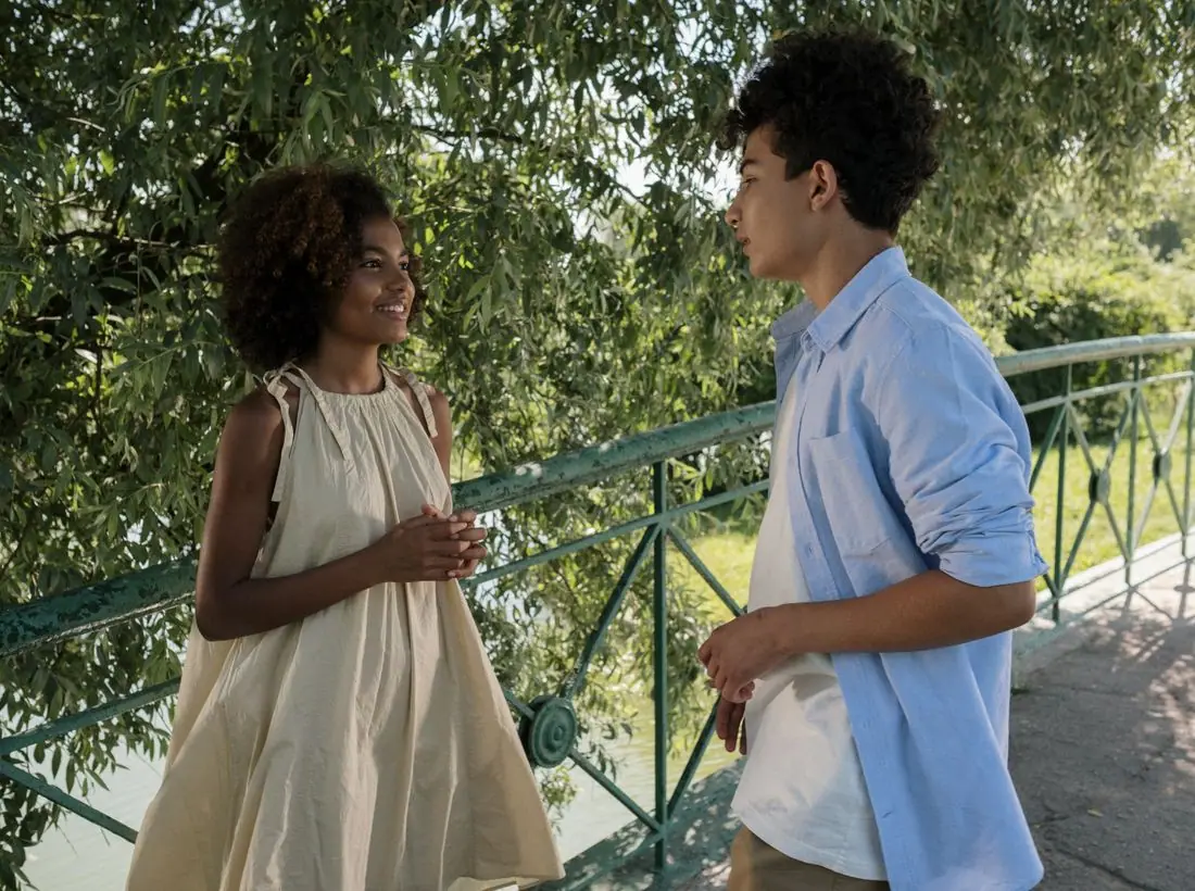
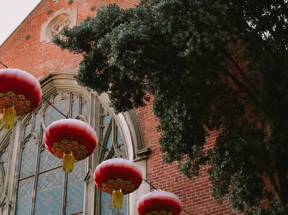
The home page opens with an editorial stack of three photos: a family in áo dài at Tết, the Lord's Supper being passed hand to hand, and the teenagers. The headline names the real shape of the church, two languages and one lunch, instead of a slogan.
Calls to action
The header button asks the question visitors actually have, 'Vietnamese or English service?', and the Sundays page answers it in one screen. The other actions are specific: sign up for citizenship class, enroll in Vietnamese school, ask about baptism.
Photography
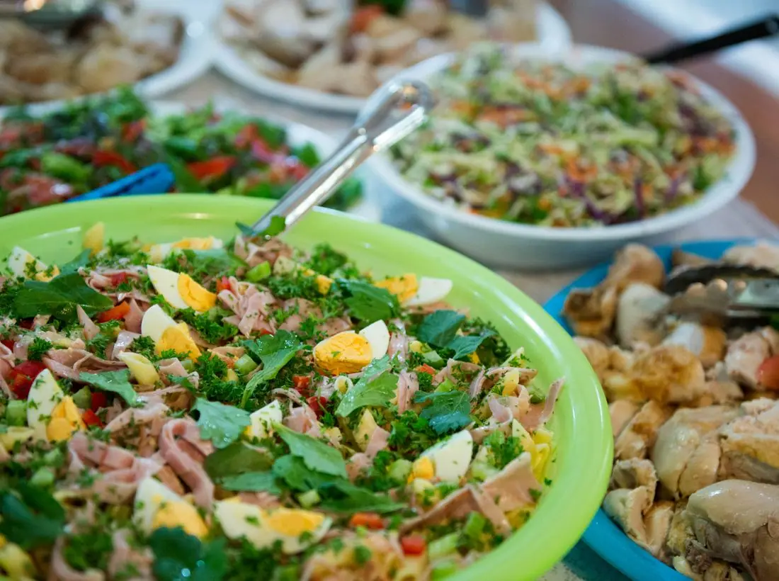
Wherever the library allowed it we used Vietnamese and East Asian families, students and elders. Where we couldn't, we chose photographs without identifiable faces, such as worship from behind, the ocean at dawn and lunch on the table, so the site never shows a congregation that isn't this one.
Accessibility
Every color pair passes WCAG AA in light and dark themes, the language toggle sets the lang attribute so screen readers switch pronunciation, and the class sign-up form labels each field in both languages. Phone numbers sit in the top strip on every page for members who would rather call than click.
Type system
- DisplayBe Vietnam ProBe Vietnam Pro was drawn by a Vietnamese team so its stacked diacritics sit cleanly in tight headlines, which most Western grotesques fumble.
- TextLiterataA sturdy reading serif with full Vietnamese support and generous size, for grandparents reading on a phone at arm's length.
Colour and contrast
Every text pairing is checked against WCAG 2.2 in both themes.
Light theme
| Pairing | Sample | Ratio | WCAG |
|---|
| Body text on page | Aa | 15.35:1 | AAA |
| Body text on cards | Aa | 16.96:1 | AAA |
| Secondary text | Aa | 5.69:1 | AA |
| Links | Aa | 6.57:1 | AA |
| Button text | Aa | 7.41:1 | AAA |
| Accent label text | Aa | 6.23:1 | AA |
| Text on dark bands | Aa | 15.35:1 | AAA |
| Muted text on dark bands | Aa | 8.05:1 | AAA |
| Text on brand bands | Aa | 7.41:1 | AAA |
| Muted text on brand bands | Aa | 4.82:1 | AA |
Dark theme
| Pairing | Sample | Ratio | WCAG |
|---|
| Body text on page | Aa | 15.83:1 | AAA |
| Body text on cards | Aa | 14.63:1 | AAA |
| Secondary text | Aa | 6.95:1 | AA |
| Links | Aa | 8.03:1 | AAA |
| Button text | Aa | 8.03:1 | AAA |
| Accent label text | Aa | 9.4:1 | AAA |
| Text on dark bands | Aa | 16.58:1 | AAA |
| Muted text on dark bands | Aa | 8.28:1 | AAA |
| Text on brand bands | Aa | 8.03:1 | AAA |
| Muted text on brand bands | Aa | 5.12:1 | AA |