Why Steady Ground looks the way it does
Steady Ground is a sliding-scale counseling center, so the site has one job above the rest: let a nervous person ask for an appointment in under a minute, then answer the money question honestly. Everything else is reassurance and logistics.
- Built for
- Adults, couples and parents in Washtenaw County who need therapy but can't afford private rates, many of them reaching out for the first time.
- Navigation
- Centred masthead. The name sits centred like a printed masthead; pages run underneath. Signals heritage and calm.
- Pages
- Home, Fees, Clinicians, Groups, First visit, Help now, Give
- Hero
- a short action form as the hero: the one thing most visitors came to do (request a ride, ask for help, register a child) can be done before they scroll, with reassurance beside it. Variants: a = headline, reassurance and a photo on the left with the form as a raised card on the right; b = a tall photo carrying the headline, with the form and reassurance on a plain panel beside it; c = headline beside a photo, then the form laid out as one horizontal booking bar
Typography
Castoro is an old-style serif drawn by Tiro Typeworks with soft, open curves; it reads like a paperback you'd lend a friend, which is the tone a first-time client needs. We set it at a modest 1.2 scale and never in capitals. Hanken Grotesk carries the forms and fee tables at 18px, because the person filling them in may be reading through anxiety or tears.
Color
The palette comes from the Huron River on a gray March morning: spruce-green water, pale lichen paper and a lamp-amber accent used sparingly for links and highlights. There is no clinical white and no alarm red anywhere, including on the crisis page. The dark theme deepens the river rather than inverting it, so evening visitors get the same quiet room.
Layout and navigation
A centred masthead with the pages underneath feels settled and unhurried, like the sign on an established practice. Seven pages, each named for the question a client is actually asking: what will it cost, who will I see, what happens at the first visit, and what do I do if it can't wait.
The hero
The first screen is the appointment request itself, kept to four fields. Most people who look up a counselor have rehearsed the phone call several times and still not made it; a short form they can finish on the bus lowers that bar. Beside it sit plain promises about callbacks, cost and privacy.
Calls to action
The nav action is "Ask for a first appointment" because asking is the hard part and booking comes later. "Work out your fee" answers the second fear directly. "I need help right now" appears on every page, set in the same calm style as everything else.
Photography
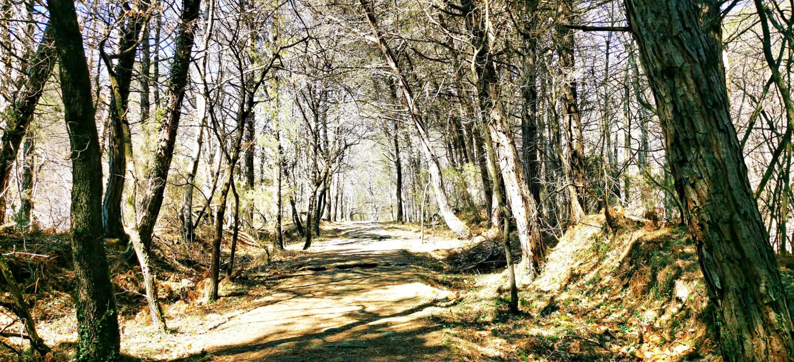
No staged therapy-couch photos and no clients' faces. The hero is a boardwalk through wet woodland, which is what the center's name means, and the river and lake pictures elsewhere are all within a short drive of Packard Street. Clinicians appear in real portraits, and groups are shown as empty chairs or from a distance.
Accessibility
Body text is 18px with long line height and every form field has a visible label and an optional tag rather than asterisks. Contrast is checked in both themes. Crisis numbers are plain text links that work with a screen reader and a single tap.
Type system
- DisplayCastoroCastoro is a bookish old-style serif with soft, open curves; it reads like a well-printed paperback rather than a clinic sign.
- TextHanken GroteskA plain, generous grotesque at 18px so forms and fee tables are easy on tired eyes.
Colour and contrast
Every text pairing is checked against WCAG 2.2 in both themes.
Light theme
| Pairing | Sample | Ratio | WCAG |
|---|
| Body text on page | Aa | 13.77:1 | AAA |
| Body text on cards | Aa | 15.11:1 | AAA |
| Secondary text | Aa | 5.49:1 | AA |
| Links | Aa | 6.44:1 | AA |
| Button text | Aa | 7.34:1 | AAA |
| Accent label text | Aa | 4.65:1 | AA |
| Text on dark bands | Aa | 13.77:1 | AAA |
| Muted text on dark bands | Aa | 7.46:1 | AAA |
| Text on brand bands | Aa | 7.34:1 | AAA |
| Muted text on brand bands | Aa | 4.94:1 | AA |
Dark theme
| Pairing | Sample | Ratio | WCAG |
|---|
| Body text on page | Aa | 14.56:1 | AAA |
| Body text on cards | Aa | 13.09:1 | AAA |
| Secondary text | Aa | 6.61:1 | AA |
| Links | Aa | 9.18:1 | AAA |
| Button text | Aa | 9.82:1 | AAA |
| Accent label text | Aa | 9.47:1 | AAA |
| Text on dark bands | Aa | 15.8:1 | AAA |
| Muted text on dark bands | Aa | 8.0:1 | AAA |
| Text on brand bands | Aa | 9.82:1 | AAA |
| Muted text on brand bands | Aa | 5.8:1 | AA |