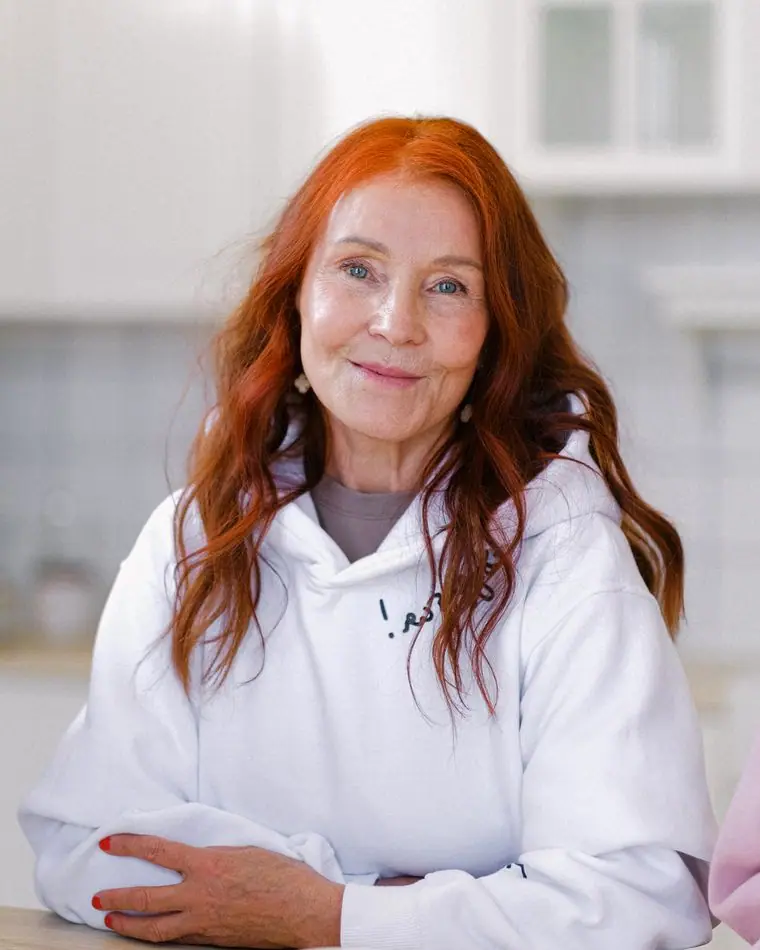
Clinical Director, PhD, LP
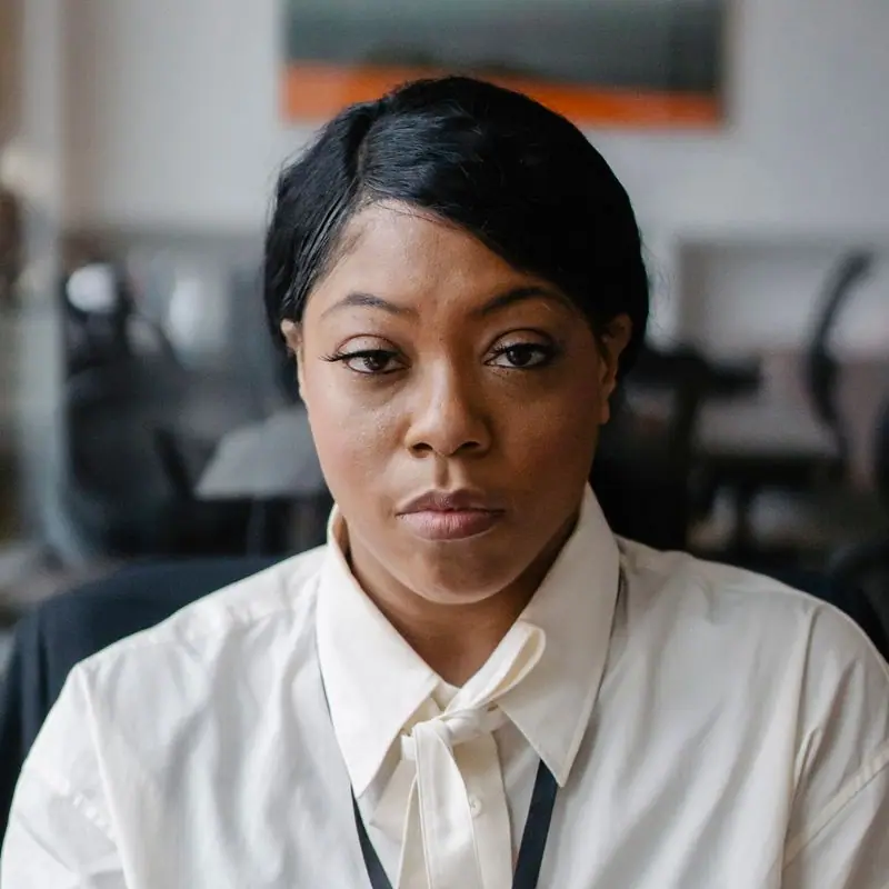
Dr. Miriam Halloran
Miriam co-founded Steady Ground in 2009 after twelve years in hospital psychiatry. She still sees eight clients a week, supervises the interns and chairs the fee review every summer.
Who you'll see
Licensed social workers, counselors and family therapists, plus four interns in their final year of training. You can ask for someone by name, or let us match you.
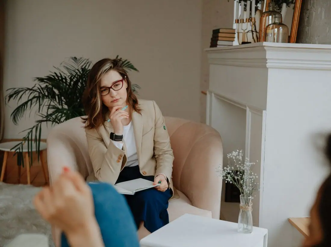
Clinical staff
Every clinician keeps evening hours at least two nights a week.
Clinical Director, PhD, LP
Miriam co-founded Steady Ground in 2009 after twelve years in hospital psychiatry. She still sees eight clients a week, supervises the interns and chairs the fee review every summer.



Training clinic
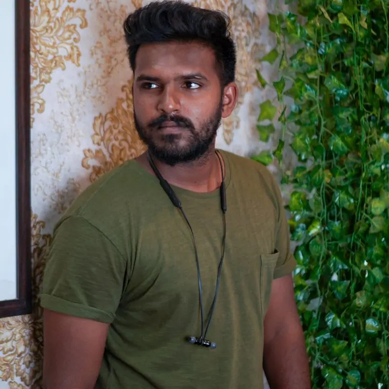
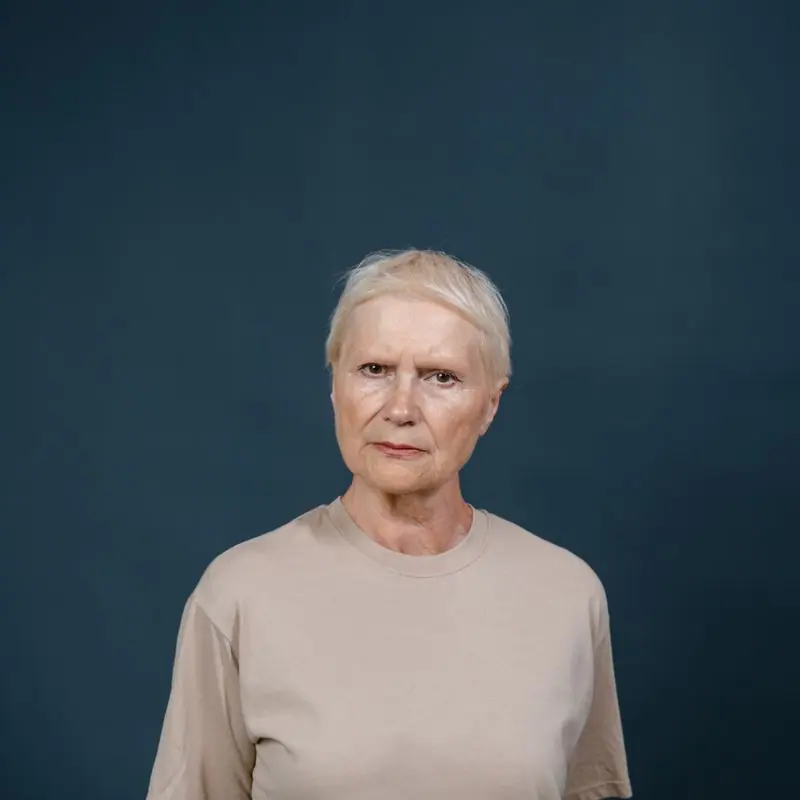
Four graduate students spend their final year with us, each seeing about twelve clients a week. Every case is reviewed weekly with a licensed supervisor, and sessions can be recorded for supervision only with your written consent.
Interns see clients at a lower fee on the same table. If you'd rather not see an intern, say so on the first call; it won't affect how soon you're seen.
Choosing someone
Yes. Tell Hana on the first call and we'll do our best. It sometimes adds a week to the wait.
Tell your clinician or the front desk and we'll switch you. It happens often and nobody takes offense.
Yes, for anyone in Michigan. Several clinicians work from home on Fridays.
No. We work alongside the Huron Valley Free Clinic, whose psychiatric nurse sees our clients on Wednesdays.
Mention them in your request and we'll check their evenings first.
Design notes
Steady Ground is a sliding-scale counseling center, so the site has one job above the rest: let a nervous person ask for an appointment in under a minute, then answer the money question honestly. Everything else is reassurance and logistics.
Castoro is an old-style serif drawn by Tiro Typeworks with soft, open curves; it reads like a paperback you'd lend a friend, which is the tone a first-time client needs. We set it at a modest 1.2 scale and never in capitals. Hanken Grotesk carries the forms and fee tables at 18px, because the person filling them in may be reading through anxiety or tears.
The palette comes from the Huron River on a gray March morning: spruce-green water, pale lichen paper and a lamp-amber accent used sparingly for links and highlights. There is no clinical white and no alarm red anywhere, including on the crisis page. The dark theme deepens the river rather than inverting it, so evening visitors get the same quiet room.
A centred masthead with the pages underneath feels settled and unhurried, like the sign on an established practice. Seven pages, each named for the question a client is actually asking: what will it cost, who will I see, what happens at the first visit, and what do I do if it can't wait.
The first screen is the appointment request itself, kept to four fields. Most people who look up a counselor have rehearsed the phone call several times and still not made it; a short form they can finish on the bus lowers that bar. Beside it sit plain promises about callbacks, cost and privacy.
The nav action is "Ask for a first appointment" because asking is the hard part and booking comes later. "Work out your fee" answers the second fear directly. "I need help right now" appears on every page, set in the same calm style as everything else.
No staged therapy-couch photos and no clients' faces. The hero is a boardwalk through wet woodland, which is what the center's name means, and the river and lake pictures elsewhere are all within a short drive of Packard Street. Clinicians appear in real portraits, and groups are shown as empty chairs or from a distance.
Body text is 18px with long line height and every form field has a visible label and an optional tag rather than asterisks. Contrast is checked in both themes. Crisis numbers are plain text links that work with a screen reader and a single tap.
Every text pairing is checked against WCAG 2.2 in both themes.
| Pairing | Sample | Ratio | WCAG |
|---|---|---|---|
| Body text on page | Aa | 13.77:1 | AAA |
| Body text on cards | Aa | 15.11:1 | AAA |
| Secondary text | Aa | 5.49:1 | AA |
| Links | Aa | 6.44:1 | AA |
| Button text | Aa | 7.34:1 | AAA |
| Accent label text | Aa | 4.65:1 | AA |
| Text on dark bands | Aa | 13.77:1 | AAA |
| Muted text on dark bands | Aa | 7.46:1 | AAA |
| Text on brand bands | Aa | 7.34:1 | AAA |
| Muted text on brand bands | Aa | 4.94:1 | AA |
| Pairing | Sample | Ratio | WCAG |
|---|---|---|---|
| Body text on page | Aa | 14.56:1 | AAA |
| Body text on cards | Aa | 13.09:1 | AAA |
| Secondary text | Aa | 6.61:1 | AA |
| Links | Aa | 9.18:1 | AAA |
| Button text | Aa | 9.82:1 | AAA |
| Accent label text | Aa | 9.47:1 | AAA |
| Text on dark bands | Aa | 15.8:1 | AAA |
| Muted text on dark bands | Aa | 8.0:1 | AAA |
| Text on brand bands | Aa | 9.82:1 | AAA |
| Muted text on brand bands | Aa | 5.8:1 | AA |
Designed by Greater Purpose Web. Names, people and events are sample content.