Why Bon Berger looks the way it does
A site for a Haitian Baptist congregation that worships in Kreyòl, sings from the French-and-Creole hymnal, and serves its neighborhood with a Saturday clinic for immigration and benefits paperwork. It is built for phones first, with navigation in a thumb-reach dock and the clinic booking as the main action.
- Built for
- Haitian families in North Miami and Little Haiti, from grandparents who arrived in the 1980s to newcomers who landed last year, plus their English-speaking children and neighbors who need help with forms.
- Navigation
- Floating dock. Navigation floats in a dock at the bottom of the screen, where thumbs and eyes already are.
- Pages
- Home, Services, Prayer, Clinic, Our story, Give
- Hero
- a two-tone split: one half is a solid block of the brand colour carrying a giant date, time or short word (such as SUN 10:30), and the other half holds the headline, a short lead, the main action and a photo. Variants: a = block on the left at full height with the giant type stacked, content and photo on the right; b = the block runs across the top with the giant type on one line, and headline, lead and photo sit in columns beneath; c = a narrow block on the left, the text in the middle and a photo bleeding off the right edge; a short action form as the hero: the one thing most visitors came to do (request a ride, ask for help, register a child) can be done before they scroll, with reassurance beside it. Variants: a = headline, reassurance and a photo on the left with the form as a raised card on the right; b = a tall photo carrying the headline, with the form and reassurance on a plain panel beside it; c = headline beside a photo, then the form laid out as one horizontal booking bar; A single verse or sentence set enormous as the opening statement, with its reference, a short supporting line and one action. Variants: a = the quote fills the width with a hanging quotation mark; b = the quote beside a tall photograph; c = the reference becomes the architecture, with the book name and a giant outlined chapter and verse in the left column
Typography
Caprasimo is a heavy, rounded display serif with the confidence of hand-painted tap-tap buses and the storefront signs along NE 2nd Avenue. It is set very large in the hero so SUNDAY 10:30 reads from across a room on a phone held at arm's length. Bricolage Grotesque handles reading text: a wide, sturdy sans with a slightly hand-made edge that keeps the warmth without slowing anyone down.
Color
The red and blue are the Haitian flag, softened: a hibiscus red for the brand and a deep marine blue for links and accents, on a faintly blushed paper instead of a stark white. The dark theme moves to a plum-black so the red can turn coral and still sing, rather than simply inverting the light version.
Layout and navigation
Most of this congregation reaches the site on a phone, often a hand-me-down Android over a family plan. A floating dock puts six icon-labeled pages where thumbs already are, and the clinic button stays in the header on every page. Page names are in Kreyòl first, short enough to read at a glance: Sèvis, Lapriyè, Klinik, Istwa, Bay.
The hero
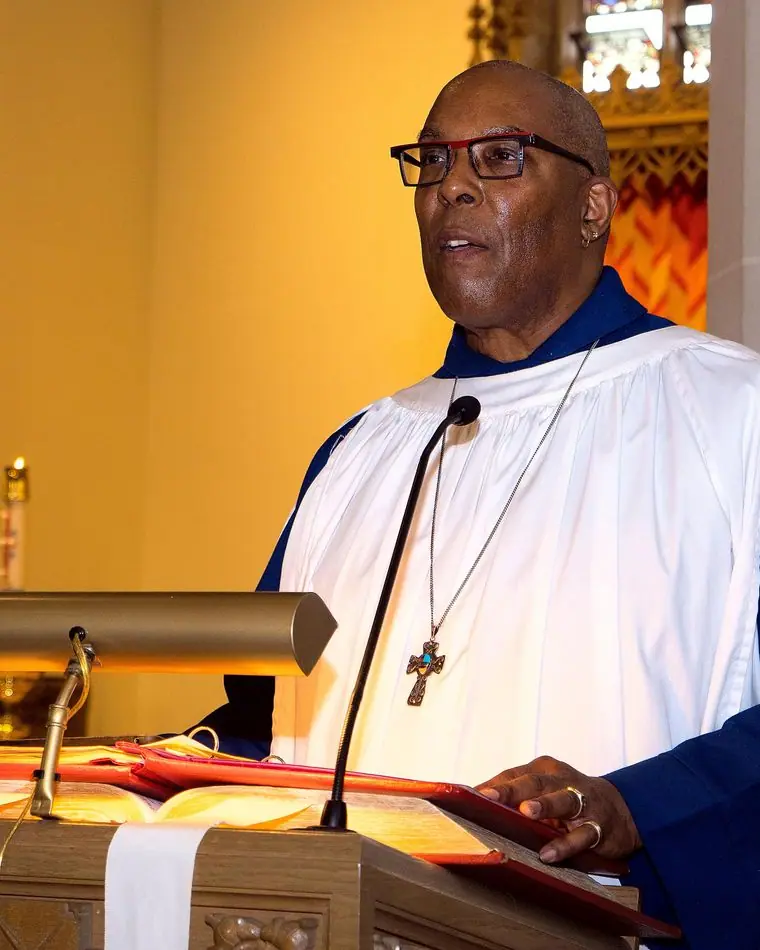
A block of flag red stacks Dim, 9:00 and 10:30 in giant Caprasimo, Sunday school and worship, because the most asked question is when church starts. Beside it, a choir in white robes, which is what a Haitian Sunday morning actually looks like, and a link straight to the Saturday clinic for people who came for help with papers.
Calls to action
The header button is "Book a clinic slot" (Rezève yon plas). The Saturday paperwork clinic is the church's busiest door: TPS renewals, work permits, SNAP and school forms, with volunteer attorneys and interpreters. Prayer and giving have their own pages, and giving is tied to something concrete, the partner school in Jacmel.
Photography
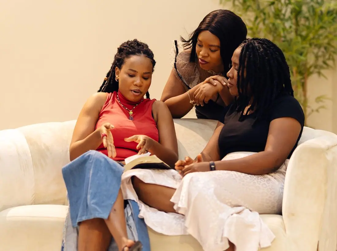
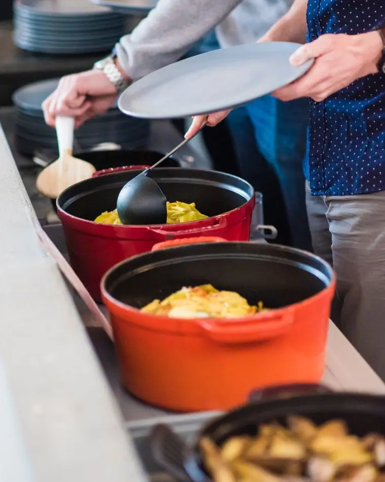
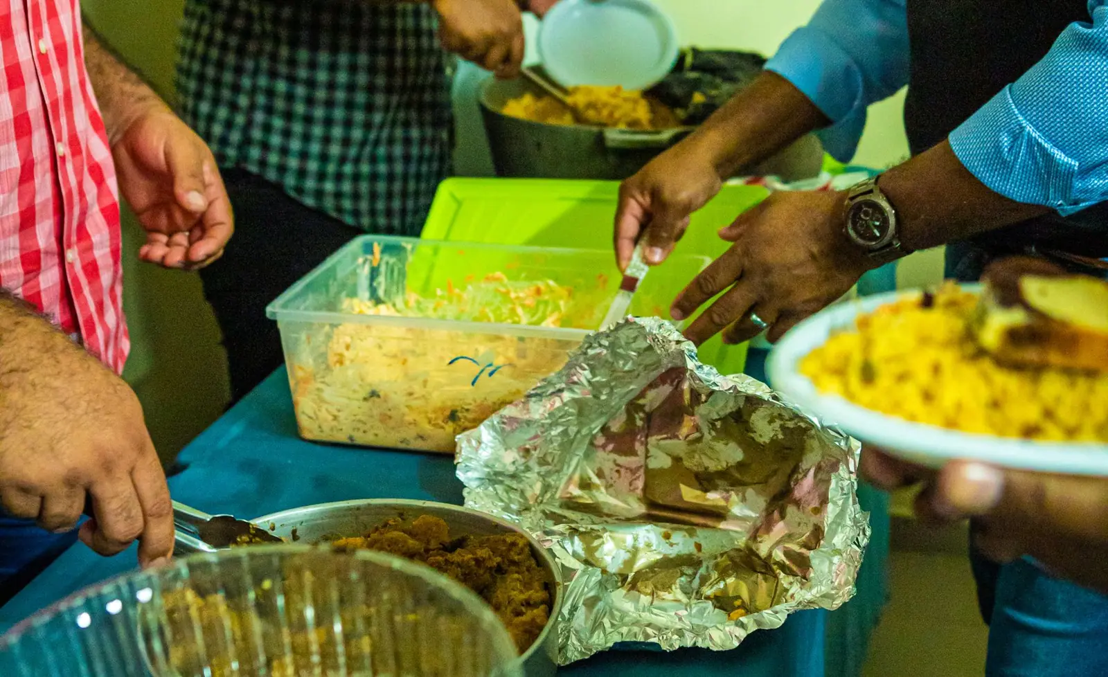
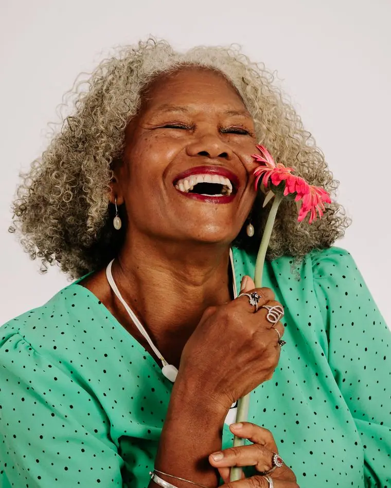
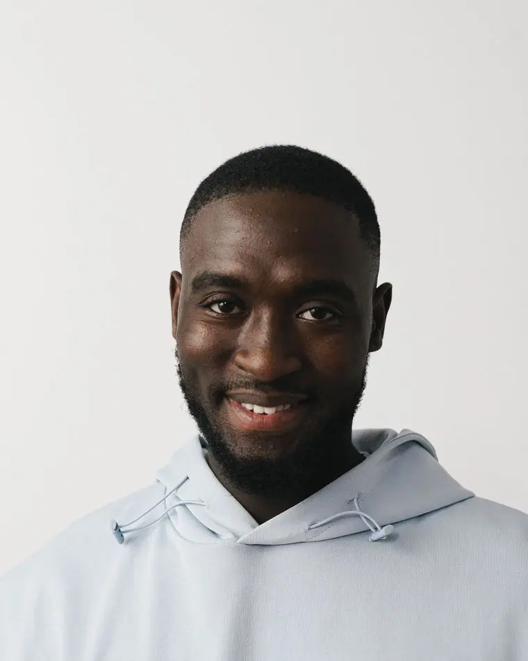
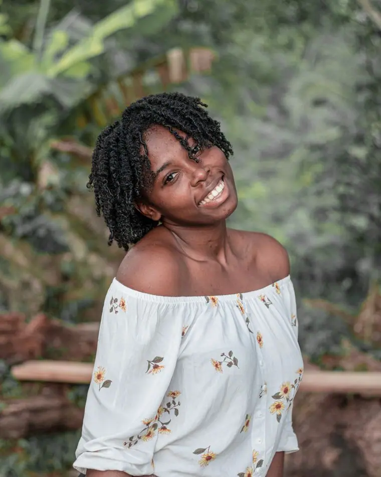
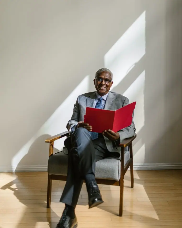
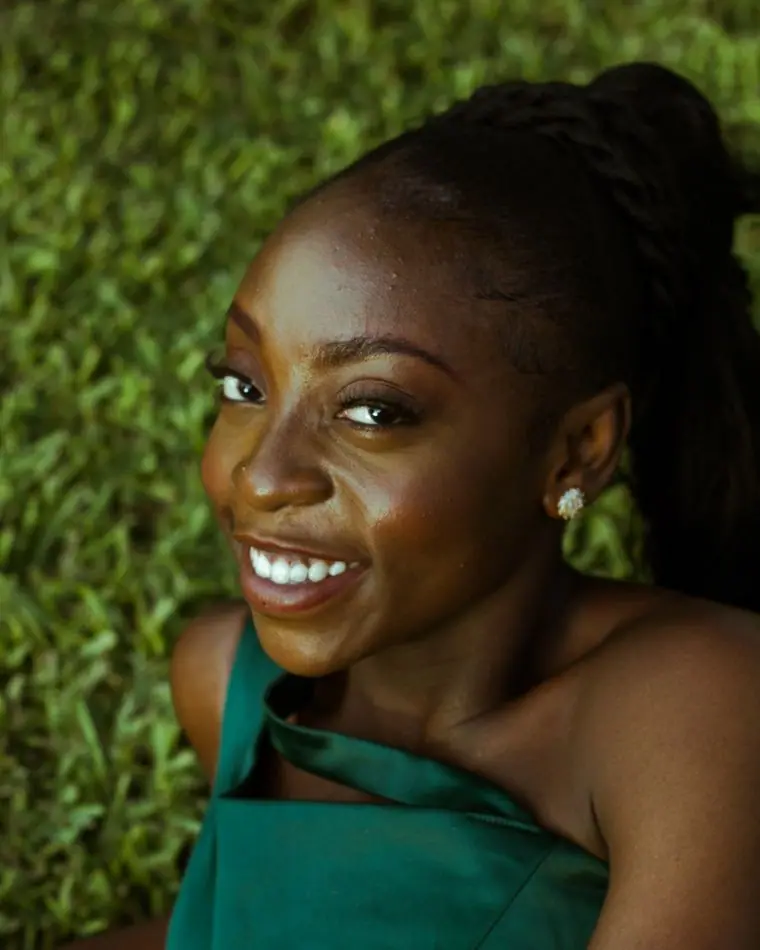
Choirs in white robes, hands raised, pots of soup joumou and families. Faces are Black and Caribbean throughout. The clinic pages show volunteers and staff families, never the people who come for help: someone renewing TPS should not find their face on a church website, and the caption under the clinic photo says so plainly.
Accessibility
Kreyòl is marked with its own lang attribute. Long paragraphs stay in English with a short Kreyòl summary, so nothing is machine-translated badly. Body text is 18px, every button is a large pill, and contrast passes 4.5:1 in both themes.
Type system
- DisplayCaprasimoA soft, heavy display serif with the round confidence of hand-painted tap-tap lettering and storefront signs on NE 2nd Avenue.
- TextBricolage GrotesqueA sturdy grotesque with a little hand-made irregularity, wide enough to stay readable for grandparents on a phone.
Colour and contrast
Every text pairing is checked against WCAG 2.2 in both themes.
Light theme
| Pairing | Sample | Ratio | WCAG |
|---|
| Body text on page | Aa | 15.79:1 | AAA |
| Body text on cards | Aa | 17.75:1 | AAA |
| Secondary text | Aa | 5.81:1 | AA |
| Links | Aa | 5.74:1 | AA |
| Button text | Aa | 6.45:1 | AA |
| Accent label text | Aa | 9.93:1 | AAA |
| Text on dark bands | Aa | 15.79:1 | AAA |
| Muted text on dark bands | Aa | 8.19:1 | AAA |
| Text on brand bands | Aa | 6.45:1 | AA |
| Muted text on brand bands | Aa | 4.64:1 | AA |
Dark theme
| Pairing | Sample | Ratio | WCAG |
|---|
| Body text on page | Aa | 15.98:1 | AAA |
| Body text on cards | Aa | 14.54:1 | AAA |
| Secondary text | Aa | 7.01:1 | AAA |
| Links | Aa | 7.51:1 | AAA |
| Button text | Aa | 7.68:1 | AAA |
| Accent label text | Aa | 8.93:1 | AAA |
| Text on dark bands | Aa | 16.88:1 | AAA |
| Muted text on dark bands | Aa | 8.42:1 | AAA |
| Text on brand bands | Aa | 7.68:1 | AAA |
| Muted text on brand bands | Aa | 4.97:1 | AA |