
Ministry Homeless Outreach Ministry Website Template
Shelter
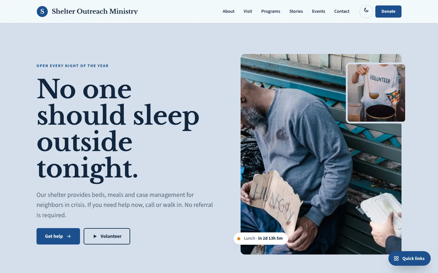
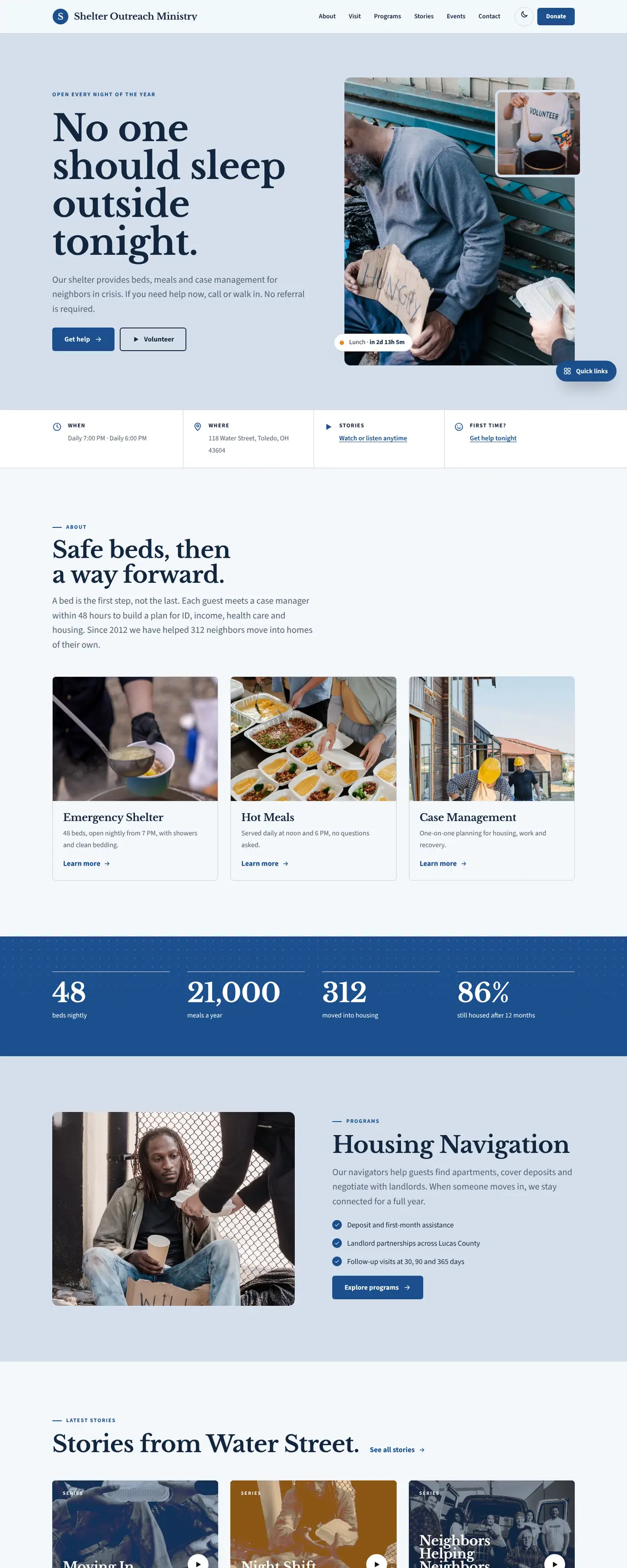
Shelter is a homeless outreach site that puts the need first. It has a plain blue palette, a serif headline that says 'No one should sleep outside tonight.' and a stats band with beds, meals and housing outcomes.
Starting at $500
Start with this design and I’ll personalize it with your branding, photos and words. Keep your current domain or get a new one.
Changes you make in the editor stay in your own browser, so try anything.
- Built for
- People in crisis who need a bed tonight, social workers referring clients, volunteers, and donors who want to see results.
- Navigation
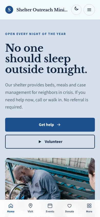
- Sticky frosted bar with the full menu and a Give button. On phones, a bottom tab bar plus a quick-links launcher.
Names, photos, times and stories in this template are sample content. Your version uses your own words, photos and branding.
Why it looks this way.
- Typography
Libre Baskerville Bold sets the headline, a sturdy book serif with a steady rhythm that reads as serious and trustworthy. Source Sans 3 handles body text and is clear at small sizes, which matters for hours and addresses. The pairing looks professional without feeling corporate.
- Libre Baskerville headlines
- Source Sans 3 body text
- Color
A pale blue-grey (#F3F7FB) is the page, with deep navy text (#12263F), a firm blue (#1B4F8C) for buttons and one warm orange (#E08A1E) accent. Blue signals reliability, and the orange marks things that need attention. The dark theme uses a lighter sky blue (#7FB0E8).
- Page
#F3F7FB - Cards
#FFFFFF - Text
#12263F - Brand
#1B4F8C - Accent
#E08A1E
- Page
- Layout
A white bar has the name, six links and a blue Donate button. Below the hero, a stats band reports 48 beds nightly, 21,000 meals a year and 312 moved into housing. Cards use thin outlines. The design avoids ornament so that hours and phone numbers stay easy to find.
Pages: Home, About, Visit, Programs, Stories, Events, Donate, Contact
- Hero
The hero is split. The left side holds the headline in four lines and a short line telling people to call or walk in, with no referral needed. On the right is a tall city photo at sunset with a smaller crowd photo overlapping. A chip tells people when lunch is served next.
- Calls to action
'Get help' is the first button and it is a solid blue, with 'Volunteer' beside it. Getting help is placed before giving, because a person in need should not have to look for it. Donate is in the header for those who want it.
- Photography
A city street at dusk suggests the setting without showing an individual in distress. People in crisis should never be photographed for decoration, so a real site should use consented portraits of staff and volunteers, and keep clients anonymous.
- Accessibility
Navy on pale blue measures about 14 to 1, and white on the blue button about 8 to 1. The call-to-help text is clear, short and in plain language. Reading level is low on purpose, and the theme toggle supports people using phones at night.
Like where this is going?
Starting at $500
Start with this design
Your colors, logo, photos and words, on a layout that already works.
Start with This DesignStarting at $1,500
Build something custom
A new design shaped around your organization from the first sketch.
Start a Custom WebsiteBoth include keeping your current domain or getting a new one, plus simple editing tools for your team. Monthly hosting and care plans are listed on Services & Pricing.