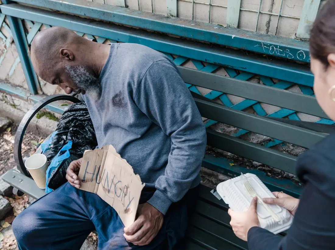
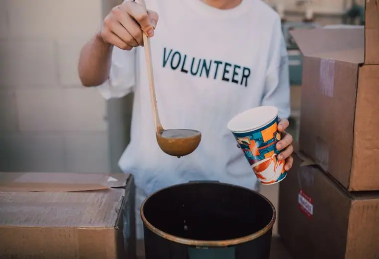
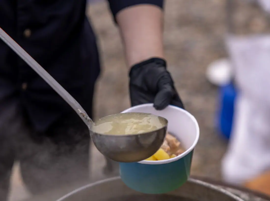
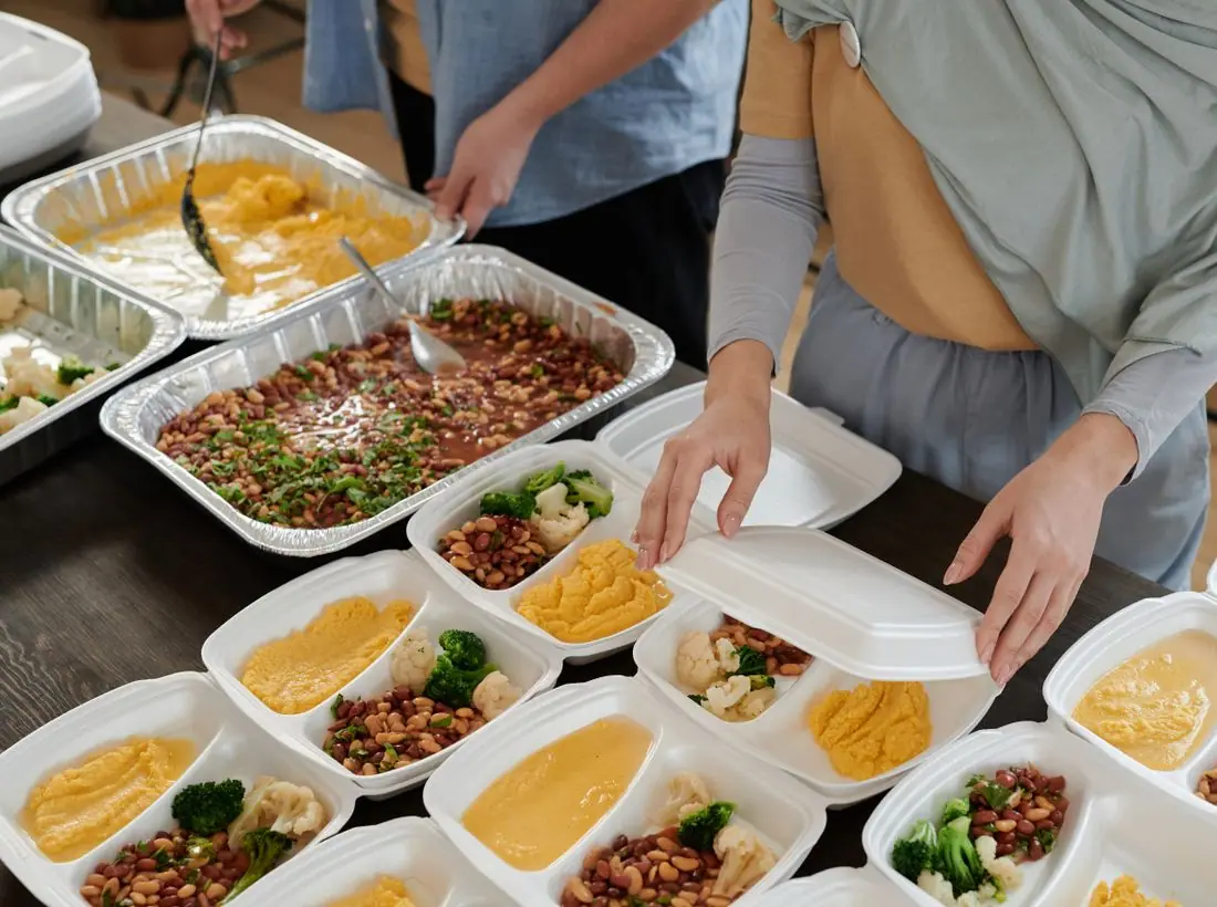
 SeriesMoving In
 SeriesNight Shift
 SeriesNeighbors Helping Neighbors
Nov07
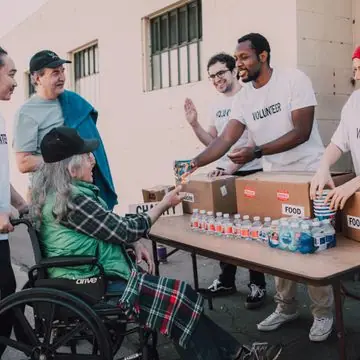
Coat and Blanket Drive
9:00 AM · 118 Water St
Drop off clean winter coats, blankets and new socks.
A bed is the first step, not the last. Each guest meets a case manager within 48 hours to build a plan for ID, income, health care and housing. Since 2012 we have helped 312 neighbors move into homes of their own.
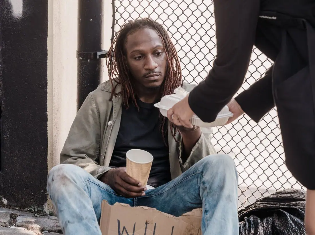
Our navigators help guests find apartments, cover deposits and negotiate with landlords. When someone moves in, we stay connected for a full year.
I was a stranger, and you took me in.Matthew 25:35
Drop off clean winter coats, blankets and new socks.
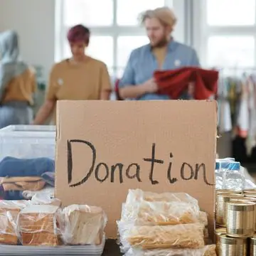
Required for all new volunteers. About 90 minutes.
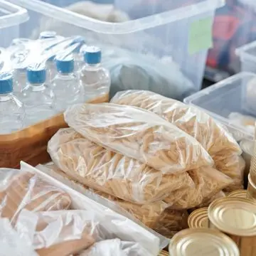
Help sort and bag donated winter gear for distribution.
A bed, a hot dinner and breakfast for one neighbor.
Design notes
Shelter is a homeless outreach site that puts the need first. It has a plain blue palette, a serif headline that says 'No one should sleep outside tonight.' and a stats band with beds, meals and housing outcomes.
Libre Baskerville Bold sets the headline, a sturdy book serif with a steady rhythm that reads as serious and trustworthy. Source Sans 3 handles body text and is clear at small sizes, which matters for hours and addresses. The pairing looks professional without feeling corporate.
A pale blue-grey (#F3F7FB) is the page, with deep navy text (#12263F), a firm blue (#1B4F8C) for buttons and one warm orange (#E08A1E) accent. Blue signals reliability, and the orange marks things that need attention. The dark theme uses a lighter sky blue (#7FB0E8).
A white bar has the name, six links and a blue Donate button. Below the hero, a stats band reports 48 beds nightly, 21,000 meals a year and 312 moved into housing. Cards use thin outlines. The design avoids ornament so that hours and phone numbers stay easy to find.
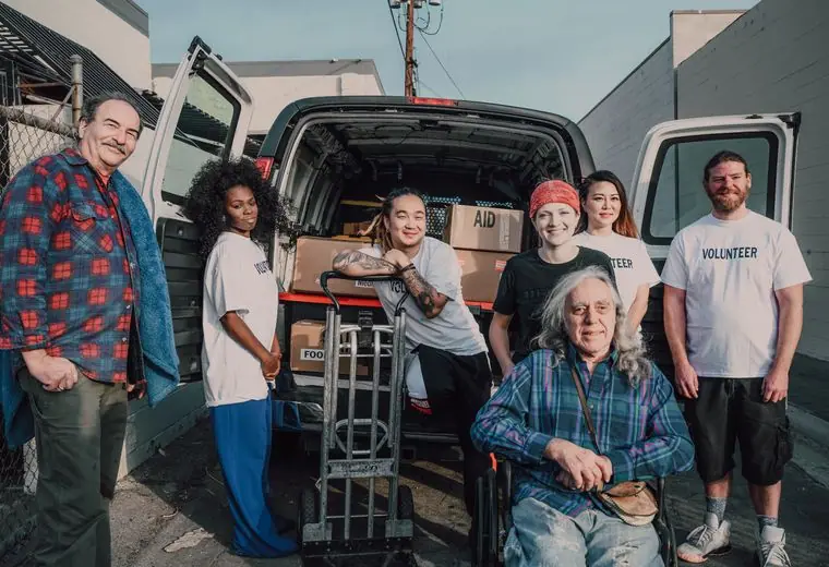
The hero is split. The left side holds the headline in four lines and a short line telling people to call or walk in, with no referral needed. On the right is a tall city photo at sunset with a smaller crowd photo overlapping. A chip tells people when lunch is served next.
'Get help' is the first button and it is a solid blue, with 'Volunteer' beside it. Getting help is placed before giving, because a person in need should not have to look for it. Donate is in the header for those who want it.
A city street at dusk suggests the setting without showing an individual in distress. People in crisis should never be photographed for decoration, so a real site should use consented portraits of staff and volunteers, and keep clients anonymous.
Navy on pale blue measures about 14 to 1, and white on the blue button about 8 to 1. The call-to-help text is clear, short and in plain language. Reading level is low on purpose, and the theme toggle supports people using phones at night.
Each text pairing is checked against WCAG 2.2 in both themes. Ratios are computed from the exact theme colours.
| Pairing | Sample | Ratio | WCAG |
|---|---|---|---|
| Body text on page | Aa | 14.19:1 | AAA |
| Body text on cards | Aa | 15.28:1 | AAA |
| Secondary text | Aa | 5.89:1 | AA |
| Secondary text on tinted bands | Aa | 4.71:1 | AA |
| Links and labels | Aa | 7.67:1 | AAA |
| Button text | Aa | 8.26:1 | AAA |
| Accent button text | Aa | 7.33:1 | AAA |
| Footer text | Aa | 14.19:1 | AAA |
| Pairing | Sample | Ratio | WCAG |
|---|---|---|---|
| Body text on page | Aa | 15.22:1 | AAA |
| Body text on cards | Aa | 13.43:1 | AAA |
| Secondary text | Aa | 7.96:1 | AAA |
| Secondary text on tinted bands | Aa | 6.18:1 | AA |
| Links and labels | Aa | 7.72:1 | AAA |
| Button text | Aa | 8.70:1 | AAA |
| Accent button text | Aa | 9.82:1 | AAA |
| Footer text | Aa | 15.22:1 | AAA |
Designed by Greater Purpose Web. Names, people, photos and events are sample content.