PROGRAM DISCOVERY
From hidden choices to visible options.
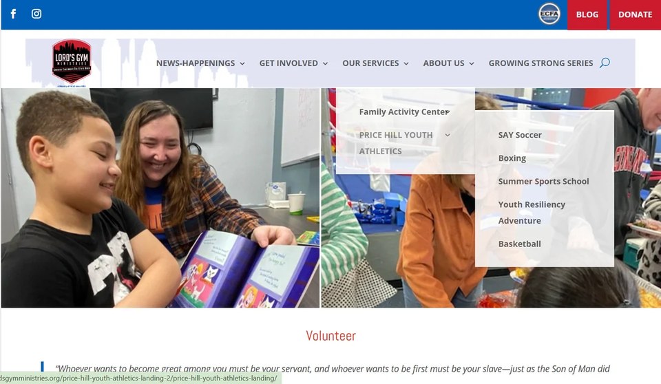
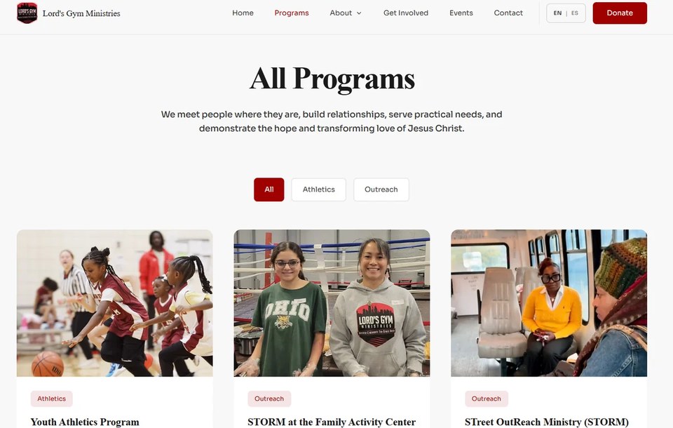
The original experience relied heavily on navigation. The redesign brings programs onto the page so visitors can browse visually and compare options faster.
 ZANE RAMSEYWEB DESIGN FOR GREATER PURPOSE
A full website redesign and digital-systems build focused on making the ministry easier to understand, easier to navigate, and easier to engage with.
The original site already contained ministry information, programs, events, staff details, partners, volunteer pathways, and ways to connect. The opportunity was to make that information easier to understand and turn more of it into clear action paths.
The redesign reorganized the experience around visitor intent: learn the mission → choose a path → take the next step.
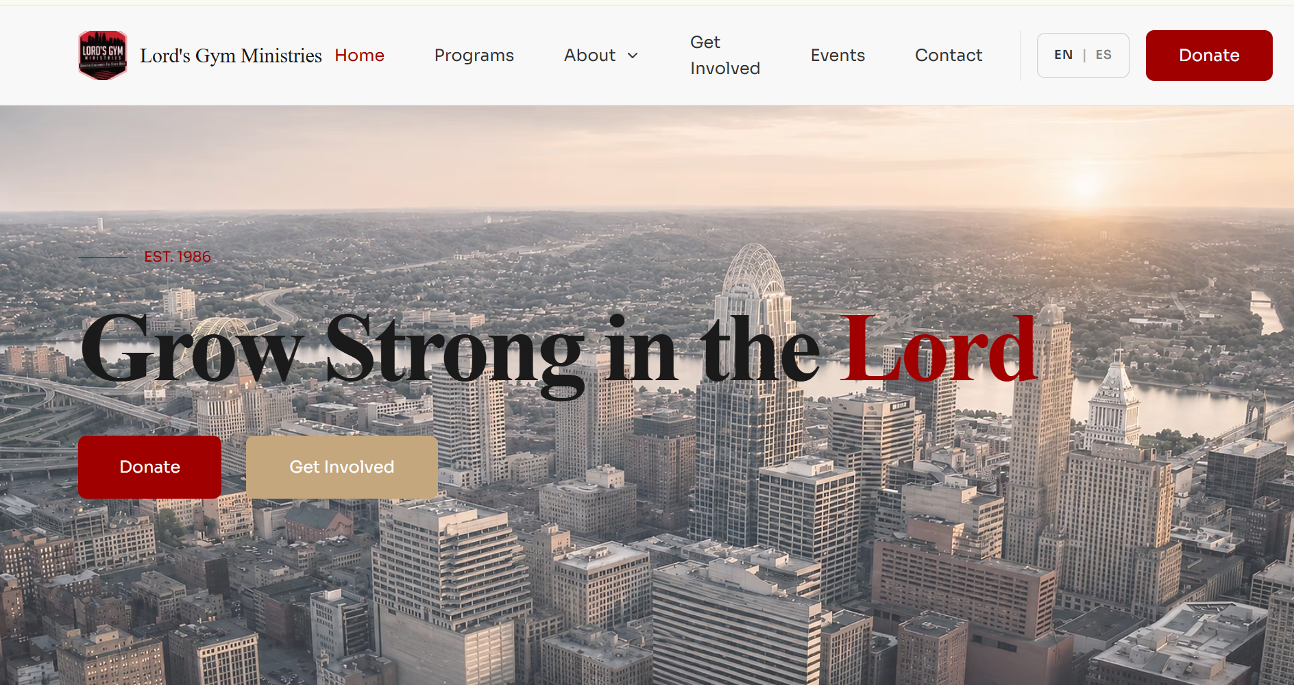
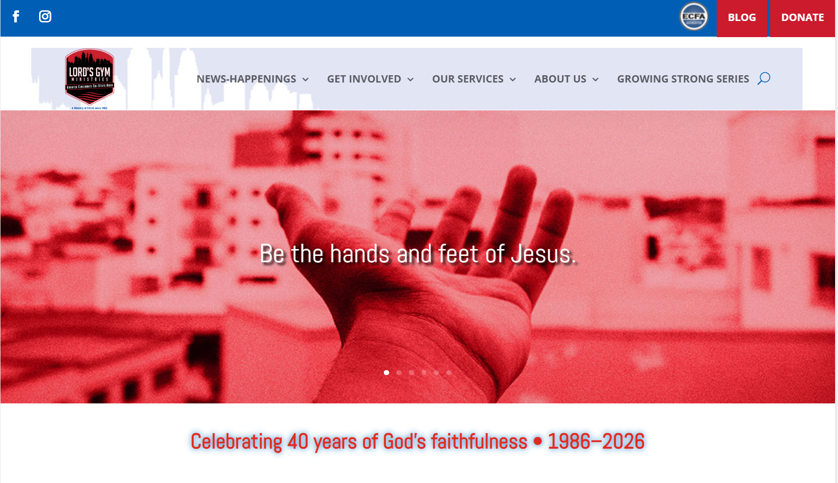
The homepage comparison shows the larger design shift: stronger hierarchy, fewer competing visual signals, and immediate next steps tied to the ministry's mission.
These comparisons show how the redesign changes real visitor tasks, not just colors and typography.
The original experience relied heavily on navigation. The redesign brings programs onto the page so visitors can browse visually and compare options faster.
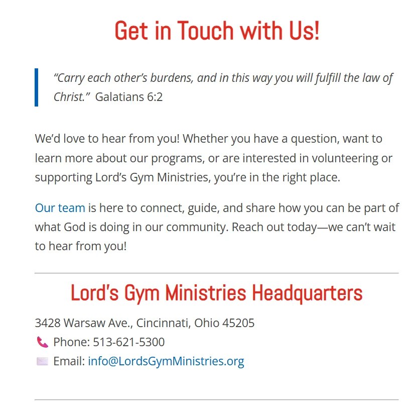
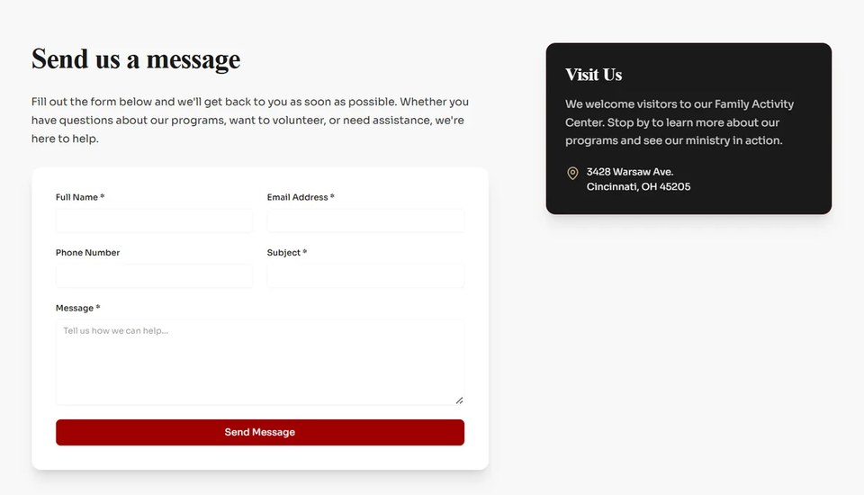
The redesign turns a passive contact page into a structured on-page form while keeping location information visible beside the action.
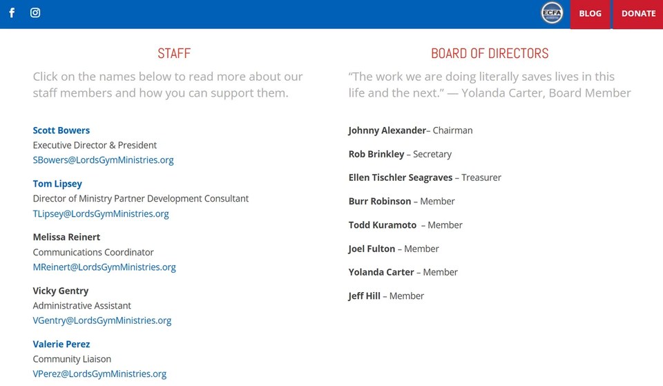
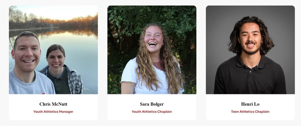
Photography, consistent cards, and clear roles create a warmer introduction to the people behind a relationship-driven ministry.
Visual design mattered, but the more important work was reducing friction around real visitor tasks.
Programs moved from navigation-heavy discovery toward a visual, easier-to-scan directory that helps families and community partners understand the options faster.
Youth athletics moved from instructions and manual follow-up toward a structured registration flow that captures the information staff actually need.
The volunteer path was separated into a clearer application experience with structured opportunity, availability, and applicant information.
Visitors can take action on the site through clearer event presentation and direct inquiry capture instead of relying primarily on static information.
The project included the content systems and workflows needed to support registrations, volunteers, staff follow-up, programs, and future updates.
Wix CMS structure for repeatable, easier-to-maintain content
Sports and registration collections with parent, child, emergency, medical, and payment fields
Automated staff notifications and parent confirmation emails
Volunteer application workflow connected to the ministry social agreement
Structured event, program, partner, staff, and story presentation
Responsive layouts and content hierarchy across the site
Launch support, domain connection, DNS, and SSL troubleshooting
The redesign did not replace the substance of the original site. It reorganized that substance around the decisions a visitor is trying to make.
The new structure prioritizes a simple sequence: understand the mission, find the right path, and take the next step.
Reusable CMS structures, forms, and automations were built so the site can support ongoing ministry work instead of functioning as a one-time brochure.
Lord's Gym now has a clearer structure for communicating its mission, presenting programs, receiving registrations and inquiries, supporting volunteers, recognizing partners, and maintaining changing content.
This case study describes documented design and workflow improvements. Post-launch conversion or traffic lift is not claimed without measured analytics.
VIEW LORD'S GYM LIVE ↗