Why Twelve Dinners looks the way it does
A site for a marriage ministry whose whole program is a year of monthly dinners: four couples, rotating homes, one conversation card per month. It should read like an invitation to supper, while keeping the route to real counselling one click away.
- Built for
- Married and engaged couples in Charlotte, from newlyweds to forty-year marriages, and the churches that send them.
- Navigation
- Split screen. Identity and navigation stay fixed on the left half while content scrolls on the right, like a printed programme.
- Pages
- Home, How the year works, The twelve questions, Host a table, When it's hard, Join a table
- Hero
- a short action form as the hero: the one thing most visitors came to do (request a ride, ask for help, register a child) can be done before they scroll, with reassurance beside it. Variants: a = headline, reassurance and a photo on the left with the form as a raised card on the right; b = a tall photo carrying the headline, with the form and reassurance on a plain panel beside it; c = headline beside a photo, then the form laid out as one horizontal booking bar; an editorial collage: three photographs placed off-grid and overlapping, with a large headline laid across them like a magazine cover, a small caption and a single quiet link. Variants: a = headline on the left breaking into a cascade of photos on the right; b = three photos in a staggered row with the headline running across all of them; c = headline at top left over a large photo, with two smaller photos pinned to its corners
Typography
Gilda Display is a high-contrast display serif with the look of an engraved place card, so every headline reads like an invitation to supper. Instrument Sans handles the practical layer (dates, addresses, childcare times) in a plain, slightly narrow grotesque that never competes with it.
Color
A claret red taken from a glass of wine held up to a candle, a beeswax gold for small accents, and a linen background with a faint rose cast. Dark mode is a candlelit room: deep plum-brown with the claret lifted to a dusty rose so it still reads at night.
Layout and navigation
A split panel keeps the name, the one-line promise and the navigation fixed on the left like the card on a dinner menu, while the content scrolls beside it. Couples usually read this site together on one laptop, so a calm, book-like layout suits it better than a busy header.
The hero
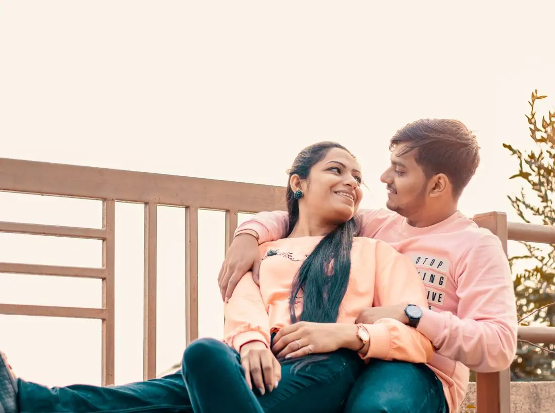
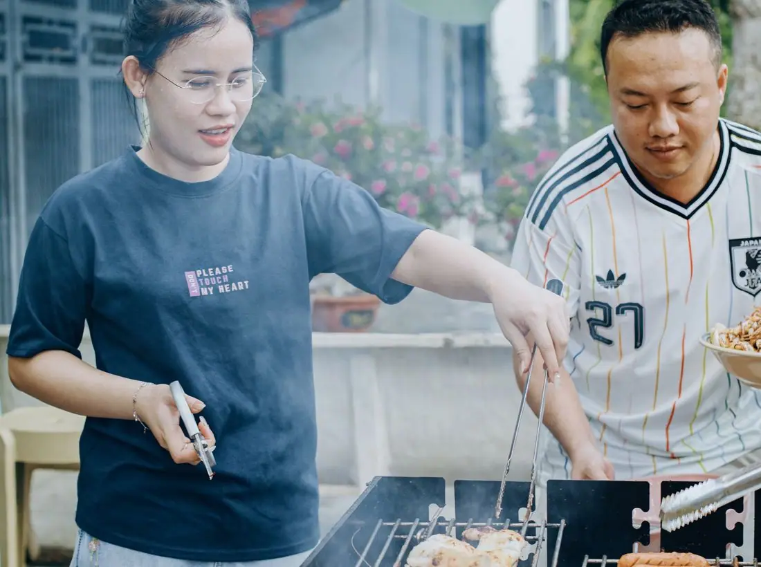
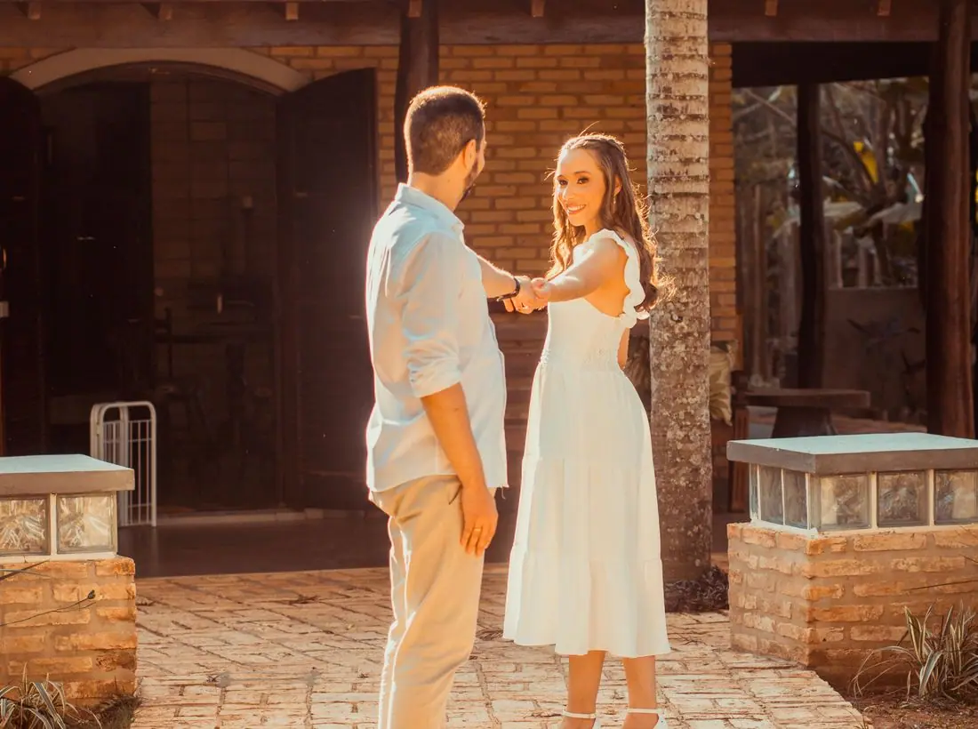
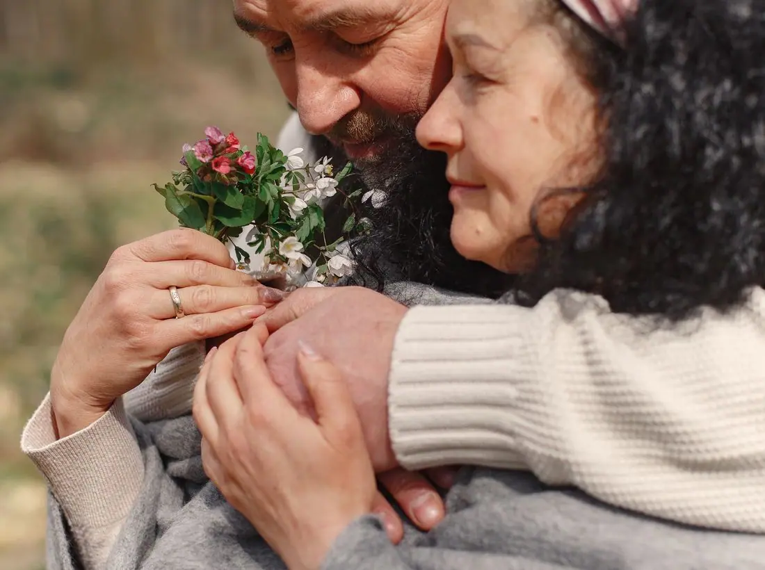
Three photographs in a staggered row with the headline running across them, like a magazine spread about a dinner party. The first thing you see is people at a table, which is the whole program in one image.
Calls to action
'Join a table' is the main action because a single sign-up is the only step a couple needs to take. Hosting, giving and counselling each get their own verb: offer your dining room, sponsor a table's childcare, talk to a counselor this week.
Photography
Candlelit dinners, couples of different ages and backgrounds, and long tables. We avoided wedding imagery on purpose: this ministry is for year seven and year thirty, not the big day.
Accessibility
Underlined text buttons with a heavy focus ring, body text at 17px, and every date written in words. The 'When it's hard' page lists crisis and domestic-violence lines in plain text that works without JavaScript.
Type system
- DisplayGilda DisplayGilda Display has the high contrast and ball terminals of an engraved dinner invitation, which is exactly what each month of the program is.
- TextInstrument SansA quiet, slightly narrow grotesque that keeps practical details (dates, childcare, addresses) crisp next to the formal headlines.
Colour and contrast
Every text pairing is checked against WCAG 2.2 in both themes.
Light theme
| Pairing | Sample | Ratio | WCAG |
|---|
| Body text on page | Aa | 14.91:1 | AAA |
| Body text on cards | Aa | 16.53:1 | AAA |
| Secondary text | Aa | 5.88:1 | AA |
| Links | Aa | 9.43:1 | AAA |
| Button text | Aa | 10.74:1 | AAA |
| Accent label text | Aa | 6.09:1 | AA |
| Text on dark bands | Aa | 14.91:1 | AAA |
| Muted text on dark bands | Aa | 7.86:1 | AAA |
| Text on brand bands | Aa | 10.74:1 | AAA |
| Muted text on brand bands | Aa | 6.72:1 | AA |
Dark theme
| Pairing | Sample | Ratio | WCAG |
|---|
| Body text on page | Aa | 15.15:1 | AAA |
| Body text on cards | Aa | 13.92:1 | AAA |
| Secondary text | Aa | 6.69:1 | AA |
| Links | Aa | 8.49:1 | AAA |
| Button text | Aa | 8.63:1 | AAA |
| Accent label text | Aa | 9.28:1 | AAA |
| Text on dark bands | Aa | 15.93:1 | AAA |
| Muted text on dark bands | Aa | 8.01:1 | AAA |
| Text on brand bands | Aa | 8.63:1 | AAA |
| Muted text on brand bands | Aa | 5.31:1 | AA |