Why Rivertown looks the way it does
Rivertown is a small museum with a big subject, and the site is designed like its own exhibition labels: one strong photograph, a precise caption, and the facts a visitor needs set in a ruled strip. It should feel like a well-kept archive, not an attraction.
- Built for
- Paducah residents, school groups from western Kentucky, family historians, and travelers stopping between the interstate and the river
- Navigation
- Full-screen menu. Only a Menu button shows; it opens a full-screen index with large type. Keeps the first screen uncluttered.
- Pages
- Home, Visit, Exhibitions, The '37 flood, Field trips, Research room, Membership
- Hero
- a short action form as the hero: the one thing most visitors came to do (request a ride, ask for help, register a child) can be done before they scroll, with reassurance beside it. Variants: a = headline, reassurance and a photo on the left with the form as a raised card on the right; b = a tall photo carrying the headline, with the form and reassurance on a plain panel beside it; c = headline beside a photo, then the form laid out as one horizontal booking bar; A full-bleed photograph left completely free of words, with the headline set underneath it like a museum caption and a small column of place, date and photo credit. Variants: a = catalogue entry (plate number, headline, details column); b = the details run as a ruled strip above one wide headline; c = the photo bleeds off the left edge and the details hang in the right-hand margin beside it
Typography
Old Standard TT is a revival of the Modern serifs used in American books and newspapers in the 1870s and 80s, which is exactly when the warehouse was built. Libre Franklin, a Franklin Gothic revival, handles body text the way that face once handled railway and river-packet timetables. Courier Prime sets dates and catalog numbers like a typed accession card.
Color
The red is the oxide paint on old packet boats and the brick of Water Street; the blue-green is the Ohio on a clear day. The background is a cool gray taken from river fog rather than the beige of most history sites, and a fine grain sits over everything like the tooth of archival paper. Every pairing passes WCAG AA in both themes.
Layout and navigation
A single Menu button opens a full-screen index of the seven pages in large type. Museum visitors usually come for one thing, today's hours or the flood, and the uncluttered first screen lets the photograph and its caption do the introducing.
The hero
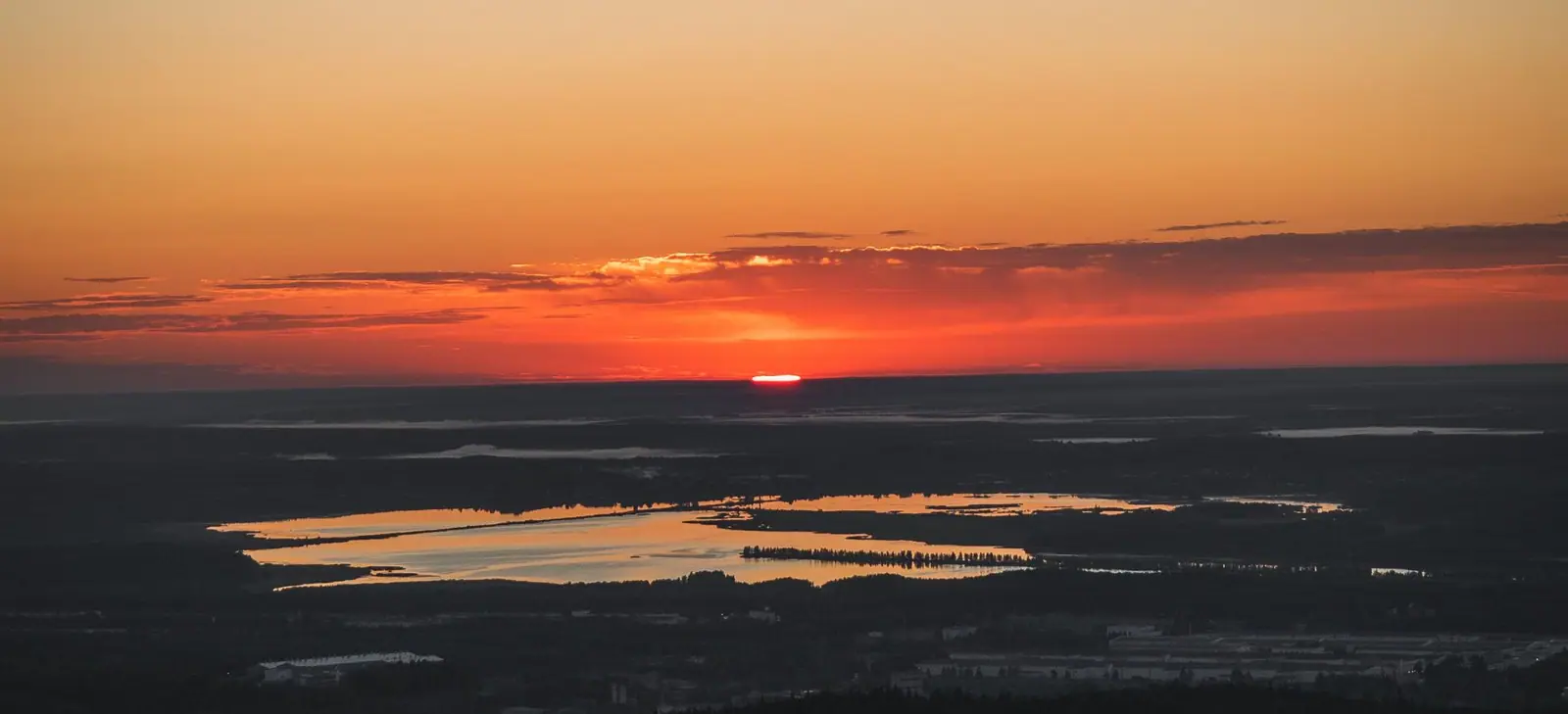
The photograph runs edge to edge with no words on it, and the headline sits underneath like a gallery caption, with place, date and photographer in a ruled strip above. It is how the museum labels its own objects, so the first screen behaves like the building.
Calls to action
The main action is Hours & admission, because nearly every visitor arrives asking whether we are open. The others name specific outcomes: Book a class visit, Request a research hour, Become a member. The brackets around each button echo the square brackets archivists use for supplied information.
Photography
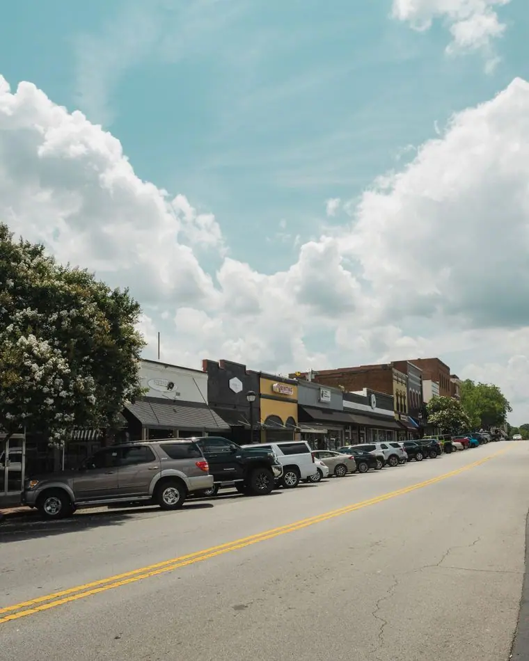
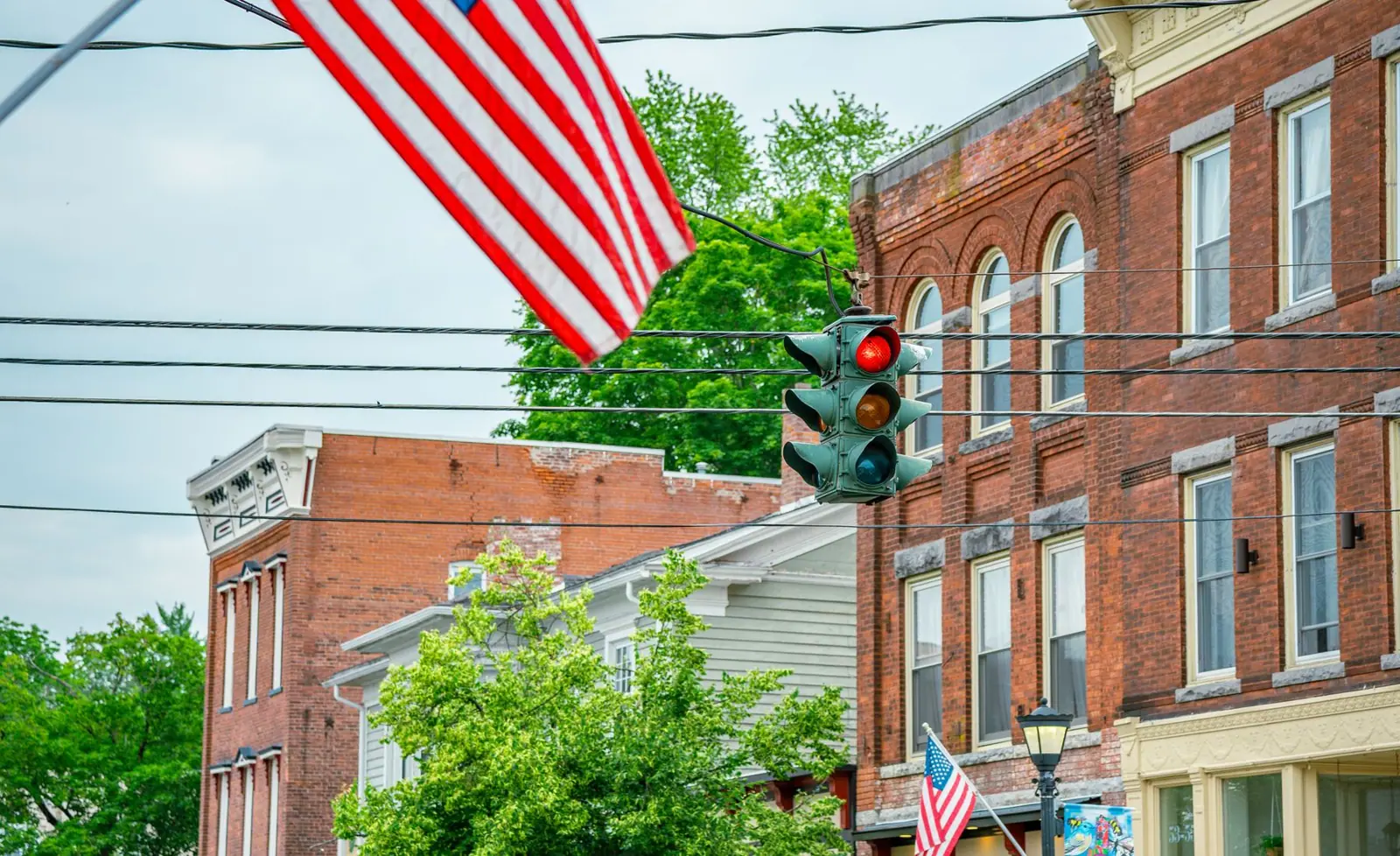
Paducah streets, the river, the research room and the people who remember. We deliberately avoided generic grand museum halls: this is a two-storey warehouse with oak floors, and the photography should never promise marble.
Accessibility
Generous body size, full-contrast captions, and an honest access section: the elevator, the hearing loop in the listening room, the bench in every gallery. The live open-or-closed status is written out in words as well as shown.
Type system
- DisplayOld Standard TTOld Standard revives the Modern serifs of late-1800s American books and newspapers, the type the Paducah Sun was set in when the warehouse was built.
- TextLibre FranklinA revival of Franklin Gothic, the American sans of railway timetables and river-packet notices, plain enough for long gallery text.
- AccentCourier PrimeTypewriter labels, like the accession cards in the museum's own 1960s card catalog.
Colour and contrast
Every text pairing is checked against WCAG 2.2 in both themes.
Light theme
| Pairing | Sample | Ratio | WCAG |
|---|
| Body text on page | Aa | 13.6:1 | AAA |
| Body text on cards | Aa | 15.19:1 | AAA |
| Secondary text | Aa | 5.91:1 | AA |
| Links | Aa | 7.71:1 | AAA |
| Button text | Aa | 9.5:1 | AAA |
| Accent label text | Aa | 6.7:1 | AA |
| Text on dark bands | Aa | 13.6:1 | AAA |
| Muted text on dark bands | Aa | 7.25:1 | AAA |
| Text on brand bands | Aa | 9.5:1 | AAA |
| Muted text on brand bands | Aa | 6.06:1 | AA |
Dark theme
| Pairing | Sample | Ratio | WCAG |
|---|
| Body text on page | Aa | 14.71:1 | AAA |
| Body text on cards | Aa | 13.24:1 | AAA |
| Secondary text | Aa | 6.62:1 | AA |
| Links | Aa | 8.06:1 | AAA |
| Button text | Aa | 8.46:1 | AAA |
| Accent label text | Aa | 9.15:1 | AAA |
| Text on dark bands | Aa | 15.81:1 | AAA |
| Muted text on dark bands | Aa | 8.03:1 | AAA |
| Text on brand bands | Aa | 8.46:1 | AAA |
| Muted text on brand bands | Aa | 5.25:1 | AA |