 SeriesLiving Water
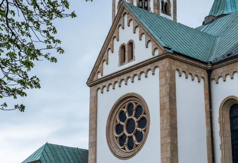 SeriesRooted
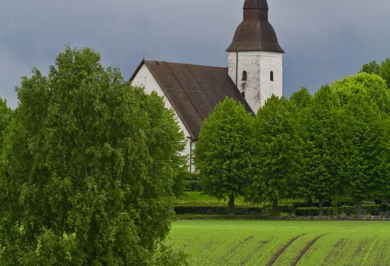 SeriesSent
Nov08
Care Team Training
1:00 PM · River Hall
Learn how to deliver meals and visit neighbors with compassion.
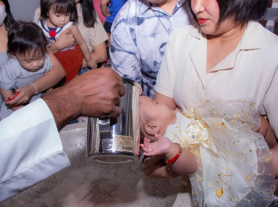
Join us on the banks of the river for worship, service and baptism Sundays. Come as you are; leave with a neighbor.
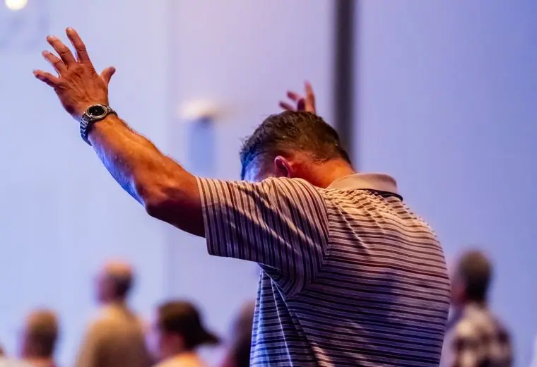
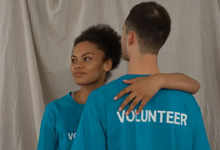
Riverbank is a community church on the water's edge. We sing, pray and eat together, and we send our people into the neighborhood with casseroles, rides and open hands. Like the river, we are always moving toward someone who needs us.
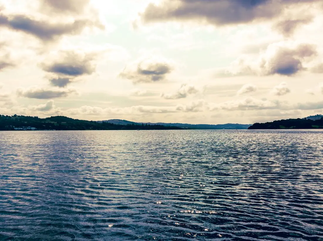
On summer Sundays we gather at the water's edge to celebrate new life in Christ. Friends, family and strangers line the bank to cheer.
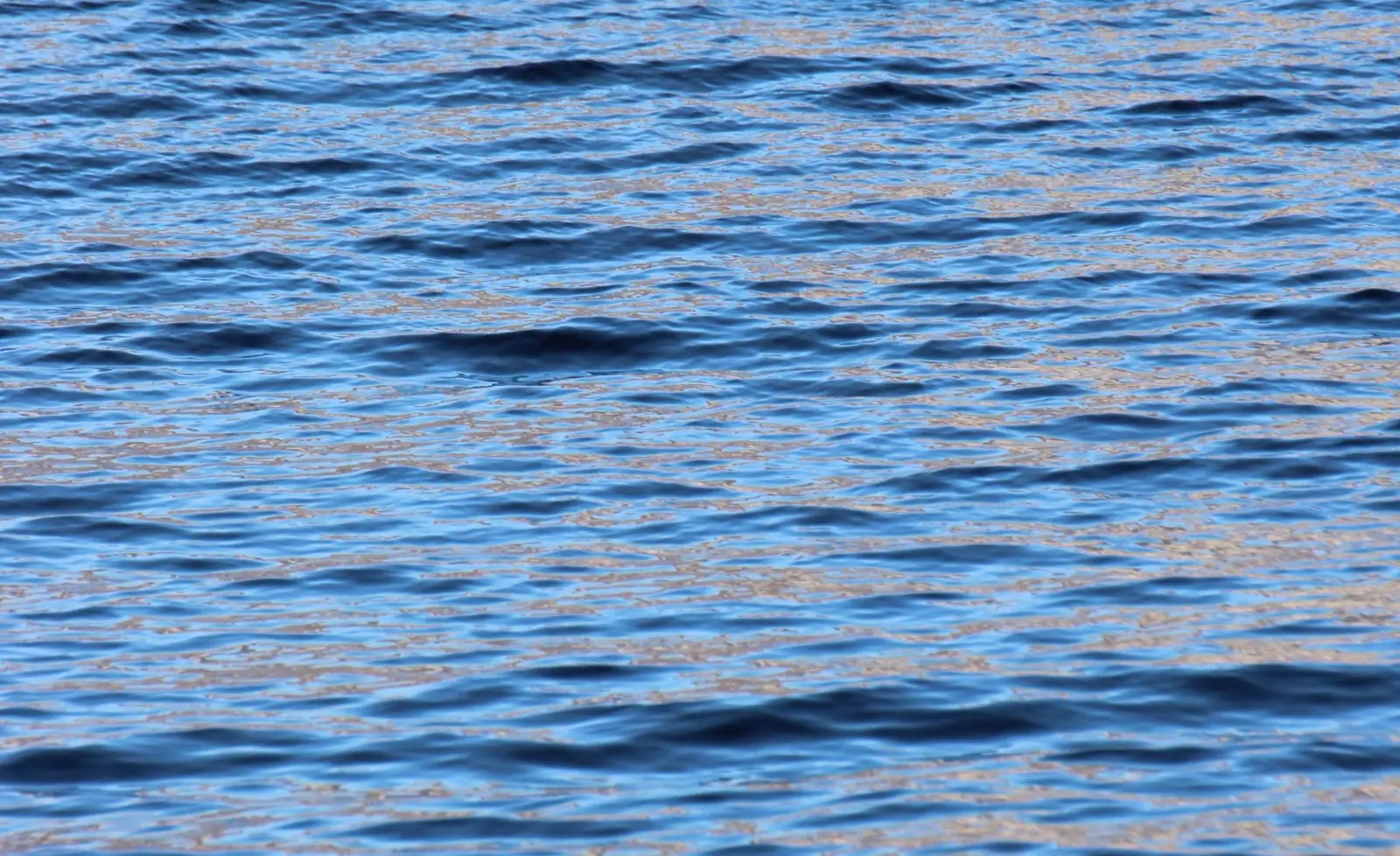
He will be like a tree planted by the streams of water, that produces its fruit in its season.Psalm 1:3 (WEB)
Learn how to deliver meals and visit neighbors with compassion.
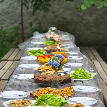
A service of gratitude followed by a community potluck.

Fill 200 holiday boxes for local families.
Your giving supports worship, local missions and the care team's work.
Design notes
Riverbank is a riverside community church site with a teal palette, a scalloped wave pattern behind a centred headline, and a stats band showing how much the church does for its town. The water theme comes from the name and the place.
Gloock, a high-contrast display serif with sharp, tapered strokes, sets the headline. Karla handles body copy, a slightly condensed grotesque that reads well at small sizes. The result is a literate, slightly dressy headline with a practical body face under it.
Pale aqua (#F2F8F8) is the page, with deep teal-black (#0F2B33) text, a river teal (#0E7C86) brand colour and a warm orange (#F2A541) accent that stands out like a lantern on water. The dark theme moves to a deep blue-green with a brighter teal (#5CC8D0). Teal and orange sit opposite each other, so the accent is easy to spot.
A white bar holds the logo, six links and a round Give button. A scalloped wave pattern fills the hero background and returns as a divider between sections. A stats band reports meals shared, volunteers and local partners, followed by rounded cards for ministries.
The hero is centred. 'Deep roots, flowing grace.' is set on two lines over the wave pattern, with a short line about baptism Sundays beneath. Three photos in a staggered row begin just below the fold. A chip counts down to the next River Pantry.
'Visit Sunday' is the solid teal pill and 'Serve with us' is outlined. The second button speaks to people who come for service rather than worship. Give is a teal pill in the header.
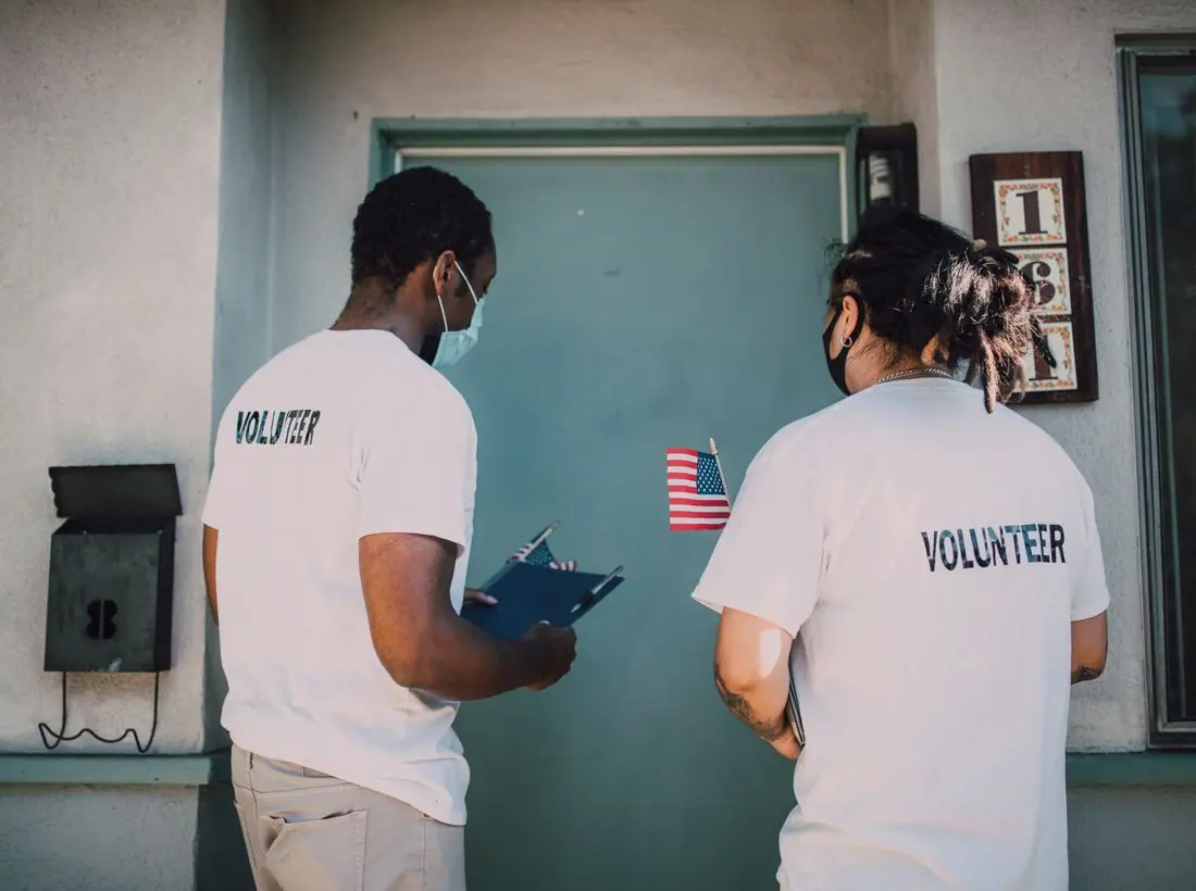
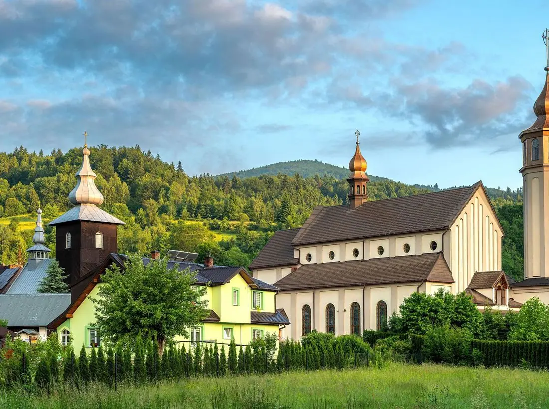
The photographs are natural landscapes and community moments, with mountains, water and gardens. They convey place more than people. A real church should add its own riverfront and a few photos of volunteers at the pantry, which is the proof the stats band promises.
Dark teal text on aqua measures about 13.8 to 1 and white on the teal button about 4.9 to 1. The wave pattern is low contrast and does not sit behind small text for long. Light and dark themes are one click away.
Each text pairing is checked against WCAG 2.2 in both themes. Ratios are computed from the exact theme colours.
| Pairing | Sample | Ratio | WCAG |
|---|---|---|---|
| Body text on page | Aa | 13.83:1 | AAA |
| Body text on cards | Aa | 14.85:1 | AAA |
| Secondary text | Aa | 5.81:1 | AA |
| Secondary text on tinted bands | Aa | 4.86:1 | AA |
| Links and labels | Aa | 5.72:1 | AA |
| Button text | Aa | 4.95:1 | AA |
| Accent button text | Aa | 9.59:1 | AAA |
| Footer text | Aa | 13.83:1 | AAA |
| Pairing | Sample | Ratio | WCAG |
|---|---|---|---|
| Body text on page | Aa | 15.32:1 | AAA |
| Body text on cards | Aa | 13.45:1 | AAA |
| Secondary text | Aa | 8.07:1 | AAA |
| Secondary text on tinted bands | Aa | 6.10:1 | AA |
| Links and labels | Aa | 8.75:1 | AAA |
| Button text | Aa | 9.96:1 | AAA |
| Accent button text | Aa | 10.76:1 | AAA |
| Footer text | Aa | 15.32:1 | AAA |
Designed by Greater Purpose Web. Names, people, photos and events are sample content.