Why ReadWell Literacy looks the way it does
ReadWell teaches adults to read and write, in English and in Spanish, and pairs children with volunteer reading buddies. Many visitors read with difficulty, so the site itself had to be easy to read before it could be anything else.
- Built for
- Adults in Fresno who want to read better (many of them Spanish speakers, some reading for the first time in any language), parents worried about a child's reading, and the volunteers and donors who make the classes free.
- Navigation
- Two-tier header. A thin utility strip carries times, phone and language; the main bar below holds pages and the action.
- Pages
- Home, Adult classes, For kids, Tutor, Where we meet, Give
- Hero
- a short action form as the hero: the one thing most visitors came to do (request a ride, ask for help, register a child) can be done before they scroll, with reassurance beside it. Variants: a = headline, reassurance and a photo on the left with the form as a raised card on the right; b = a tall photo carrying the headline, with the form and reassurance on a plain panel beside it; c = headline beside a photo, then the form laid out as one horizontal booking bar; Three doors instead of one headline: visitors pick the path that fits them (for example New here, Need help, Want to help)
Typography
Lexend was developed from reading-fluency research to reduce visual stress for struggling readers, which makes it the honest choice for a literacy charity rather than a stylistic one. Body text is Atkinson Hyperlegible at 18px, drawn for the Braille Institute so that letters people commonly confuse never look alike. Both carry Spanish accents and the ñ properly.
Color
The deep teal is the cloth of an old library binding, and the yellow is a highlighter pen: the most-used tool in every one of our classrooms. The ground is a very pale green-gray rather than white, which cuts glare for readers with dyslexia. In dark mode the teal lifts to sea-glass so headings stay calm, and the highlighter stays bright.
Layout and navigation
A two-tier header puts class times, the phone number and 'Se habla español' above the main menu, because the first question most adult learners have is 'when, and can I call someone?'. The language switch sits in that strip and changes the whole page at once, never mixing two languages in one paragraph.
The hero
The home page opens with three doors: one for an adult who wants to read better, one for a parent, one for a would-be tutor. Asking an adult to admit they struggle to read is a big moment, so their door comes first and its wording is as plain and private as we could make it.
Calls to action
"Sign up for a class" is the main action, because a class feels ordinary, like signing up for a gym. Parents get "Get a reading buddy", and donors are asked to "Buy a learner's books", a gift people can picture.
Photography
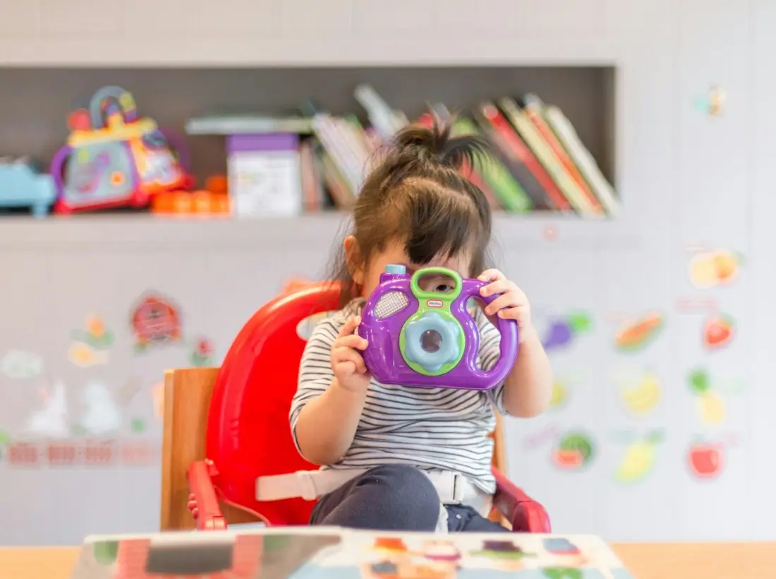
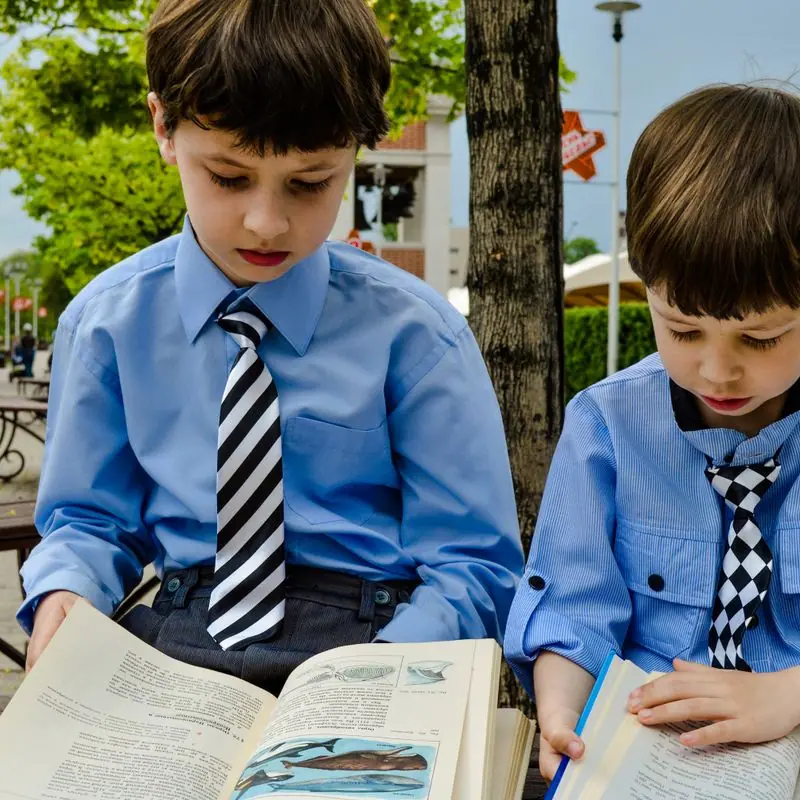
Adults learning at kitchen tables and in small classrooms, children reading on sofas and floors. No graduation caps and no sad close-ups. We chose photographs where the learner is doing the reading, not being read to.
Accessibility
Short sentences throughout, at roughly a fifth-grade reading level in both languages. All text passes WCAG AA in both themes, and links are always underlined or styled as buttons, never signalled by color alone. Forms ask for the minimum: a name and a way to reach you.
Type system
- DisplayLexendLexend was designed with reading-fluency research to make text easier for struggling readers, which is exactly who this site is for.
- TextAtkinson HyperlegibleDrawn for the Braille Institute so that easily confused letters like I, l and 1 never look alike; it carries Spanish accents cleanly.
Colour and contrast
Every text pairing is checked against WCAG 2.2 in both themes.
Light theme
| Pairing | Sample | Ratio | WCAG |
|---|
| Body text on page | Aa | 15.19:1 | AAA |
| Body text on cards | Aa | 16.67:1 | AAA |
| Secondary text | Aa | 5.54:1 | AA |
| Links | Aa | 6.84:1 | AA |
| Button text | Aa | 7.5:1 | AAA |
| Accent label text | Aa | 12.44:1 | AAA |
| Text on dark bands | Aa | 15.19:1 | AAA |
| Muted text on dark bands | Aa | 8.01:1 | AAA |
| Text on brand bands | Aa | 7.5:1 | AAA |
| Muted text on brand bands | Aa | 5.0:1 | AA |
Dark theme
| Pairing | Sample | Ratio | WCAG |
|---|
| Body text on page | Aa | 15.47:1 | AAA |
| Body text on cards | Aa | 13.79:1 | AAA |
| Secondary text | Aa | 6.95:1 | AA |
| Links | Aa | 9.13:1 | AAA |
| Button text | Aa | 9.7:1 | AAA |
| Accent label text | Aa | 13.2:1 | AAA |
| Text on dark bands | Aa | 16.72:1 | AAA |
| Muted text on dark bands | Aa | 8.48:1 | AAA |
| Text on brand bands | Aa | 9.7:1 | AAA |
| Muted text on brand bands | Aa | 5.77:1 | AA |