Why Rapid Relief Network looks the way it does
A relief site for people having the worst week of their lives, and for the volunteers who come to help them. The help request sits in the first screen, the phone number sits above everything, and the rest of the site is about getting ready before the next one.
- Built for
- Homeowners and renters across Calcasieu, Cameron, Beauregard, Jeff Davis and Allen parishes after a storm, flood or freeze, plus visiting church crews and local volunteers.
- Navigation
- Two-tier header. A thin utility strip carries times, phone and language; the main bar below holds pages and the action.
- Pages
- Home, Get help, Volunteer, Get ready, Supplies, Our story
- Hero
- a short action form as the hero: the one thing most visitors came to do (request a ride, ask for help, register a child) can be done before they scroll, with reassurance beside it. Variants: a = headline, reassurance and a photo on the left with the form as a raised card on the right; b = a tall photo carrying the headline, with the form and reassurance on a plain panel beside it; c = headline beside a photo, then the form laid out as one horizontal booking bar; A 'What do you need today?' search that filters real services as you type, for organisations whose visitors arrive with an urgent need
Typography
Fjalla One is set in capitals for headings because it should look like the signage people already trust in an emergency: road closures, shelter arrows, the boards on a fire station. Barlow, drawn from highway signs, handles the reading text at 18px, a size chosen for tired eyes on a phone with ten percent battery.
Color
The blue is a FEMA roof tarp, which is what every street in Lake Charles looked like for a year after Laura. The orange is a high-visibility vest. Everything else is a pale storm-sky gray with a cool bias. The dark theme is for people reading at night on a generator, with lighter blue and orange so nothing glares.
Layout and navigation
A two-tier header puts the help line, the storm status and the warehouse days in a strip above the main bar, on every page. If someone only reads one line on this site, it should be that phone number.
The hero
The hero is the form. Name, number, address and what's wrong, in one bar, before any explanation. Beside the headline are four promises that answer the questions people are afraid to ask: does it cost anything, will someone call, do renters count.
Calls to action
The main action is 'Request help', the exact words a person in a wet house is looking for. Volunteers get 'Join a crew', donors get 'Fund a roof tarp' because a tarp is something you can picture, and everyone gets 'Make your storm plan' in the quiet months.
Photography
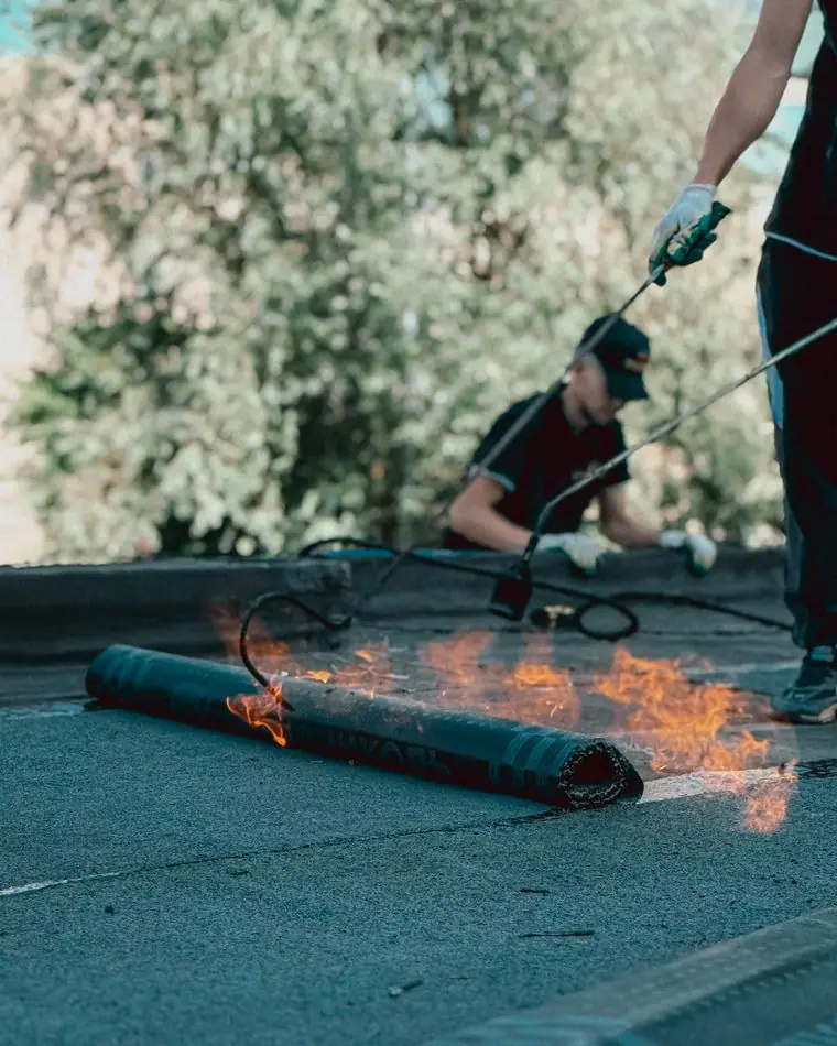
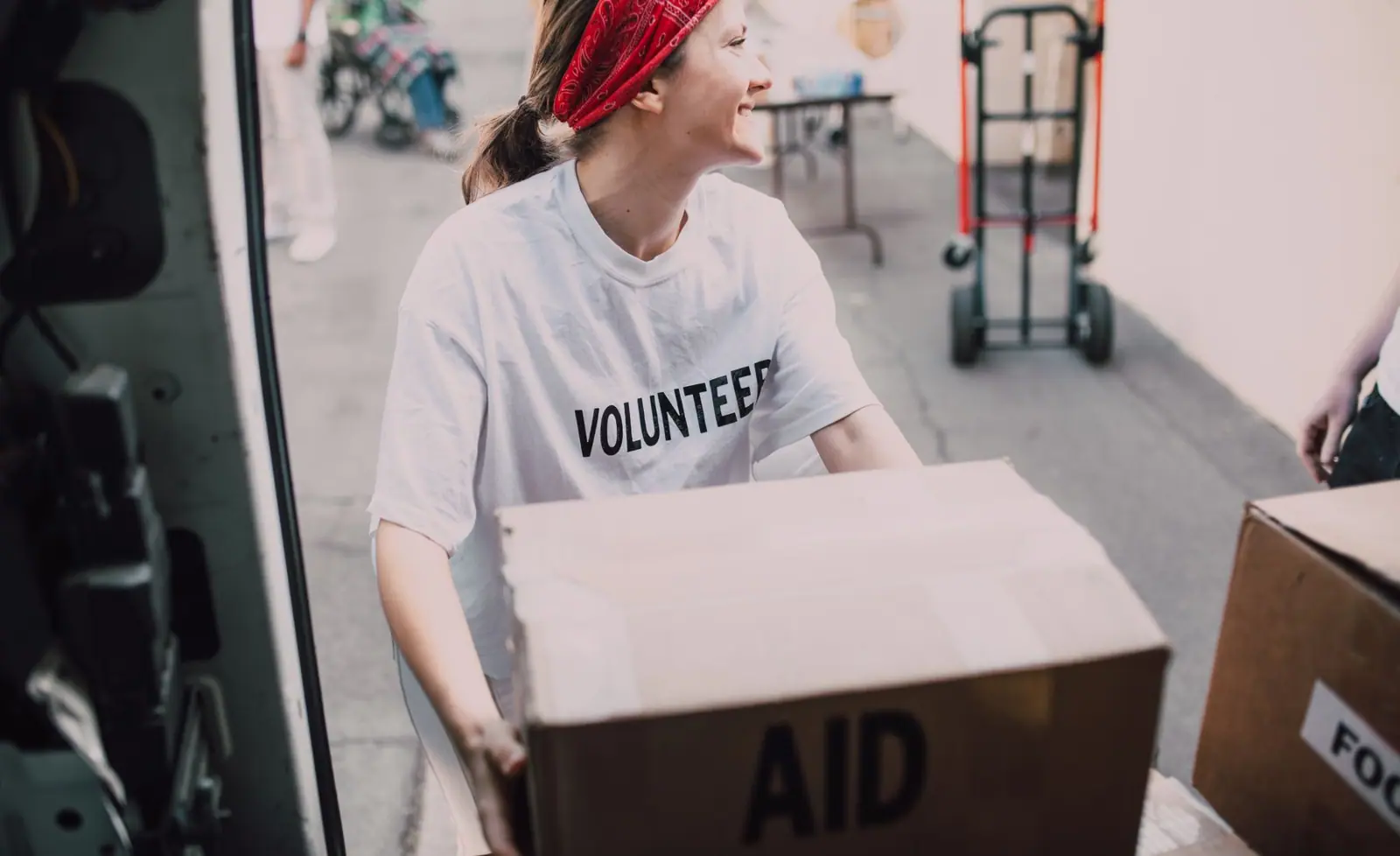
Volunteers in work clothes carrying boxes, builders on a frame, a flooded street. No pity shots of people at their lowest. The people pictured are the ones doing the helping, which is how this network sees itself.
Accessibility
Square buttons are large and high-contrast, and the form works without a mouse. Every storm status is written in words, not shown only in color. Pages are light enough to load on a single bar of signal.
Type system
- DisplayFjalla OneFjalla One is a sturdy condensed sans that reads like the stencilled lettering on a road-closure sign: big, plain and readable from across a flooded street.
- TextBarlowBarlow was drawn from California highway signs, so it shares Fjalla's no-nonsense temperament and stays clear on a cracked phone screen in bright sun.
- AccentBarlow CondensedSmall condensed labels for times, phone lines and status tags, like the strips on a crew's clipboard.
Colour and contrast
Every text pairing is checked against WCAG 2.2 in both themes.
Light theme
| Pairing | Sample | Ratio | WCAG |
|---|
| Body text on page | Aa | 15.47:1 | AAA |
| Body text on cards | Aa | 17.55:1 | AAA |
| Secondary text | Aa | 5.71:1 | AA |
| Links | Aa | 6.05:1 | AA |
| Button text | Aa | 6.86:1 | AA |
| Accent label text | Aa | 5.14:1 | AA |
| Text on dark bands | Aa | 15.47:1 | AAA |
| Muted text on dark bands | Aa | 8.04:1 | AAA |
| Text on brand bands | Aa | 6.86:1 | AA |
| Muted text on brand bands | Aa | 4.64:1 | AA |
Dark theme
| Pairing | Sample | Ratio | WCAG |
|---|
| Body text on page | Aa | 15.46:1 | AAA |
| Body text on cards | Aa | 13.83:1 | AAA |
| Secondary text | Aa | 6.89:1 | AA |
| Links | Aa | 7.2:1 | AAA |
| Button text | Aa | 7.46:1 | AAA |
| Accent label text | Aa | 6.87:1 | AA |
| Text on dark bands | Aa | 16.46:1 | AAA |
| Muted text on dark bands | Aa | 8.28:1 | AAA |
| Text on brand bands | Aa | 7.46:1 | AAA |
| Muted text on brand bands | Aa | 4.85:1 | AA |