Why Post 214 Veterans Hall looks the way it does
A website for a working veterans hall: part claims office, part canteen, part honor guard. It is written for a 74-year-old Vietnam veteran on a tablet and for his granddaughter on a phone, and both should find the claims help within one tap.
- Built for
- Veterans and their families in Delaware County, Indiana, funeral directors, and anyone looking for a hall to rent.
- Navigation
- Two-tier header. A thin utility strip carries times, phone and language; the main bar below holds pages and the action.
- Pages
- The hall, Claims help, Honor guard, This week, Rent the hall, Join
- Hero
- a short action form as the hero: the one thing most visitors came to do (request a ride, ask for help, register a child) can be done before they scroll, with reassurance beside it. Variants: a = headline, reassurance and a photo on the left with the form as a raised card on the right; b = a tall photo carrying the headline, with the form and reassurance on a plain panel beside it; c = headline beside a photo, then the form laid out as one horizontal booking bar; A tall typographic poster: the headline stacks down the left in mixed weights, italics and outlines, with a rotated side label and a photo panel. Variants: a = side label, stacked headline, then a tall photo on the right; b = photo panel on the left and the lines stepping in from the right, label on the far edge; c = the lines are pasted like strips over the edge of a large photo
Typography
Alfa Slab One is a fat slab that reads like a bond-drive poster or the painted board over a canteen hatch, so the headlines feel like they belong on the building. Libre Franklin carries the body because Franklin Gothic was the face of government notices and the Star Press for decades, and it stays clear at large sizes for older eyes. Courier Prime labels echo the typed boxes of a DD-214, the discharge form the post is named after.
Color
Olive drab and a faded flag red, set on a khaki that leans green. We avoided bright red, white and blue because every car dealer in town uses it on the Fourth of July. The dark theme goes to a field-jacket night green with a lighter sage brand so headings still carry.
Layout and navigation
The two-tier header puts the canteen hours, the service-office phone and the Veterans Crisis Line in a strip above everything else, on every page. Many members phone before they click, and the crisis line should never be more than a glance away. The main bar below holds six plainly named pages.
The hero
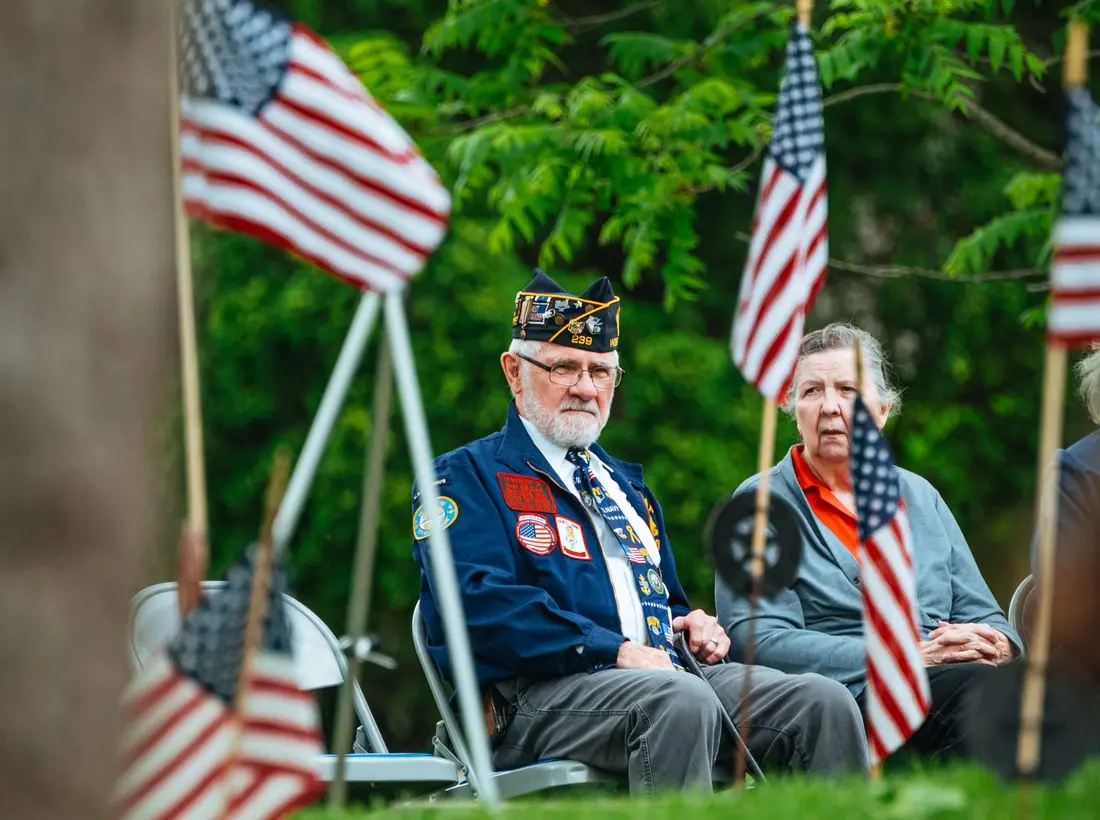
The opening poster says what is on: coffee at eight, claims at ten, fish fry on Friday. The lines are pasted over a portrait of a Vietnam veteran in his unit cap, like a bill stuck on the hall's own noticeboard. It tells a newcomer the hall is open and busy before it asks anything of them.
Calls to action
The single most important action is booking a free appointment with the service officer, because unfiled VA claims cost local veterans real money every month. Requesting funeral honors is the second, written for funeral directors who need to act within days. Membership comes last on purpose.
Photography
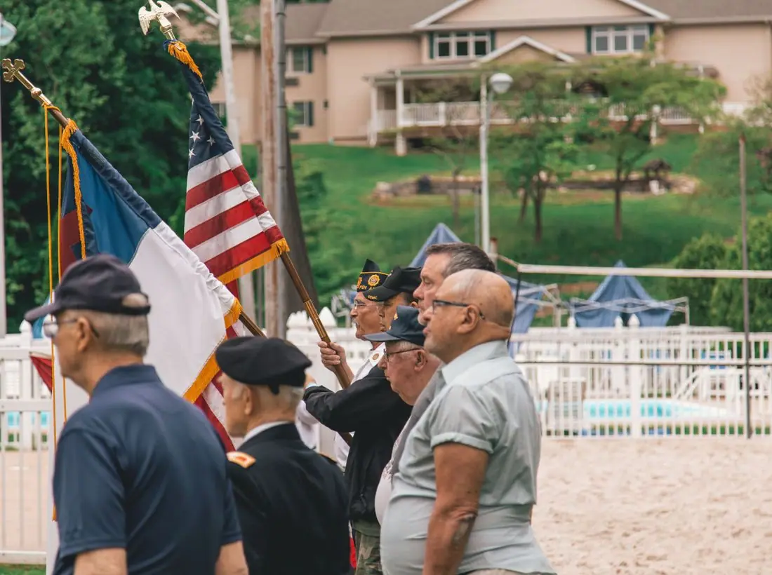
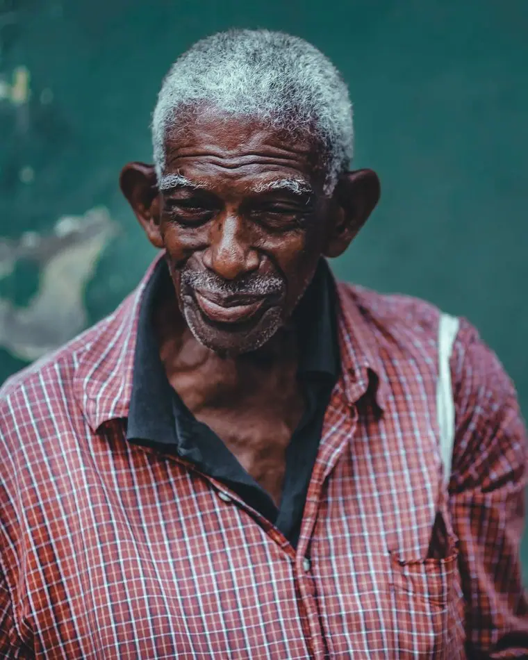
Honor guard ceremonies, flags and older faces, with a younger veteran in the mix so a 30-year-old Marine sees he is wanted too. No stock soldiers in combat gear, because the people reading this have been home for years.
Accessibility
Body type at 17px with generous line spacing, square buttons with heavy borders that are easy to hit with a thumb, and a high-contrast palette that passes 4.5:1 in both themes. Phone numbers are written out in full everywhere, not hidden behind icons.
Type system
- DisplayAlfa Slab OneAlfa Slab One is a fat-faced slab, the letter of bond-drive posters, bingo boards and the hand-painted sign over a canteen door.
- TextLibre FranklinFranklin Gothic set the government notices and newspaper columns these members grew up reading; it stays plain and sturdy at any size.
- AccentCourier PrimeTypewriter labels, like the stamped boxes on a DD-214 discharge form.
Colour and contrast
Every text pairing is checked against WCAG 2.2 in both themes.
Light theme
| Pairing | Sample | Ratio | WCAG |
|---|
| Body text on page | Aa | 13.03:1 | AAA |
| Body text on cards | Aa | 14.8:1 | AAA |
| Secondary text | Aa | 5.74:1 | AA |
| Links | Aa | 6.05:1 | AA |
| Button text | Aa | 7.52:1 | AAA |
| Accent label text | Aa | 6.97:1 | AA |
| Text on dark bands | Aa | 13.03:1 | AAA |
| Muted text on dark bands | Aa | 7.06:1 | AAA |
| Text on brand bands | Aa | 7.52:1 | AAA |
| Muted text on brand bands | Aa | 5.09:1 | AA |
Dark theme
| Pairing | Sample | Ratio | WCAG |
|---|
| Body text on page | Aa | 14.42:1 | AAA |
| Body text on cards | Aa | 12.89:1 | AAA |
| Secondary text | Aa | 6.46:1 | AA |
| Links | Aa | 8.72:1 | AAA |
| Button text | Aa | 9.09:1 | AAA |
| Accent label text | Aa | 6.47:1 | AA |
| Text on dark bands | Aa | 15.45:1 | AAA |
| Muted text on dark bands | Aa | 7.81:1 | AAA |
| Text on brand bands | Aa | 9.09:1 | AAA |
| Muted text on brand bands | Aa | 5.48:1 | AA |