Why Pine Hollow looks the way it does
Pine Hollow has two readers who want different things from the same page: a nine-year-old who wants to see the creek and the campfire, and a parent who wants dates, prices and the nurse's name. The design gives the first screen to the kids and every screen after it to the parent.
- Built for
- Parents and grandparents in the Carolinas, Georgia and Tennessee choosing a summer camp, the campers themselves, churches sending groups, and college students applying for summer staff.
- Navigation
- Classic top bar. Logo left, pages right, one action. Familiar to every visitor.
- Pages
- Home, Dates & prices, A day at camp, For parents, Register, Camperships, Summer staff
- Hero
- a short action form as the hero: the one thing most visitors came to do (request a ride, ask for help, register a child) can be done before they scroll, with reassurance beside it. Variants: a = headline, reassurance and a photo on the left with the form as a raised card on the right; b = a tall photo carrying the headline, with the form and reassurance on a plain panel beside it; c = headline beside a photo, then the form laid out as one horizontal booking bar; An asymmetric mosaic of five photographs with the headline locked into one cell of the grid, so the first screen shows real people before it says anything. Variants: a = headline block top-left beside one large photo, three smaller below; b = a tall photo leads and the headline sits low on the right; c = a triptych, with the headline in the middle panel between stacked photos
Typography
Fredoka is a rounded sans with the soft corners of a painted cabin sign or a craft-foam name tag, so headings feel like camp without resorting to a novelty font. Nunito Sans carries the dense practical copy, prices, medication rules, packing lists, in a calm, open text face. Caveat appears sparingly as a counselor's handwriting.
Color
The orange is the old canoe fleet, re-painted every spring, and the green is the pine canopy above the cabins. The background is the pale gray-green of creek mist at 7 AM. In the dark theme the page turns into the campfire: deep lake blue with the orange brightened to flame and the green to fresh fern.
Layout and navigation
A classic top bar with every page named, because parents are task-driven and come back several times between October and June: dates, then the packing list, then the drop-off map. Register a camper is always top right. Rounded corners and soft shadows keep cards feeling like things you could pick up.
The hero
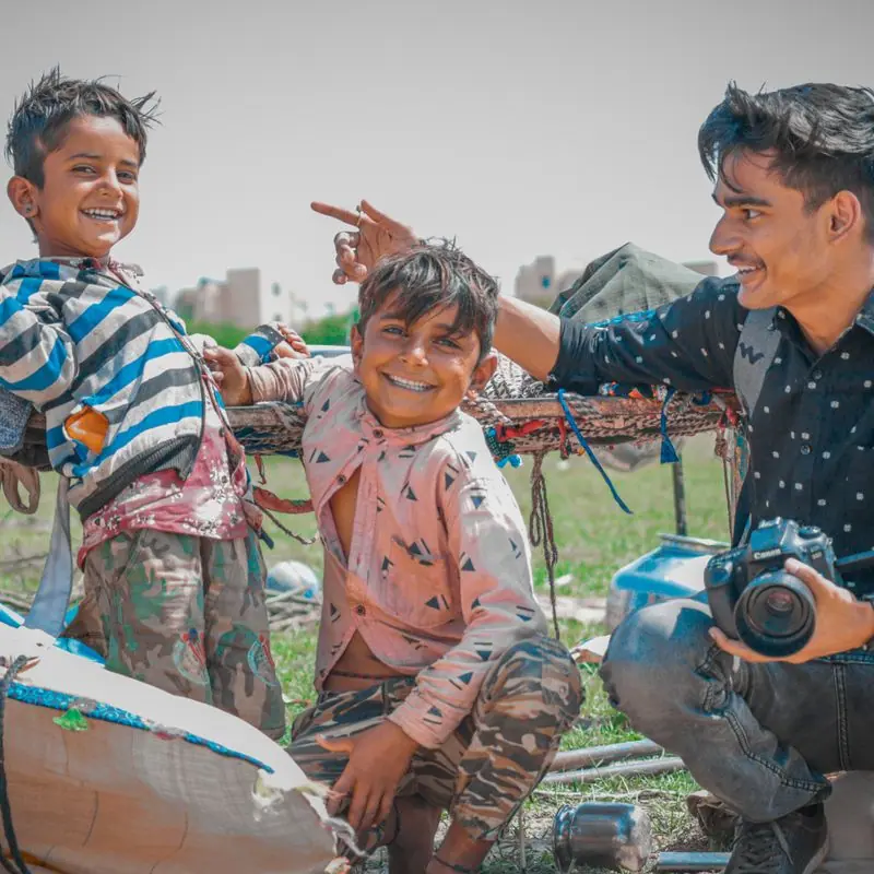
A mosaic of five photographs leads, with the headline locked into one corner, so a child scrolling over a parent's shoulder sees campfires, tents and friends before reading anything. The headline is written for the parent; the photos do the talking to the kid.
Calls to action
Register a camper is the action that matters from October to May, so it never moves. Secondary buttons name the next task honestly: See 2027 dates and prices, Book an open-house tour, Send a kid to camp.
Photography
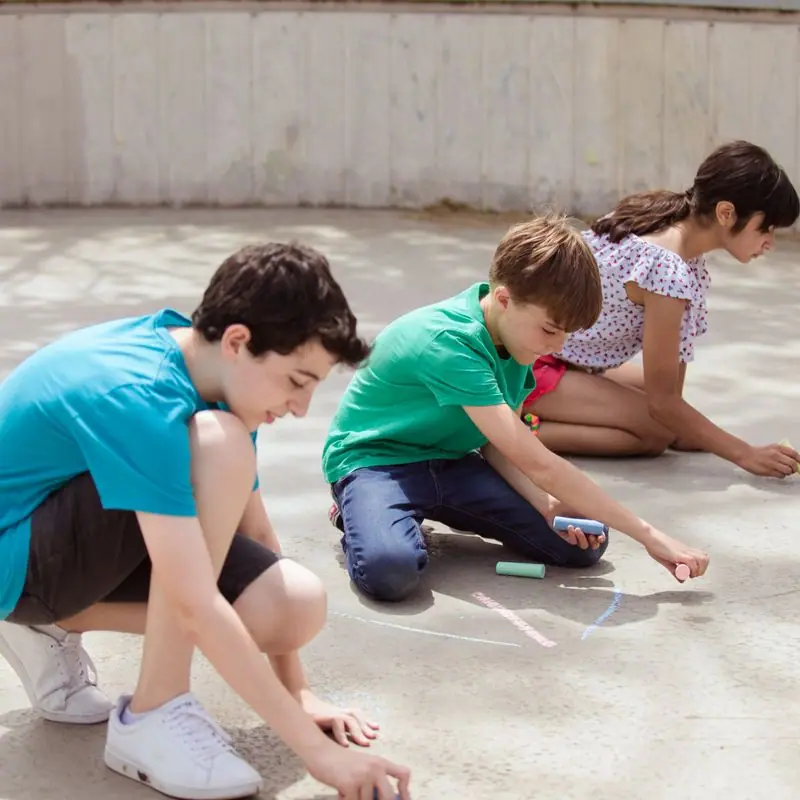
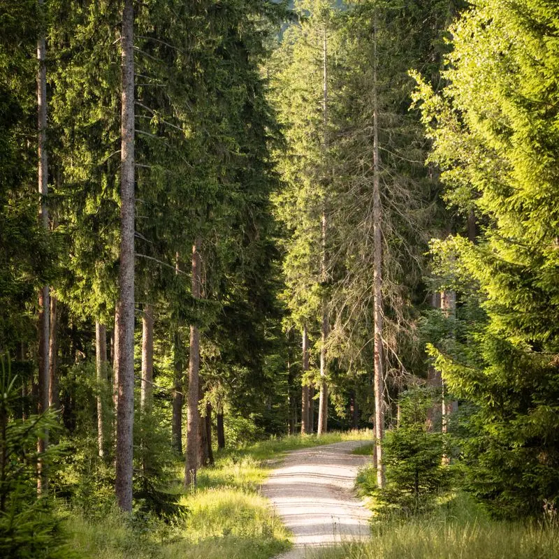
Real outdoor moments, campfires, forest paths, circle games and tents, with kids who look like the camp's actual mix of campers. Staff portraits are relaxed and outdoors because the people in them will be living in a cabin with your child.
Accessibility
Prices, dates and ages are set as text in tables and lists, never baked into images. The orange has been darkened until white text on it passes AA, the sessions list works with a keyboard, and the health and medication information is written in plain sentences, not policy language.
Type system
- DisplayFredokaFredoka's rounded terminals look like letters cut from craft foam or painted on a cabin sign: friendly to a seven-year-old, still sturdy enough for a parent reading prices.
- TextNunito SansA clear, open sans whose rounded joins sit happily beside Fredoka without turning the long parent-facing paragraphs into a cartoon.
- AccentCaveatThe counselor's handwriting, for little notes and sign-offs, the way a letter home from camp looks.
Colour and contrast
Every text pairing is checked against WCAG 2.2 in both themes.
Light theme
| Pairing | Sample | Ratio | WCAG |
|---|
| Body text on page | Aa | 12.11:1 | AAA |
| Body text on cards | Aa | 13.87:1 | AAA |
| Secondary text | Aa | 5.62:1 | AA |
| Links | Aa | 5.52:1 | AA |
| Button text | Aa | 5.24:1 | AA |
| Accent label text | Aa | 5.67:1 | AA |
| Text on dark bands | Aa | 12.11:1 | AAA |
| Muted text on dark bands | Aa | 6.73:1 | AA |
| Text on brand bands | Aa | 5.24:1 | AA |
| Muted text on brand bands | Aa | 4.6:1 | AA |
Dark theme
| Pairing | Sample | Ratio | WCAG |
|---|
| Body text on page | Aa | 15.0:1 | AAA |
| Body text on cards | Aa | 13.15:1 | AAA |
| Secondary text | Aa | 6.81:1 | AA |
| Links | Aa | 7.64:1 | AAA |
| Button text | Aa | 8.29:1 | AAA |
| Accent label text | Aa | 10.51:1 | AAA |
| Text on dark bands | Aa | 16.43:1 | AAA |
| Muted text on dark bands | Aa | 8.32:1 | AAA |
| Text on brand bands | Aa | 8.29:1 | AAA |
| Muted text on brand bands | Aa | 5.25:1 | AA |

 Most added