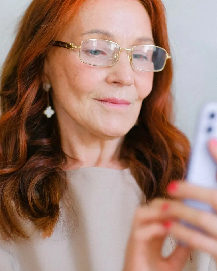
Executive Director
Maren Holtz
Maren is a wheelchair user, a former occupational therapist and the person who bought the first ramp. She leads most walk-throughs and still does Saturday deliveries.
Who we are
Every board member is disabled, and so are five of our seven staff.
Board meetings are open to anyone: second Tuesday of the month, captioned, in the front room and on Zoom.
Since 2014
In 2014, Maren Holtz needed a ramp for a friend's wedding and found that the only way to get one in Madison was to buy it. She bought it, lent it out eleven times that summer, and started a spreadsheet.
Twelve years later the spreadsheet is a booking system, the ramp is one of forty pieces of gear, and the people who once borrowed things now run the board. We are funded by members, small gifts, and the fees organizations pay for interpreters and walk-throughs.
Staff and board
Everyone answers their own email. VP and text work for all of us.
Executive Director
Maren is a wheelchair user, a former occupational therapist and the person who bought the first ramp. She leads most walk-throughs and still does Saturday deliveries.

Our history
2014
Maren buys a 6 ft ramp for a wedding and lends it out all summer from her garage on Russell Street.
2016
A donated garage on Atwood Avenue, twelve pieces of equipment and a paper sign-out book.
2018
Deaf members ask for a say in who interprets for them. The roster starts with nine interpreters they chose.
2020
The chronic-illness circle starts on Zoom and turns out to suit people who could never get to the room anyway. It stays online.
2023
A Lutheran church on the east side asks for help. Sixty-three buildings later, it's a program.
2026
Six CART captioners join the roster, and twelve congregations now caption their Sunday livestreams.
Partners
We are a small collective. These groups make it possible to do more than our size suggests.
Lends us the garage for a dollar a year.
Shapes the interpreter roster and co-hosts the ASL coffee hour.
Gives us the gym for wheelchair basketball every Saturday.
Trains our captioners and covers overflow bookings.
Contact
We answer within one working day. If something on this site or at an event wasn't accessible, please tell us; we'd rather know.
A real person will reply within a day.
Design notes
Open Access is a collective run by disabled people, so the website has to pass the test its own members would set. Everything here was decided by asking what a screen-reader user, a Deaf member on a phone and a person on their third migraine day this week would each need first.
The whole site is set in the Atkinson Hyperlegible family, which the Braille Institute commissioned so that letters low-vision readers confuse (I, l, 1; O, 0; b, d) are drawn deliberately different. The original cut sets the headlines, the newer Next cut sets 19px body text, and the Mono cut sets times and booking details. Using one family on purpose keeps the page calm and predictable.
The blue and gold come from the Disability Pride Flag, deepened until the blue passes AAA against the page in both themes. The page is a faintly green off-white instead of pure white, which many people with light sensitivity and dyslexia find easier for long reading. The dark theme starts from the flag's charcoal and lightens the blue, so it is a separate palette and not an inversion.
A classic top bar with six plainly named pages, in the same place on every page, because predictable navigation matters more to keyboard and screen-reader users than novelty. Each page answers one job: booking, borrowing, walk-throughs, meetups, who runs it. Borders are two pixels and focus rings are thick, so the layout survives 200% zoom and high-contrast mode.
The opener is a short manifesto of five concrete promises set right-aligned against a vertical rule. Each line names something you could check on the day, like a step-free door, captions or a quiet room, so the hero states what the collective does without a slogan. The last line, Disabled-led, is the one underlined, because it is the reason the rest gets done properly.
The main button reads Book ASL or captions, because interpreter booking is the most time-sensitive thing people come here for: ten days' notice for most events. The secondary actions say exactly what happens next, like Borrow a ramp or Book a walk-through, so nobody has to guess where a button leads.
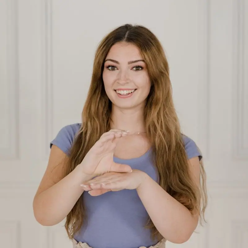
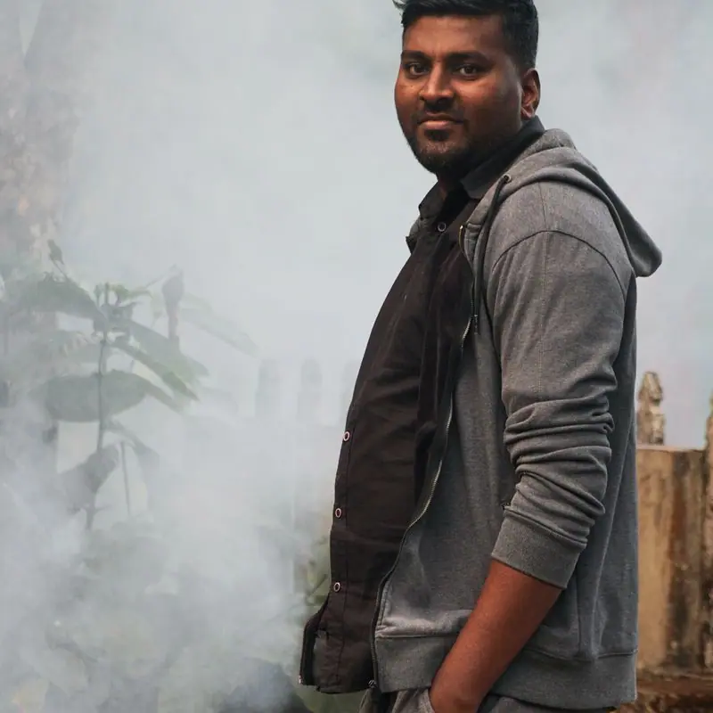
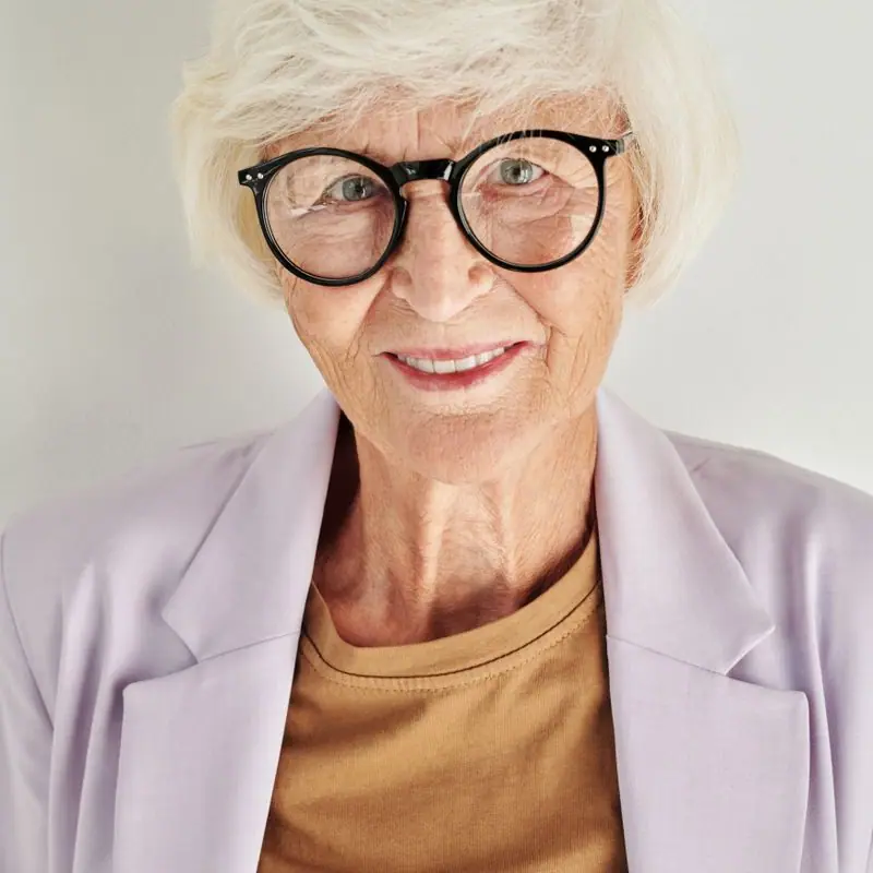
Photos show disabled people doing ordinary things together: signing across a table, playing wheelchair basketball, talking in a group. We avoided inspiration-style imagery, close-ups of mobility aids without people, and any photo where a disabled person is only being helped.
Body text is 19px with 1.6 line height and a 62-character measure. Every pairing meets WCAG AA and the main text pairings meet AAA. The template respects reduced-motion settings, gives every form field a visible label, and the plain-words summary on the home page follows the Easy Read habit of one idea per sentence.
Every text pairing is checked against WCAG 2.2 in both themes.
| Pairing | Sample | Ratio | WCAG |
|---|---|---|---|
| Body text on page | Aa | 16.29:1 | AAA |
| Body text on cards | Aa | 17.85:1 | AAA |
| Secondary text | Aa | 5.94:1 | AA |
| Links | Aa | 6.88:1 | AA |
| Button text | Aa | 7.54:1 | AAA |
| Accent label text | Aa | 9.62:1 | AAA |
| Text on dark bands | Aa | 16.29:1 | AAA |
| Muted text on dark bands | Aa | 8.43:1 | AAA |
| Text on brand bands | Aa | 7.54:1 | AAA |
| Muted text on brand bands | Aa | 5.03:1 | AA |
| Pairing | Sample | Ratio | WCAG |
|---|---|---|---|
| Body text on page | Aa | 16.1:1 | AAA |
| Body text on cards | Aa | 14.44:1 | AAA |
| Secondary text | Aa | 7.1:1 | AAA |
| Links | Aa | 10.01:1 | AAA |
| Button text | Aa | 10.36:1 | AAA |
| Accent label text | Aa | 12.5:1 | AAA |
| Text on dark bands | Aa | 17.11:1 | AAA |
| Muted text on dark bands | Aa | 8.6:1 | AAA |
| Text on brand bands | Aa | 10.36:1 | AAA |
| Muted text on brand bands | Aa | 5.98:1 | AA |
Designed by Greater Purpose Web. Names, people and events are sample content.