
Nov10
Estate Planning Briefing
5:30 PM · Fund Office
A conversation with attorneys on charitable estate planning.
Dinners, briefings and receptions for donors, grantees and friends of the Fund.

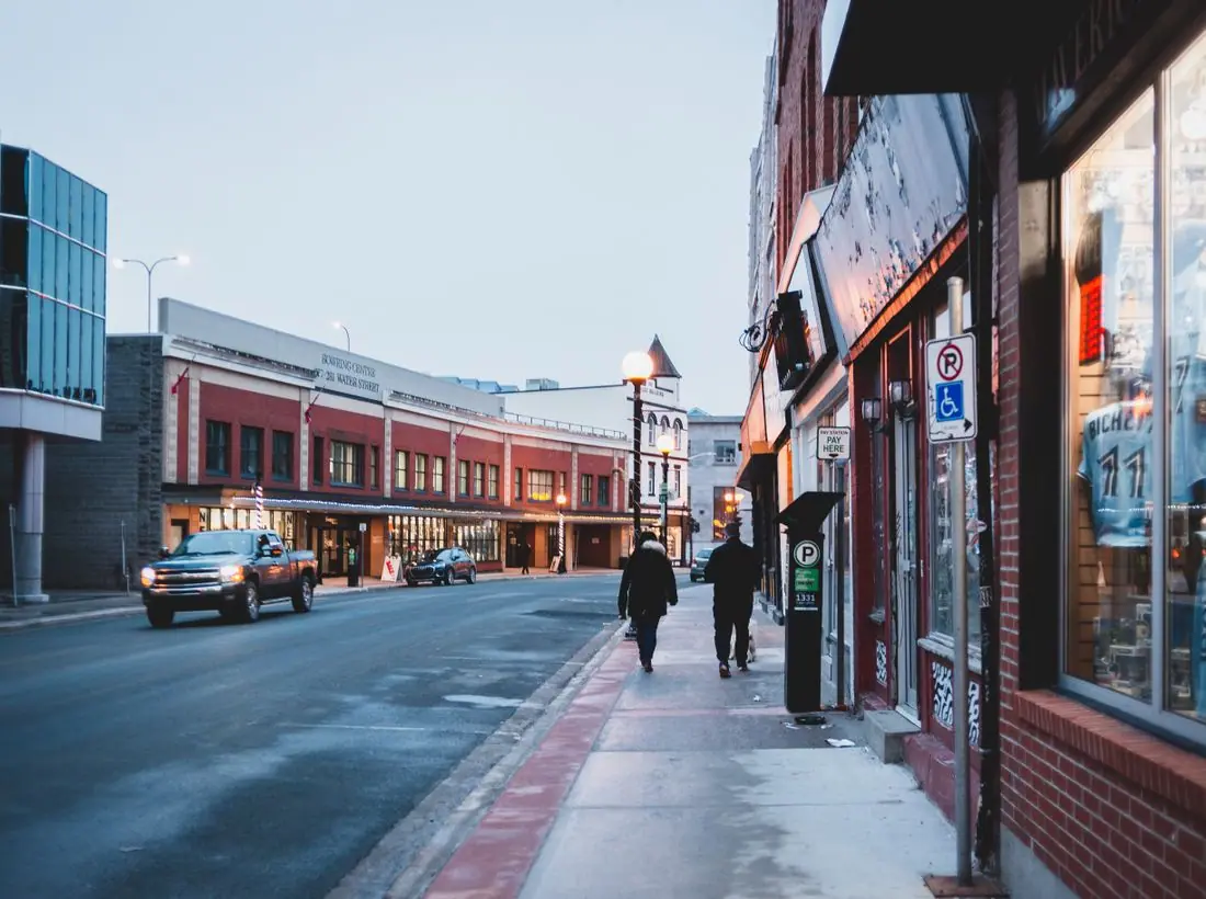
6:30 PM · The Gibbes Hall, 78 Meeting St
An evening celebrating thirty-eight years of giving, with remarks from our founding families and this year's grantees. Black tie optional.
A conversation with attorneys on charitable estate planning.

Meet grantees and learn how gifts are put to work.

An afternoon with friends of the Fund, with carols and cider.

Local nonprofits share lessons and challenges.
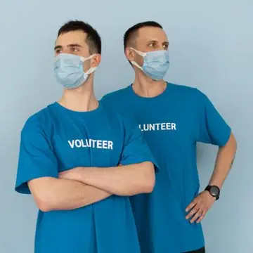
A practical guide to recommending grants with confidence.
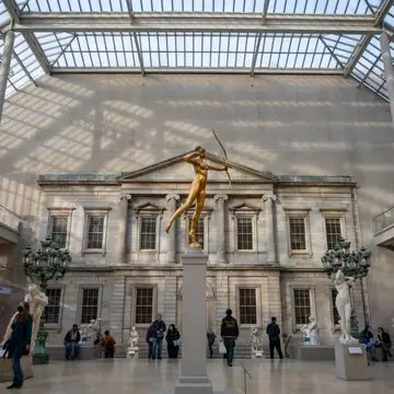
Honoring members who have planned future gifts.
Design notes
The Legacy Fund is a grantmaking foundation site with a big serif headline, a faint grid and a warm neutral palette with deep green. It looks like a private bank's letterhead and gives donors a sense of permanence.
Crimson Pro at semibold sets the headline at about 100 pixels. It is a traditional book serif with a sharp, readable shape. Inter handles body text and the interface. The serif gives weight and the sans keeps the details clean.
The page is warm white (#FBF9F4) with near-black text (#1C1B19), deep green (#0F3D3E) for buttons and brass (#B08D57) as an accent. The dark theme uses a muted teal (#6FB3B0) and lighter brass (#D2B27A). Deep green and brass are traditional colours for wealth and permanence.
A centred logo and name sit above six links, with a green Give button. A faint graph-paper grid is behind the hero. A stats band reports $62M in assets, 1,100 grants and 38 years of giving. Outlined cards and thin rules divide the sections.
The hero is centred and type-only. 'Generosity, built to last.' appears on two lines, followed by a sentence about endowments, donor-advised funds and grants. A chip at the bottom left shows the next donor services session.
'Open a fund' is a solid green button and 'Grant guidelines' is outlined. The first speaks to donors, and the second to applicants. The wording is exact, which suits an audience that reads carefully.
The hero has no photograph, because a foundation's credibility comes from numbers and history more than from pictures. Mountain landscapes appear lower, and a real foundation should add portraits of donors and grantees with their stories.
Near-black on warm white is about 16.4 to 1, and white on deep green about 11.9 to 1. The grid is faint and sits behind the paragraph, so a real build might fade it near text. Contrast stays above 15 to 1 in dark mode.
Each text pairing is checked against WCAG 2.2 in both themes. Ratios are computed from the exact theme colours.
| Pairing | Sample | Ratio | WCAG |
|---|---|---|---|
| Body text on page | Aa | 16.36:1 | AAA |
| Body text on cards | Aa | 17.21:1 | AAA |
| Secondary text | Aa | 6.16:1 | AA |
| Secondary text on tinted bands | Aa | 4.80:1 | AA |
| Links and labels | Aa | 11.36:1 | AAA |
| Button text | Aa | 11.95:1 | AAA |
| Accent button text | Aa | 6.37:1 | AA |
| Footer text | Aa | 16.36:1 | AAA |
| Pairing | Sample | Ratio | WCAG |
|---|---|---|---|
| Body text on page | Aa | 15.36:1 | AAA |
| Body text on cards | Aa | 13.79:1 | AAA |
| Secondary text | Aa | 7.93:1 | AAA |
| Secondary text on tinted bands | Aa | 6.29:1 | AA |
| Links and labels | Aa | 7.63:1 | AAA |
| Button text | Aa | 8.20:1 | AAA |
| Accent button text | Aa | 9.74:1 | AAA |
| Footer text | Aa | 15.36:1 | AAA |
Designed by Greater Purpose Web. Names, people, photos and events are sample content.