 SeriesStill Waters
 SeriesNight Watch
 SeriesEmber Sessions
Nov08
Neighbor Supper
5:00 PM · The Warehouse
A free meal before the evening gathering.
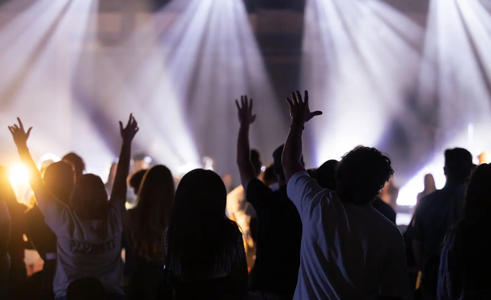
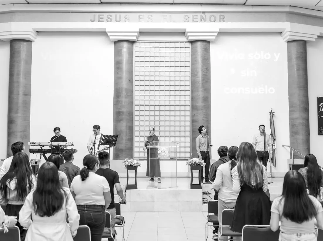
Evening gathering Sundays at 6. Acoustic songs, short teaching and prayer. Come as the day cools down.
Ember is for people who find mornings loud. We meet at sundown, sit close and sing softly. The teaching is short, the prayer is long and the coffee is strong. If your faith feels like a low flame, you are in the right room.
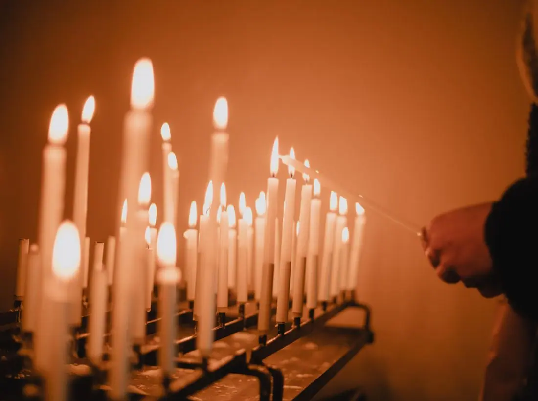
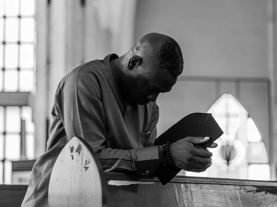
Every Thursday at eight we turn the lights low and pray together. No agenda, no script, just an hour of quiet with others who are listening too.
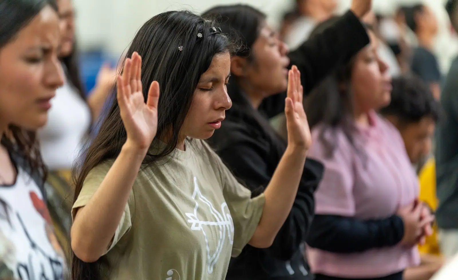
Be still, and know that I am God.Psalm 46:10 (WEB)
A free meal before the evening gathering.
A Thursday of thanks and quiet.
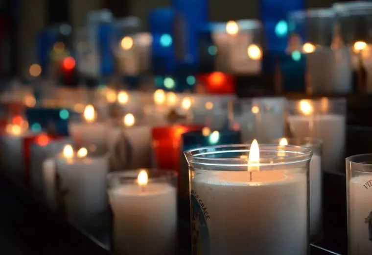
We light the first candle of the season.
Your gifts fund Sunday evenings, prayer nights and the recordings we share.
Design notes
Ember is an evening-service church site set in dark photography and warm amber, with a sans-serif headline and monospace-style labels. It is aimed at people who do not do mornings, and it looks like the room feels at 6 pm.
Space Grotesk is used for headings, body and labels. It has quirky geometric shapes that look technical and modern, and the single family keeps the page tidy. Headlines are bold and large. Small caps-style labels with wide spacing add a monospace-like texture.
The theme opens in dark. Black-brown (#14100E) is the base with cream text (#F6EBDD), glowing orange (#FF7A3D) as the brand colour and gold (#F2C14E) as the accent. The light theme uses a cream page with burnt orange (#B8420F). The colours come from a campfire, which fits the name and the evening time slot.
A simple top bar with the logo, six links and an orange Give button. Below the hero a four-cell strip lists When, Where, Messages and First time. Cards are tinted rather than outlined. The layout is plain so the dark photograph carries the atmosphere.
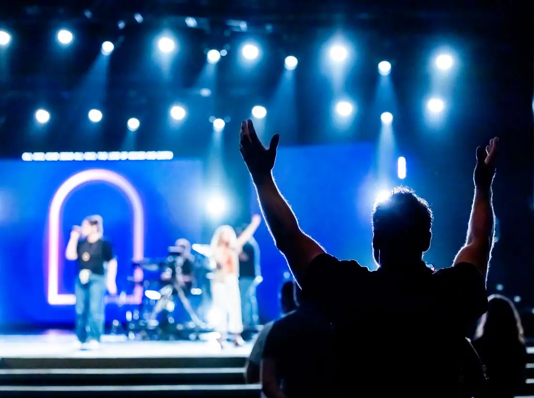
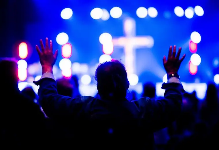
A full-bleed photo of a seated audience facing a stage lit with bokeh lights fills the first screen. 'Worship by firelight.' is set on two lines at left. The dark overlay lets the white headline stand clear of the faces in the crowd.
'Come Sunday evening' is the orange primary button, and 'Listen online' sits next to it as an outline. The label states the unusual time, which is the whole selling point. A chip counts down to Prayer Night.
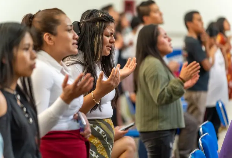
The picture is a real-looking audience in low light, which shows the size and mood of the gathering. A candid evening photo works for this audience better than a staged one. A real church should use its own room and avoid close identifiable faces unless people have agreed.
Cream text on near-black measures about 16 to 1. Orange with white text on the light-theme button is about 5.5 to 1. Small labels are uppercase with wide tracking, and nothing is set below a comfortable reading size over the photo.
Each text pairing is checked against WCAG 2.2 in both themes. Ratios are computed from the exact theme colours.
| Pairing | Sample | Ratio | WCAG |
|---|---|---|---|
| Body text on page | Aa | 16.07:1 | AAA |
| Body text on cards | Aa | 14.73:1 | AAA |
| Secondary text | Aa | 8.17:1 | AAA |
| Secondary text on tinted bands | Aa | 6.68:1 | AA |
| Links and labels | Aa | 7.30:1 | AAA |
| Button text | Aa | 7.59:1 | AAA |
| Accent button text | Aa | 11.73:1 | AAA |
| Footer text | Aa | 16.07:1 | AAA |
| Pairing | Sample | Ratio | WCAG |
|---|---|---|---|
| Body text on page | Aa | 15.46:1 | AAA |
| Body text on cards | Aa | 16.73:1 | AAA |
| Secondary text | Aa | 5.95:1 | AA |
| Secondary text on tinted bands | Aa | 4.88:1 | AA |
| Links and labels | Aa | 5.85:1 | AA |
| Button text | Aa | 5.49:1 | AA |
| Accent button text | Aa | 5.07:1 | AA |
| Footer text | Aa | 15.46:1 | AAA |
Designed by Greater Purpose Web. Names, people, photos and events are sample content.