Why Cipher Church looks the way it does
Cipher is built for a hip-hop church in North Philadelphia whose people find it through a friend, a flyer or a clip from Friday night. The site has to sound like the room: loud type, short sentences, and the Sunday time on every screen.
- Built for
- Young adults and teens from North Philly and Kensington, many with no church background, plus the grandparents who come with them.
- Navigation
- Corner controls. Name in one corner, menu in the opposite corner, primary action in a third. The page itself has no header bar.
- Pages
- Home, Pull Up, Friday Cypher, The Booth, Messages, Crew
- Hero
- A tall photograph on one side; on the other, the headline, a short intro and three 'next step' rows with arrows instead of a pair of buttons. Variants: a = photo bleeds off the left edge, rows show when each step happens; b = photo bleeds off the right edge, rows are numbered steps set large; A big headline with a slow, pausable line of words running across the page (real needs, or things people say), plus one photograph; the line stands still for visitors who prefer reduced motion. Variants: a = headline beside a portrait photo, with the moving line underneath; b = headline first, then the moving line set huge, then a wide photo beside the intro; c = headline and intro side by side over a full-width photo with the moving line laid along its lower edge
Typography
Bungee was designed for vertical signage and borrows from the hand-lettered awnings on Germantown Avenue, so the headlines feel like they were painted on the block rather than typeset in an office. Archivo carries the reading text because it is wide and plain enough to sit under Bungee without a fight. Space Mono handles times and labels like the credits on a record sleeve.
Color
The orange is safety-cone and spray-paint orange; the blue is the SEPTA blue of the Broad Street Line signs. The dark theme leads because Cipher's best-known moments happen after dark, and the light theme swaps to a cool concrete gray rather than cream.
Layout and navigation
The corner navigation keeps the first screen almost empty of chrome: a logo, a menu and one button that always says when Sunday is. Six pages, each named the way people at Cipher actually talk about them: Pull Up, Friday Cypher, The Booth.
The hero
The headline is followed by a huge running line of real bars from the last Friday Cypher. It tells a newcomer in two seconds that this is a church where regular people get the mic. It stops moving for anyone who has reduced motion switched on, and it can be paused.
Calls to action
The main button is 'Pull up Sunday at 4' because the time is the one thing people forget. The other actions are specific to the room: get on the Friday list, book a Booth session, back the Booth.
Photography
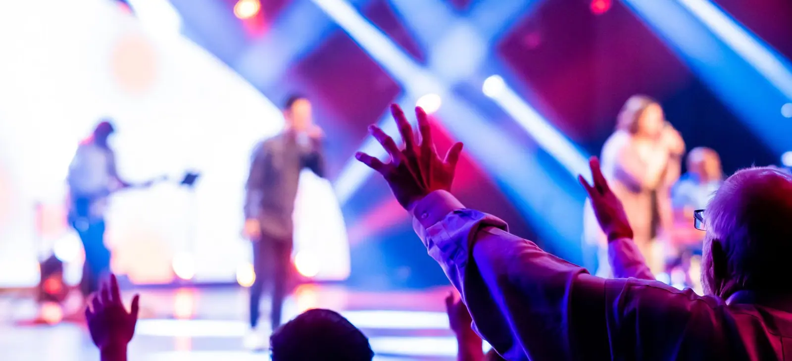
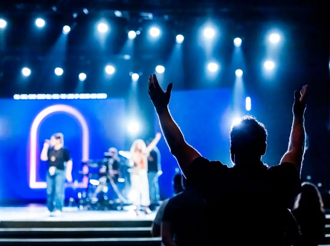
Dancers, neon, worship nights and a real recording booth, with the people of the neighborhood in front of the lens. Portraits are of the crew themselves and nobody is shown looking needy.
Accessibility
Bungee is used only for headings; every paragraph is in Archivo at 17px with generous line height. Moving type pauses on hover and focus, the cypher sign-up works with a keyboard, and orange on dark meets AA contrast.
Type system
- DisplayBungeeBungee was drawn for vertical street signage and reads like the hand-cut letters on corner-store awnings and block-party flyers.
- TextArchivoA sturdy grotesque with wide shoulders that stands up next to Bungee without competing with it.
- AccentSpace MonoMonospaced labels read like tracklists and liner notes.
Colour and contrast
Every text pairing is checked against WCAG 2.2 in both themes.
Dark theme
| Pairing | Sample | Ratio | WCAG |
|---|
| Body text on page | Aa | 16.03:1 | AAA |
| Body text on cards | Aa | 14.51:1 | AAA |
| Secondary text | Aa | 7.03:1 | AAA |
| Links | Aa | 7.23:1 | AAA |
| Button text | Aa | 7.29:1 | AAA |
| Accent label text | Aa | 10.4:1 | AAA |
| Text on dark bands | Aa | 16.79:1 | AAA |
| Muted text on dark bands | Aa | 8.38:1 | AAA |
| Text on brand bands | Aa | 7.29:1 | AAA |
| Muted text on brand bands | Aa | 4.85:1 | AA |
Light theme
| Pairing | Sample | Ratio | WCAG |
|---|
| Body text on page | Aa | 14.66:1 | AAA |
| Body text on cards | Aa | 17.12:1 | AAA |
| Secondary text | Aa | 5.46:1 | AA |
| Links | Aa | 5.58:1 | AA |
| Button text | Aa | 5.13:1 | AA |
| Accent label text | Aa | 7.06:1 | AAA |
| Text on dark bands | Aa | 14.66:1 | AAA |
| Muted text on dark bands | Aa | 7.59:1 | AAA |
| Text on brand bands | Aa | 5.13:1 | AA |
| Muted text on brand bands | Aa | 4.62:1 | AA |