Why Anchor looks the way it does
Anchor is a recovery ministry site that uses grey-green, white space and a condensed light serif headline. It is quiet on purpose, because people in recovery do not want a loud website.
- Built for
- People in recovery, their families, and pastors or counsellors who refer them to a confidential group.
- Navigation
- Floating rounded pill that sits over the hero photo. On phones, a bottom tab bar plus a quick-links launcher.
- Pages
- Home, About, Visit, Groups, Stories, Events, Give, Contact
- Hero
- Centred headline over a three-photo collage.
Typography
Instrument Serif is a narrow, light serif with a refined look, set at about 100 pixels in the hero. Inter provides body text and the interface. The thin headline feels calm and the neutral body keeps information plain.
Colour
The page is soft grey (#F7F8F6) with deep green-grey text (#1E2A2A), a muted sage teal (#4E7C78) as the brand colour and a sand (#C9B79C) accent. The dark theme is a deep green-black with a pale sage (#8CC2BC). The restrained palette feels peaceful and avoids the bright colours that can feel like marketing.
Layout and navigation
A floating white pill nav carries the logo, six links and a sage Give button. Faint curved lines in the hero background suggest ripples. Content below is centred with generous gaps, then groups listed in rounded cards. The reader is never rushed.
The hero
The hero is centred. 'Healing happens in community.' is on two lines in the light serif, with a short promise of confidential care. A chip at the lower left shows when family support meets next. The first photo begins below the fold.
Calls to action
'Find a group' is a sage pill and 'Talk to someone' is outlined beside it. The second option is for the person who is not ready to attend, which matters for a first contact. The tone is an invitation and avoids urgency.
Photography
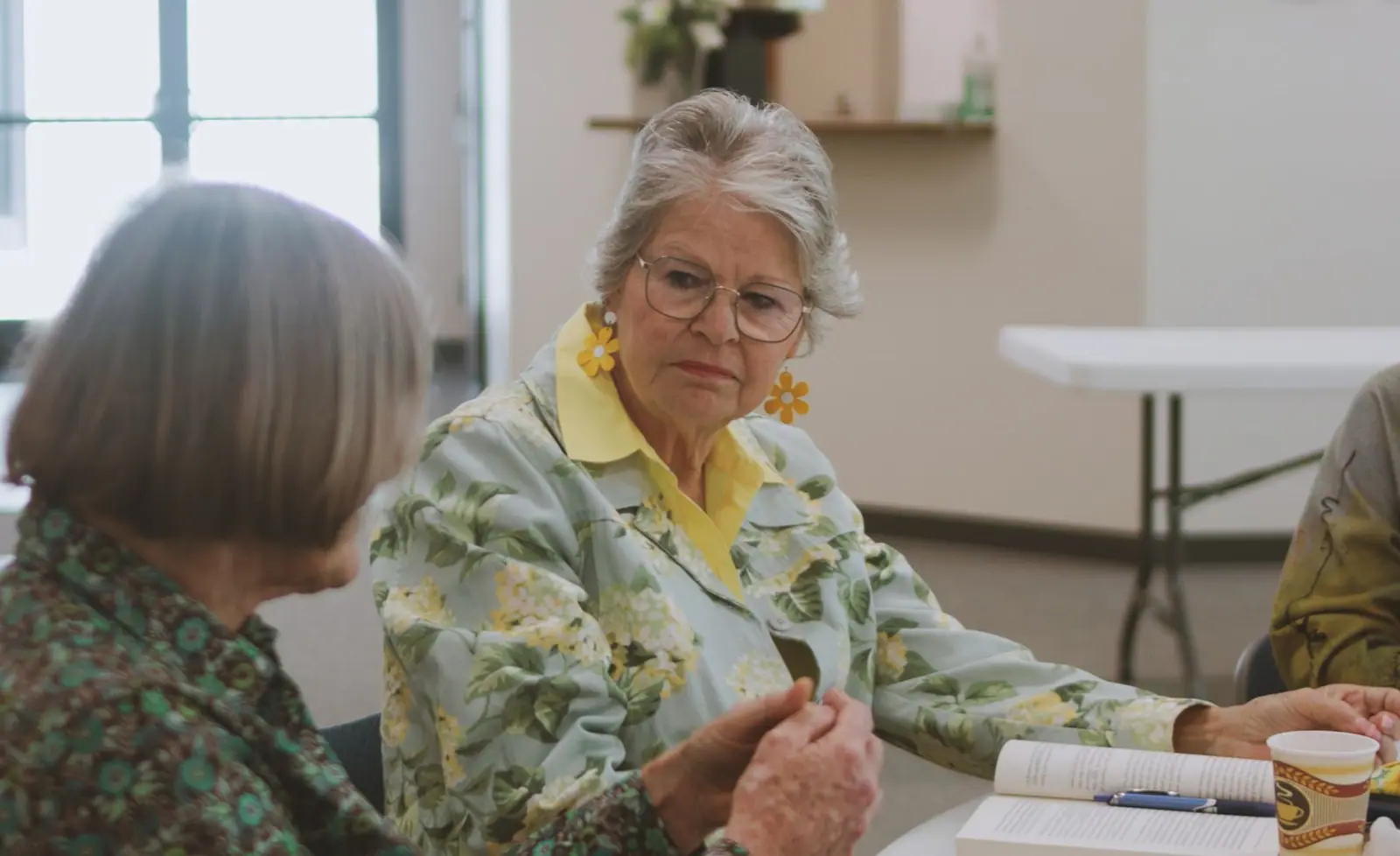
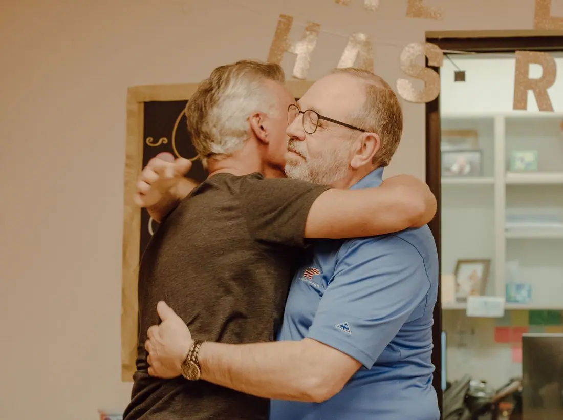
The photos begin below the fold in cool teal water tones, and the template avoids close portraits of group members. A real site should keep people in recovery out of its pictures, and use environment shots and approved portraits of leaders.
Accessibility
Dark text on soft grey is about 13.9 to 1 and white on the sage button about 4.7 to 1. The thin serif headline is large enough to stay legible. The background lines are very faint and do not interfere with reading.
Type system
- DisplayInstrument SerifInstrument Serif is light and gentle, with an elegance that helps a hard subject feel approachable.
- TextInterInter is neutral and legible, so meeting times and contact details never compete with the headline.
Colour and contrast
Each text pairing is checked against WCAG 2.2 in both themes. Ratios are computed from the exact theme colours.