Nonprofit Community Makerspace Website Template
Workbench Makerspace
A site for a member-run workshop that wants people who have never held a router to walk in on a Thursday night. It reads like a well-labeled tool room: every page has a contents column, every time is exact, and the photography shows hands at work rather than finished objects.
Starting at $500
Start with this design and I’ll personalize it with your branding, photos and words. Keep your current domain or get a new one.
Changes you make in the editor stay in your own browser, so try anything.
- Built for
- Olneyville and West End neighbors, RISD and trade-school students, retired machinists and jewelers, and anyone with a broken lamp.
- Navigation
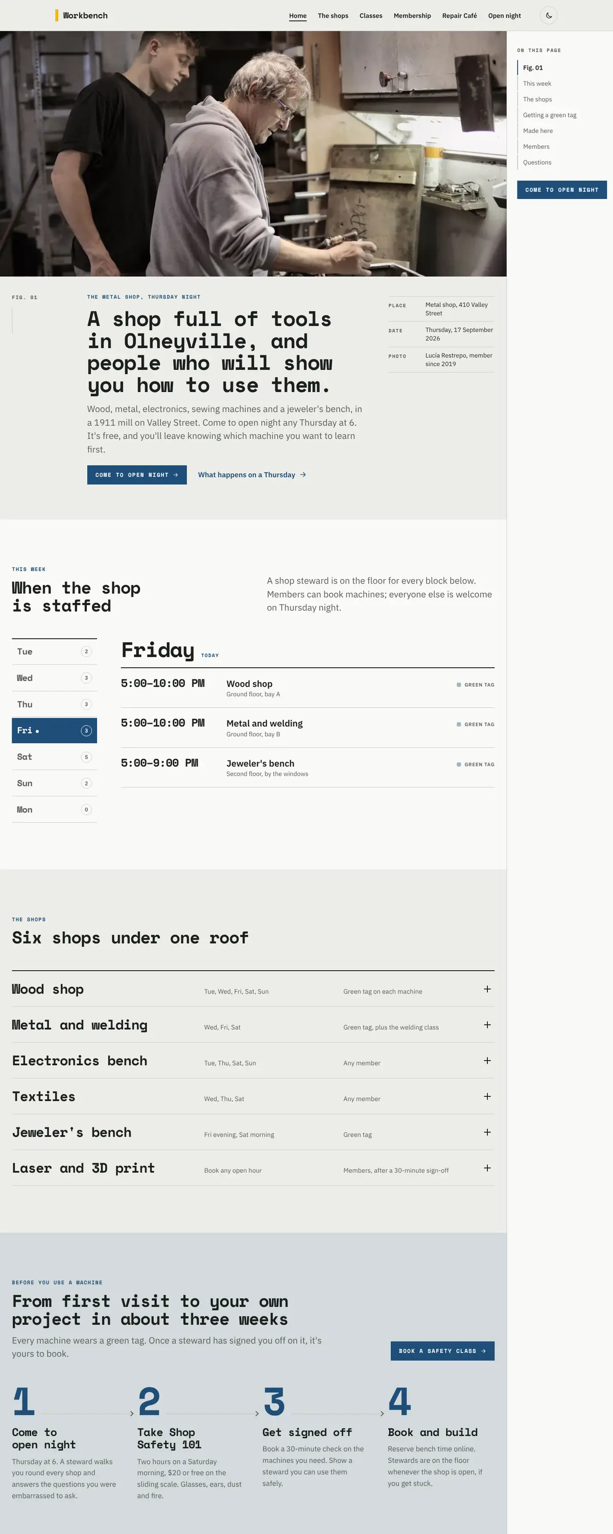
- Contents column. A right-hand contents list tracks where you are on long pages, the way a well-made book or report does.
Names, photos, times and stories in this template are sample content. Your version uses your own words, photos and branding.
Why it looks this way.
- Typography
Space Mono sets the headings. Its fixed-width letters have the look of a stamped part number or a label-maker strip on a drawer of drill bits, which is the visual language of every good shop. IBM Plex Sans carries the reading text, because it comes from the same engineering family and stays readable through long safety notes.
- Space Mono headlines
- IBM Plex Sans body text
- Space Mono labels
- Color
Blueprint blue and safety-line yellow, the two colors painted on every workshop floor. The light ground has a faint green cast, like pegboard under fluorescent tubes. In the dark theme the blue lifts to the color of a welding flash on a night shift and the yellow stays as the only warm note.
- Page
#ECEDE8 - Cards
#F9F9F6 - Text
#1C1F1D - Brand
#1F4E79 - Accent
#F2B705
- Page
- Layout
The contents column on the right works like the index card pinned to each machine: it shows where you are on long pages such as the shop list and the safety steps. The main pages sit in a slim bar on top, so the column can do its one job.
Pages: Home, The shops, Classes, Membership, Repair Café, Open night
- Hero
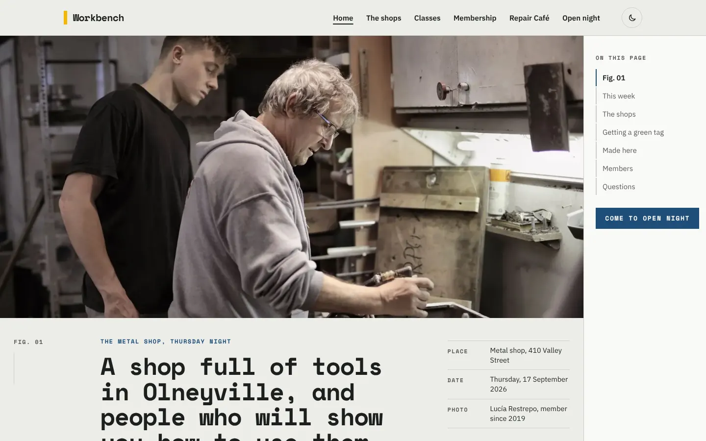
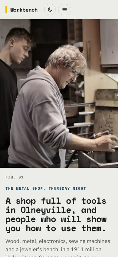
The home page opens on a photograph with no words on it: an older machinist showing a younger man how to set a cut. The headline sits underneath like a catalog caption, with the place, date and the member who took the picture. The point of the place is that someone shows you, so the picture shows it.
- Calls to action
The main action is 'Come to open night', because the Thursday tour is free and nobody can use the tools before it. After that come 'Book a safety class' and 'Join from $15 a month', in the order people actually do them. The Repair Café gets its own plain verb: bring something broken.
- Photography
Benches, aprons, safety glasses and work in progress: a jeweler's bench in morning light, teenagers soldering a robot, a glass furnace. People of every age and background, mostly mid-task and not posing.
- Accessibility
All text passes WCAG AA on both themes, and the yellow is never used for text on the light ground. Shop hours are a real table, the contents column is a labeled list, and the open-night countdown is written out in words.
Like where this is going?
Starting at $500
Start with this design
Your colors, logo, photos and words, on a layout that already works.
Start with This DesignStarting at $1,500
Build something custom
A new design shaped around your organization from the first sketch.
Start a Custom WebsiteBoth include keeping your current domain or getting a new one, plus simple editing tools for your team. Monthly hosting and care plans are listed on Services & Pricing.