
Ministry HBCU Campus Ministry Website Template
Upper Room
Upper Room is an independent campus ministry for students at a historically Black university in Durham. Most of what it does happens on three nights and one Sunday morning, so the site is built around those times and the practical things a freshman without a car needs: a ride to church, a study in their own hall and someone to talk to.
Starting at $500
Start with this design and I’ll personalize it with your branding, photos and words. Keep your current domain or get a new one.
Changes you make in the editor stay in your own browser, so try anything.
- Built for
- First-years and transfer students looking for a church home away from home, upperclassmen who lead the studies, worried parents, and alumni who come back every Homecoming.
- Navigation
- Tabbed app bar. Pages behave like tabs in an app: a sticky segmented bar under a compact header.
Names, photos, times and stories in this template are sample content. Your version uses your own words, photos and branding.
Why it looks this way.
- Typography
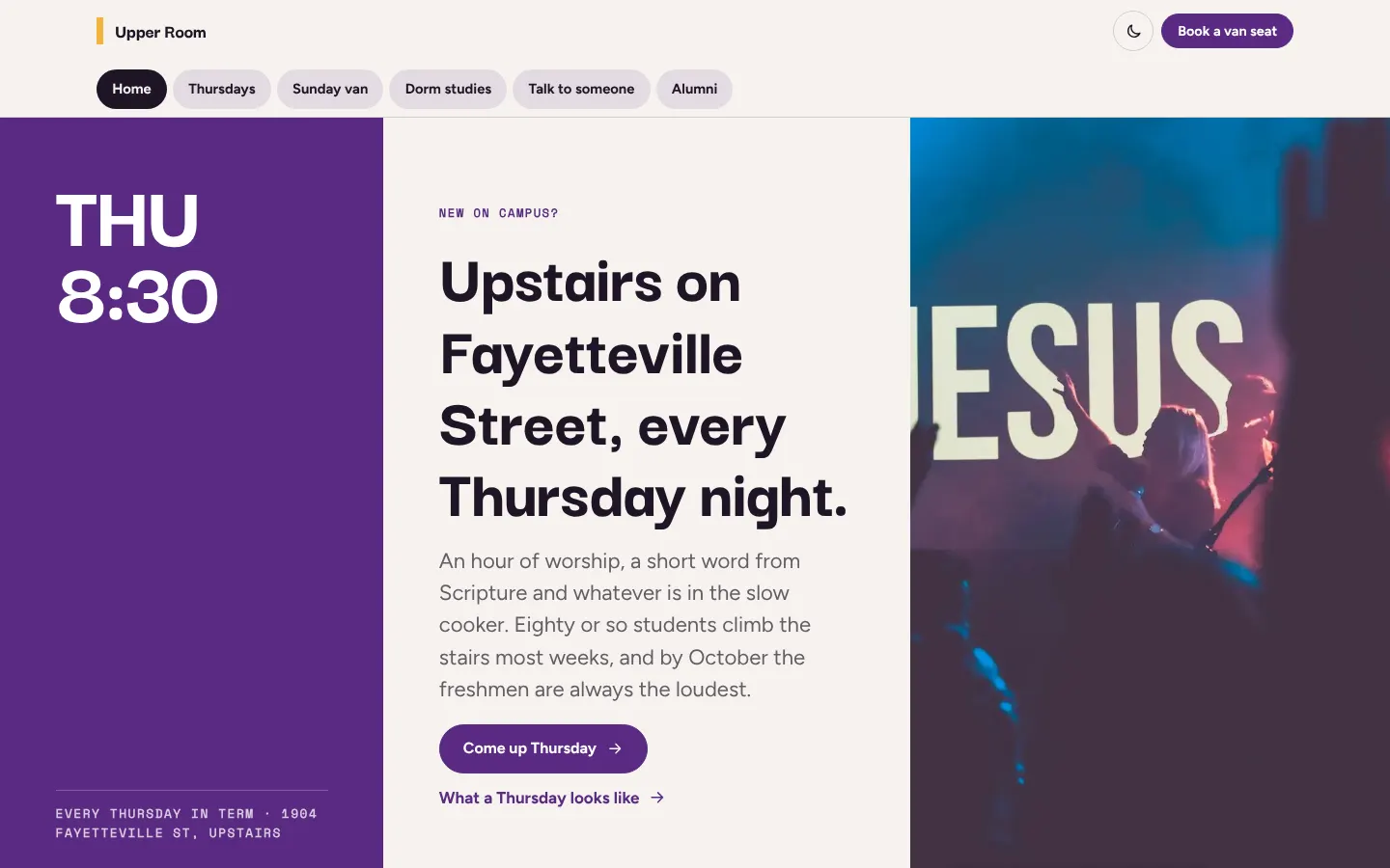
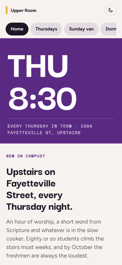
Darker Grotesque at 800 is short, wide-shouldered and loud, the kind of lettering you see on a homecoming flyer taped to a dorm door. Figtree keeps the body copy relaxed and very legible on a cracked phone screen. Space Mono sets the times, rooms and van stops so they look like a class schedule, which is how students already scan for when things happen.
- Darker Grotesque headlines
- Figtree body text
- Space Mono labels
- Color
The violet comes from choir robes and the stoles at Sunday service, and the marigold from the lamp in the upstairs front window that students use as a landmark at night. The neutrals are warm with a slight rose bias rather than gray. In dark mode the violet lifts to a soft lilac so it stays readable on a near-black plum, and the marigold is kept for small signals.
- Page
#F7F3EF - Cards
#FFFFFF - Text
#1F1526 - Brand
#5A2A82 - Accent
#F2B33D
- Page
- Layout
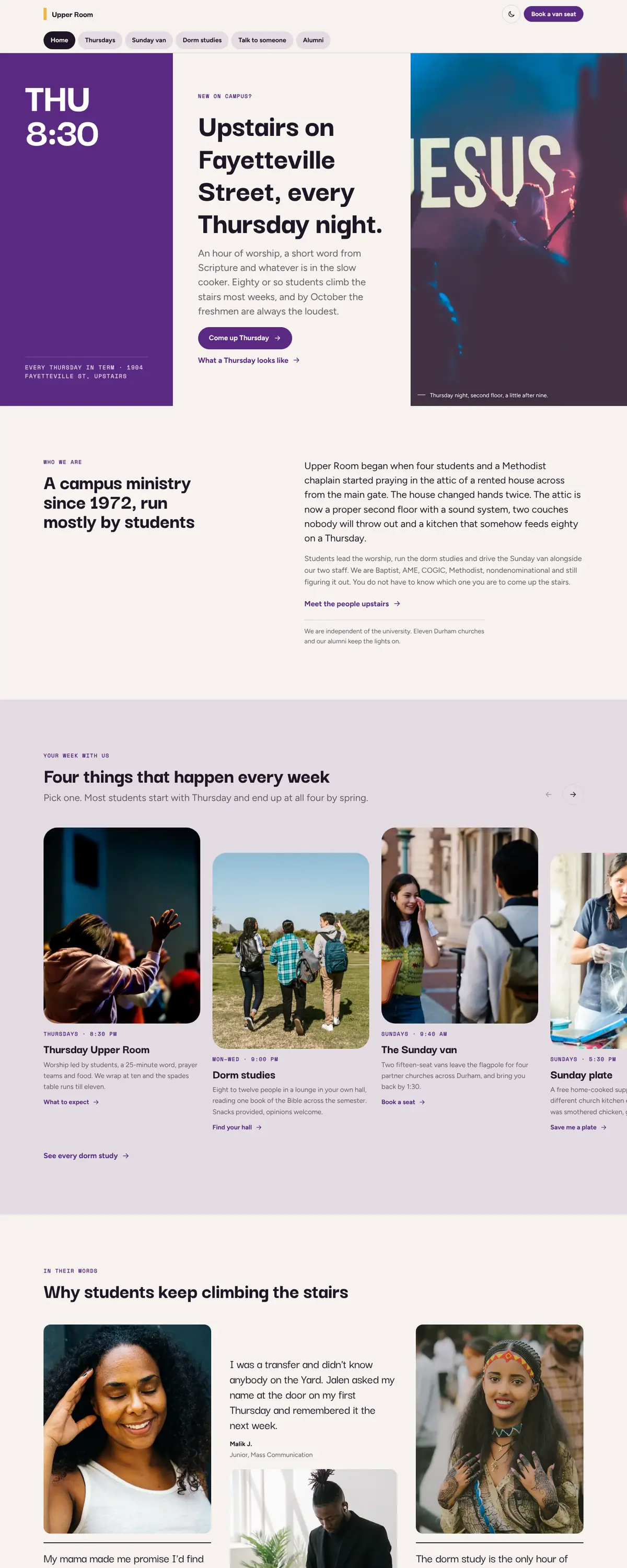
The tabbed app bar behaves like the apps students live in: six tabs, always in reach, with the one practical action (booking a van seat) pinned beside them. Pages are short and each one answers one question, so nobody has to scroll past history to find the Thursday address.
Pages: Home, Thursdays, Sunday van, Dorm studies, Talk to someone, Alumni
- Hero
The opening screen is a block of violet carrying THU 8:30 in huge type, because the time is the single fact a new student needs. The headline and a short, honest description sit in the middle column, and a photo of students praying in the front room bleeds off the right edge, so the first thing you see is people your age in a real living room.
- Calls to action
Every button says exactly what will happen: Come up Thursday, Book a van seat, Join a dorm study, Text a chaplain. The giving button is aimed at alumni and names a real, small thing (finals-week breakfast) instead of a general appeal.
- Photography
Young Black students in living rooms, libraries and choir lofts, never stock crowds under stage lights. Portraits of student leaders are warm and close, and the choir photographs carry the gospel tradition many students grew up in.
- Accessibility
Text contrast meets WCAG AA in both themes, every time is written out in full, and the van form works with a keyboard and screen reader. The Talk to someone page puts the 988 crisis line and campus counseling hours above the fold, because some visitors arrive at 2 AM.
Like where this is going?
Starting at $500
Start with this design
Your colors, logo, photos and words, on a layout that already works.
Start with This DesignStarting at $1,500
Build something custom
A new design shaped around your organization from the first sketch.
Start a Custom WebsiteBoth include keeping your current domain or getting a new one, plus simple editing tools for your team. Monthly hosting and care plans are listed on Services & Pricing.