
Church Heritage Cathedral Church Website Template
Steeple & Stone
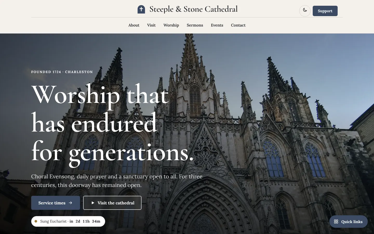
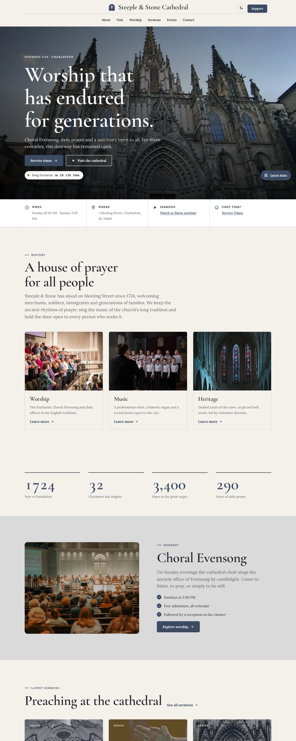
Steeple and Stone is a heritage cathedral site with a centred masthead, thin rules and a large Cormorant Garamond headline over a photo of stained glass. It is deliberately restrained, and it uses a slate blue and antique gold palette to suit a historic parish.
Starting at $500
Start with this design and I’ll personalize it with your branding, photos and words. Keep your current domain or get a new one.
Changes you make in the editor stay in your own browser, so try anything.
- Built for
- Members of a long-established liturgical congregation, visitors, tourists drawn by the building's history, and donors who value tradition.
- Navigation
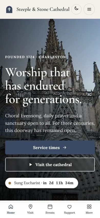
- Centred logo with the menu on a rule below, editorial style. On phones, a bottom tab bar plus a quick-links launcher.
Names, photos, times and stories in this template are sample content. Your version uses your own words, photos and branding.
Why it looks this way.
- Typography
Cormorant Garamond at semibold sets the headline at about 100 pixels. It has delicate, high-contrast forms taken from Renaissance printing, and it suits a church founded in 1724. Lora handles body text, a sturdy serif with warmth that stays readable at paragraph length. Both are serifs, so the whole site reads as a book rather than a web app.
- Cormorant Garamond headlines
- Lora body text
- Color
The page is a stone grey-beige (#F4F1EC) with charcoal text (#23252B), slate blue (#3B4A63) for buttons and old gold (#9C7A3C) for fine details. The palette looks like limestone, ink and gilding. The dark theme uses a soft periwinkle (#9DB0CF) and a lighter gold (#D4B06A).
- Page
#F4F1EC - Cards
#FFFFFF - Text
#23252B - Brand
#3B4A63 - Accent
#9C7A3C
- Page
- Layout
A centred logo sits above a single row of six links, divided from the content by a thin rule. The Support button is tucked in the top right, a quiet word for a cathedral. Thin hairlines separate sections and cards are outlined rather than filled, a traditional printed-programme look.
Pages: Home, About, Visit, Worship, Sermons, Events, Support, Contact
- Hero
A full-width photo of stained-glass windows lies under a dark overlay. The three-line headline 'Worship that has endured for generations.' is set large and left-aligned over it. The date of founding appears in the eyebrow, which tells visitors immediately that this church has history.
- Calls to action
'Service times' is the slate-blue primary button and 'Visit the cathedral' is outlined. Both are labels a visitor would use in conversation. The header button says Support, which is more fitting for a cathedral than the more urgent Give. A small chip below the hero counts down to the next sung Eucharist.
- Photography
The photograph is of lit lanterns and tall stained-glass lancets, which shows craftsmanship and age. Because the same image can feel generic, a real cathedral should replace it with its own nave or tower, and add architectural detail shots for the visitor pages.
- Accessibility
The text on stone measures about 13.6 to 1, and the slate-blue button carries white text at about 9 to 1. A dark theme is available from the header. The thin hairlines are decorative only, and the information they separate is also separated by spacing and headings.
Like where this is going?
Starting at $500
Start with this design
Your colors, logo, photos and words, on a layout that already works.
Start with This DesignStarting at $1,500
Build something custom
A new design shaped around your organization from the first sketch.
Start a Custom WebsiteBoth include keeping your current domain or getting a new one, plus simple editing tools for your team. Monthly hosting and care plans are listed on Services & Pricing.