
Church Editorial, Sermon-led Church Website Template
Sanctuary Journal
Sanctuary Journal is a church site that behaves like a magazine, with an issue number, a centred wordmark, and a headline taken from the week's sermon. It puts teaching ahead of programmes.
Starting at $500
Start with this design and I’ll personalize it with your branding, photos and words. Keep your current domain or get a new one.
Changes you make in the editor stay in your own browser, so try anything.
- Built for
- Thoughtful readers, seekers and lapsed churchgoers who prefer to read or listen before they decide to visit.
- Navigation
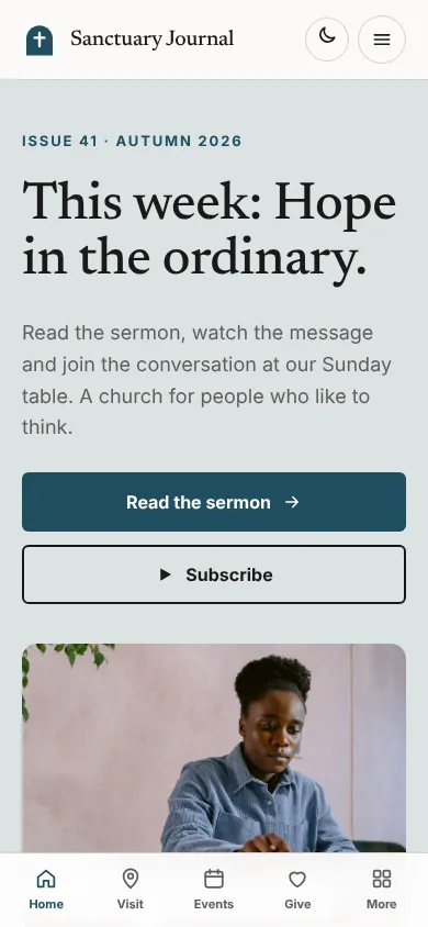
- Centred logo with the menu on a rule below, editorial style. On phones, a bottom tab bar plus a quick-links launcher.
Names, photos, times and stories in this template are sample content. Your version uses your own words, photos and branding.
Why it looks this way.
- Typography
Newsreader at medium weight sets headlines. It is an editorial serif designed for long reading on screens, so a sermon title looks like a magazine feature. Inter provides the body copy and navigation. The two faces keep the page orderly and let the headline carry the voice.
- Newsreader headlines
- Inter body text
- Color
The page is warm white (#FBFAF7) with near-black text (#1A1A1A). Deep teal (#1F4E5F) is the brand colour and a terracotta (#C8553D) marks small highlights, such as the live status dot. The hero panel is a pale grey-blue. Teal and clay are calm, bookish colours that match a reading-led site.
- Page
#FBFAF7 - Cards
#FFFFFF - Text
#1A1A1A - Brand
#1F4E5F - Accent
#C8553D
- Page
- Layout
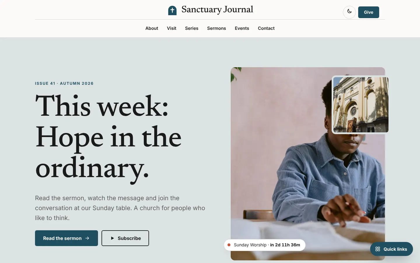
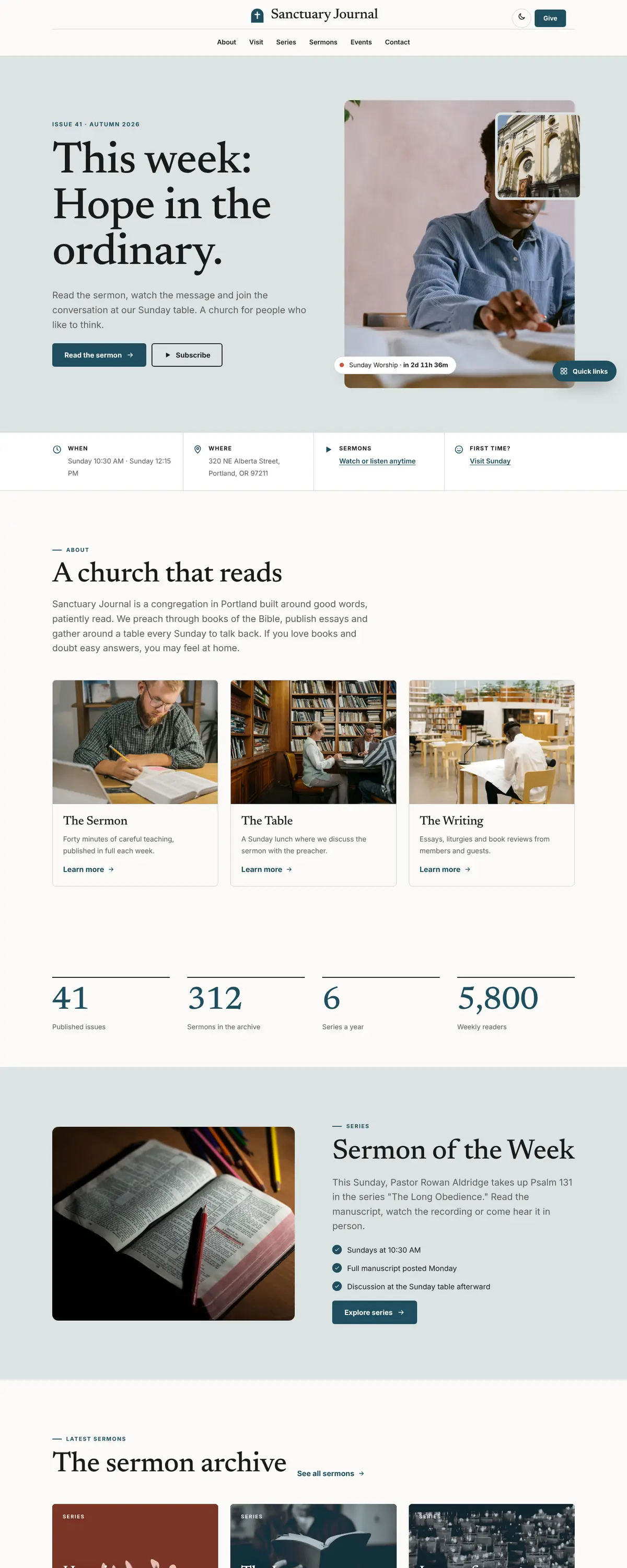
A centred wordmark sits above a single row of navigation links, a masthead arrangement taken from print. Give is a small button in the corner. Content is arranged in a visible grid with outlined cells, which gives the site the structure of a magazine contents page.
Pages: Home, About, Visit, Series, Sermons, Events, Give, Contact
- Hero
The hero is split. On the left is the eyebrow 'Issue 41, Autumn 2026' and the headline 'This week: Hope in the ordinary.' On the right is a tall photo of an open Bible with a small projector image overlapping. The structure reads as a cover story.
- Calls to action
'Read the sermon' is the primary teal button and 'Subscribe' is outlined beside it. The primary action is reading, which fits an audience that wants to think first. Give is present but quiet.
- Photography
The photos are close, shallow-focus images of a Bible and old projector, objects that suggest study rather than crowds. The pictures suit the magazine tone. A real church should add portraits of the preacher, because readers want to know who is speaking.
- Accessibility
Body text is about 16.7 to 1 against the page. White on the teal button is about 9 to 1. The editorial serif is set at a generous size and line height for long reading, and the dark theme keeps text above 15 to 1.
Like where this is going?
Starting at $500
Start with this design
Your colors, logo, photos and words, on a layout that already works.
Start with This DesignStarting at $1,500
Build something custom
A new design shaped around your organization from the first sketch.
Start a Custom WebsiteBoth include keeping your current domain or getting a new one, plus simple editing tools for your team. Monthly hosting and care plans are listed on Services & Pricing.