Nonprofit Job Training Website Template
Launchpad
Launchpad is built for an adult in Gary who has maybe twenty minutes on a phone to decide whether this is real. Every page answers the same three things early: is it free, how long does it take, and is there a job at the end.
Starting at $500
Start with this design and I’ll personalize it with your branding, photos and words. Keep your current domain or get a new one.
Changes you make in the editor stay in your own browser, so try anything.
- Built for
- Adults in Gary and Lake County looking for a trade, plus the employers who hire from each class
- Navigation
- Tabbed app bar. Pages behave like tabs in an app: a sticky segmented bar under a compact header.
Names, photos, times and stories in this template are sample content. Your version uses your own words, photos and branding.
Why it looks this way.
- Typography
Geologica carries the headlines: a squared, sturdy sans that feels at home on a shop wall and holds up at 100 pixels or on a small screen. Body text is Public Sans, drawn for US government websites, so it reads like the forms our trainees already know rather than a sales page. Azeret Mono handles dates and times, set like a time-card stamp.
- Geologica headlines
- Public Sans body text
- Azeret Mono labels
- Color
The cobalt and orange come from the old South Shore Line travel posters, the trains that still run along the lakefront here, with the orange pulled toward the glow of the mill. Neutrals lean slightly cool, like galvanized steel, so the page never reads as beige. Every text pairing passes WCAG AA in both themes.
- Page
#ECEFEE - Cards
#FFFFFF - Text
#151A1D - Brand
#1F4C8A - Accent
#D9682A
- Page
- Layout
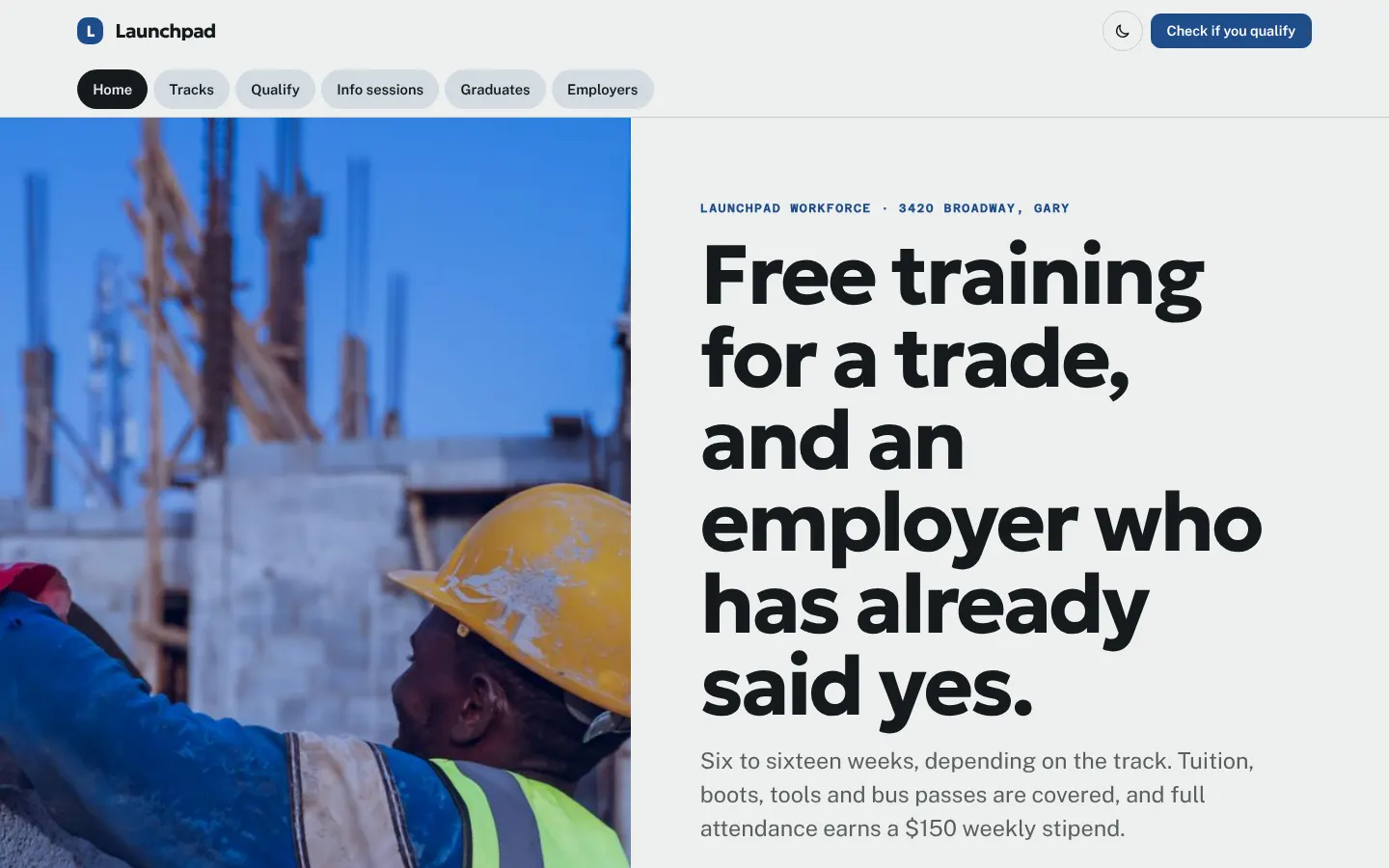
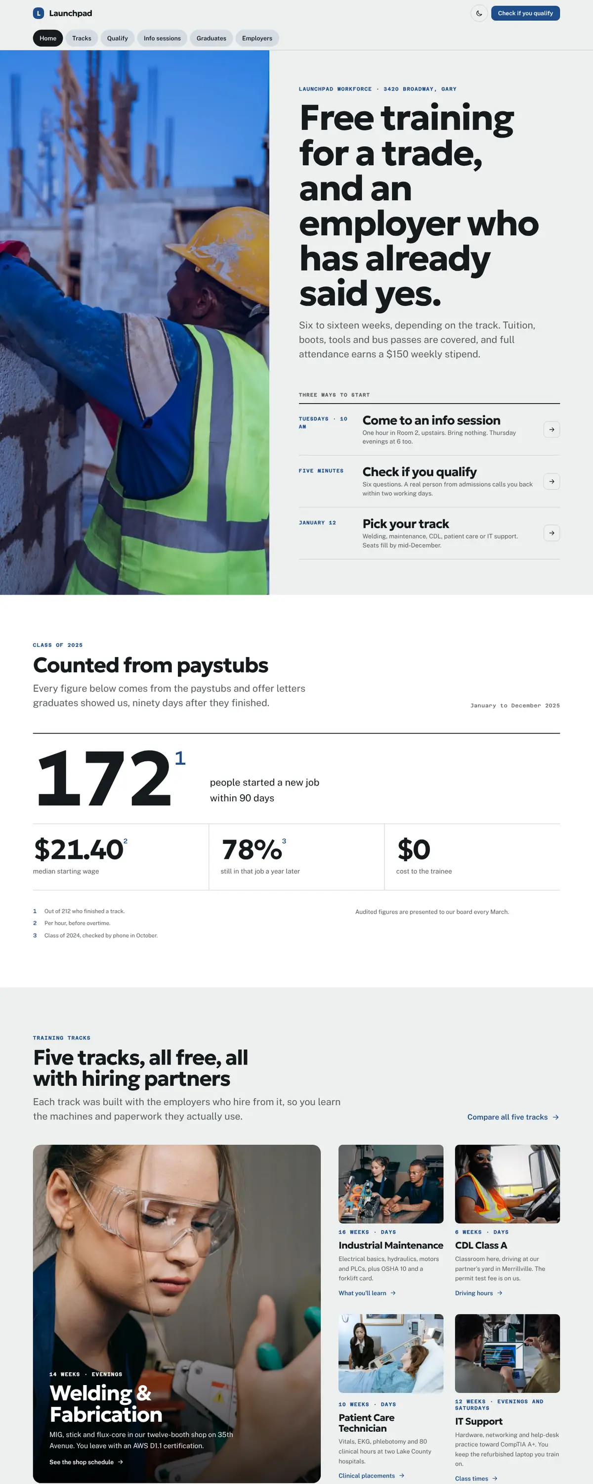
A tabbed app bar keeps all six pages in one row under the name, because most visitors arrive on a phone from a Facebook post and behave as they would in an app. The nav action is always Check if you qualify, since that is the question that stops people.
Pages: Home, Tracks, Qualify, Info sessions, Graduates, Employers
- Hero
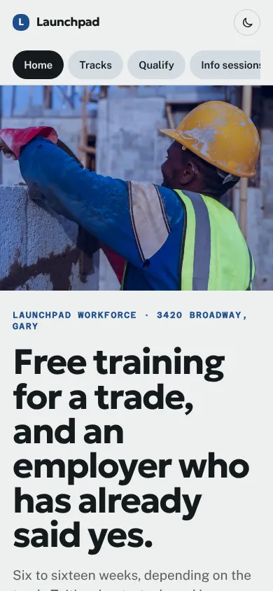
A young builder in a hard hat fills the left edge, and instead of two buttons the hero gives three dated next steps: this Tuesday's info session, a five-minute eligibility check and the January start date. A date is easier to act on than a slogan.
- Calls to action
Every action names what happens next: Check if you qualify, Save a seat at an info session, Hire a graduate, Fund a trainee's toolkit. Employers get their own page and their own verb, so they are never routed through a donation form.
- Photography
Real work in progress: hands on a workbench, a trainee in safety glasses, a driver at the wheel. We avoided staged handshakes and graduation-cap clichés; the gallery is shop days, because that is what the sixteen weeks are actually made of.
- Accessibility
Body text is set at 18 pixels with generous line spacing. Forms use large targets, visible labels and the right mobile keyboards. Nothing important is carried by color alone, and the eligibility check tells you in plain words what happens after you press send.
Like where this is going?
Starting at $500
Start with this design
Your colors, logo, photos and words, on a layout that already works.
Start with This DesignStarting at $1,500
Build something custom
A new design shaped around your organization from the first sketch.
Start a Custom WebsiteBoth include keeping your current domain or getting a new one, plus simple editing tools for your team. Monthly hosting and care plans are listed on Services & Pricing.