
Ministry Motorcycle Ministry Website Template
Iron Road Riders
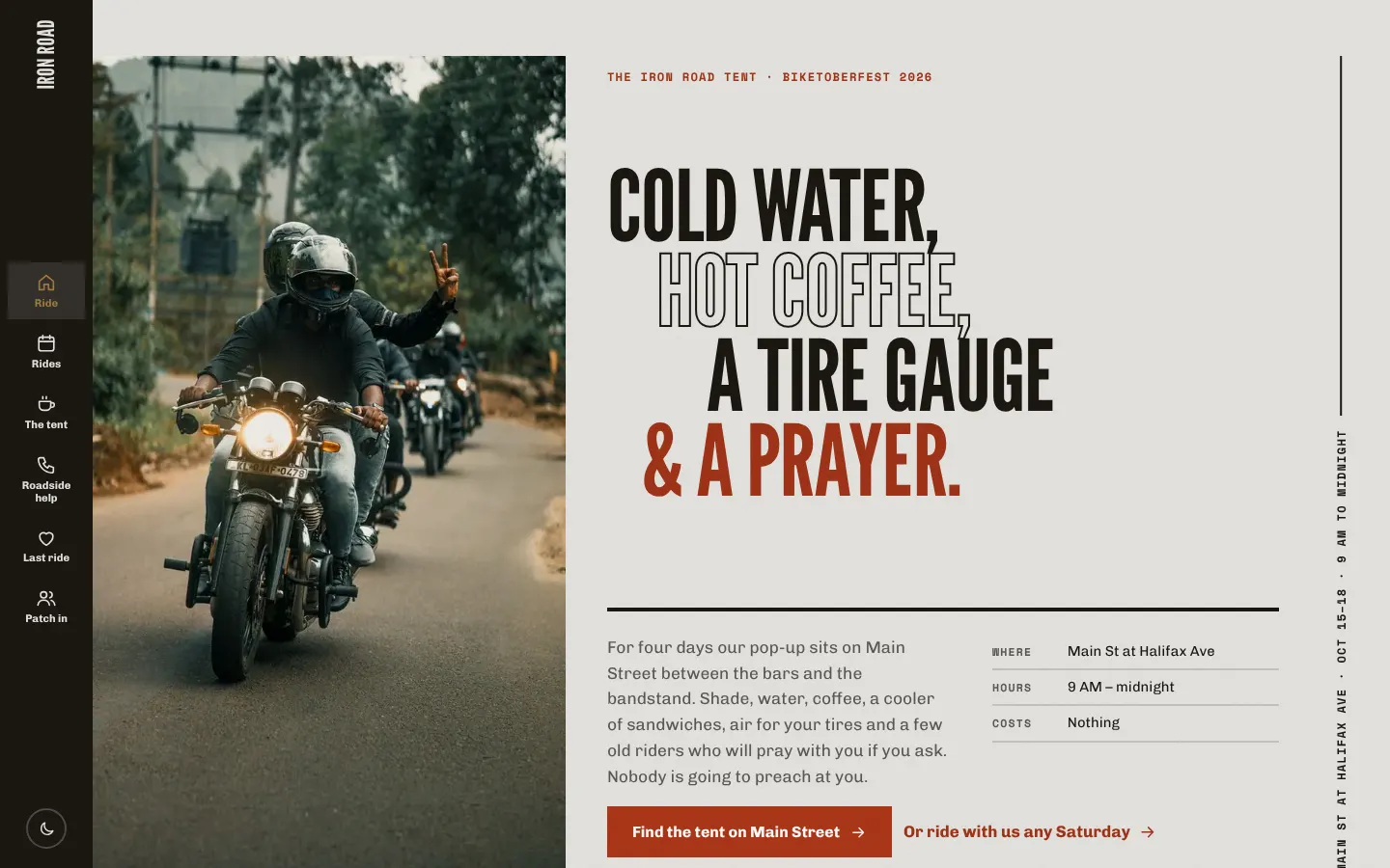
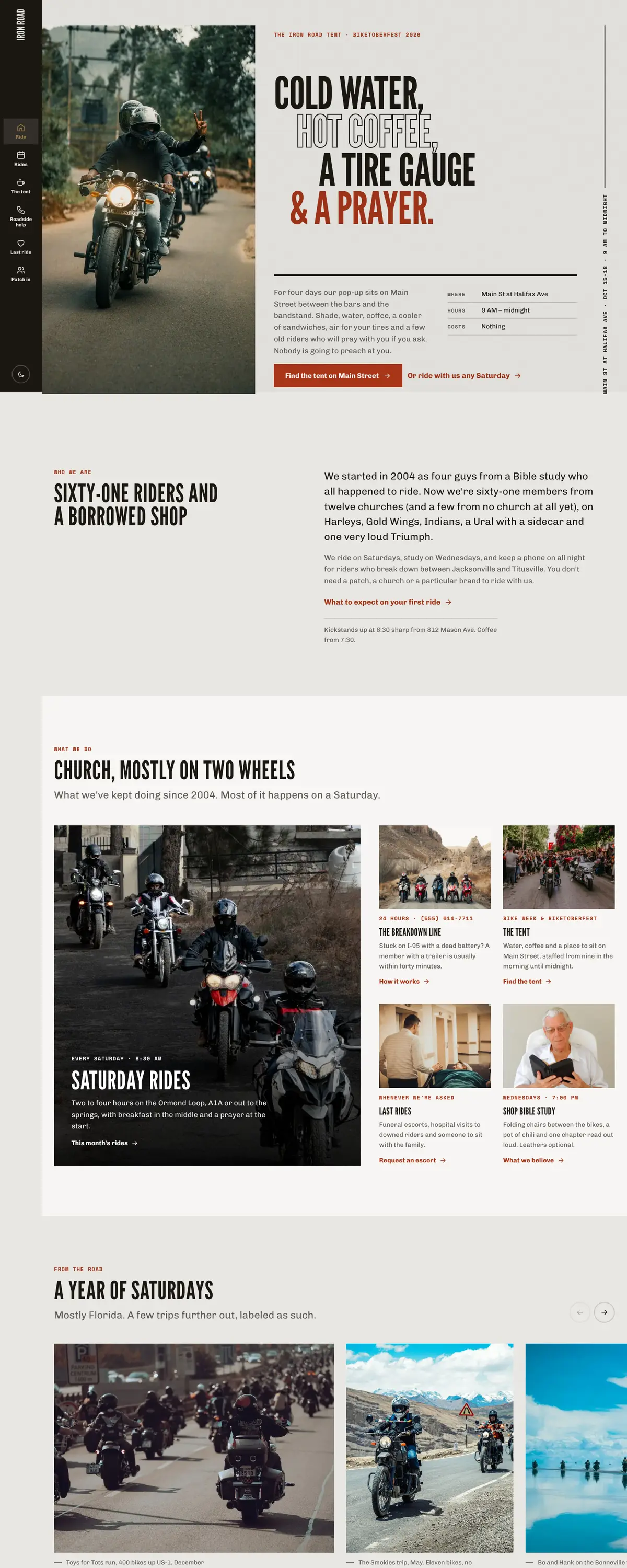
Iron Road Riders is a Daytona Beach motorcycle ministry: Saturday rides, a 24-hour breakdown line, a tent on Main Street during Bike Week and Biketoberfest, and escorts for riders' funerals. The site looks like a rally poster pasted on a shop wall, and it treats the people at the bar next to the tent as the audience.
Starting at $500
Start with this design and I’ll personalize it with your branding, photos and words. Keep your current domain or get a new one.
Changes you make in the editor stay in your own browser, so try anything.
- Built for
- Riders in Volusia and Flagler counties, many of whom haven't been inside a church in years, plus visitors who pass the tent during Bike Week and families arranging a rider's funeral.
- Navigation
- Slim icon rail. A narrow fixed rail with a vertical wordmark leaves the full width for photography and type.
Names, photos, times and stories in this template are sample content. Your version uses your own words, photos and branding.
Why it looks this way.
- Typography
League Gothic in capitals comes from the wood-type gothics on speedway programs and rally flyers stapled to telephone poles on Beach Street. It is set very large on a steep 1.36 scale, because this audience reads posters, not paragraphs. Chivo carries the body with a little mechanical weight, and Space Mono labels the ride times and phone numbers like stamped metal.
- League Gothic headlines
- Chivo body text
- Space Mono labels
- Color
Dark comes first: road tar and a leather-jacket brown-black, with a hot orange-red taken from a Daytona sunset on the hood of a tank and the amber of a turn signal for small accents. The light theme is sun-bleached concrete in a shop forecourt, with the red darkened to rust so it stays legible. Nothing chrome-blue, nothing that looks like a dealership.
- Page
#E8E7E3 - Cards
#F6F5F2 - Text
#1B1712 - Brand
#AE3718 - Accent
#8A5A10
- Page
- Layout
A slim icon rail on the left leaves the whole width for big type and road photographs, and the vertical wordmark reads like the side of a trailer. Six pages, each named the way riders talk: Rides, The tent, Roadside help, Last ride, Patch in.
Pages: Ride, Rides, The tent, Roadside help, Last ride, Patch in
- Hero
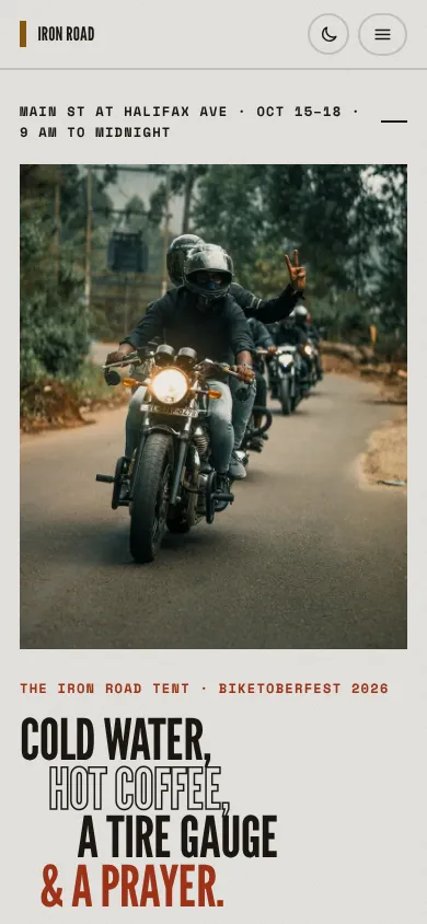
The home page opens with a poster for the tent at Biketoberfest, because in October that is where most people meet the ministry. The stacked lines list what's actually in the tent (cold water, hot coffee, a tire gauge, a prayer) so a visitor knows the deal before anyone mentions church.
- Calls to action
"Ride with us Saturday" is the main action, because a ride is the easiest yes for a stranger. The rest are practical: call the breakdown line, find the tent, request a funeral escort, ask about patching in. The giving action is "Stock the tent", tied to cases of water and coffee rather than a general fund.
- Photography
Riders in leather on open roads, parades and group shots by the bikes, with real variety in age, race and gender, because the ministry's women riders are a third of the Saturday pack. Where a photo is from a trip outside Florida, the caption says so.
- Accessibility
The display face is only used for headings, never paragraphs. The breakdown number is written out in full on every page and in the footer, as a tappable link. Contrast is checked in both themes, and the poster headline is real text for screen readers rather than an image.
Like where this is going?
Starting at $500
Start with this design
Your colors, logo, photos and words, on a layout that already works.
Start with This DesignStarting at $1,500
Build something custom
A new design shaped around your organization from the first sketch.
Start a Custom WebsiteBoth include keeping your current domain or getting a new one, plus simple editing tools for your team. Monthly hosting and care plans are listed on Services & Pricing.