
Church Quaker Meeting Website Template
Hollow Oak
A site for a small unprogrammed Quaker meeting that has to explain, gently and without jargon, what happens in an hour of silence. Everything is pared back: one typeface pair, two quiet colors, generous space, and no decoration that a plain-dressing Friend of 1850 would have raised an eyebrow at.
Starting at $500
Start with this design and I’ll personalize it with your branding, photos and words. Keep your current domain or get a new one.
Changes you make in the editor stay in your own browser, so try anything.
- Built for
- Curious neighbors, Antioch and Wright State students, seekers coming from other churches, and the meeting's own forty or so regular attenders and members.
- Navigation
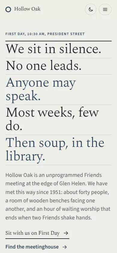
- Full-screen menu. Only a Menu button shows; it opens a full-screen index with large type. Keeps the first screen uncluttered.
Names, photos, times and stories in this template are sample content. Your version uses your own words, photos and branding.
Why it looks this way.
- Typography
Spectral at a light weight carries the headlines. It was drawn for long reading on screens, and at 300 it reads like a well-set Quaker pamphlet. Source Sans 3 does the work underneath: plain, open and unremarkable on purpose, the way Friends talk about plainness of speech.
- Spectral headlines
- Source Sans 3 body text
- Color
The palette comes from iron-gall ink and undyed linen: a blue-black slate for links and actions, a soft gray-green paper for the background, and one note of oak-leaf ochre used sparingly. The dark theme moves to a night-time slate with the ink lifted to a pale blue so links stay legible.
- Page
#EDEEE8 - Cards
#F8F8F4 - Text
#22262A - Brand
#33465C - Accent
#9C7A3C
- Page
- Layout
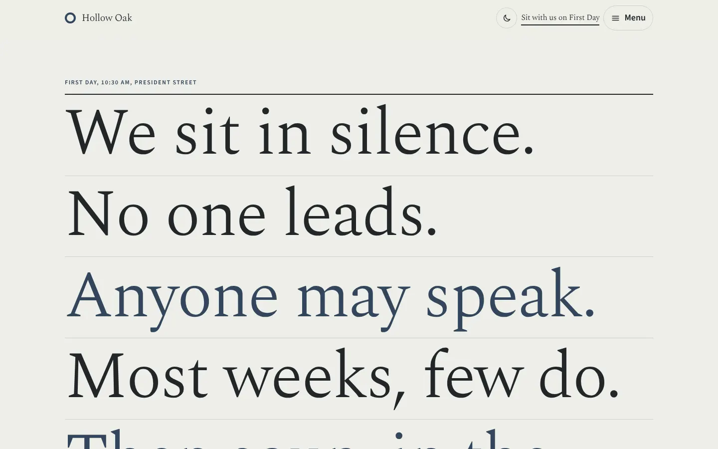
The overlay menu keeps the first screen empty except for the words. A Quaker meeting is mostly waiting, and the site starts the same way: one button, a lot of space, and the full list of pages one tap away when you want it.
Pages: Home, Meeting for Worship, What Friends hold, First Day School, Peace and witness, The meetinghouse
- Hero
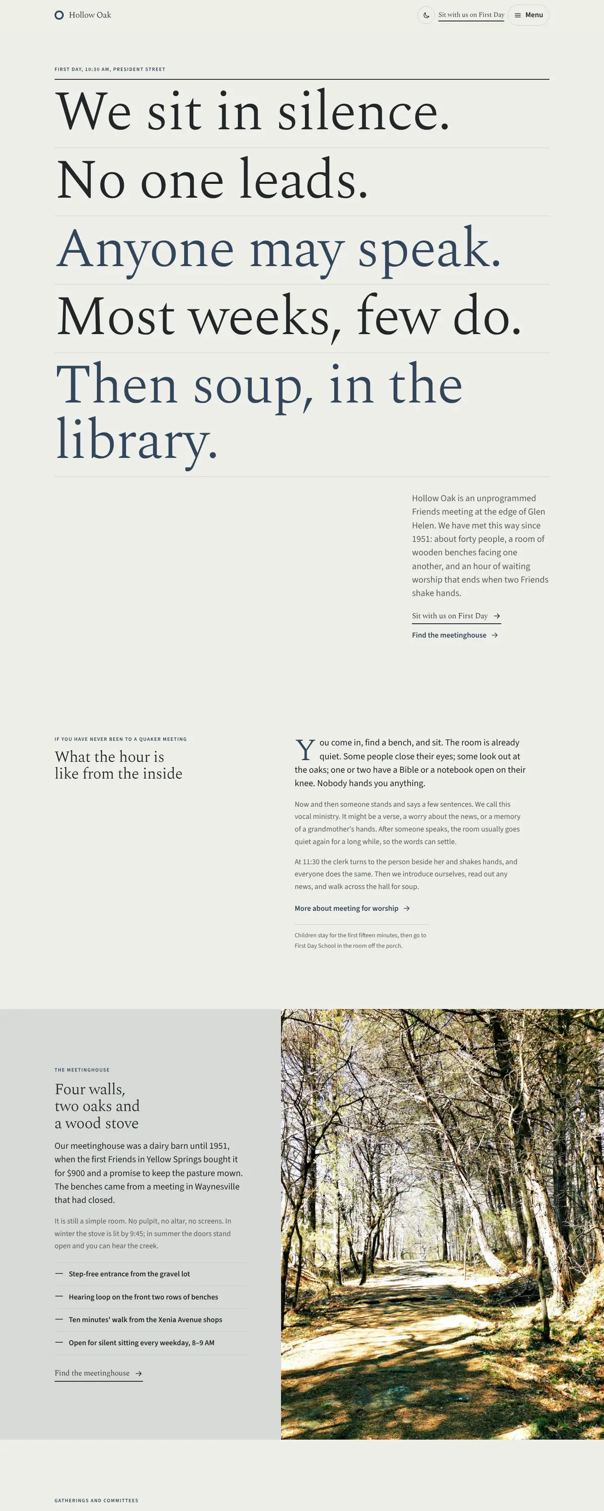
The opening is a short manifesto of plain statements, each on its own ruled line, because the most common question a first-time visitor has is 'what actually happens?' Five sentences answer it before any photograph or sermon could.
- Calls to action
The main action is 'Sit with us on First Day'. It uses the meeting's own word for Sunday and the verb people actually do. The secondary actions ('Find the meetinghouse', 'Write to the clerk') name a real person and a real building.
- Photography
Very few people appear, and none of them are performing. Woodland paths from the Glen, morning fog over the meadow, Wendell's bicycle shop, children outdoors at First Day School. There is no photo of a pulpit or a stage because the meetinghouse has neither. The one gap is the meetinghouse itself: we have left the woodland in that slot until someone can photograph the barn and the benches in winter light.
- Accessibility
Body text is set at 18px with a 62-character measure. Every link is underlined, so nothing depends on color alone. The menu traps focus while open and returns it to the button when closed, and the meeting's hearing-loop and step-free details are written out in full on the meetinghouse page.
Like where this is going?
Starting at $500
Start with this design
Your colors, logo, photos and words, on a layout that already works.
Start with This DesignStarting at $1,500
Build something custom
A new design shaped around your organization from the first sketch.
Start a Custom WebsiteBoth include keeping your current domain or getting a new one, plus simple editing tools for your team. Monthly hosting and care plans are listed on Services & Pricing.