
Church Community Church Website Template
Harvest Table
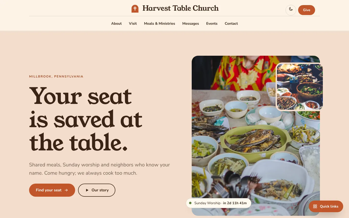
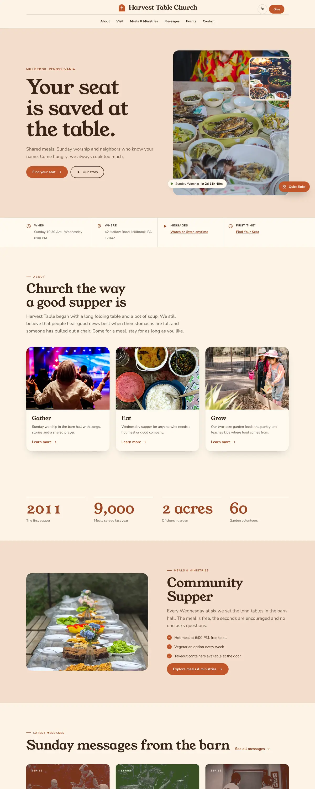
Harvest Table is a community church site built around shared meals, with a warm peach split hero that pairs a large headline with two overlapping food and gathering photos. Rounded shapes and wavy dividers keep the page friendly and informal.
Starting at $500
Start with this design and I’ll personalize it with your branding, photos and words. Keep your current domain or get a new one.
Changes you make in the editor stay in your own browser, so try anything.
- Built for
- Families and neighbours in a small town who come to a church for community meals as much as for Sunday worship, including people who have never attended a service.
- Navigation
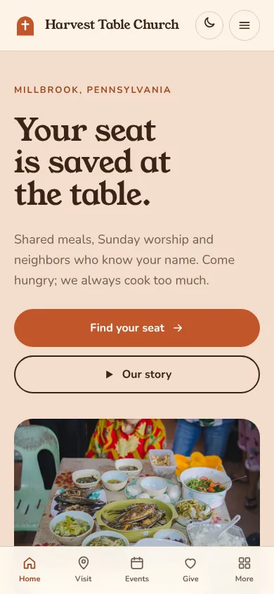
- Centred logo with the menu on a rule below, editorial style. On phones, a bottom tab bar plus a quick-links launcher.
Names, photos, times and stories in this template are sample content. Your version uses your own words, photos and branding.
Why it looks this way.
- Typography
Young Serif sets the headline in a single heavy weight with soft, round terminals that look like lettering on a bakery sign. Nunito carries the body text with rounded stroke ends that match the pill buttons and rounded photos. Both faces feel hand-made rather than corporate.
- Young Serif headlines
- Nunito body text
- Color
The page is a creamy parchment (#FBF3E6) with dark chocolate text (#3A2417), terracotta (#C2562B) for buttons and a leaf green (#5B7F3A) for accents. The hero itself sits on a peach wash. These are pantry and table colours, so the palette says food before a visitor reads a word.
- Page
#FBF3E6 - Cards
#FFF9EF - Text
#3A2417 - Brand
#C2562B - Accent
#5B7F3A
- Page
- Layout
The logo sits centred above a row of six links, with Give pinned to the right, a centred masthead that suggests a cookbook or a menu. Sections are separated by wavy dividers and use rounded cards. The grid never goes beyond three columns, so the page stays calm.
Pages: Home, About, Visit, Meals & Ministries, Messages, Events, Give, Contact
- Hero
The hero is split. On the left is the headline 'Your seat is saved at the table.' in four heavy lines, and on the right a tall rounded photo of people talking at a candlelit table with a smaller photo of breakfast overlapping its corner. The layered images look like snapshots on a table.
- Calls to action
'Find your seat' is the terracotta primary pill and 'Our story' sits beside it as an outlined pill. The wording picks up the table metaphor so the button feels like an invitation. Give is a smaller solid pill in the header.
- Photography
The photography is warm, with amber light and food shown from above. The candlelit dinner gives a sense of fellowship, and the brunch image shows what a meal looks like. A real church should photograph its own fellowship hall, because the table has to look like theirs.
- Accessibility
Brown text on cream measures about 13 to 1 and white on the terracotta button about 4.5 to 1, which just passes for normal text. Buttons are large pill shapes with generous tap areas. Light and dark themes are available from the toggle beside the Give button.
Like where this is going?
Starting at $500
Start with this design
Your colors, logo, photos and words, on a layout that already works.
Start with This DesignStarting at $1,500
Build something custom
A new design shaped around your organization from the first sketch.
Start a Custom WebsiteBoth include keeping your current domain or getting a new one, plus simple editing tools for your team. Monthly hosting and care plans are listed on Services & Pricing.