
Church Welcoming Neighborhood Church Website Template
Gather
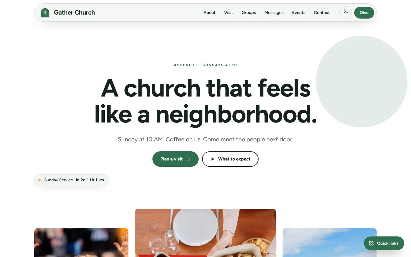
Gather is a centred, airy neighbourhood church site with a big sans-serif headline, a pill navigation and almost no decoration. It trades ornament for space so the welcome message does the work.
Starting at $500
Start with this design and I’ll personalize it with your branding, photos and words. Keep your current domain or get a new one.
Changes you make in the editor stay in your own browser, so try anything.
- Built for
- Newcomers and people recovering from a bad church experience, especially those who want a low-pressure look at what Sunday is like.
- Navigation
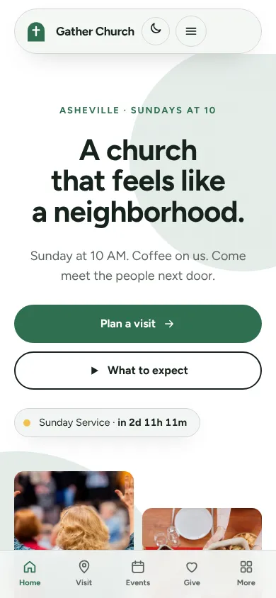
- Floating rounded pill that sits over the hero photo. On phones, a bottom tab bar plus a quick-links launcher.
Names, photos, times and stories in this template are sample content. Your version uses your own words, photos and branding.
Why it looks this way.
- Typography
Figtree is used for both headings and body text, in bold for headlines and regular for paragraphs. One geometric sans keeps the page quiet and consistent, and its friendly letterforms stop the minimalism from feeling cold. The headline sits at about 80 pixels, with plenty of line spacing.
- Figtree headlines
- Figtree body text
- Color
White (#FFFFFF) is the page, with near-black green text (#16231C), a forest green (#2F6F4F) for buttons and a small amount of sunny yellow (#F2C14E). The dark theme moves to a deep green-black with mint (#6FCB9F). Green reads as calm and outdoors, and yellow adds a little warmth without dominating.
- Page
#FFFFFF - Cards
#F3F6F4 - Text
#16231C - Brand
#2F6F4F - Accent
#F2C14E
- Page
- Layout
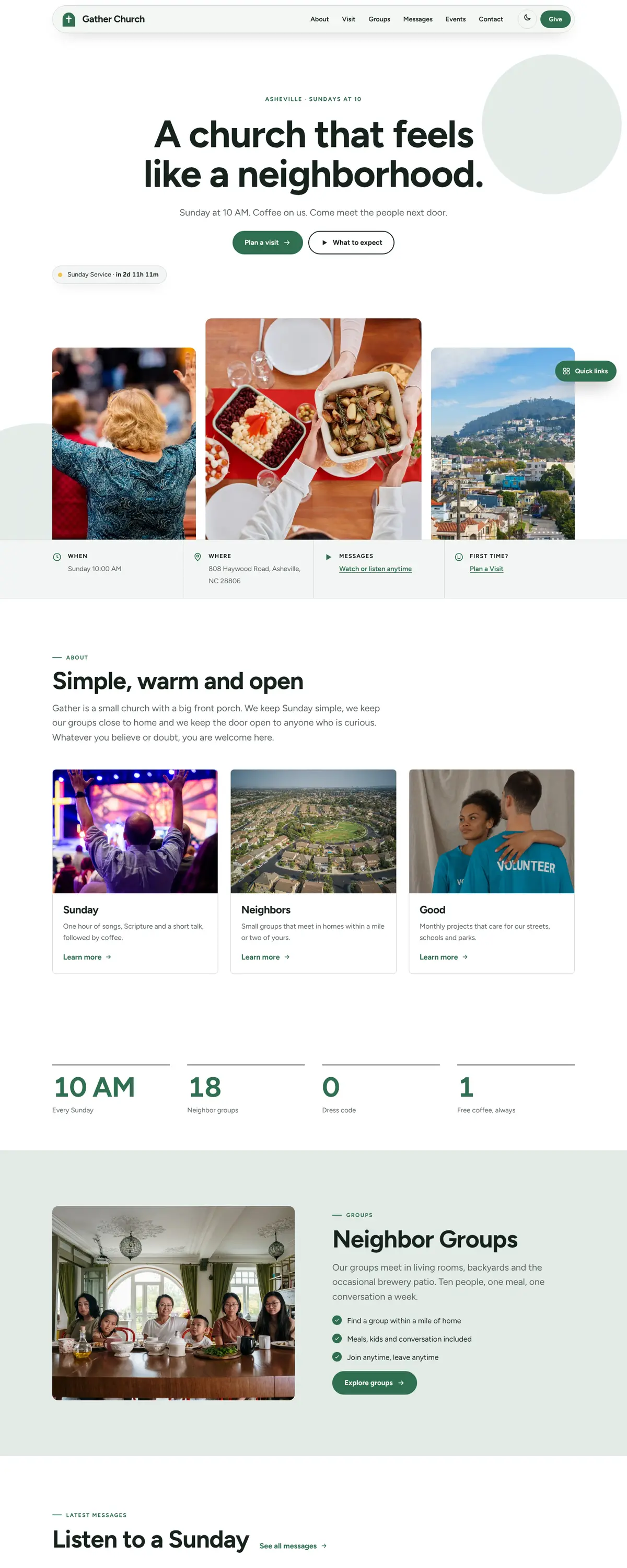
A white pill navigation floats near the top with the logo on the left, links in the middle and Give on the right. The page below is centred and generously spaced, with outlined cards and a three-photo arrangement. Fewer elements per screen means a visitor sees the invitation and the Sunday time first.
Pages: Home, About, Visit, Groups, Messages, Events, Give, Contact
- Hero
The hero is a centred headline, 'A church that feels like a neighborhood.', with a single line about coffee and a Sunday time under it. A pale green circle sits off to the right as the only decoration. Below, three photos at staggered heights show people outdoors.
- Calls to action
'Plan a visit' is the solid green pill and 'What to expect' is the outlined pill beside it. The second button answers the most common nervous question. A small status chip below the buttons says when the next service starts.
- Photography
Photos are bright, outdoors and in daylight, with raised arms against a sky and group shots in a park. Staggering the three frames makes the row look like a casual photo wall. The images do not show a building, so the church feels like a group of people rather than an institution.
- Accessibility
Dark green text on white measures about 16 to 1, and white on the green button about 6 to 1, both comfortable. The nav links are plain text with clear spacing, and buttons are large. Colour is never the only signal for a link or a state.
Like where this is going?
Starting at $500
Start with this design
Your colors, logo, photos and words, on a layout that already works.
Start with This DesignStarting at $1,500
Build something custom
A new design shaped around your organization from the first sketch.
Start a Custom WebsiteBoth include keeping your current domain or getting a new one, plus simple editing tools for your team. Monthly hosting and care plans are listed on Services & Pricing.