
Nonprofit Senior Center Website Template
Elm Street Seniors
Elm Street's visitors are mostly over seventy, often reading on a tablet a grandchild set up, or are adult children checking for a parent. The site opens with the week itself, in large type, because the first question is always "what's on, and when is lunch?"
Starting at $500
Start with this design and I’ll personalize it with your branding, photos and words. Keep your current domain or get a new one.
Changes you make in the editor stay in your own browser, so try anything.
- Built for
- Dubuque adults 60 and over, their adult children and caregivers, and the volunteers who drive and cook.
- Navigation
- Classic top bar. Logo left, pages right, one action. Familiar to every visitor.
Names, photos, times and stories in this template are sample content. Your version uses your own words, photos and branding.
Why it looks this way.
- Typography
Merriweather was designed for reading on screens, with a large x-height and sturdy serifs that survive older eyes and older tablets. Body text is Atkinson Hyperlegible at 20px, a face the Braille Institute drew so that letters like I, l and 1 can never be confused. Nothing on the site is set below 16px.
- Merriweather headlines
- Atkinson Hyperlegible body text
- Color
The green is taken from the American elms that gave the street its name, and the warm ochre accent is an elm leaf in October. The background is a soft butter tone, warmer than white, which cuts glare for readers with cataracts. We avoided a hospital palette on purpose: this is a place people come to for lunch and euchre. Every pair of colors clears 4.5:1, most clear 7:1.
- Page
#F7F2E2 - Cards
#FFFCF3 - Text
#24201A - Brand
#2D5A3B - Accent
#9A5B14
- Page
- Layout
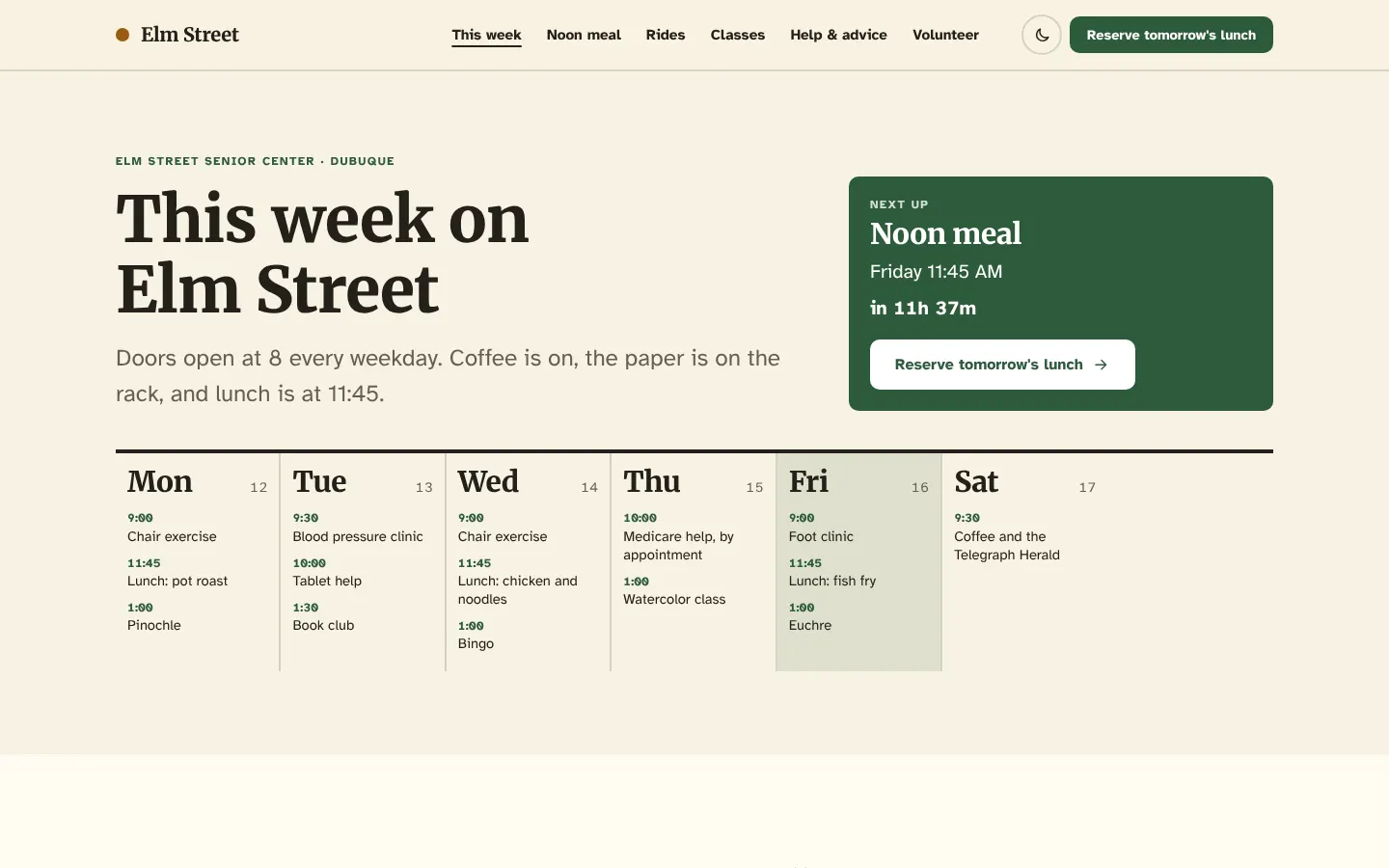
A classic top bar with words, not icons: logo on the left, six plainly named pages, one button. Our users have learned this pattern over twenty years and we see no reason to make them learn another. Pages are short and each one answers one question.
Pages: This week, Noon meal, Rides, Classes, Help & advice, Volunteer
- Hero
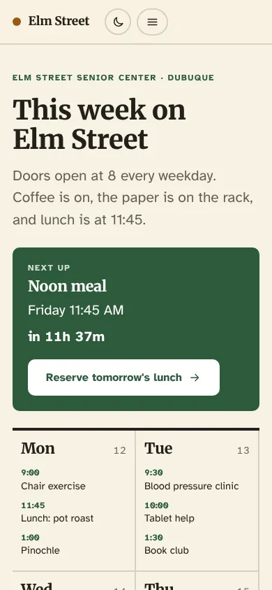
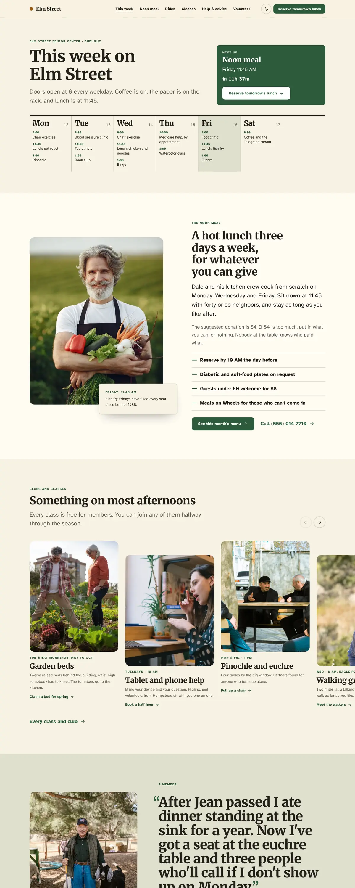
The first screen is this week's schedule, day by day, with the lunch and the bingo and the blood pressure clinic. That's what regulars come to check, and it shows a newcomer that something is on every day.
- Calls to action
"Reserve tomorrow's lunch" is the nav button because the kitchen needs a count by 10 AM the day before, and a no-show wastes a meal. "Book a ride" comes next. "Call the front desk" sits beside both, because many members will always prefer the phone, and that's fine.
- Photography
Real older people doing ordinary things: tending the garden beds, looking at a phone together, two volunteers at a front door on a Meals on Wheels round. No stock grandparents laughing at salads. Staff portraits are plain and friendly so members recognize faces at the door.
- Accessibility
Large tap targets, soft rounded buttons with a visible label and arrow, and a thick rule between sections so it's clear where one ends. Phone numbers are always tappable. The menu and calendar are also offered as large-print PDFs to print at home.
Like where this is going?
Starting at $500
Start with this design
Your colors, logo, photos and words, on a layout that already works.
Start with This DesignStarting at $1,500
Build something custom
A new design shaped around your organization from the first sketch.
Start a Custom WebsiteBoth include keeping your current domain or getting a new one, plus simple editing tools for your team. Monthly hosting and care plans are listed on Services & Pricing.