Ministry Pregnancy & New Moms Ministry Website Template
Cradle & Co.
Cradle & Co. is a small church-backed ministry that keeps women company through pregnancy and the first year with a baby: a mentor who answers texts, a free baby closet, rides to appointments and two weekly moms' groups. The site is written for someone who may be frightened, tired or reading with one hand, so it starts by asking where she is rather than telling her who we are.
Starting at $500
Start with this design and I’ll personalize it with your branding, photos and words. Keep your current domain or get a new one.
Changes you make in the editor stay in your own browser, so try anything.
- Built for
- Women who have just found out they're pregnant, new moms in their first year (many young, single or far from family), and the churches, grandmothers and neighbors who want to help.
- Navigation
- Centred masthead. The name sits centred like a printed masthead; pages run underneath. Signals heritage and calm.
Names, photos, times and stories in this template are sample content. Your version uses your own words, photos and branding.
Why it looks this way.
- Typography
Unna is a soft transitional serif with rounded joins, warm enough for a birth announcement but sturdy enough for a headline. Nunito Sans sets the body in round, open shapes that stay easy to read on a phone in a dark nursery. Caveat appears only for the director's signature and small handwritten notes, like the card tucked into every closet bag.
- Unna headlines
- Nunito Sans body text
- Caveat labels
- Color
The deep rose is taken from the hand-knit blankets volunteers bring in every week, and the sage is the color of the front door at the house. The neutrals lean slightly green rather than cream, which keeps the site from looking like a baby-shower invitation. In dark mode, for night feeds, the rose lifts to a soft pink on a warm charcoal so nothing glares.
- Page
#F3F4F1 - Cards
#FFFFFF - Text
#2A2328 - Brand
#963D5A - Accent
#5E8C7C
- Page
- Layout
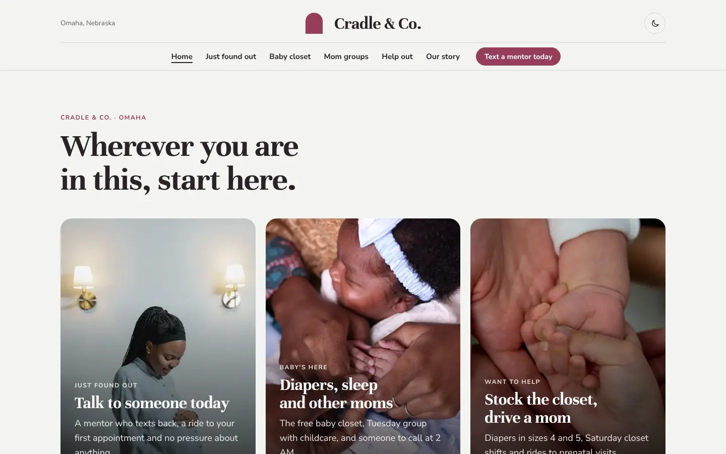
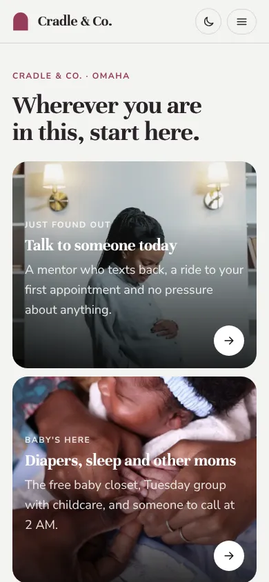
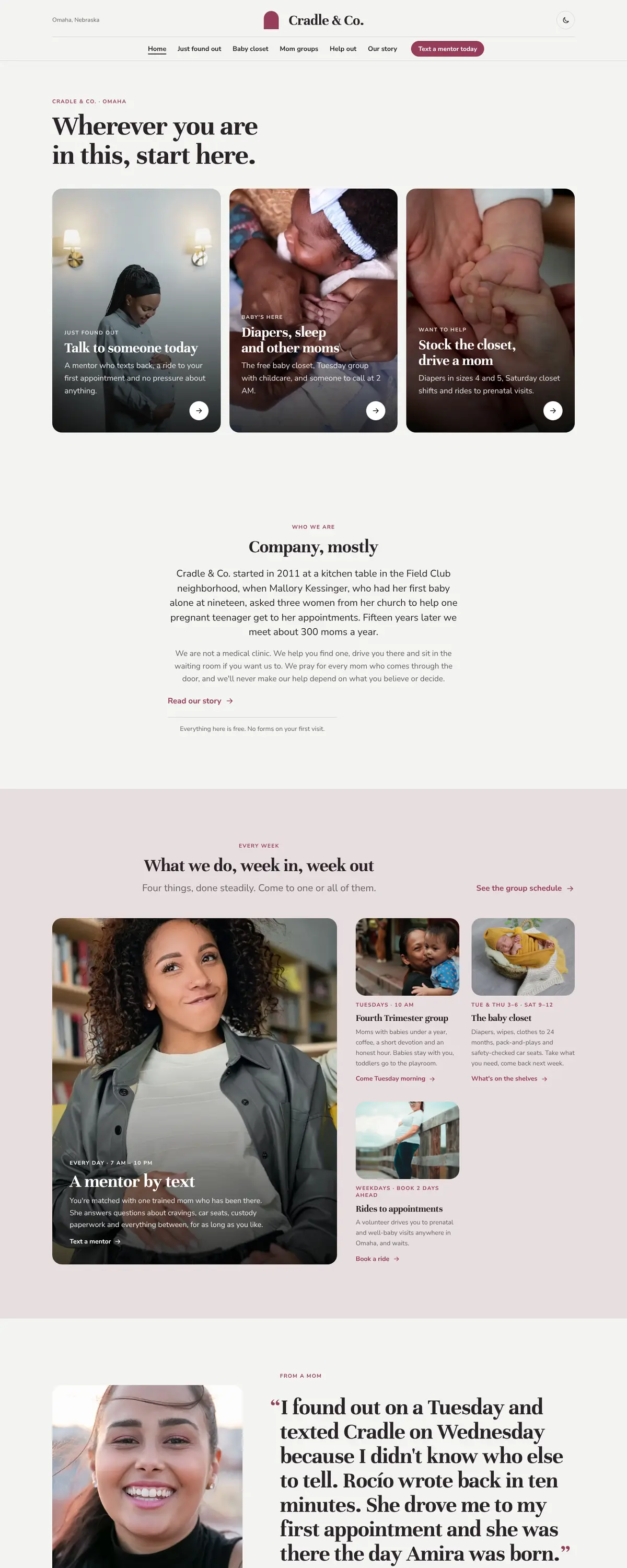
A centred top bar with six plain words keeps things calm and symmetrical. The one action beside them, Text a mentor today, is the thing we most want a frightened visitor to do, so it is always in reach.
Pages: Home, Just found out, Baby closet, Mom groups, Help out, Our story
- Hero
The home page opens with three doors: Just found out, Baby's here, Want to help. A woman who has just seen two lines on a test should not have to read about our history to find the text line. Each door has its own photograph and leads to a page written only for her.
- Calls to action
Buttons describe a small, concrete step: Text a mentor today, Pick up diapers, Come Tuesday morning, Stock the closet. Nothing says sign up or register, because many of the women we meet have filled in enough forms this month.
- Photography
Women of different ages and backgrounds, hands around tiny fingers, volunteers at the closet shelves. The posed studio newborns are kept small and mostly on the giving cards, where a donor wants to picture who the diapers are for. We never show an ultrasound or anything that might feel like pressure.
- Accessibility
Body text is 18px with generous line height, every button is large enough to tap one-handed, and both color themes meet WCAG AA. The text line, the 988 crisis line and the Nebraska Safe Haven information sit on the Just found out page in plain words.
Like where this is going?
Starting at $500
Start with this design
Your colors, logo, photos and words, on a layout that already works.
Start with This DesignStarting at $1,500
Build something custom
A new design shaped around your organization from the first sketch.
Start a Custom WebsiteBoth include keeping your current domain or getting a new one, plus simple editing tools for your team. Monthly hosting and care plans are listed on Services & Pricing.