Nonprofit Community Foundation Website Template
Common Ground
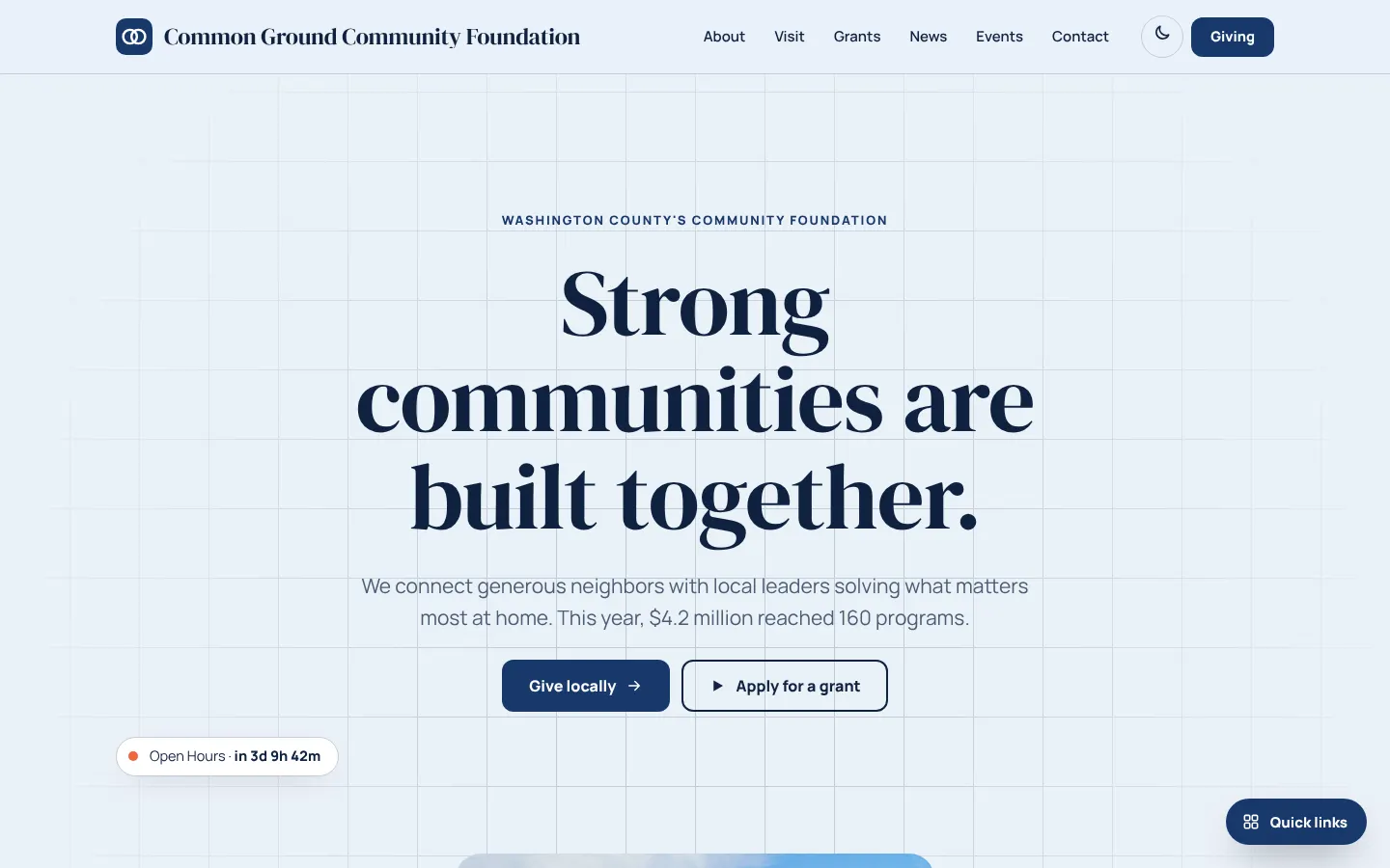
Common Ground is a community foundation site with navy type on pale blue, a faint grid and a big serif headline. It looks organised and trustworthy, which suits an organisation that manages other people's gifts.
Starting at $500
Start with this design and I’ll personalize it with your branding, photos and words. Keep your current domain or get a new one.
Changes you make in the editor stay in your own browser, so try anything.
- Built for
- Local donors, nonprofit leaders applying for grants, and professional advisors who refer clients to a foundation.
- Navigation
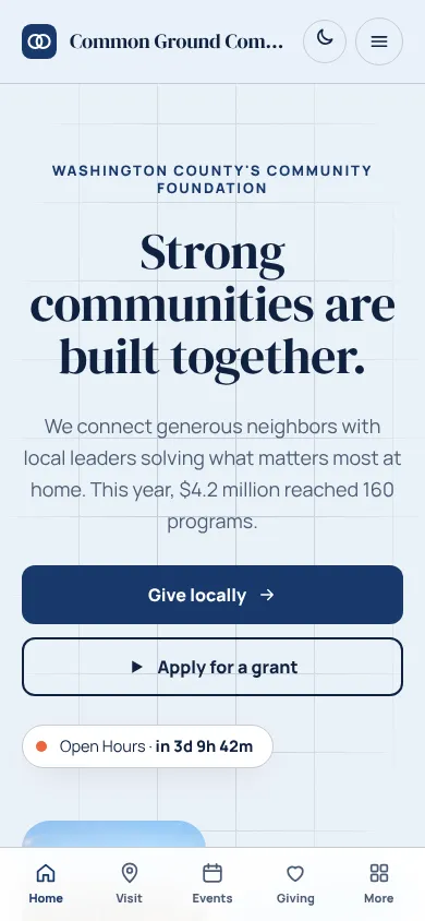
- Sticky frosted bar with the full menu and a Give button. On phones, a bottom tab bar plus a quick-links launcher.
Names, photos, times and stories in this template are sample content. Your version uses your own words, photos and branding.
Why it looks this way.
- Typography
DM Serif Display sets the headline at about 90 pixels. It has high contrast and strong, rounded forms that read as authoritative. Manrope handles body text, with a modern, even shape that is good for figures and dates. The pair feels like an annual report.
- DM Serif Display headlines
- Manrope body text
- Color
The page is pale blue (#EAF1F8) with deep navy text (#0F2240) and a navy brand colour (#17386B). Coral (#F0643C) is the accent. The dark theme uses a lighter periwinkle (#8DB2EC). Navy is a conventional colour for financial trust, and the coral prevents the page from feeling stiff.
- Page
#EAF1F8 - Cards
#FFFFFF - Text
#0F2240 - Brand
#17386B - Accent
#F0643C
- Page
- Layout
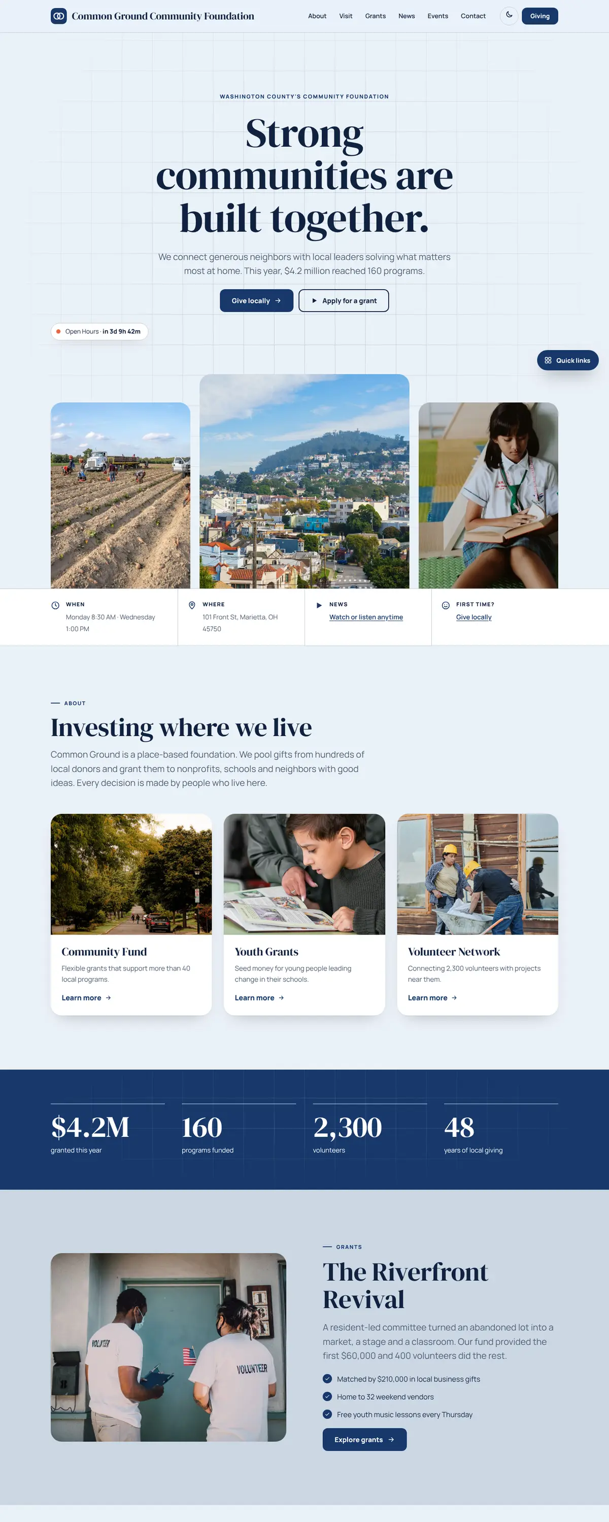
A bar with a navy logo tile, the full name, six links and a navy Giving button. A faint grid pattern sits behind the hero like graph paper. Below are a stats band reporting $4.2M granted, 160 programs and 2,300 volunteers, rounded photo cards and a scrolling word marquee.
Pages: Home, About, Visit, Grants, News, Events, Giving, Contact
- Hero
The hero is centred and typographic, with no photograph. 'Strong communities are built together.' fills three lines, followed by a sentence explaining that $4.2 million reached 160 programs. A chip shows the next open office hours.
- Calls to action
'Give locally' is the navy primary button and 'Apply for a grant' is outlined. The two buttons address the foundation's two audiences, donors and grantees. Both are in the hero, so neither group has to search.
- Photography
The hero has no photo, so the first impression comes from type and structure. Photos appear lower in rounded cards, and a real foundation should use portraits of grantees and projects, with names and consent.
- Accessibility
Navy on pale blue measures about 14 to 1, and white on the navy button about 11.6 to 1. The grid pattern is faint, though a few thin lines run behind body text, so a real build could reduce them at that point. A theme toggle is in the header.
Like where this is going?
Starting at $500
Start with this design
Your colors, logo, photos and words, on a layout that already works.
Start with This DesignStarting at $1,500
Build something custom
A new design shaped around your organization from the first sketch.
Start a Custom WebsiteBoth include keeping your current domain or getting a new one, plus simple editing tools for your team. Monthly hosting and care plans are listed on Services & Pricing.