
Ministry Podcast & Media Ministry Website Template
Chapel Radio
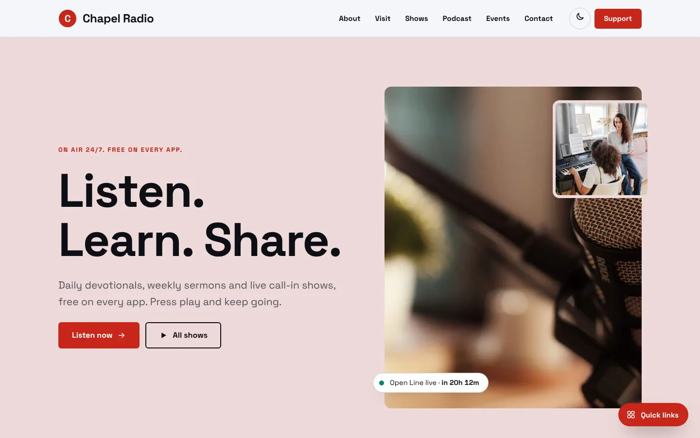
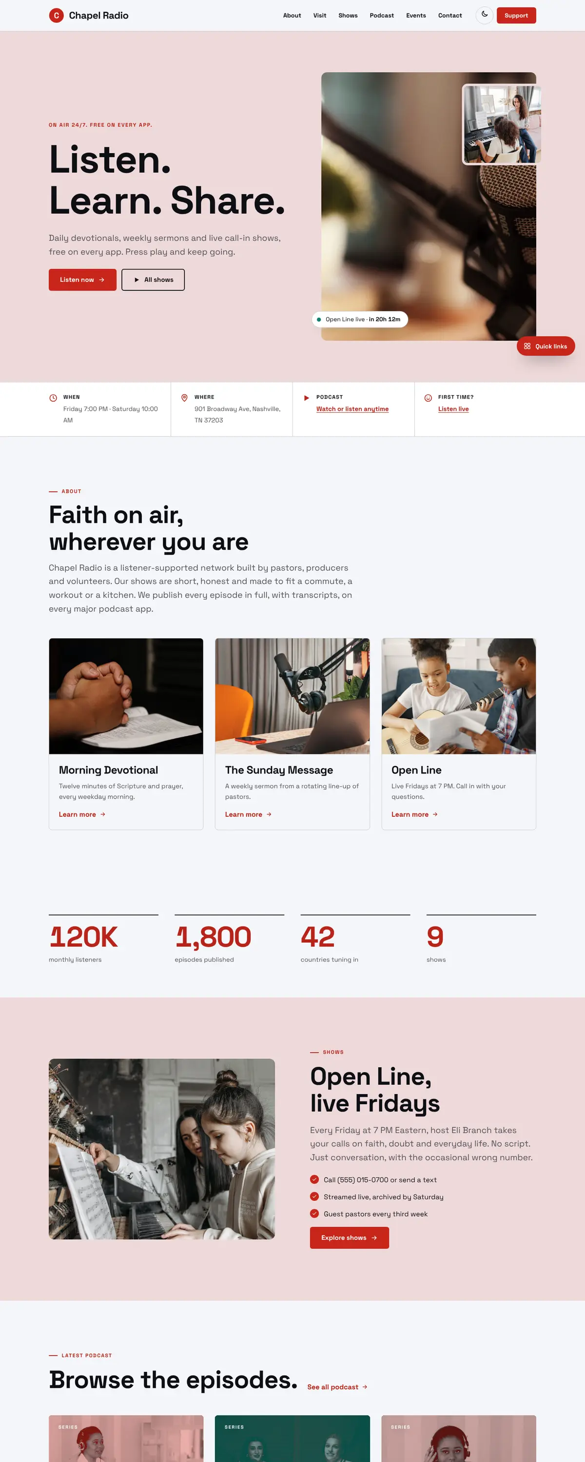
Chapel Radio is a podcast and media ministry site with a pink-grey hero card, a microphone photo and a big sans-serif headline. It looks like a streaming app, so listeners know what to do within a second.
Starting at $500
Start with this design and I’ll personalize it with your branding, photos and words. Keep your current domain or get a new one.
Changes you make in the editor stay in your own browser, so try anything.
- Built for
- Regular listeners of devotionals and call-in shows, new podcast subscribers, and ministries looking for a platform to syndicate teaching.
- Navigation
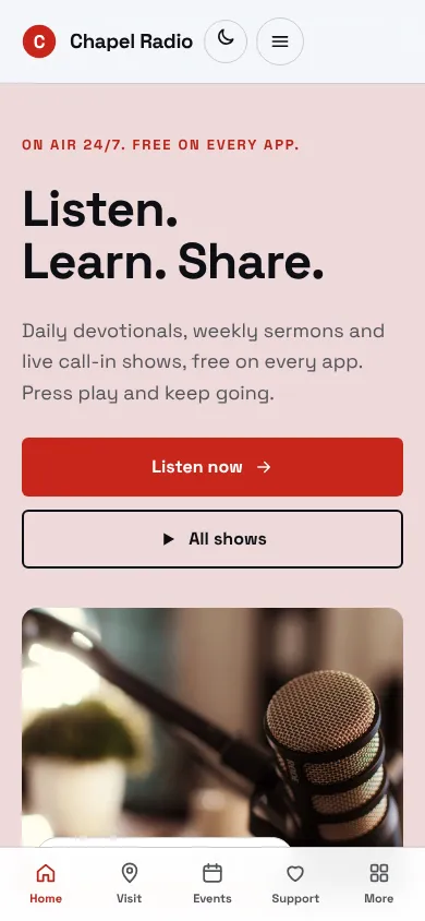
- Sticky frosted bar with the full menu and a Give button. On phones, a bottom tab bar plus a quick-links launcher.
Names, photos, times and stories in this template are sample content. Your version uses your own words, photos and branding.
Why it looks this way.
- Typography
Space Grotesk Bold is used for the headline and body copy, with small labels in a monospace-like spacing. The shapes are geometric and technical, in keeping with audio and software. 'Listen. Learn. Share.' fits on two lines at about 90 pixels.
- Space Grotesk headlines
- Space Grotesk body text
- Color
The page uses cool off-white (#F4F6F9) with near-black text (#0D0F14), broadcast red (#C7261A) as the brand colour and a teal (#0F7F74) accent for the live indicator. The hero panel is a soft rose tint. The dark theme is first and uses a coral red (#FF5A4E). Red is the colour of an on-air light, so it signals live content straight away.
- Page
#F4F6F9 - Cards
#FFFFFF - Text
#0D0F14 - Brand
#C7261A - Accent
#0F7F74
- Page
- Layout
A white bar has a red circle logo, the name, six links and a red Support button. Below are rounded content cards for shows and episodes. The structure follows podcast apps, with a clear list of shows and a latest episode, so a regular listener finds a familiar pattern.
Pages: Home, About, Visit, Shows, Podcast, Events, Support, Contact
- Hero
The hero is split. On the left is the eyebrow 'On air 24/7. Free on every app.', the headline and a short line on devotionals and call-in shows. On the right is a tall photo of a microphone with a smaller concert image overlapping. A chip shows the next live show.
- Calls to action
'Listen now' is a solid red button and 'All shows' is outlined. The first action plays audio, which is the reason people come. Support replaces Give in the header, which suits a listener-funded station.
- Photography
The main photo is a macro shot of a microphone with soft background light, which communicates audio instantly. The overlapping concert image adds energy. A real station should add portraits of hosts, since listeners attach to voices and want a face to go with them.
- Accessibility
Near-black on off-white is about 17.7 to 1, and white on the red button about 5.6 to 1. Audio content should always have transcripts, and a real build should add them next to each episode. The theme toggle supports listeners using the site at night.
Like where this is going?
Starting at $500
Start with this design
Your colors, logo, photos and words, on a layout that already works.
Start with This DesignStarting at $1,500
Build something custom
A new design shaped around your organization from the first sketch.
Start a Custom WebsiteBoth include keeping your current domain or getting a new one, plus simple editing tools for your team. Monthly hosting and care plans are listed on Services & Pricing.