
Ministry College Ministry Website Template
Campus Fire
Campus Fire is a college ministry site with a huge extended headline, a lime and black palette and a striped background. It is built for a student who decides within a few seconds whether a group is for them.
Starting at $500
Start with this design and I’ll personalize it with your branding, photos and words. Keep your current domain or get a new one.
Changes you make in the editor stay in your own browser, so try anything.
- Built for
- Undergraduates looking for a community, campus staff, and parents of first-year students.
- Navigation
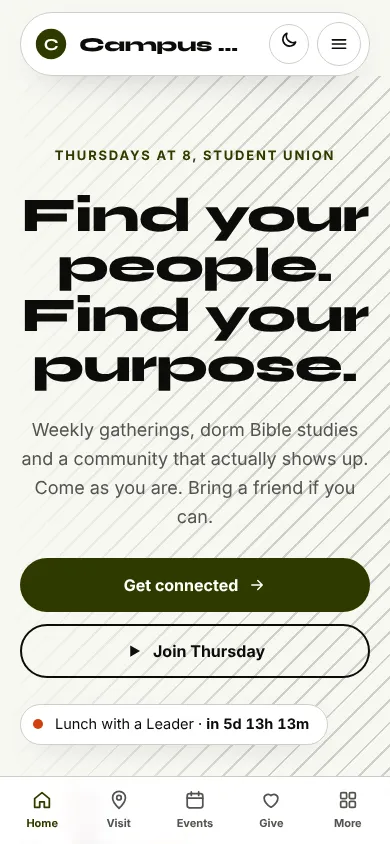
- Floating rounded pill that sits over the hero photo. On phones, a bottom tab bar plus a quick-links launcher.
Names, photos, times and stories in this template are sample content. Your version uses your own words, photos and branding.
Why it looks this way.
- Typography
Syne ExtraBold is a very wide display face, and the headline is set at about 90 pixels across three lines. Inter handles the body text and the interface. The wide letters make the headline look like a poster, while Inter stays modest underneath.
- Syne headlines
- Inter body text
- Color
The light theme uses off-white (#F7F8F2), near-black (#0B0C0A) and a deep olive (#2E3A00) for buttons. The dark theme is first, using black (#08090A), bright lime (#C6F432) and a hot orange-red (#FF5E3A) accent. Lime on black has the energy of a student festival and does not look like a conventional church site.
- Page
#F7F8F2 - Cards
#FFFFFF - Text
#0B0C0A - Brand
#2E3A00 - Accent
#D2410F
- Page
- Layout
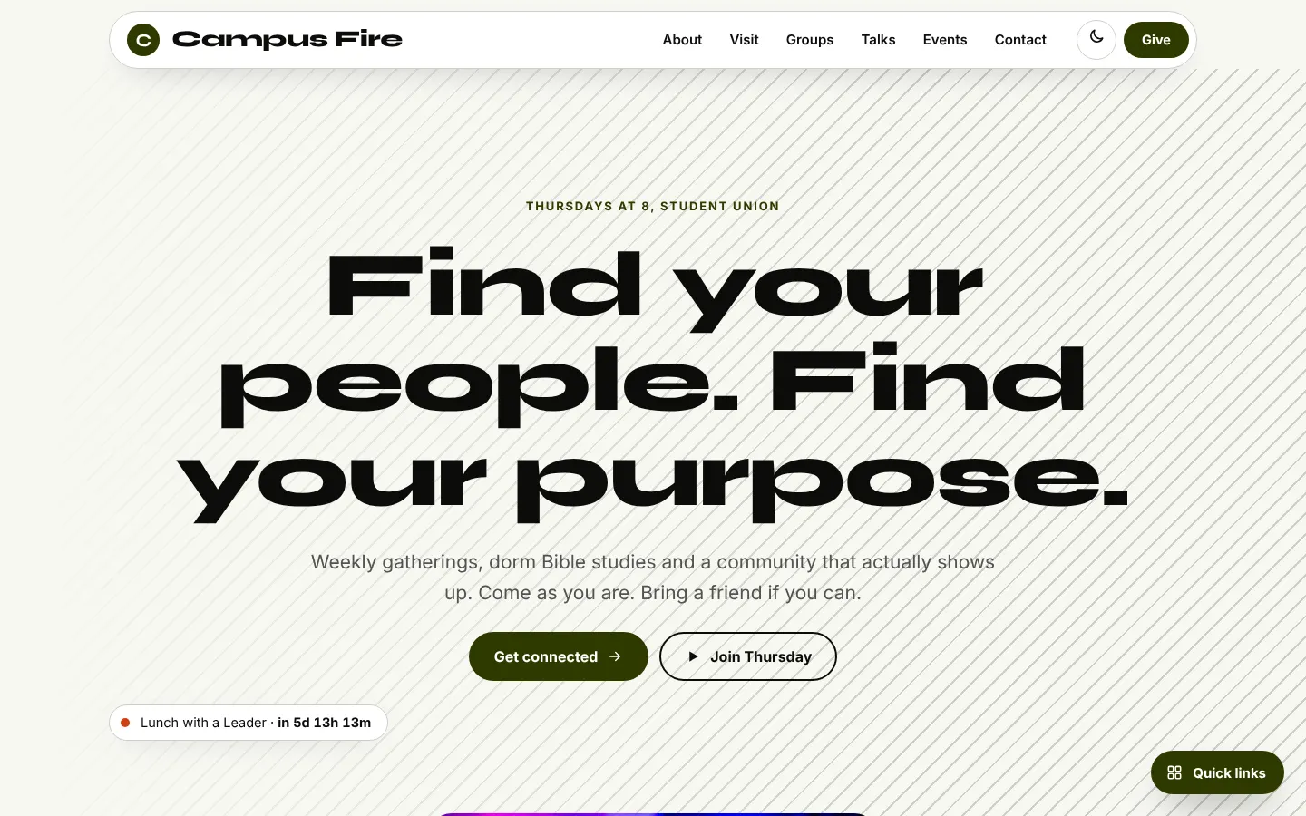
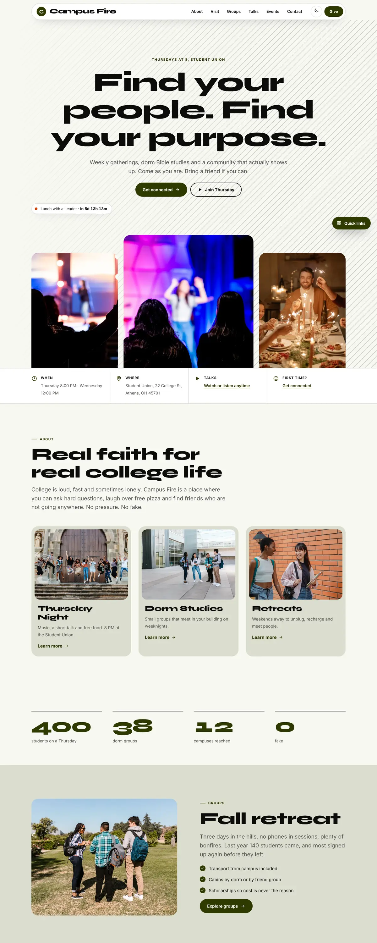
A floating white pill nav holds a circular monogram, the name in the wide face, six links and a Give pill. Diagonal stripes fill the hero background. Content below is in tinted rounded cards, and a scrolling word marquee runs between sections for movement.
Pages: Home, About, Visit, Groups, Talks, Events, Give, Contact
- Hero
The hero is centred. 'Find your people. Find your purpose.' fills three lines, with the meeting night and place in the eyebrow above it. The first photo sits below the fold. A chip counts down to Thursday night.
- Calls to action
'Get connected' is a solid olive pill and 'Join Thursday' is an outlined pill. The second button gives a concrete time to show up, which students prefer to an abstract sign-up. Give is a small pill in the header.
- Photography
Students are minors or near-minors in some cases, so a real build should rely on crowd shots and consented photos from events. Candid gatherings in dorm rooms and the quad work better than posed groups.
- Accessibility
Near-black on off-white measures about 18 to 1 and olive buttons carry white text at about 12 to 1. The stripes in the background are light and do not reduce the contrast of the headline. The wide headline is large enough to read comfortably, though very wide letters can be slow for some readers at small sizes.
Like where this is going?
Starting at $500
Start with this design
Your colors, logo, photos and words, on a layout that already works.
Start with This DesignStarting at $1,500
Build something custom
A new design shaped around your organization from the first sketch.
Start a Custom WebsiteBoth include keeping your current domain or getting a new one, plus simple editing tools for your team. Monthly hosting and care plans are listed on Services & Pricing.