Why Westside Youth Hoops looks the way it does
A free youth league site built for the parent standing in a school pickup line with one hand free. The first thing it answers is where practice is tonight, and the second is how to get a kid onto a team.
- Built for
- West Oakland parents, grandparents and kids 8 to 17, plus the neighbors who coach, ref, drive the van and pay for the shoes.
- Navigation
- Floating dock. Navigation floats in a dock at the bottom of the screen, where thumbs and eyes already are.
- Pages
- This week, Sign up, Gyms, Coach, Sponsor, Story
- Hero
- a short action form as the hero: the one thing most visitors came to do (request a ride, ask for help, register a child) can be done before they scroll, with reassurance beside it. Variants: a = headline, reassurance and a photo on the left with the form as a raised card on the right; b = a tall photo carrying the headline, with the form and reassurance on a plain panel beside it; c = headline beside a photo, then the form laid out as one horizontal booking bar; This week's schedule is the hero: day columns with what is on, so regulars and newcomers see when to come before anything else; A tall photograph on one side; on the other, the headline, a short intro and three 'next step' rows with arrows instead of a pair of buttons. Variants: a = photo bleeds off the left edge, rows show when each step happens; b = photo bleeds off the right edge, rows are numbered steps set large
Typography
Bebas Neue is set in caps with almost no tracking, the way gym banners and jersey backs are lettered, and it carries every heading and the giant footer wordmark. Body copy is Geologica, a plain geometric sans that holds up at small sizes on old phones. Times and figures use Overpass Mono, which comes from Highway Gothic road signs and gives the schedule the look of a scorer's book.
Color
The green is the deep oak green of Oakland's city tree, and the orange is the pebbled leather of a game ball. The site opens dark, like a gym at seven o'clock under the lights, with a muted court green rather than a neon one. The light theme is tinted toward Bay fog instead of white so it doesn't glare at Saturday-morning games.
Layout and navigation
Six pages sit in a dock at the bottom of the screen, where a thumb already is. Most visits happen on a phone between work and practice, so every page is one tap away and the dock never scrolls away. On a laptop the dock stays put and the header carries only the logo and the sign-up button.
The hero
The home page opens on this week's schedule, day by day, with the next session counting down. The most common call to the office is "which gym is it tonight?", and this answers it before anything else. Sunday shows as a rest day because the gym really is closed.
Calls to action
The header button says "Sign up a player" because getting a kid onto a team is the whole point. The other actions are just as literal: "Coach a team", "Save a seat on the van", "Sponsor a team". Nothing asks a family for money; the sponsor page is written for neighbors and businesses.
Photography
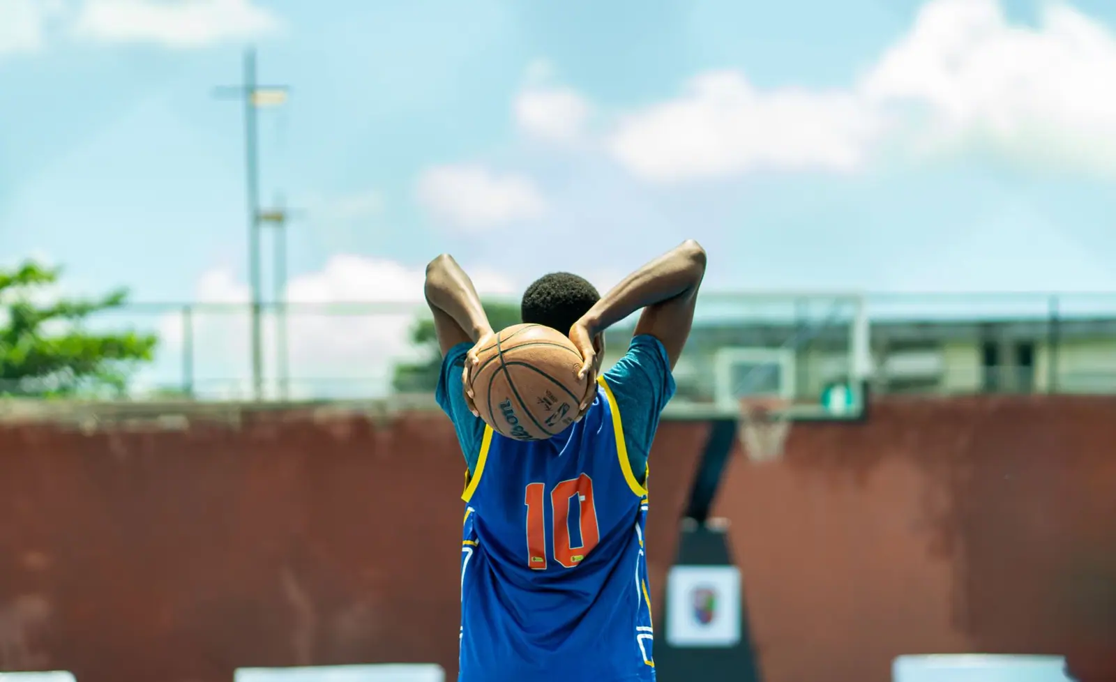
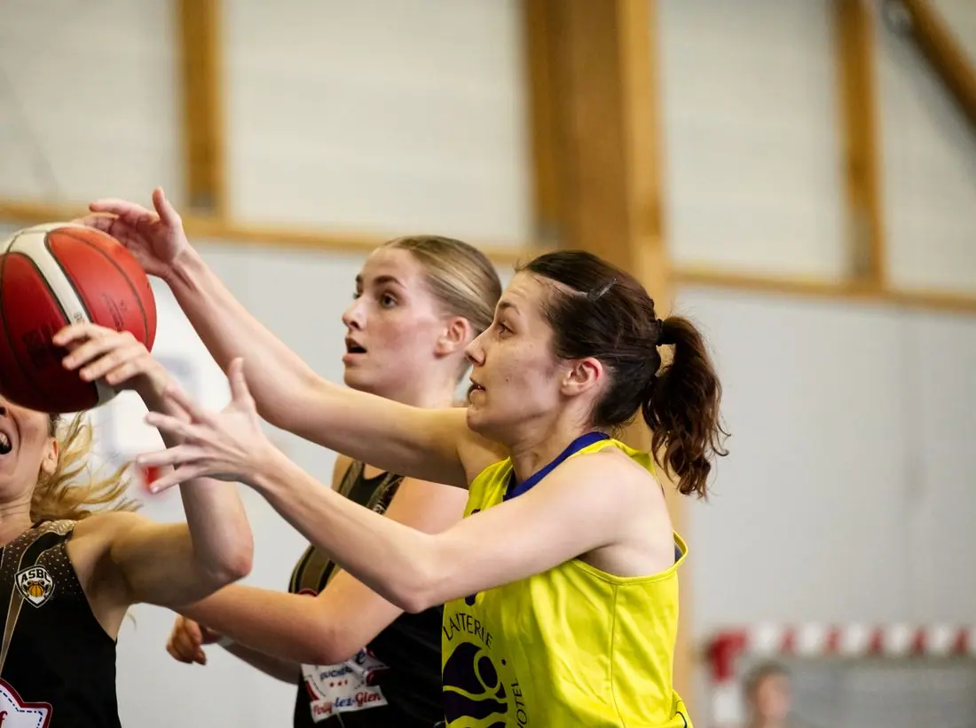
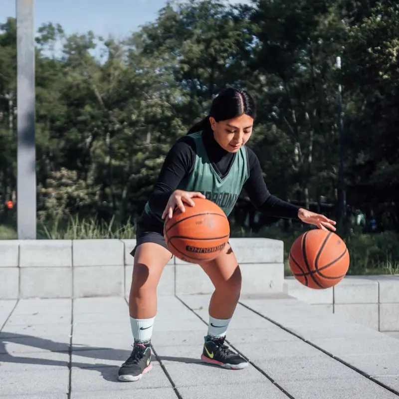
Photos are of kids actually playing, mostly on outdoor courts, and the captions say so: they are labeled as summer league on the 10th Street court instead of pretending to be the winter gym. Adults appear only where they are coaching or volunteering. There are no crowd shots, because a Minis game draws about forty people.
Accessibility
Body text is 17px and every color pair passes WCAG AA in both themes. Dock buttons have full-height tap targets with text labels under each icon. Copy is written at about a sixth-grade reading level for parents reading in a second language, and the gym list notes step-free entrances and Wheels Night.
Type system
- DisplayBebas NeueBebas Neue is the condensed all-caps of gym banners, jersey backs and scoreboard headers, so the schedule reads like it was painted on the wall.
- TextGeologicaGeologica is a sturdy geometric sans with open counters that stays clear on a cracked phone screen at pickup.
- AccentOverpass MonoOverpass descends from Highway Gothic, the lettering of road signs, and its mono cut gives times and scores the feel of a scorer's book.
Colour and contrast
Every text pairing is checked against WCAG 2.2 in both themes.
Dark theme
| Pairing | Sample | Ratio | WCAG |
|---|
| Body text on page | Aa | 15.88:1 | AAA |
| Body text on cards | Aa | 14.39:1 | AAA |
| Secondary text | Aa | 6.98:1 | AA |
| Links | Aa | 9.26:1 | AAA |
| Button text | Aa | 9.36:1 | AAA |
| Accent label text | Aa | 7.63:1 | AAA |
| Text on dark bands | Aa | 16.74:1 | AAA |
| Muted text on dark bands | Aa | 8.34:1 | AAA |
| Text on brand bands | Aa | 9.36:1 | AAA |
| Muted text on brand bands | Aa | 5.65:1 | AA |
Light theme
| Pairing | Sample | Ratio | WCAG |
|---|
| Body text on page | Aa | 15.32:1 | AAA |
| Body text on cards | Aa | 16.94:1 | AAA |
| Secondary text | Aa | 5.76:1 | AA |
| Links | Aa | 6.43:1 | AA |
| Button text | Aa | 7.47:1 | AAA |
| Accent label text | Aa | 5.07:1 | AA |
| Text on dark bands | Aa | 15.32:1 | AAA |
| Muted text on dark bands | Aa | 7.97:1 | AAA |
| Text on brand bands | Aa | 7.47:1 | AAA |
| Muted text on brand bands | Aa | 4.99:1 | AA |