Why Twelve Stones Recovery looks the way it does
A site for a Knoxville recovery ministry whose whole job is getting a frightened person on the phone with someone who has been where they are. Everything else (meetings, the sober house, the family group) sits one click behind that call.
- Built for
- People in active addiction, often reading late at night on a phone; their parents and spouses; men leaving treatment or jail; churches and volunteers who want to help.
- Navigation
- Classic top bar. Logo left, pages right, one action. Familiar to every visitor.
- Pages
- Home, Meetings, Gilgal House, Families, Stories, Help out
- Hero
- a short action form as the hero: the one thing most visitors came to do (request a ride, ask for help, register a child) can be done before they scroll, with reassurance beside it. Variants: a = headline, reassurance and a photo on the left with the form as a raised card on the right; b = a tall photo carrying the headline, with the form and reassurance on a plain panel beside it; c = headline beside a photo, then the form laid out as one horizontal booking bar
Typography
Schibsted Grotesk was drawn for a Scandinavian news group, and it carries that plain newsroom voice: heavy, short, no flourish. Set at 800 with tight tracking, the headlines sound like someone talking straight to you. Piazzolla, a sturdy serif built for small text, carries the long stories so they read like letters rather than marketing.
Color
The palette comes from the riverbed in Joshua 4: limestone gray for the page, wet slate blue for the brand, and the peach of first light for the accent. It is calm on purpose. Nothing flashes or shouts, because many visitors arrive anxious, ashamed or still using. The dark theme is a deep slate night, with the peach warmed so it still reads at 3 AM.
Layout and navigation
A classic top bar, because nobody in crisis should have to learn a menu. Six plain page names and one button that never moves: Talk to someone tonight. On a phone the button stays beside the menu icon.
The hero
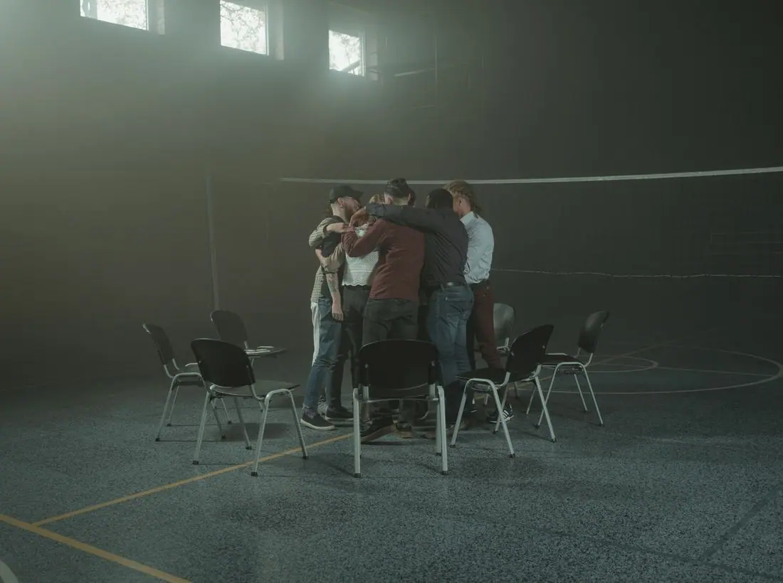
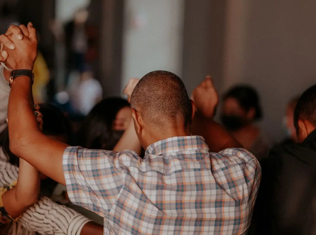
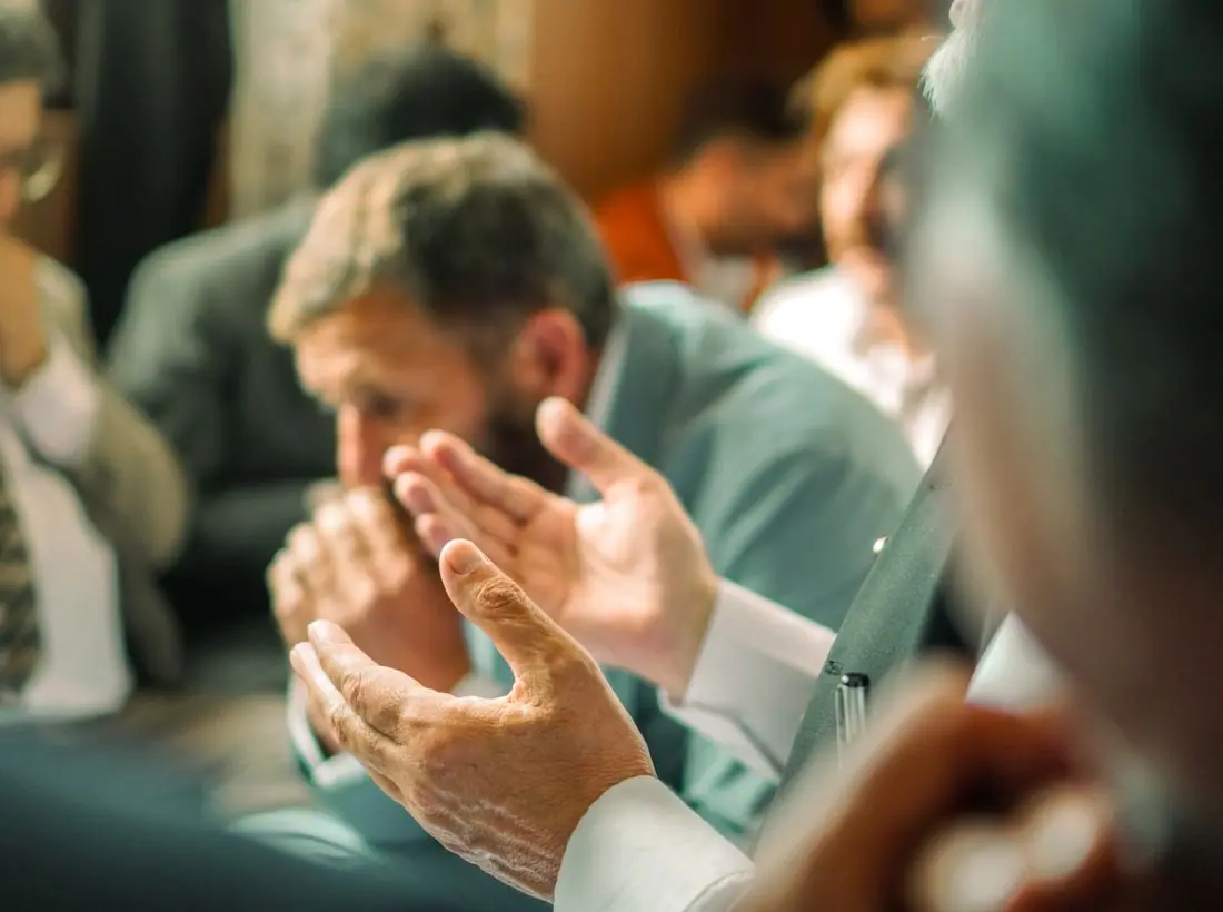
The first screen is a call-back form beside a tall photograph of men praying over a friend. Calling a stranger is the hardest step, so we made asking for a call even easier: a first name and a number. The reassurance list answers the fears people actually tell us about: cost, police, family finding out, and whether the person calling back really understands.
Calls to action
Each action names the next real step: Talk to someone tonight, Find Tuesday's meeting, Ask about a bed, Come to Family Circle, Sponsor a bed. There is no Learn more anywhere, and giving is kept off the main bar so a person looking for help never sees a donation ask first.
Photography
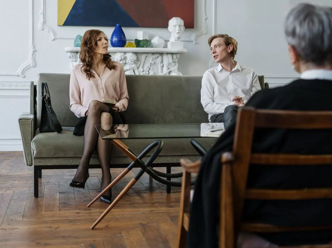
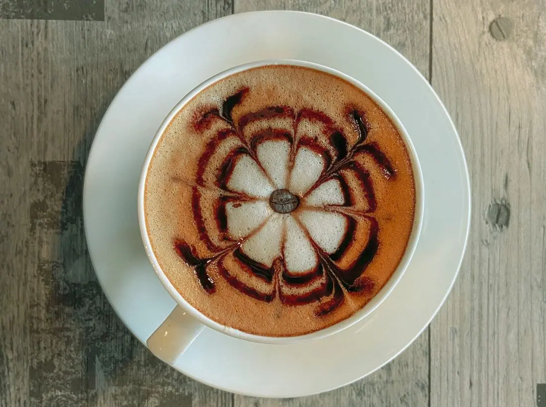
Circles of chairs, men holding each other up, a woman laughing on a bench, coffee on a table. Ordinary adults in ordinary rooms, never a staged sad face or a needle. Every testimony uses a first name and last initial, the way recovery rooms protect anonymity.
Accessibility
Body text is 18px with generous spacing, and every color pair passes 4.5:1. Forms label every field, mark what is optional and never require an email. The 24-hour number is a tappable link on every page, and the crisis line and 988 appear wherever someone might be in danger.
Type system
- DisplaySchibsted GroteskA newsroom grotesque with blunt, honest shapes: it reads like a notice pinned to a church-basement corkboard, not like a brochure.
- TextPiazzollaA sturdy book serif drawn for small sizes, so long first-person stories feel like they were written by hand and set with care.
Colour and contrast
Every text pairing is checked against WCAG 2.2 in both themes.
Light theme
| Pairing | Sample | Ratio | WCAG |
|---|
| Body text on page | Aa | 13.23:1 | AAA |
| Body text on cards | Aa | 15.02:1 | AAA |
| Secondary text | Aa | 5.8:1 | AA |
| Links | Aa | 8.07:1 | AAA |
| Button text | Aa | 9.99:1 | AAA |
| Accent label text | Aa | 7.18:1 | AAA |
| Text on dark bands | Aa | 13.23:1 | AAA |
| Muted text on dark bands | Aa | 7.12:1 | AAA |
| Text on brand bands | Aa | 9.99:1 | AAA |
| Muted text on brand bands | Aa | 6.43:1 | AA |
Dark theme
| Pairing | Sample | Ratio | WCAG |
|---|
| Body text on page | Aa | 14.72:1 | AAA |
| Body text on cards | Aa | 13.18:1 | AAA |
| Secondary text | Aa | 6.58:1 | AA |
| Links | Aa | 8.86:1 | AAA |
| Button text | Aa | 9.12:1 | AAA |
| Accent label text | Aa | 9.14:1 | AAA |
| Text on dark bands | Aa | 15.62:1 | AAA |
| Muted text on dark bands | Aa | 7.9:1 | AAA |
| Text on brand bands | Aa | 9.12:1 | AAA |
| Muted text on brand bands | Aa | 5.49:1 | AA |