Why Trinity Lutheran looks the way it does
A website for a 180-year-old liturgical congregation whose life is organized around the Divine Service, the church year and a parish school. It is calm and printed in feel, puts the liturgy first and explains it plainly for people who have never opened a hymnal.
- Built for
- Lifelong Lutherans and their grandchildren, families weighing the parish school, and newcomers drawn by the liturgy who want to know what to expect and how communion works.
- Navigation
- Centred masthead. The name sits centred like a printed masthead; pages run underneath. Signals heritage and calm.
- Pages
- Home, The Divine Service, Learn the faith, Trinity School, Sermons, Since 1846
- Hero
- A single verse or sentence set enormous as the opening statement, with its reference, a short supporting line and one action. Variants: a = the quote fills the width with a hanging quotation mark; b = the quote beside a tall photograph; c = the reference becomes the architecture, with the book name and a giant outlined chapter and verse in the left column; A tall photograph on one side; on the other, the headline, a short intro and three 'next step' rows with arrows instead of a pair of buttons. Variants: a = photo bleeds off the left edge, rows show when each step happens; b = photo bleeds off the right edge, rows are numbered steps set large
Typography
Brygada 1918 is a revival of a Polish book face cut the same year Trinity stopped printing its hymnal in German. Its sturdy serifs and slightly calligraphic italic suit a congregation that still reads old words aloud. Alegreya Sans carries the reading text at 18 pixels, warm enough to sit beside the serif and plain enough for the 8:00 congregation's reading glasses.
Color
The palette is taken from Luther's seal: the deep blue of its field and the gold of its ring, set on a warm stone gray close to the limestone steps on Fairfield Avenue. Gold is kept for rules, the footer button and small marks, never for text. In dark mode the blue is lifted to a pale slate so links and buttons stay readable on the near-black ground.
Layout and navigation
A centred masthead with the pages running beneath it, like the front of a parish bulletin. Members of a 180-year-old church want the site to look as settled as the building, and a centred name says that before anything else does. The one button in the masthead goes to the Divine Service.
The hero
The opening is Isaiah 6:3, the text of the Sanctus sung at every Divine Service. The book name and an outlined 6:3 hold the left column and the verse is set in italic beside it, the way a reference sits in the margin of a bulletin. Service times and the one button sit directly under the verse, so nobody has to scroll to find out when to come.
Calls to action
Attend the Divine Service, See this Sunday's hymns, Join the inquirers' class, Speak with a pastor, Book a school tour. The wording follows the congregation's own vocabulary and is honest about practice: communion is explained, and visitors are asked to speak with a pastor first rather than being surprised at the rail.
Photography
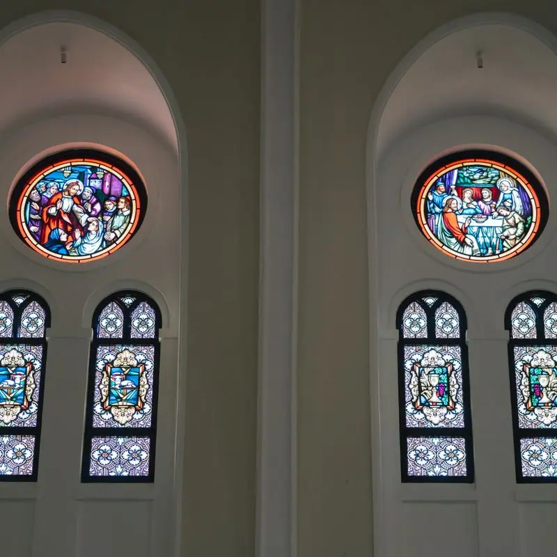
Chalices, pews, a fanlight and close-ups of glass, with people reading in pews and children in a parish classroom. We avoided famous Gothic interiors, because Trinity is a brick parish church in the Midwest. The history page carries photographs only where we had a fitting one; a modern classroom photo next to '1849' would have been a lie.
Accessibility
Body text is 18 pixels with a 1.6 line height, and every text color passes WCAG AA in both themes. The weekly schedule opens on today's tab, hymn numbers are written out as text rather than images, and the lift, hearing loop and large-print hymnals are mentioned on the home page and again on the Divine Service page, before anyone has to ask.
Type system
- DisplayBrygada 1918A revival of a 1918 book face with the sturdy, slightly old-world strokes of a German hymnal printed for an American congregation.
- TextAlegreya SansA humanist sans with calligraphic roots that sits quietly beside a serif and stays readable for older eyes at 18 pixels.
Colour and contrast
Every text pairing is checked against WCAG 2.2 in both themes.
Light theme
| Pairing | Sample | Ratio | WCAG |
|---|
| Body text on page | Aa | 14.81:1 | AAA |
| Body text on cards | Aa | 16.29:1 | AAA |
| Secondary text | Aa | 5.9:1 | AA |
| Links | Aa | 8.58:1 | AAA |
| Button text | Aa | 9.87:1 | AAA |
| Accent label text | Aa | 5.98:1 | AA |
| Text on dark bands | Aa | 14.81:1 | AAA |
| Muted text on dark bands | Aa | 7.85:1 | AAA |
| Text on brand bands | Aa | 9.87:1 | AAA |
| Muted text on brand bands | Aa | 6.36:1 | AA |
Dark theme
| Pairing | Sample | Ratio | WCAG |
|---|
| Body text on page | Aa | 15.3:1 | AAA |
| Body text on cards | Aa | 13.84:1 | AAA |
| Secondary text | Aa | 6.79:1 | AA |
| Links | Aa | 9.57:1 | AAA |
| Button text | Aa | 9.82:1 | AAA |
| Accent label text | Aa | 10.0:1 | AAA |
| Text on dark bands | Aa | 16.25:1 | AAA |
| Muted text on dark bands | Aa | 8.12:1 | AAA |
| Text on brand bands | Aa | 9.82:1 | AAA |
| Muted text on brand bands | Aa | 5.76:1 | AA |
 Trinity season, 2026The Season after Pentecost