Nov06
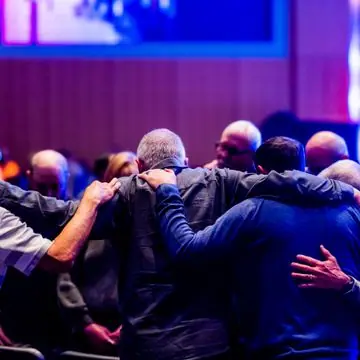
Friday Breakfast: Gratitude
6:00 AM · Fellowship Hall
Chaplain Gil on thankfulness when work is hard.
8:00 AM · Meet at the Fellowship Hall
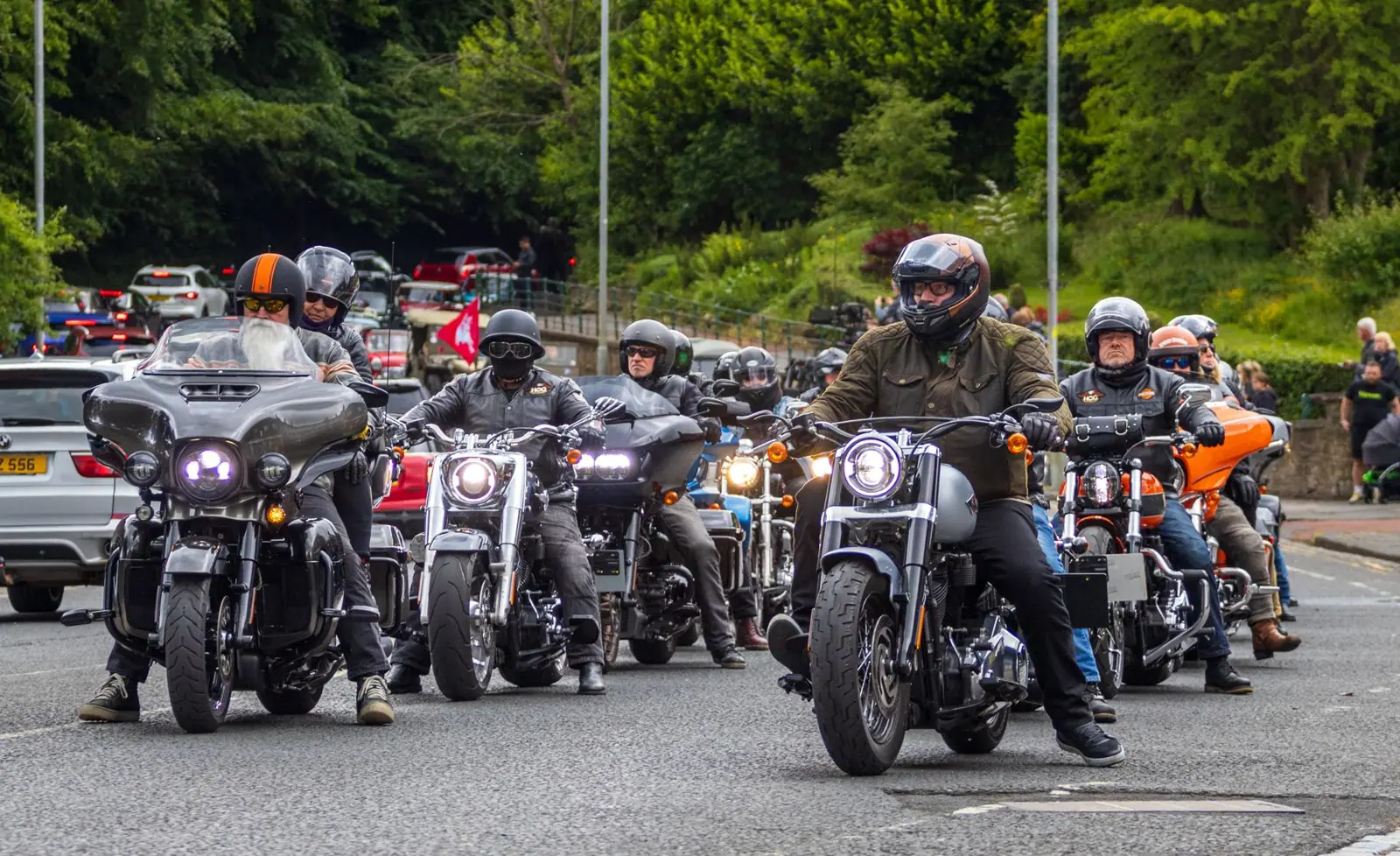
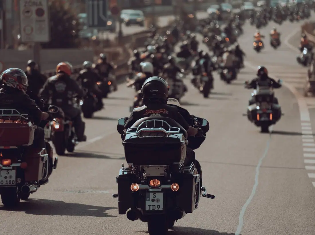
We're replacing the roof on a widow's home before winter. Tools, lunch and good company provided.
Chaplain Gil on thankfulness when work is hard.
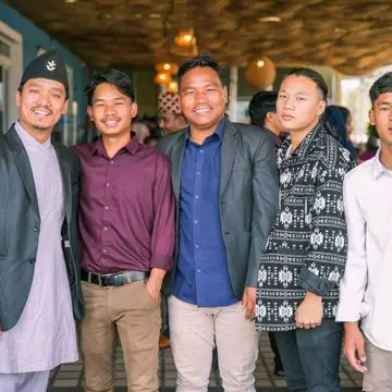
Build wooden toolboxes together.
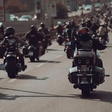
A morning for slowing down.
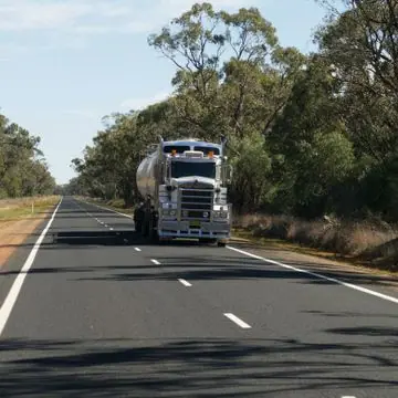
Assemble and wrap toys for neighbors.
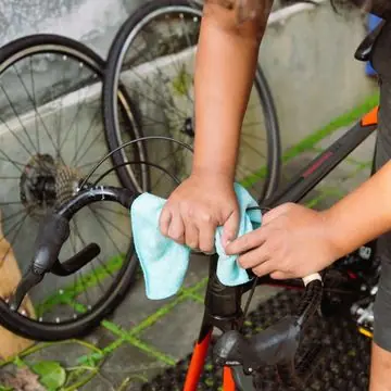
Set a goal you'll actually keep.
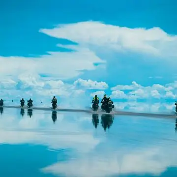
Crews compete for the iron pot.
Design notes
The Forge is a men's ministry site with condensed uppercase headlines, a rust orange accent and a full-bleed photo of two colleagues. It is direct and practical, like a tradesman's workshop sign.
Oswald Bold in capitals sets the headline at about 100 pixels. It is a tall, condensed face that looks like stamped metal. Source Sans 3 handles body text and is calm and legible beside the heavy headline.
The light theme uses warm grey (#EFEBE6) and charcoal (#1E1D1B), with rust orange (#A9501F) for buttons and moss green (#3F4B3C) as an accent. The dark theme is first, with near-black (#151413) and a brighter ember orange (#E08A55). The colours come from iron, brick and wood, and they feel earned rather than glossy.
A light bar has a round rust monogram, the name in condensed capitals, six links and a rust Give button. Below the hero a four-cell strip gives meeting times and place. Cards have thin outlines and square corners, in keeping with the hard-edged type.
A full-bleed photo of two colleagues sharing a high five fills the screen under a dark overlay. 'BUILD SOMETHING THAT LASTS.' is set in white capitals across two lines. The eyebrow gives the time, 'Fridays at 6 AM. Show up.', which is both the schedule and the tone.
'Join a crew' is a solid rust button and 'Next meetup' is outlined. The language of crews fits the work-and-build identity. The chip below shows how soon the next Friday breakfast starts.
The photo is a bright office scene with warm light and a visible laugh. It shows friendship and humour rather than gloom. A real ministry should use its own men at work on a service project, with sleeves rolled up.
White text over the darkened photo stays clear, and rust buttons with white text measure about 5.4 to 1. Charcoal on warm grey is about 14 to 1. Uppercase headlines are short, which avoids the slow reading that long all-caps passages cause.
Each text pairing is checked against WCAG 2.2 in both themes. Ratios are computed from the exact theme colours.
| Pairing | Sample | Ratio | WCAG |
|---|---|---|---|
| Body text on page | Aa | 15.10:1 | AAA |
| Body text on cards | Aa | 13.63:1 | AAA |
| Secondary text | Aa | 7.78:1 | AAA |
| Secondary text on tinted bands | Aa | 6.29:1 | AA |
| Links and labels | Aa | 6.95:1 | AA |
| Button text | Aa | 7.44:1 | AAA |
| Accent button text | Aa | 8.95:1 | AAA |
| Footer text | Aa | 15.10:1 | AAA |
| Pairing | Sample | Ratio | WCAG |
|---|---|---|---|
| Body text on page | Aa | 14.19:1 | AAA |
| Body text on cards | Aa | 15.89:1 | AAA |
| Secondary text | Aa | 5.70:1 | AA |
| Secondary text on tinted bands | Aa | 4.74:1 | AA |
| Links and labels | Aa | 5.55:1 | AA |
| Button text | Aa | 5.45:1 | AA |
| Accent button text | Aa | 9.20:1 | AAA |
| Footer text | Aa | 14.19:1 | AAA |
Designed by Greater Purpose Web. Names, people, photos and events are sample content.