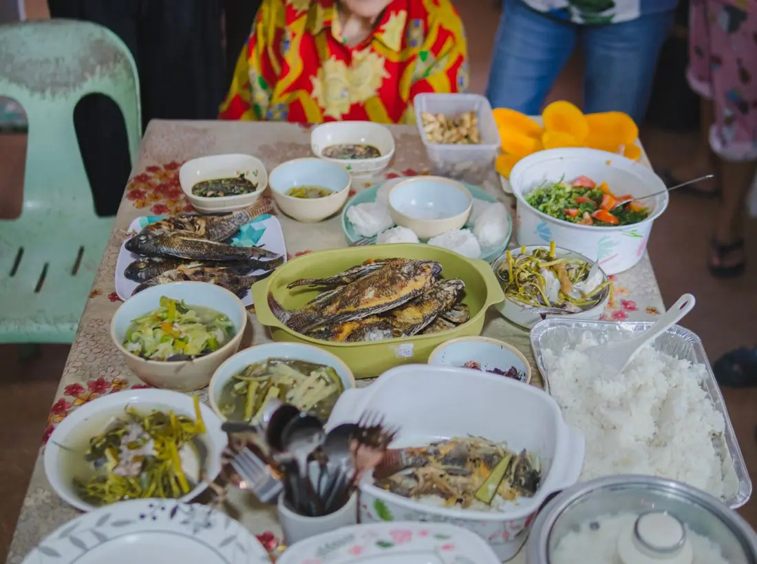

 SeriesSeasons of a Woman
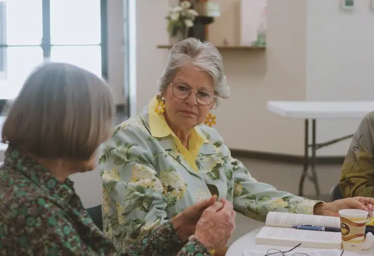
 SeriesTable Talk
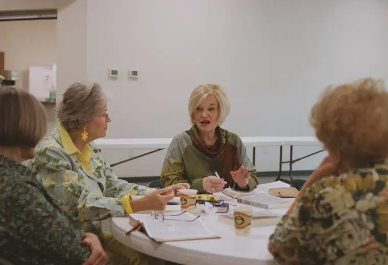
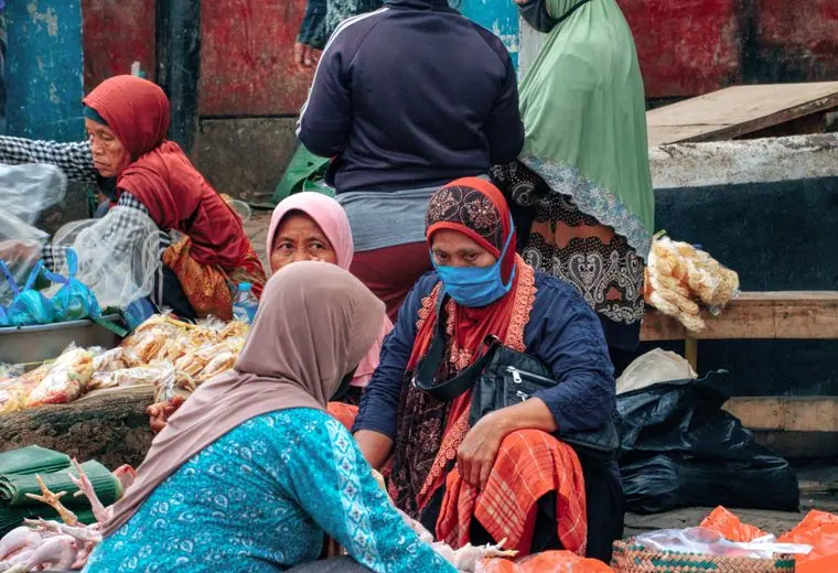 SeriesQuiet Mornings
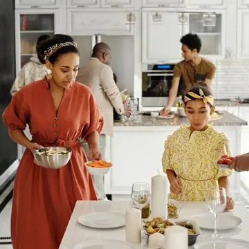
Nov03
Mothers' Circle Potluck
9:30 AM · Fellowship Hall
A meal for moms with little ones, childcare included.
Monthly brunches, small groups and mentoring that spans every season of life. Come as you are. There is a place set for you.
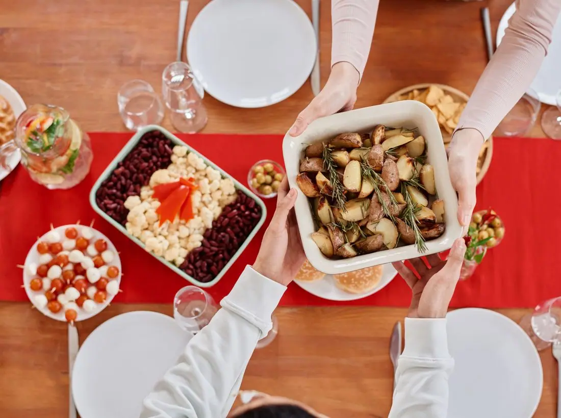

Life is fuller and lonelier than it looks. Table of Grace is a community of women who share meals, stories and the quiet work of encouraging each other. Whether you are twenty-three or seventy-three, you will find someone who gets it.
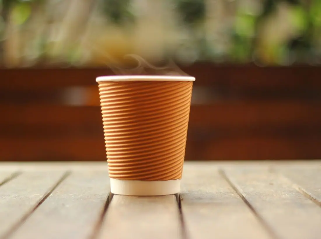
We match women by season, story and personality, then provide a guide for six months of monthly conversations. Many pairs keep meeting long after the program ends.
You prepare a table before me in the presence of my enemies. You anoint my head with oil. My cup runs over.Psalm 23:5
A meal for moms with little ones, childcare included.

This month: a classic about a small-town woman.

Build a wreath and share your Advent traditions.
One gift covers brunch, a book and a place among friends.
Design notes
Table of Grace is a women's ministry site with a dusty rose palette, a light Cormorant headline and round photos. It feels like a handwritten invitation to a brunch.
Cormorant Garamond at semibold sets the headline at about 100 pixels with an airy, elegant look. Karla provides body text with a friendly, slightly informal grotesque form. The pairing is feminine without being fussy, and the body face stays readable at small sizes.
The page is a pale blush (#FBF3F1) with plum-brown text (#3A2A33), a dusty rose (#9B4B6A) brand colour and a soft gold (#C9A66B) accent. The hero is a rose tint. The dark theme moves to deep mulberry with a lighter pink (#E59AB4). The palette is soft but the rose is deep enough to keep buttons clear.
A centred logo sits above a single row of links, with a rose Give pill at the right. Content is arranged in rounded cards and circular category images for groups. The centred masthead and round shapes feel gentle and domestic.
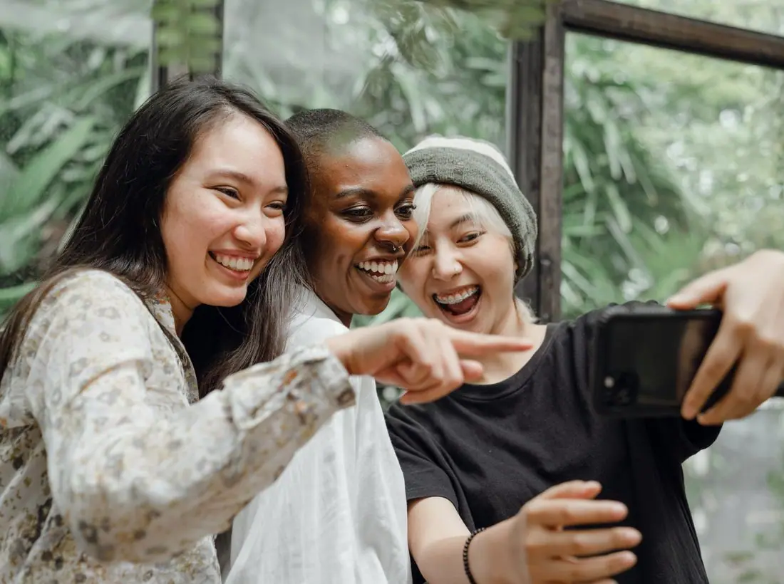
The hero is split. 'A seat for every woman.' appears in light serif on two lines at the left, with a short line about brunches, small groups and mentoring. On the right a tall photo of two women laughing in front of a mural has a small coffee-bean image overlapping. A chip names the next monthly brunch.
'Join a group' is a solid rose pill and 'Upcoming events' is outlined. Groups are the heart of the ministry, so they come first. The wording is warm, with no pressure.
The photo shows real laughter and bright colours, which is more welcoming than a posed Bible study. A real ministry should photograph its own gatherings with consent, and include women of different ages.
Plum text on blush is about 12.3 to 1, and white on rose about 5.8 to 1. The light weight of the headline is offset by its very large size. Buttons are large pills with plenty of space around them.
Each text pairing is checked against WCAG 2.2 in both themes. Ratios are computed from the exact theme colours.
| Pairing | Sample | Ratio | WCAG |
|---|---|---|---|
| Body text on page | Aa | 12.31:1 | AAA |
| Body text on cards | Aa | 13.47:1 | AAA |
| Secondary text | Aa | 5.61:1 | AA |
| Secondary text on tinted bands | Aa | 4.62:1 | AA |
| Links and labels | Aa | 5.71:1 | AA |
| Button text | Aa | 5.82:1 | AA |
| Accent button text | Aa | 8.58:1 | AAA |
| Footer text | Aa | 12.31:1 | AAA |
| Pairing | Sample | Ratio | WCAG |
|---|---|---|---|
| Body text on page | Aa | 15.26:1 | AAA |
| Body text on cards | Aa | 13.81:1 | AAA |
| Secondary text | Aa | 7.95:1 | AAA |
| Secondary text on tinted bands | Aa | 6.13:1 | AA |
| Links and labels | Aa | 8.15:1 | AAA |
| Button text | Aa | 9.01:1 | AAA |
| Accent button text | Aa | 10.49:1 | AAA |
| Footer text | Aa | 15.26:1 | AAA |
Designed by Greater Purpose Web. Names, people, photos and events are sample content.