Why St. Demetrios looks the way it does
A parish site for a Greek Orthodox church in Astoria, where the Liturgy is sung in Greek and English and the people range from new arrivals from Athens to fourth-generation families who moved to Long Island and still drive in on Sundays. It is built around the things people actually phone the office about: service times, sacraments and memorials, Greek School and the October feast.
- Built for
- Parishioners across Astoria, Long Island City and Long Island; Greek-speaking grandparents; non-Greek spouses and inquirers visiting their first Liturgy; families planning a baptism, wedding or memorial.
- Navigation
- Split screen. Identity and navigation stay fixed on the left half while content scrolls on the right, like a printed programme.
- Pages
- Home, Services, Sacraments, Feast & festival, Greek School, Parish life
- Hero
- An asymmetric mosaic of five photographs with the headline locked into one cell of the grid, so the first screen shows real people before it says anything. Variants: a = headline block top-left beside one large photo, three smaller below; b = a tall photo leads and the headline sits low on the right; c = a triptych, with the headline in the middle panel between stacked photos; A full-bleed photograph left completely free of words, with the headline set underneath it like a museum caption and a small column of place, date and photo credit. Variants: a = catalogue entry (plate number, headline, details column); b = the details run as a ruled strip above one wide headline; c = the photo bleeds off the left edge and the details hang in the right-hand margin beside it
Typography
Cinzel is built from Roman inscriptional capitals, the chiselled letter you see in the band of text around a Byzantine dome. It gives the headings a carved, liturgical stillness. Literata carries the reading because it has a complete Greek alphabet; anything set in Greek switches to Noto Serif automatically so accents and breathings are always correct.
Color
Oxblood and old gold come from the vestments and the gilded iconostasis, set on a pale marble ground rather than a cream. The dark theme is the church at Vespers: near-black, with the gold becoming the main color the way candlelight picks out the icons. A faint grain sits under everything, like the gesso of an icon board.
Layout and navigation
The split screen works like a printed service book: the parish name, the Sunday times and the six pages stay fixed on the left while the content scrolls on the right. The language switch sits in that panel, so a grandmother can turn the whole site to Greek in one tap and keep it there.
The hero
The home page opens on a single photograph of candles burning in the sand tray before the icons, with no words over it. The headline sits underneath like a museum caption, because lighting a candle is the first thing every Orthodox Christian does on entering, and it is the first thing a visitor should understand about the building.
Calls to action
The one button that is always visible is Arrange a sacrament. Baptisms, weddings and memorials are the reasons most people contact a Greek parish, and each needs weeks of notice and paperwork. The other actions are just as specific: Enroll in Greek School, Come to the feast, Make your stewardship pledge.
Photography
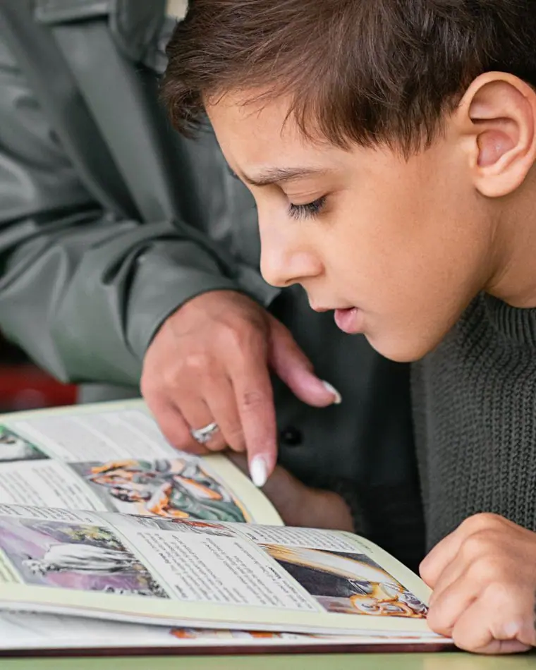
Candles, icons, a priest at a font with a family, children reading at a school desk, a long table at the feast. We left out onion domes and Russian exteriors; the photographs had to look like a Greek parish in Queens rather than a postcard.
Accessibility
Every heading, button and service name exists in both languages, with the correct lang attribute so screen readers pronounce Greek as Greek. Long paragraphs stay in English with Greek headings, so nothing is machine-translated. Body text is 18px and the oxblood on marble passes AA comfortably.
Type system
- DisplayCinzelCinzel is drawn from Roman inscriptional capitals, the same chiselled letter that runs around the dome and across the iconostasis in Greek churches.
- TextLiterataA book face with full Greek and Latin alphabets, so a yiayia reading in Greek and her grandson reading in English get the same calm, bookish page.
Colour and contrast
Every text pairing is checked against WCAG 2.2 in both themes.
Light theme
| Pairing | Sample | Ratio | WCAG |
|---|
| Body text on page | Aa | 14.5:1 | AAA |
| Body text on cards | Aa | 15.99:1 | AAA |
| Secondary text | Aa | 5.8:1 | AA |
| Links | Aa | 8.76:1 | AAA |
| Button text | Aa | 10.25:1 | AAA |
| Accent label text | Aa | 5.25:1 | AA |
| Text on dark bands | Aa | 14.5:1 | AAA |
| Muted text on dark bands | Aa | 7.68:1 | AAA |
| Text on brand bands | Aa | 10.25:1 | AAA |
| Muted text on brand bands | Aa | 6.41:1 | AA |
Dark theme
| Pairing | Sample | Ratio | WCAG |
|---|
| Body text on page | Aa | 15.38:1 | AAA |
| Body text on cards | Aa | 14.28:1 | AAA |
| Secondary text | Aa | 6.74:1 | AA |
| Links | Aa | 9.22:1 | AAA |
| Button text | Aa | 9.14:1 | AAA |
| Accent label text | Aa | 7.46:1 | AAA |
| Text on dark bands | Aa | 16.02:1 | AAA |
| Muted text on dark bands | Aa | 8.03:1 | AAA |
| Text on brand bands | Aa | 9.14:1 | AAA |
| Muted text on brand bands | Aa | 5.56:1 | AA |