Why St. Brigid looks the way it does
A parish website built around the question Catholics ask most: when is Mass? The weekly schedule is the home page's first screen, the utility strip repeats daily Mass and confession on every page, and everything else follows the way parish life actually runs: sacraments, the bulletin, becoming Catholic, and the St. Vincent de Paul conference that helps neighbors with rent and groceries.
- Built for
- Registered parishioners of all ages, especially the daily-Mass regulars; Catholics new to Toledo looking for a parish; engaged couples and new parents; adults exploring the faith; neighbors who need help and have heard St. Vincent de Paul can give it.
- Navigation
- Two-tier header. A thin utility strip carries times, phone and language; the main bar below holds pages and the action.
- Pages
- Home, Mass times, Sacraments, Becoming Catholic, Need help?, Bulletin, Register
- Hero
- a short action form as the hero: the one thing most visitors came to do (request a ride, ask for help, register a child) can be done before they scroll, with reassurance beside it. Variants: a = headline, reassurance and a photo on the left with the form as a raised card on the right; b = a tall photo carrying the headline, with the form and reassurance on a plain panel beside it; c = headline beside a photo, then the form laid out as one horizontal booking bar; This week's schedule is the hero: day columns with what is on, so regulars and newcomers see when to come before anything else; A 'What do you need today?' search that filters real services as you type, for organisations whose visitors arrive with an urgent need
Typography
EB Garamond is a careful revival of Claude Garamond's type, the same family of letters used in missals and breviaries for four centuries. We use its old-style figures, so times like 10:30 sit in the line like printed text, and its italic for the names of feasts. Red Hat Text does the reading because it stays crisp and open at small sizes on old phones.
Color
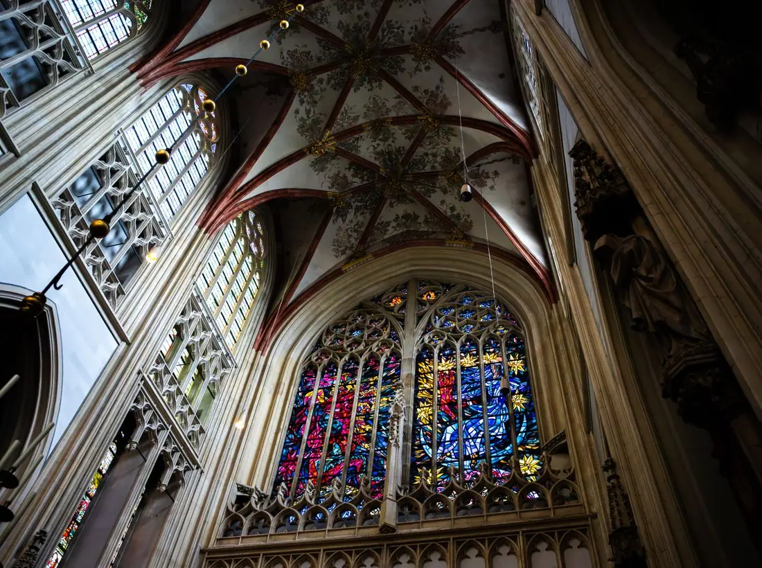
The violet is the color of Advent and Lent vestments, and the deep orange is St. Brigid's flame, the fire her nuns kept burning at Kildare for centuries. Neutrals lean very slightly toward lavender, like light through Toledo-made glass. In the dark theme the violet lightens to a lilac so it reads as a color rather than a shadow.
Layout and navigation
The two-tier header keeps daily Mass, confession, the address and the phone number in a thin strip on every page, because those are the four things people look up most. The main bar holds seven pages named in plain parish language, and the single button is Register with the parish, which is how a Catholic family formally joins.
The hero
The home page opens on this week's calendar, not a photograph: seven columns with every Mass, confession time, holy hour and meeting, and today's column highlighted. A countdown names the next Mass. For a parish where some people come every single morning, the schedule is the most welcoming thing we can show.
Calls to action
Every action is a real parish task: Register with the parish, Request a sacrament, Come to an inquiry night, Ask St. Vincent de Paul for help. Registration gets the main button because everything else here depends on it, from baptism dates to a sponsor letter for a godparent.
Photography
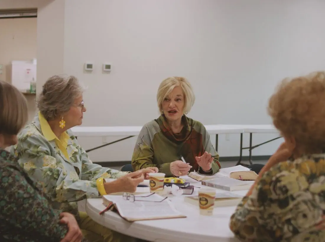
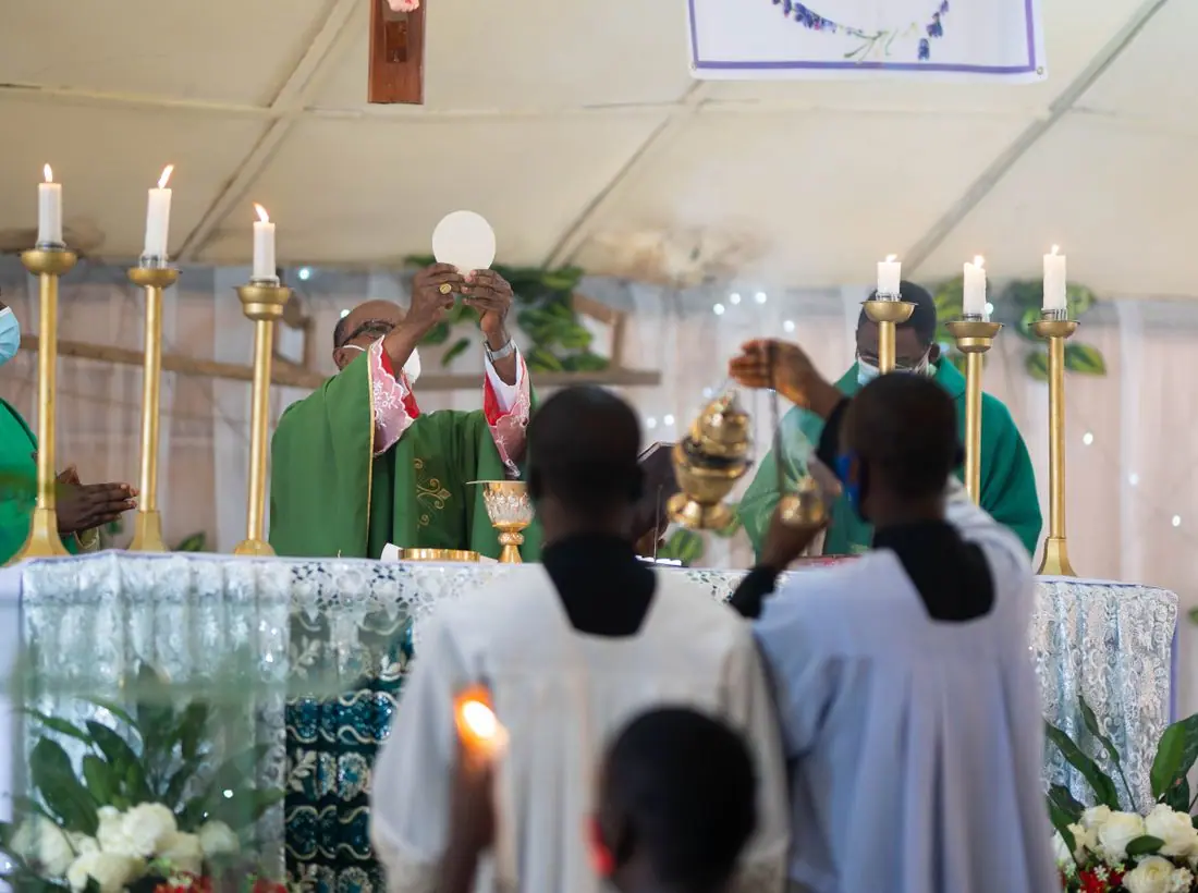
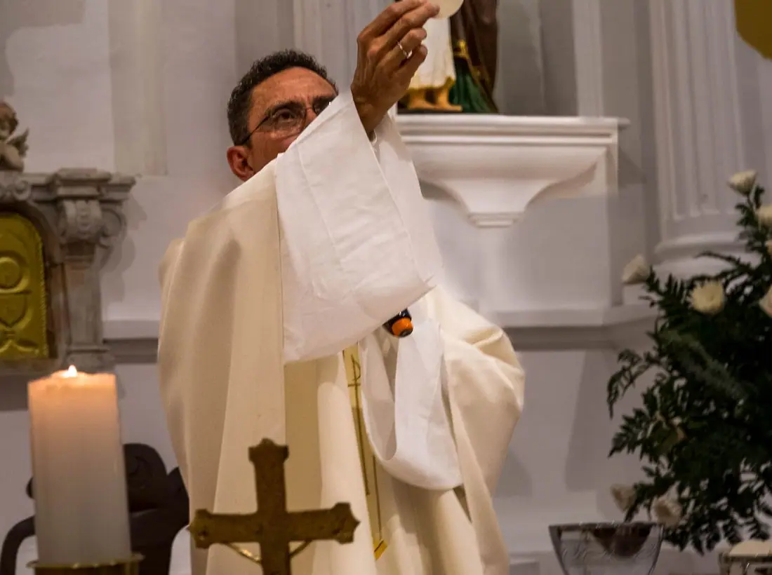
We chose photographs of the Mass itself, the font, a First Communion veil, a hospital bedside and the pantry shelves, and kept candles to the places where a parish really lights them. The volunteer and portrait shots are stock stand-ins: the first thing we will ask the parish for is twenty minutes with a photographer at the 10:30 and on a pantry Thursday.
Accessibility
Body text is 18px with a 1.6 line height, every color pairing passes AA in both themes, and today's column in the schedule is marked with text as well as color. Mass times are written as text, never as images, so screen readers and translation tools can read them.
Type system
- DisplayEB GaramondA faithful revival of Claude Garamond's sixteenth-century roman, the face of missals, breviaries and parish registers, set with old-style figures so Mass times sit in the line like printed text.
- TextRed Hat TextA clear, open sans with generous spacing, drawn for small sizes, so the 8 AM regulars can read the schedule on a phone without reaching for their glasses.
Colour and contrast
Every text pairing is checked against WCAG 2.2 in both themes.
Light theme
| Pairing | Sample | Ratio | WCAG |
|---|
| Body text on page | Aa | 14.92:1 | AAA |
| Body text on cards | Aa | 17.08:1 | AAA |
| Secondary text | Aa | 5.9:1 | AA |
| Links | Aa | 10.1:1 | AAA |
| Button text | Aa | 11.56:1 | AAA |
| Accent label text | Aa | 5.59:1 | AA |
| Text on dark bands | Aa | 14.92:1 | AAA |
| Muted text on dark bands | Aa | 7.86:1 | AAA |
| Text on brand bands | Aa | 11.56:1 | AAA |
| Muted text on brand bands | Aa | 7.25:1 | AAA |
Dark theme
| Pairing | Sample | Ratio | WCAG |
|---|
| Body text on page | Aa | 15.5:1 | AAA |
| Body text on cards | Aa | 14.33:1 | AAA |
| Secondary text | Aa | 6.84:1 | AA |
| Links | Aa | 9.49:1 | AAA |
| Button text | Aa | 9.56:1 | AAA |
| Accent label text | Aa | 8.02:1 | AAA |
| Text on dark bands | Aa | 16.24:1 | AAA |
| Muted text on dark bands | Aa | 8.17:1 | AAA |
| Text on brand bands | Aa | 9.56:1 | AAA |
| Muted text on brand bands | Aa | 5.71:1 | AA |