Why Silent Word looks the way it does
A website for a church where American Sign Language is the first language and English comes second. Everything is built for eyes: the livestream leads, every contact route is visual (videophone, text, email), and the copy is written in short, plain sentences because many members read English as a second language.
- Built for
- Deaf adults and families in the Rochester area; Deaf and hard-of-hearing students at RIT/NTID; DeafBlind members and their support providers; hearing spouses, children of Deaf adults and parents of Deaf children.
- Navigation
- Floating dock. Navigation floats in a dock at the bottom of the screen, where thumbs and eyes already are.
- Pages
- Home, Watch, Visit, Access, Groups, Talk with us
- Hero
- a short action form as the hero: the one thing most visitors came to do (request a ride, ask for help, register a child) can be done before they scroll, with reassurance beside it. Variants: a = headline, reassurance and a photo on the left with the form as a raised card on the right; b = a tall photo carrying the headline, with the form and reassurance on a plain panel beside it; c = headline beside a photo, then the form laid out as one horizontal booking bar; livestream-first: the opening screen is the stream itself, with a live or next-stream badge and countdown, a play control, the service chapters and a route to past services, for churches whose online congregation is as real as the room. Variants: a = headline above a large screen with the chapter list in a side panel; b = a full-width cinematic screen with the headline over it and chapters running beneath as a strip; c = headline and a chapter timeline in a left column beside the screen; A tall photograph on one side; on the other, the headline, a short intro and three 'next step' rows with arrows instead of a pair of buttons. Variants: a = photo bleeds off the left edge, rows show when each step happens; b = photo bleeds off the right edge, rows are numbered steps set large
Typography
Hanken Grotesk is a plain, compact sans with nothing to decode, set heavy and tight for headlines that read in one glance. Lexend carries the reading. It was developed with reading researchers to reduce visual crowding, and here many readers process English as a second language after ASL. Body text is 18px and lines are kept short.
Color
Turquoise, deep blue and yellow come from the Deaf flag that hangs behind the stage. Turquoise leads; the yellow is kept for buttons on coloured bands and for the live badge, where it has to be found instantly. The dark theme exists for evening viewing of the stream and keeps the same three colors, lifted for contrast.
Layout and navigation
Navigation lives in a dock at the bottom of the screen with an icon and a word for every page, because most members arrive on a phone, often straight from a video call. Six pages, each named for what you do there: Watch, Visit, Access, Groups, Talk with us.
The hero
The home page opens on the Sunday livestream, with the signer on screen and the service chapters listed beside it. For a Deaf congregation, seeing the worship is the welcome. The chapter list lets someone jump straight to the sermon, and the stream badge says plainly whether captions and voice interpreting are on.
Calls to action
The button in the top bar is Video-call a pastor, not a phone number, because a phone number is a closed door for most of this congregation. Other actions are just as concrete: Watch in ASL, Request access support, Sign up for ASL class. No action anywhere on the site needs hearing or a voice.
Photography
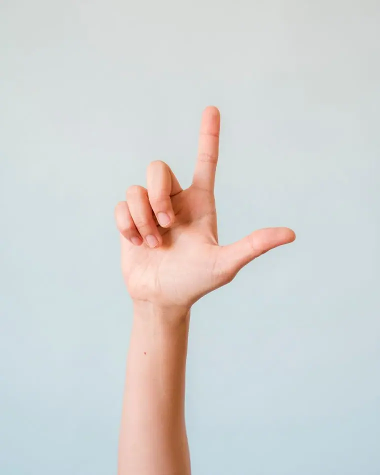
The photographs are of hands and faces signing, in good light, because ASL is read from the face as much as from the hands. We chose images where expressions are clear and hands are in frame, and avoided any image that frames deafness as something to fix.
Accessibility
Every video is captioned and has an ASL original. Contact routes are videophone, text and email, never voice-only. Color contrast passes AA in both themes, nothing depends on sound, and motion is minimal and respects reduced-motion settings, which also helps members with Usher syndrome and low vision.
Type system
- DisplayHanken GroteskA clean, compact grotesque with no flourishes to decode. Headlines read in one glance, the way a sign reads in one movement.
- TextLexendLexend was designed with reading researchers to ease visual stress and improve reading fluency, which matters for a congregation where English is usually a second language after ASL.
Colour and contrast
Every text pairing is checked against WCAG 2.2 in both themes.
Light theme
| Pairing | Sample | Ratio | WCAG |
|---|
| Body text on page | Aa | 15.29:1 | AAA |
| Body text on cards | Aa | 17.2:1 | AAA |
| Secondary text | Aa | 5.64:1 | AA |
| Links | Aa | 5.63:1 | AA |
| Button text | Aa | 6.34:1 | AA |
| Accent label text | Aa | 11.27:1 | AAA |
| Text on dark bands | Aa | 15.29:1 | AAA |
| Muted text on dark bands | Aa | 7.98:1 | AAA |
| Text on brand bands | Aa | 6.34:1 | AA |
| Muted text on brand bands | Aa | 4.6:1 | AA |
Dark theme
| Pairing | Sample | Ratio | WCAG |
|---|
| Body text on page | Aa | 15.93:1 | AAA |
| Body text on cards | Aa | 14.35:1 | AAA |
| Secondary text | Aa | 6.98:1 | AA |
| Links | Aa | 9.92:1 | AAA |
| Button text | Aa | 10.12:1 | AAA |
| Accent label text | Aa | 12.55:1 | AAA |
| Text on dark bands | Aa | 16.84:1 | AAA |
| Muted text on dark bands | Aa | 8.43:1 | AAA |
| Text on brand bands | Aa | 10.12:1 | AAA |
| Muted text on brand bands | Aa | 6.0:1 | AA |