 SeriesSabbath Rhythms
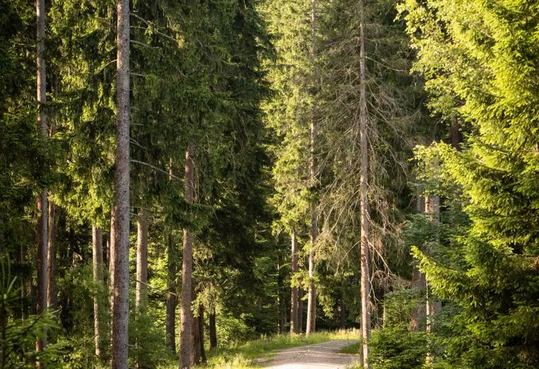 SeriesCreation Speaks
 SeriesGuided Silence
Nov14
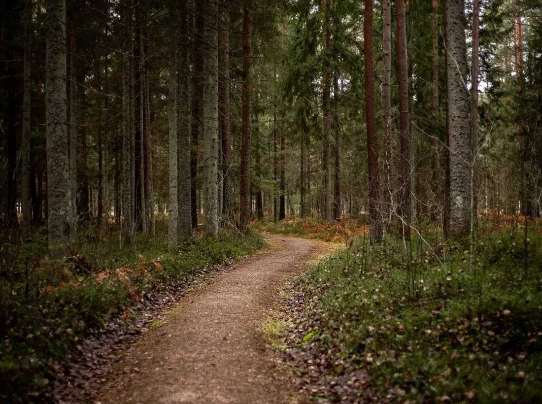
Prayer Walk: Autumn
9:00 AM · Trailhead
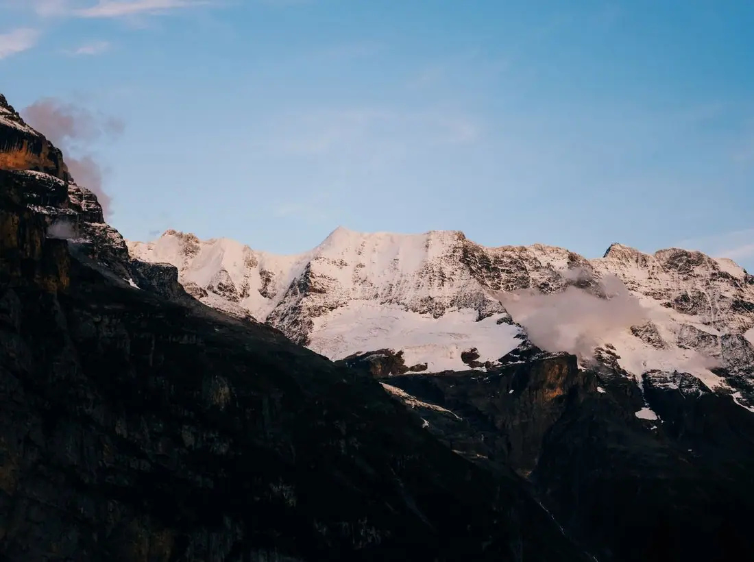
A guided walk through the colors of November.
Silent retreats, guided prayer walks and cabins in the woods, open year-round. Room to breathe is just a drive away.
Seasons sits on 140 acres of hardwood forest, creek and meadow. Come for a night, a weekend or a week. Walk, sleep, read, pray or do nothing at all. Our hosts will make sure you are fed and left alone.
One weekend a month, we turn the volume down. Meals are shared in quiet, guidance is optional, and the trails are yours. Most guests say they slept better here than they have in years.
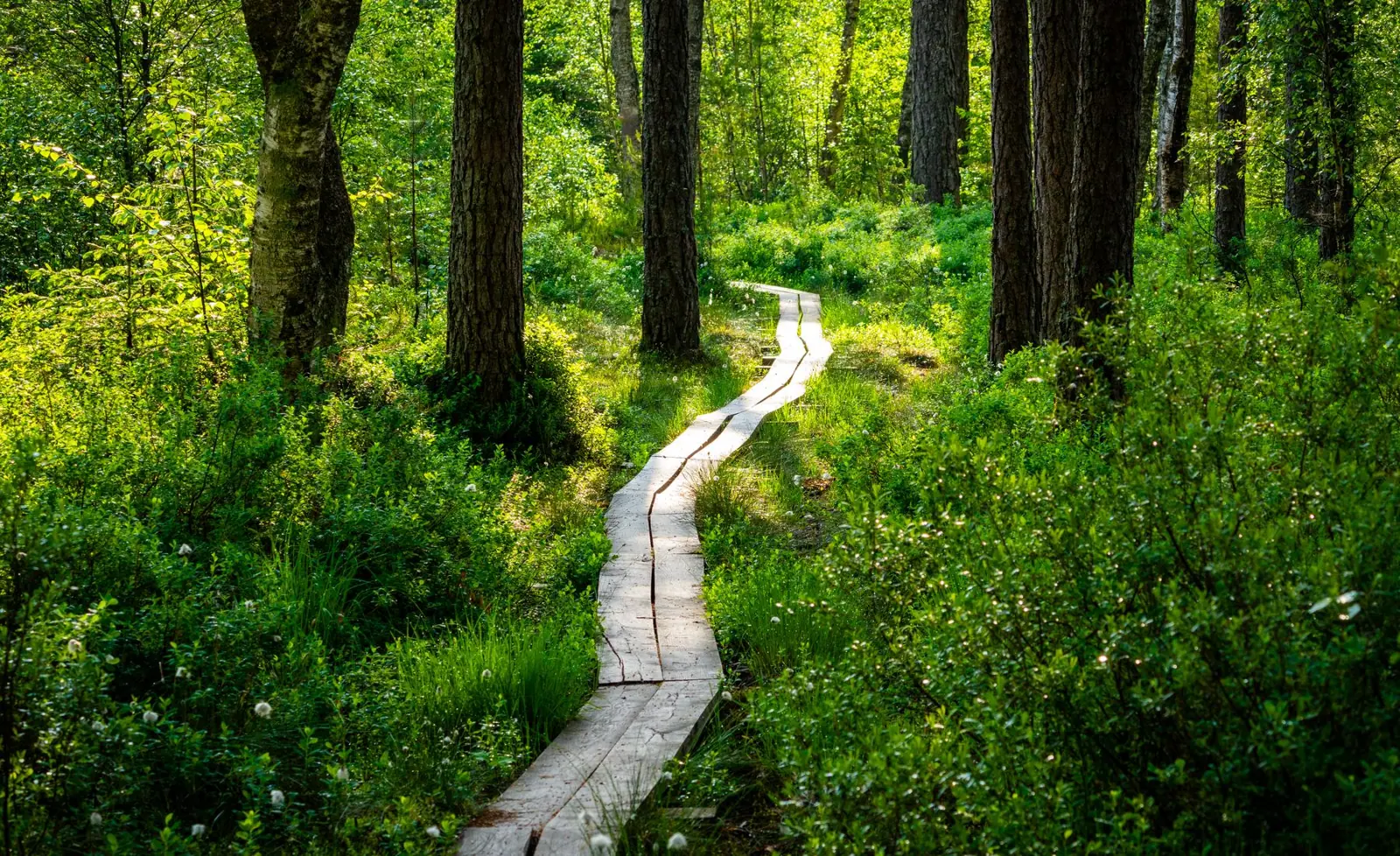
Come ye yourselves apart into a desert place, and rest a while.Mark 6:31 KJV
A guided walk through the colors of November.

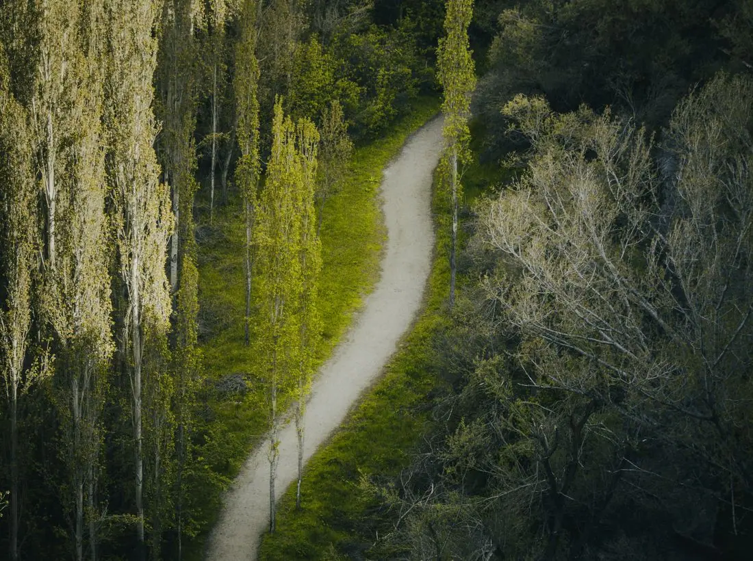
A seasonal supper with local farmers.
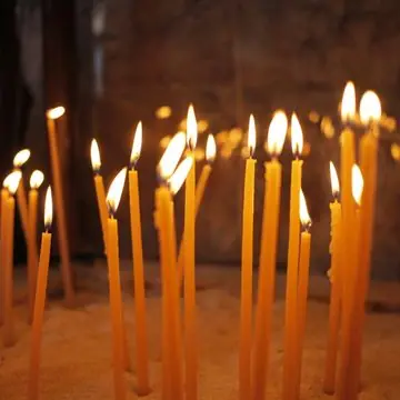
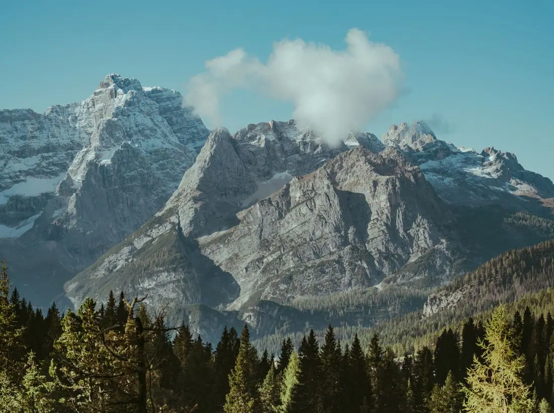
A reflective day of stillness before Christmas.
Your gift preserves the forest, funds scholarships and keeps rest within reach.
Design notes
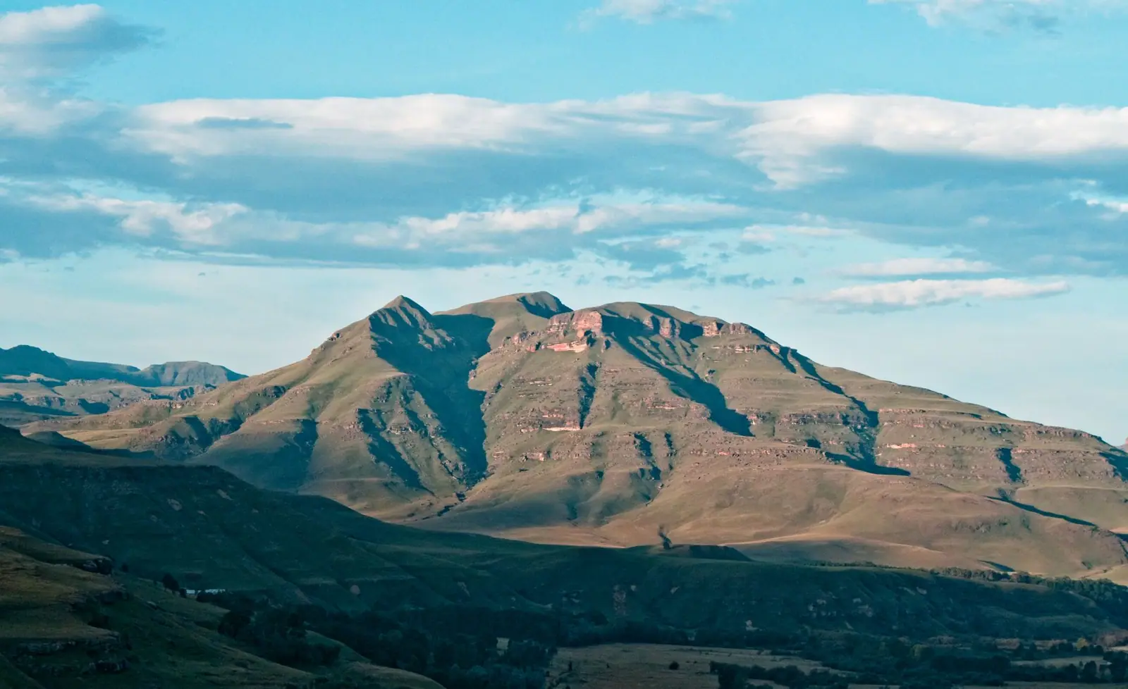
Seasons is a retreat centre site with a full-bleed photograph of a misty valley at sunset, a Lora headline and a green and amber palette. It sells quiet, so the page moves slowly and has little clutter.
Lora at semibold sets the headline. It is a calligraphic serif with gentle curves that looks human and unhurried. Work Sans handles body text and labels with an open, simple shape. The headline is large over the photo, and the paragraph is kept short.
The page is warm stone (#F3F1E8) with deep forest text (#23301F), moss green (#4F6B3A) for buttons and amber (#B7792B) as an accent. The dark theme uses a lighter leaf green (#9CC47A) and warm gold (#E2A85B). The colours are taken from the landscape in the photo.
A centred logo sits above a simple row of six links, with a green Give pill. A four-cell information strip follows the hero. Retreat types appear as rounded photo cards, with large images and little text. The layout leaves a lot of room around each element.
A sunset over a misty mountain valley fills the screen under a darkening gradient on the left. 'Come away and rest.' is set on two lines, with a short line about silent retreats, prayer walks and cabins. A chip shows the next Saturday prayer walk.
'Book a stay' is a green pill, and 'Explore retreats' is outlined. Booking is the business goal and the label says what happens next. Give sits in the header for supporters.
Landscape photography does most of the selling here, and the sunset and fog show the scale and calm of the place. A real centre must show its own cabins, chapel and trails, since guests want to see where they will sleep.
Dark green text on warm stone is about 12.3 to 1, and white on the green button about 6 to 1. The gradient behind the headline keeps text clear over the bright sky. Controls are large, and the theme toggle is in the header.
Each text pairing is checked against WCAG 2.2 in both themes. Ratios are computed from the exact theme colours.
| Pairing | Sample | Ratio | WCAG |
|---|---|---|---|
| Body text on page | Aa | 12.26:1 | AAA |
| Body text on cards | Aa | 13.26:1 | AAA |
| Secondary text | Aa | 5.63:1 | AA |
| Secondary text on tinted bands | Aa | 4.67:1 | AA |
| Links and labels | Aa | 5.70:1 | AA |
| Button text | Aa | 6.01:1 | AA |
| Accent button text | Aa | 5.42:1 | AA |
| Footer text | Aa | 12.26:1 | AAA |
| Pairing | Sample | Ratio | WCAG |
|---|---|---|---|
| Body text on page | Aa | 14.94:1 | AAA |
| Body text on cards | Aa | 13.20:1 | AAA |
| Secondary text | Aa | 7.79:1 | AAA |
| Secondary text on tinted bands | Aa | 5.91:1 | AA |
| Links and labels | Aa | 8.94:1 | AAA |
| Button text | Aa | 9.93:1 | AAA |
| Accent button text | Aa | 9.36:1 | AAA |
| Footer text | Aa | 14.94:1 | AAA |
Designed by Greater Purpose Web. Names, people, photos and events are sample content.