Why Safe Harbor looks the way it does
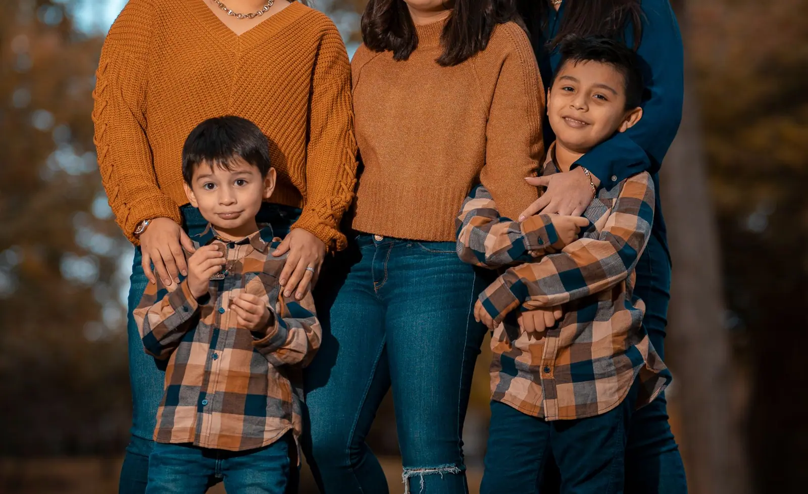
Safe Harbor is a women's shelter site with a full-bleed photograph of friends with arms around each other at dusk, a tan and brown palette and a serif headline. It leads with a 24/7 hotline because a person who needs help should not have to look for it.
- Built for
- Women and children seeking shelter or counselling, friends and family looking for help on someone's behalf, and donors.
- Navigation
- Sticky frosted bar with the full menu and a Give button. On phones, a bottom tab bar plus a quick-links launcher.
- Pages
- Home, About, Visit, Programs, Stories, Events, Donate, Contact
- Hero
- Full-bleed photograph with the headline set over a dark scrim.
Typography
Lora Bold sets the headline at about 90 pixels, a gentle serif with calligraphic curves that sounds like a calm voice. Source Sans 3 handles body text and is clear and neutral. The serif adds comfort while the sans supplies the practical information.
Colour
The page is warm sand (#EFE6D8) with deep brown text (#3A2619), a chestnut brand colour (#6B3F25) and a muted teal (#3E6F68) accent. The dark theme uses light tan (#D2A27E). The palette is earthy and quiet, and avoids bright colours that might feel clinical or alarming.
Layout and navigation
A sand bar has a brown logo tile, six links and a brown Donate button. A four-cell strip under the hero shows hours and location, and a stats band reports 24/7 hotline, 210 families sheltered and 85 percent finding stable housing. Circle icons and donor avatars appear lower on the page.
The hero
A full-width photo of four people with arms around each other, seen from behind in warm light, fills the first screen. 'You are safe here.' is set in white on a single line. The eyebrow says 24/7 confidential hotline, and a small chip shows the next hotline shift.
Calls to action
'Get help now' is a brown button, and 'How to help' is outlined. The help button is the first thing in the hero, ahead of donation. A real site should also add a quick-exit button, so someone in danger can leave the page at once.
Photography
The photo is taken from behind, so no faces are visible, which protects privacy and suits a confidential service. A real shelter must never show the building, its address or any resident.
Accessibility
Dark brown on sand is about 11.5 to 1, and white on the brown button about 9 to 1. Phone numbers should be tap-to-call links. A real build for this audience should also clear browsing history guidance and avoid tracking.
Type system
- DisplayLoraLora is warm and steady, so the central promise sounds like reassurance.
- TextSource Sans 3Source Sans 3 is plain and clear, which matters when someone is reading under stress.
Colour and contrast
Each text pairing is checked against WCAG 2.2 in both themes. Ratios are computed from the exact theme colours.