Why Saddle Creek looks the way it does
A site for a cowboy church that meets in a covered arena outside Weatherford. It is written for people who have not been inside a church in years and want to know, before they turn in at the gate, that their boots, their truck and their past will not be a problem.
- Built for
- Ranch hands, ropers, barrel-racing families, truckers and retirees in Parker County, plus the townsfolk who come for the brisket and stay.
- Navigation
- Classic top bar. Logo left, pages right, one action. Familiar to every visitor.
- Pages
- Home, Sundays, The Arena, Baptisms, Hay Fund, The Outfit
- Hero
- One impact number is the hero (for example meals served this year), with a line naming the unit, a sentence of context, a row of three supporting figures and one photograph. The number counts up once when it first comes into view. Variants: a = the number spans the full width above the photo and figures; b = photo on the left, number and a ledger of figures on the right; c = the number sits on a coloured panel that overlaps the bottom of a wide photograph; A full-bleed photograph left completely free of words, with the headline set underneath it like a museum caption and a small column of place, date and photo credit. Variants: a = catalogue entry (plate number, headline, details column); b = the details run as a ruled strip above one wide headline; c = the photo bleeds off the left edge and the details hang in the right-hand margin beside it; A single verse or sentence set enormous as the opening statement, with its reference, a short supporting line and one action. Variants: a = the quote fills the width with a hanging quotation mark; b = the quote beside a tall photograph; c = the reference becomes the architecture, with the book name and a giant outlined chapter and verse in the left column
Typography
Besley is a Clarendon, the letterform of saddle-shop signs, feed-store calendars and county fair posters, set heavy at 800 with its italic for the occasional aside. Libre Franklin carries the body because Franklin Gothic was Clarendon's partner on every handbill and newspaper ad, and it stays plain at phone sizes. Barlow Condensed handles labels and times like the numbers stencilled on a trailer gate.
Color
The brown is latigo leather, the color of a saddle that has been oiled for twenty years. The blue is faded denim and the steel of a stock tank, and the background is caliche dust, the pale road base of every county road out here. At night the palette turns to a lit barn: warm tan on near-black, with the denim lifted so it still reads.
Layout and navigation
A classic top bar, because the people this church serves did not grow up on websites and should not have to learn one. Six plainly named pages and one action, Find the arena, always top right. The double rules and outlined cards borrow from rodeo programs and sale-barn catalogues.
The hero
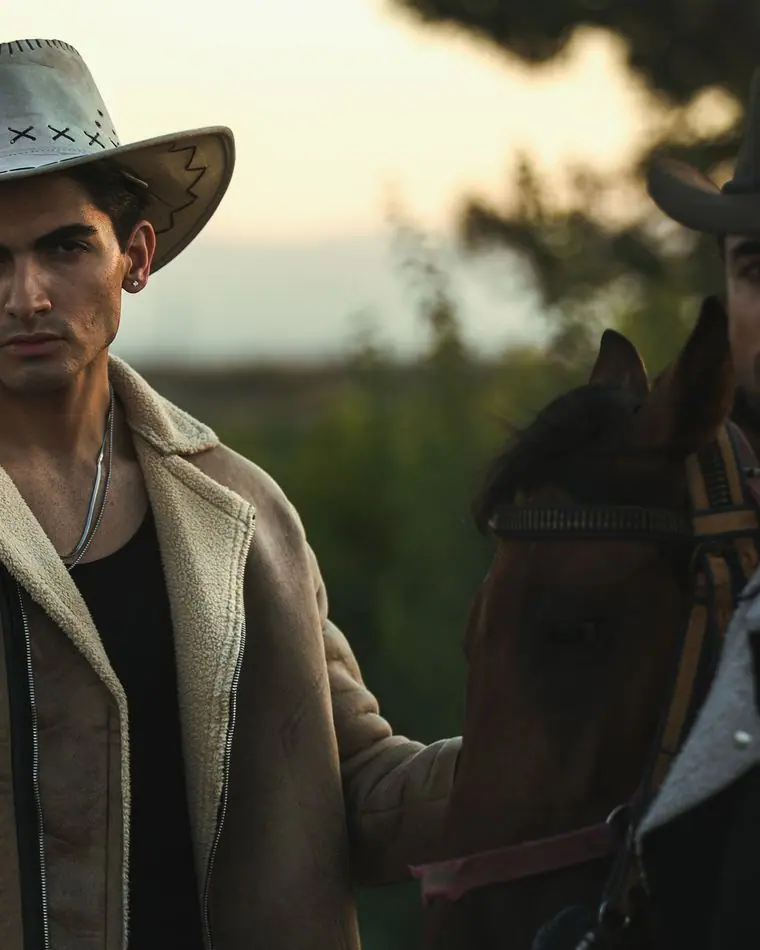
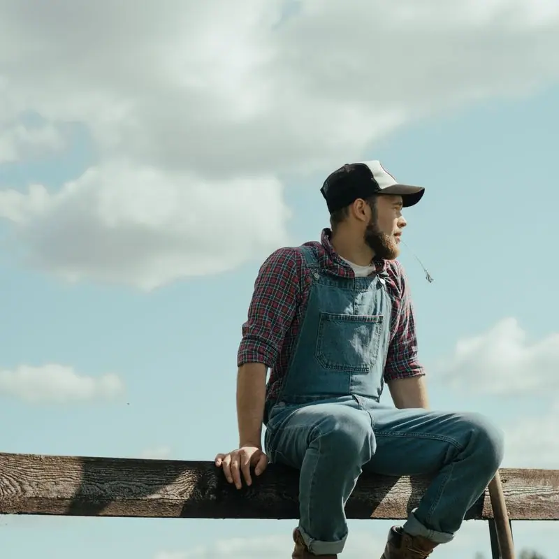
The first screen is a photograph with no words on it at all, cowboys resting along a fence, with the headline set underneath like a caption and the place and time hanging in the margin. It says what this church is before it says anything about church, which is the whole point for someone sitting in the truck deciding whether to go in.
Calls to action
Find the arena is the main action, because the hardest part for a newcomer is a gravel turn-off with no steeple. The others are just as literal: See arena nights, Talk to Clint about baptism, Ask for hay or help, Give to the Hay Fund. Nobody here would say plan your visit.
Photography
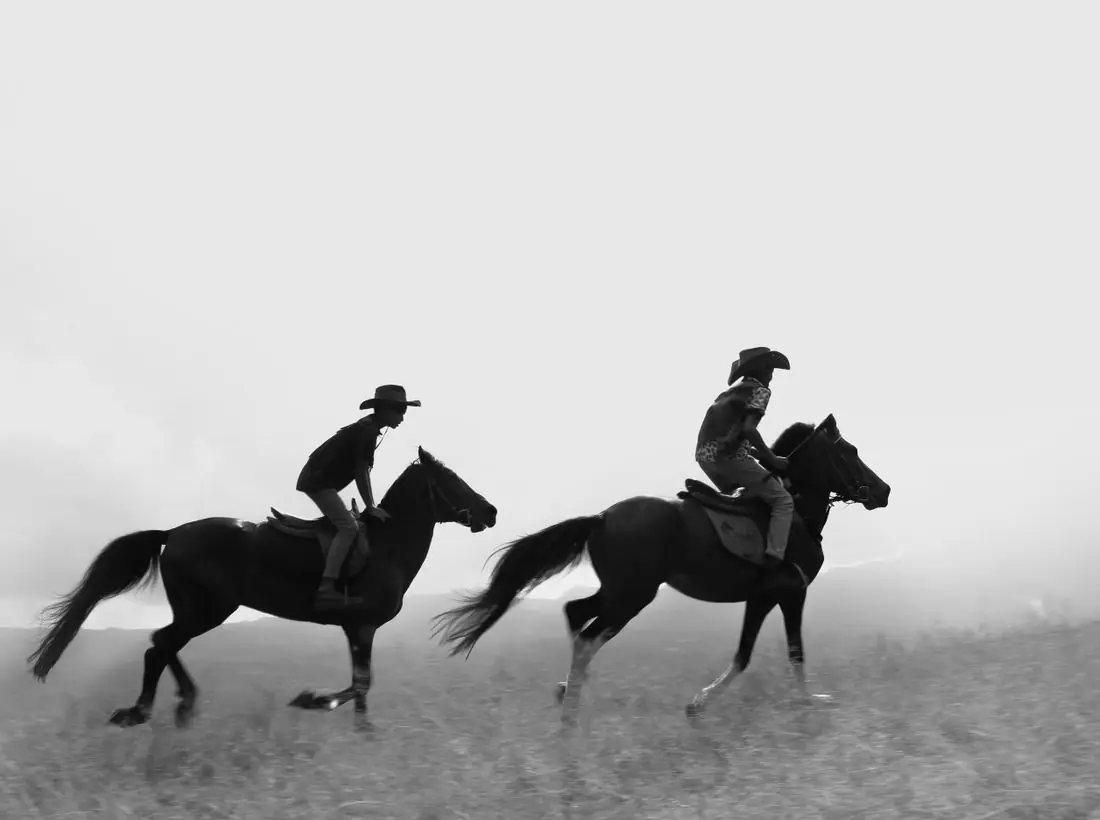
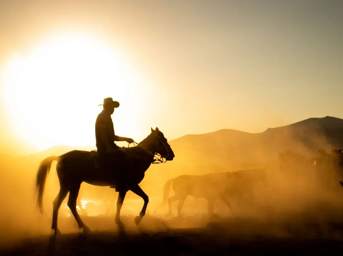
Working ranch photography: roping in a dusty pen, riders crossing a pond at golden hour, a saddled horse tied at the rail. Portraits are weathered and unposed. We avoided anything that looks like a costume or a theme park, because the congregation would spot it in a second.
Accessibility
Body text is 17px with generous line spacing and every color pair passes 4.5:1 in both themes. Times are given as plain text, never only in images, and the visit page spells out ramps, golf-cart shuttles and the step-free path from the lot, because a lot of this congregation is past seventy or has been thrown off a horse.
Type system
- DisplayBesleyBesley is a Clarendon, the bracketed slab of saddle-shop signs, feed-store calendars and county fair posters, so the headlines sound like they were painted on a barn.
- TextLibre FranklinFranklin Gothic sat beside Clarendon in every sale-barn handbill and newspaper ad; it reads plain and sturdy at small sizes on a phone in the truck.
- AccentBarlow CondensedNarrow caps for labels and times, like the numbers stenciled on a stock trailer or an arena gate.
Colour and contrast
Every text pairing is checked against WCAG 2.2 in both themes.
Light theme
| Pairing | Sample | Ratio | WCAG |
|---|
| Body text on page | Aa | 13.38:1 | AAA |
| Body text on cards | Aa | 15.16:1 | AAA |
| Secondary text | Aa | 5.87:1 | AA |
| Links | Aa | 6.9:1 | AA |
| Button text | Aa | 8.58:1 | AAA |
| Accent label text | Aa | 7.98:1 | AAA |
| Text on dark bands | Aa | 13.38:1 | AAA |
| Muted text on dark bands | Aa | 7.16:1 | AAA |
| Text on brand bands | Aa | 8.58:1 | AAA |
| Muted text on brand bands | Aa | 5.62:1 | AA |
Dark theme
| Pairing | Sample | Ratio | WCAG |
|---|
| Body text on page | Aa | 14.9:1 | AAA |
| Body text on cards | Aa | 13.74:1 | AAA |
| Secondary text | Aa | 6.6:1 | AA |
| Links | Aa | 7.53:1 | AAA |
| Button text | Aa | 7.63:1 | AAA |
| Accent label text | Aa | 8.76:1 | AAA |
| Text on dark bands | Aa | 15.69:1 | AAA |
| Muted text on dark bands | Aa | 7.93:1 | AAA |
| Text on brand bands | Aa | 7.63:1 | AAA |
| Muted text on brand bands | Aa | 4.93:1 | AA |