Why Raise the Roof Builders looks the way it does
Raise the Roof has two audiences who need opposite things: homeowners, often in their seventies or eighties, who need to know if they qualify, and volunteers who want to know what a Saturday is actually like. The site leads with the one number that persuades both, then splits cleanly into Get repairs and Volunteer.
- Built for
- Older and disabled homeowners in Birmingham's west and north side neighborhoods, and the church groups, students and companies who volunteer on Saturdays.
- Navigation
- Two-tier header. A thin utility strip carries times, phone and language; the main bar below holds pages and the action.
- Pages
- Home, Get repairs, Volunteer, This season, Sponsor a build, Our crew
- Hero
- a short action form as the hero: the one thing most visitors came to do (request a ride, ask for help, register a child) can be done before they scroll, with reassurance beside it. Variants: a = headline, reassurance and a photo on the left with the form as a raised card on the right; b = a tall photo carrying the headline, with the form and reassurance on a plain panel beside it; c = headline beside a photo, then the form laid out as one horizontal booking bar; a drawn neighbourhood map as the opener, with numbered pins for each stop or campus and a list of names, addresses and times beside it; pointing at a list item lights up its pin. Built for mobile pantries, multi-site churches and bus routes. Variants: a = map on the left, headline and stop list on the right; b = headline across the top, a wide map, and the stops as columns beneath; c = a route: stops as a connected timeline beside a map with the path drawn between pins; One impact number is the hero (for example meals served this year), with a line naming the unit, a sentence of context, a row of three supporting figures and one photograph. The number counts up once when it first comes into view. Variants: a = the number spans the full width above the photo and figures; b = photo on the left, number and a ledger of figures on the right; c = the number sits on a coloured panel that overlaps the bottom of a wide photograph
Typography
Headlines are Teko in capitals, a squared condensed face with the look of lumber stamps and job-site signage, which lets the hero number run nearly the full width of the screen. Body text is Overpass, based on the Highway Gothic of interstate signs: plain, sturdy, and easy for older eyes. Overpass Mono sets dates and start times like a tape measure.
Color
Brand red is the color of Alabama clay and the rust on old Birmingham iron; the accent is hard-hat yellow, used sparingly for the moments that matter. The background is a cool concrete gray with a hint of green instead of a warm cream. In the dark theme yellow takes over as the main color, like a site light at dusk.
Layout and navigation
A two-tier header: the thin top strip carries the three facts people phone the office to ask (when build days start, the repair line, when applications open), and the main bar holds six pages and the Check if you qualify button. Square corners, thick rules and flat cards keep the whole site feeling built rather than decorated.
The hero
The opener is a single number, 12,180 volunteer hours last year, set across the full width in Teko and counted up once when it appears, with homes, roofs and ramps beneath it. Hours are honest evidence of the thing that makes this organization work: ordinary people turning up on Saturdays. For a homeowner deciding whether to trust strangers on their roof, the 642 homes beneath it does the rest.
Calls to action
The header button reads Check if you qualify, because homeowners are the reason the organization exists and many are unsure whether they can ask. The hero's button reads Sign up for a Saturday. Giving is worded as a concrete object, Sponsor a ramp, with a price beside it.
Photography
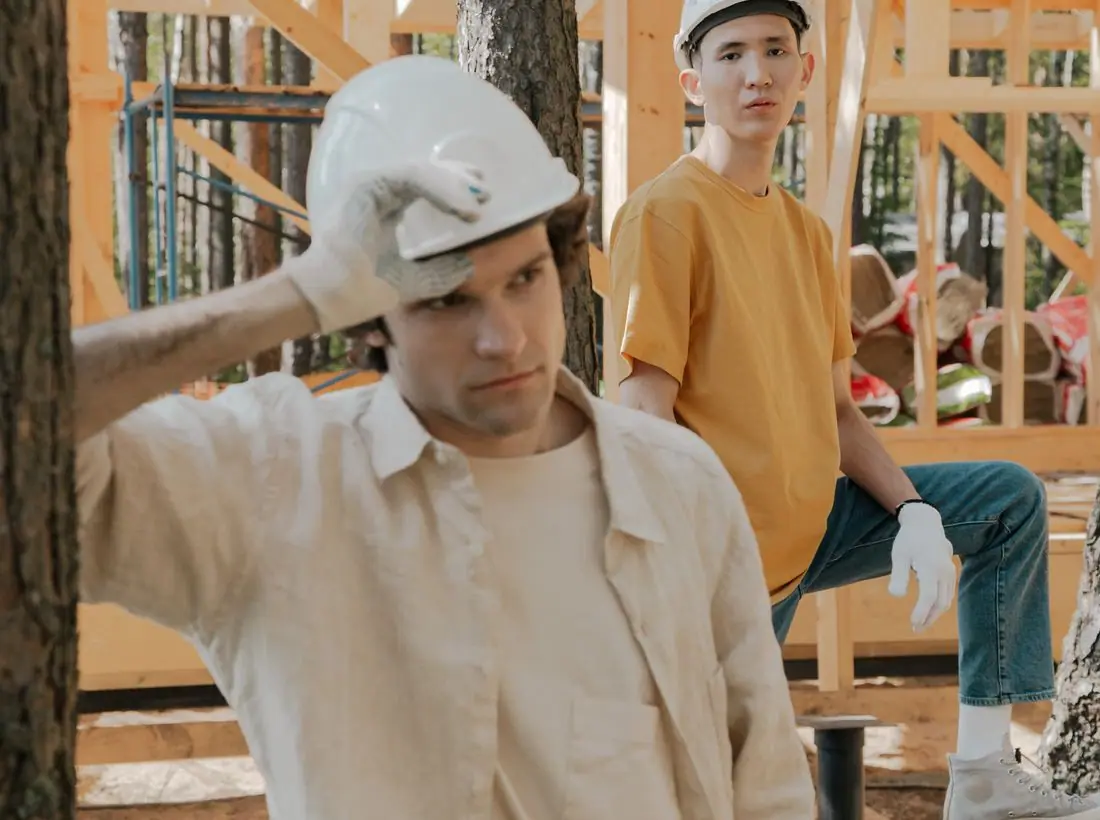
Volunteers mid-work in hard hats, and homeowners shown as themselves, never as a before-and-after. We kept to a handful of build photos and used each once; in a real build they should be the crew leaders' own phone pictures from Ensley and Pratt City porches. We avoided staged hammer-and-smile shots and any photo of a damaged house that would embarrass the people who live there.
Accessibility
Body text is 17px with roomy line height and a 66-character measure, and every pairing passes WCAG AA in both themes. The repair application asks plain questions and offers a phone number at the top, because many homeowners would rather talk. The counting number respects reduced-motion settings.
Type system
- DisplayTekoTeko is a squared, condensed face with the proportions of stencilled lumber stamps and job-site signs; set in capitals it can carry a number the size of a garage door.
- TextOverpassOverpass is drawn from Highway Gothic, the lettering on interstate signs, so it stays plain and readable in the same no-nonsense register as the headlines.
- AccentOverpass MonoThe mono cut sets dates, start times and measurements like the numbers on a tape measure.
Colour and contrast
Every text pairing is checked against WCAG 2.2 in both themes.
Light theme
| Pairing | Sample | Ratio | WCAG |
|---|
| Body text on page | Aa | 15.11:1 | AAA |
| Body text on cards | Aa | 17.63:1 | AAA |
| Secondary text | Aa | 5.67:1 | AA |
| Links | Aa | 5.8:1 | AA |
| Button text | Aa | 6.77:1 | AA |
| Accent label text | Aa | 10.39:1 | AAA |
| Text on dark bands | Aa | 15.11:1 | AAA |
| Muted text on dark bands | Aa | 7.9:1 | AAA |
| Text on brand bands | Aa | 6.77:1 | AA |
| Muted text on brand bands | Aa | 4.62:1 | AA |
Dark theme
| Pairing | Sample | Ratio | WCAG |
|---|
| Body text on page | Aa | 15.34:1 | AAA |
| Body text on cards | Aa | 13.71:1 | AAA |
| Secondary text | Aa | 6.83:1 | AA |
| Links | Aa | 10.05:1 | AAA |
| Button text | Aa | 10.39:1 | AAA |
| Accent label text | Aa | 6.9:1 | AA |
| Text on dark bands | Aa | 16.33:1 | AAA |
| Muted text on dark bands | Aa | 8.19:1 | AAA |
| Text on brand bands | Aa | 10.39:1 | AAA |
| Muted text on brand bands | Aa | 6.1:1 | AA |